All Activity
- Past hour
-
Yeah but whats the cost for 150' of gutter? Sent from my SM-S921U using Tapatalk
- Today
-

2026-2027 El Nino
snowman19 replied to Stormchaserchuck1's topic in Weather Forecasting and Discussion
-

E PA/NJ/DE Spring 2026 Obs/Discussion
RedSky replied to PhiEaglesfan712's topic in Philadelphia Region
Temperatures will be in freeze territory Wednesday morning one week from last frost date -

Central PA Spring 2026 Discussion/Obs Thread
Jns2183 replied to Voyager's topic in Upstate New York/Pennsylvania
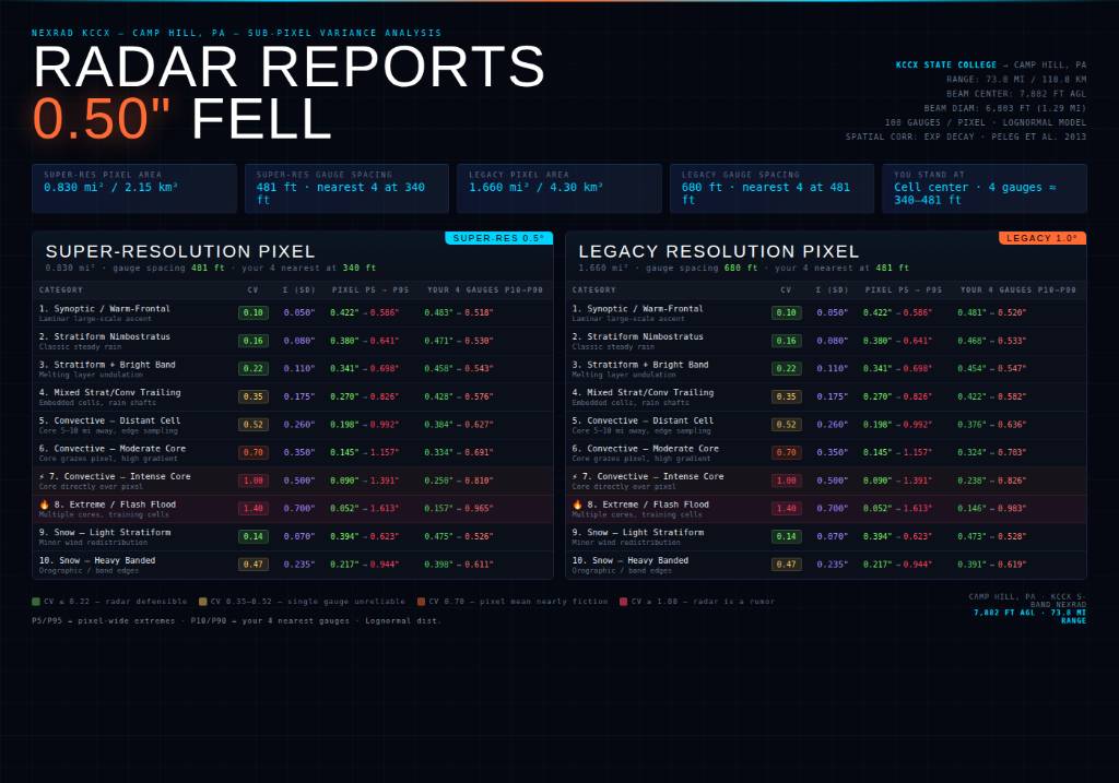
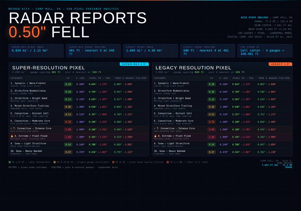
My Magnus Opus of why I can never be mad at preceiptitation reports after a big storms.. We've all been there. NEXRAD shows 0.50" for your pixel. Your CoCoRaHS gauge reads 0.22". Your neighbor two blocks over posts 0.81". Both of you are right. The radar might also be right. Here's why, and why it gets genuinely alarming during intense convection. The Geometry First I'm 73.8 miles from KCCX at State College. At that range, the 1° beam has expanded to 6,803 feet in diameter — that's 1.29 miles across. The center of that beam is floating 7,882 feet above my roof. The super-resolution pixel covering my house is 0.830 square miles / 2.15 km². The legacy pixel was 1.660 square miles / 4.30 km². That single dBZ value stamped on that pixel represents the average backscatter of a volume of air roughly the size of 12 Disneylands hovering a mile and a half above the ground. Now imagine 100 top-of-the-line rain gauges evenly distributed across that pixel. Super-res spacing works out to one gauge every 481 feet. I stand dead-center in my grid cell. By Pythagoras, my four nearest gauges are at the corners — each 340 feet away from me. Here's Where It Gets Uncomfortable For well-behaved stratiform rain — your warm-frontal overrunning, your classic nimbostratus — everything is fine. CV of 0.10 to 0.16. My four nearest gauges within a few hundredths of each other. Radar is defensible. Life is good. But bump up into Category 7 — intense convective core directly over the pixel — and the math falls apart spectacularly. Radar reports 0.50". CV = 1.00. Standard deviation = 0.50". Lognormal distribution gives a pixel-wide range of 0.090" to 1.391" at the P5/P95 level. That's a 15:1 spread across my 0.830 square mile pixel, between gauges that are less than half a mile from each other. But here's the part that genuinely made me sit back: my four nearest gauges — 340 feet away from me, about the length of a city block — have a realistic P10/P90 spread of 0.250" to 0.810". Three-to-one variation between gauges I can practically see from my porch. Both are physically correct measurements of the same event. Scale that up to Category 8 — extreme/flash flood/training cells — and it becomes almost philosophical. Radar reports 0.50". Pixel range P5/P95: 0.052" to 1.613". That's a 31:1 ratio. My four nearest gauges: 0.157" to 0.965". Six-to-one. The gauge 340 feet north of me reads under two tenths. The gauge 340 feet east reads close to an inch. The radar says half an inch. Every single instrument is functioning perfectly. At 1.00" reported by the radar the numbers get worse: Cat 7 gives my nearest four a spread of 0.500" to 1.620" and Cat 8 gives 0.314" to 1.930". The gauge closest to me physically could read less than a third of an inch while the one a city block away reads nearly two inches. During the same event. At the same time. Why This Matters for Verification Work This isn't a measurement error problem. This isn't instrument quality. This is the fundamental physics of convective precipitation at sub-kilometer scales, documented by Peleg et al. (2013) with a dense gauge network and confirmed repeatedly in the literature. Rainfall within a single radar pixel during convection can vary by over 100% — and that finding came from a network covering a smaller area than my NEXRAD pixel at 73.8 miles. When someone posts their CoCoRaHS total and it's half what radar showed during a summer storm, the correct response isn't "your gauge is off." The correct response is "yes, that is entirely expected and physically consistent with everything we know about convective precipitation structure." The radar isn't wrong. Your gauge isn't wrong. The atmosphere just doesn't care about our need for tidy single-number summaries. The only honest statement you can make about precipitation during a Cat 7/8 event with a single gauge is: this is what fell at this exact point. Full stop. Extrapolating to even the next block over is an act of faith, not measurement. Methodology: Lognormal distribution fit to literature CV values by precip type (Ciach & Krajewski 1999, 2006; Peleg et al. 2013; Jensen & Pedersen 2005). Local near-gauge CV compressed by exponential spatial correlation model. KCCX beam geometry calculated using 4/3 Earth radius refraction. All pixel areas computed from actual Camp Hill–KCCX range of 73.8 miles. Sent from my SM-S731U using Tapatalk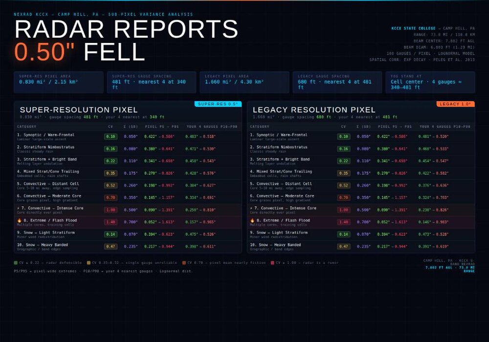

-
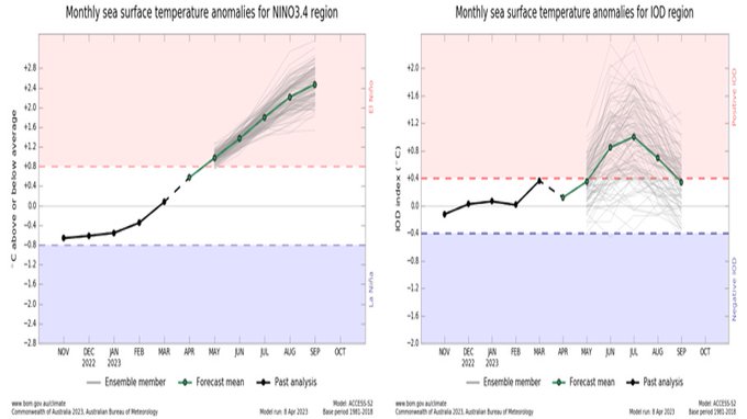
Being that the current OISST dailies suggest that RONI is likely ~-0.3 to -0.4, it is a very tall order to get the full April averaged RONI to rise all of the way to +0.6, which is what this BoM run has. We’ll see what the very strong WWB/TC triplets are able to do. The rate of April warming would probably have to be well beyond record highs to get April RONI up to +0.6. The daily RONIs may have to approach +1.5 by April 30th!! I don’t see that being realistic at all.
-
Central PA Spring 2026 Discussion/Obs Thread
Jns2183 replied to Voyager's topic in Upstate New York/Pennsylvania
A Few Things That Should Make You Uncomfortable At 100 ft — 62,351 ft³. Roughly the size of a large house. This is the only range where the radar is sampling anything resembling a point. At 1 mile — 92 ft beam diameter, still smaller than a football field. Still reasonable. Still vaguely honest. At 10 miles — beam is now 922 ft wide. Bigger than the range gate itself. The pancake starts to make sense. At 65 miles (Camp Hill) — ~22 billion ft³. The beam diameter (~5,990 ft) is now wider than it is deep by a factor of 7. Your "data point" is a disc, not a cube. And it's floating at ~5,200 ft AGL. At 100 miles — 54.9 billion ft³, beam nearly 1.75 miles wide, center beam at 9,708 ft AGL. At this point the radar is essentially sampling the lower stratosphere and calling it precipitation data. Depth is always 822 feet. It took me a number of ever increasing pancake sizes and a traffic cone of unsavory origins to visualize this. This pulse and about 50;more with 97% overlap get run through a bunch of algorithms and out pops a pixel over us. So if radar makes you want to pull your hair out, this is why. America’s Boeing Everett Factory, 25 miles north of Seattle, remains the world’s largest building by volume and world’s largest factory. Workers assemble Boeing aircraft—including the new 787 Dreamliner—within this 472,000,000-cubic-foot factory. My single radar pixel contains roughly 47 Boeing Everett Factories worth of air Sent from my SM-S731U using Tapatalk -
Central PA Spring 2026 Discussion/Obs Thread
Jns2183 replied to Voyager's topic in Upstate New York/Pennsylvania
The atmosphere is a terrible heater and a spectacular refrigerator, and it's been this way for 4.5 billion years with zero apologies. Seriously, haha, what happens when air heats up. It rises and cools. One state requires energy in, another requires nothing Sent from my SM-S731U using Tapatalk -
Couldn’t agree with you more. The purposeful imprecision of ALL of our media companies is appalling no matter what side of the spectrum one might be on.
-
Kudos to NWS for the freeze watch!
-

E PA/NJ/DE Spring 2026 Obs/Discussion
LVblizzard replied to PhiEaglesfan712's topic in Philadelphia Region
Another week of boring ass weather. Yawn…wake me up when we start getting weekly severe thunderstorm chances. -
Makes perfect sense to me.From JB:April 5, 2026The forecast numbers have been taken way down.The Canadian model has been thrown out.The European indicates a powerful El Niño and a negative AMO "look".The closest analog is 2015.The impact forecast is a roll of the dice.Impacts will likely be below normal and scattered.There is always the threat of one (un)lucky punch.Early season Gulf or SE system a concernThe Western Pacific will take up the Global slack.Eastern Pacific Mexican higher impact season possibleThe forecast numbers for the 2026 seasonTotal storms: 9-13Hurricanes: 3-5Major Hurricanes: 1-2Landfalling U.S. hurricanes: 1-2Impact storms on the U.S. when at least a warning is issued: 3ACE Index: 85-105The closest analog is 2015
-
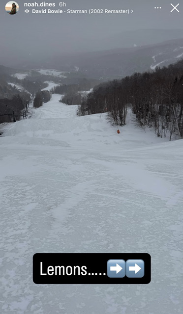
What an icy disaster today. The Lookout Snow Cam had 3” but reality was less. Could've added 3” to the tally but went with 1” instead. High Road had less than 1”, which is what the hill skied with. But there’s no shortage of snow in general.
-

2026 Atlantic Hurricane Season
Stormchaserchuck1 replied to Stormchaserchuck1's topic in Tropical Headquarters
-
Historic Tennessee Valley Cold, Snow, and Ice Events
Daniel Boone replied to Carvers Gap's topic in Tennessee Valley
That Map is low on Totals in much of the area. The Snow started where I lived west of Pennington gap around 1:15 Thursday the 2nd as a rain/snow mix that quickly turned to all Snow. It continued non stop until 1:15 Sunday the 5th. I measured about 20" at it's deepest but, it was melting underneath the whole time as the ground was warm from 2 Weeks of temps in the 70's before this. There was 30" on a parked Vehicle that sat near the north side of my Neighbor's house at the time the Snow ended. I did have some Photos I'd taken of it but misplaced them in moving process. -
I don’t want this.
-
Absolutely beautiful day here. Pollen and dust was gone, wind died down to just a slight breeze and a high of 69 with the dew point of around 50.
-
We’re due for a derecho, too.
-
Yep El Nino on the way. Strength is yet to be determined.
-

Occasional Thoughts on Climate Change
gallopinggertie replied to donsutherland1's topic in Climate Change
Those past catastrophic events in the geological record didn’t have anywhere near as rapid a rise in CO2 as we are causing now, yet still caused mass extinctions. It’s easy to forget how truly short our lives our - the fact that baby boomers have seen a rise of about 30%, give or take, in CO2 levels over the course of their lifetimes, is crazy. -
In 2023, the same BoM model also had it getting to +2.4 at the same time (Sept) as per snowman’s post at the bottom of this post. Here was that 4/8/23 run: But “it” back then was ONI, which like now was then ~0.5 higher than RONI. So, it implicitly was predicting RONI only at +1.9. Thus, the current BoM prog on an apples to apples basis is progging 0.5 warmer than what it had 3 years ago. But also keep in mind that the ‘23 BoM turned out to be significantly too warm for the ONI. In Sept, ONI verified to be only +1.64 meaning a large bust of +0.76! RONI was only +1.15. If this BoM run were to bust as badly to the top warm side, the Sept RONI would be at +1.64.
-

Central PA Spring 2026 Discussion/Obs Thread
mahantango#1 replied to Voyager's topic in Upstate New York/Pennsylvania
56 was the high here today. -

Spring 2026 Med/Long Range Discussion
BeastFromTheEast replied to Brian D's topic in Lakes/Ohio Valley
I’m Just hoping the hose doesn’t shut off for June/July/August. A dessert like summer could wipe out all of the drought progress this spring. -
I want to touch the concept of consensus for a moment. Consensus in science works a bit different than what you may be thinking. It's not a majority opinion of people. Instead it is the position most likely to be true based on the aggregation of multiple lines of evidence. An example that might resonate best with the audience here is weather forecasting. Model ensembling (like intensity and track forecasts of tropical cyclones with IVCN and TVCN) incorporate multiple lines of evidence. They are often referred to as consensus forecasts. It has nothing to do with people's opinions or even people at all. And as long as there are 2 or more lines of evidence then a consensus exists. It turns out that consensus forecasts have superior skill vs utilizing only one line of evidence. It doesn't matter if a majority of people accept it or not. In reality you do find that majority opinion tends to rally around the scientific consensus at least eventually. It is important to mention the concept of consilience as well since "consensus" and "consilience" are sometimes used interchangeably though they are subtly different. But that's a topic for another time. My point is that when many of use the word "consensus" to describe our understanding of climate change we aren't necessarily invoking the opinions of people, but instead the consilience of evidence.
-
A super nino here means napril all of next winter here
-
Strongest in a century? We don't have adequate/detailed enough ocean temp records prior to the 1970s to properly quantify the true extent of super El Ninos, which explains why we have only have had 3 since the 1980. https://ggweather.com/enso/oni.htm of 4 if you use RONI: https://ggweather.com/enso/roni.htm Also, any headline that asks a question, the answer is almost always a "NO." It is a devious way to present something as if it will happen when it is not likely to happen or highly uncertain at the time. This is done in wx en masse w/ teasing suppositions and conjectures. And the sub-headline states: "increasingly likely wide-reaching climate impacts that last into 2027." First, it is not climate impacts, it is wx impacts. Atmospheric phenomena impacted from El Nino are short-term. That is wx, not climate. It does not impact "average wx over a long period," it impacts individual wx events/patterns of various degrees in the 1-1.5 year window El Ninos last. This idea that wx=climate and vice versa is ridiculous. Changing the meaning of words to fit a narrative/ideology. Second, why wouldn't El Nino (of any strength, or La Nina for that matter) not have wide-reaching impacts? This is redundant. We know ENSO has wide-reaching impacts, as do the at least a dozen other global and hemispheric oscillations that exists. Third, how can a potential of something be increasingly likely to have impacts? You have something that is uncertain to occur (potential), so how can it be scaled as being increasingly likely to have impacts when you are not even sure if it will occur in the first place? You are putting the wagon in front of the horse here. Not being pedantic here. How science-based information is conveyed is important. Not defining terms correctly or using improper logic/reasoning is bad science.