
weatherwiz
-
Posts
79,817 -
Joined
-
Last visited
Content Type
Profiles
Blogs
Forums
American Weather
Media Demo
Store
Gallery
Everything posted by weatherwiz
-
This is bull****. The deep south got a bigger winter storm than we did and now the PAC NW will get a better severe event than we will this summer. May as well just skip summer and try luck with next winter
-
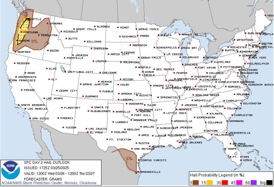
Going to see a few nasty S-N moving supercells in Washington State today. Don't know what the record hail size is in Washington but I say they break it today. There will be a >2" hail report...book it
-
Ground temperatures get way too much credit. The ground is not water, the temperature of the ground can adjust very quickly to air temperature and can be heavily influenced by precipitation. If the air temperature is 38 and the ground temperature is the same or whatever and you have heavy precipitation falling, and in this case snow, both temperatures will adjust quickly. Will it impede some accumulation? Certainly...but it is going to be a very insignificant amount of accumulation it impedes.
-
I feel like you'll have to really be a good like 75 miles into the warm sector to maximize the true warmth. There is a great deal of llvl moisture along and even just behind the front. If this was late May we could probably mix that out but that's a struggle in late March.
-
Since I do like being technical, the more correct process here would be warm front lifting northward, then becoming stationary, and potentially retreating south as what would then be a cold front.
-
I think the anomaly maps are kind of "useless" anyways for this. They aren't really providing any information that we don't know. If you warm sector, its going to be anomalously warm and if you fail to warm sector, it will be awful. The key is determining what the likelihood of either scenario occurring is and IMO a 2m temp anomaly map isn't going to do that.
-
Is it really a backdoor front? I thought it was more a warm front lifting north and having its progression shunted....didn't seem to be much of a mechanism to continue driving the warm front northward until Sunday when the main SLP lifting across the Great Lakes region deepened a bit and lifted northeast.
-
Looking at the sfc, its difficult to see the warm front making much northward progression within the region Saturday, though the Euro would probably favor this moreso - which is reflected within its output. If anything, there is a better chance for much of the region to warm sector Sunday, unfortunately it would be a dirty warm sector. Regardless, that is going to be one monster gradient Saturday...Great Plains like
-
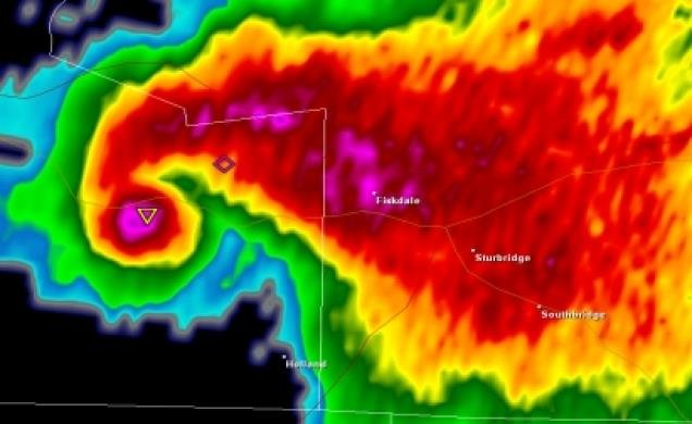
Don't see this often
-
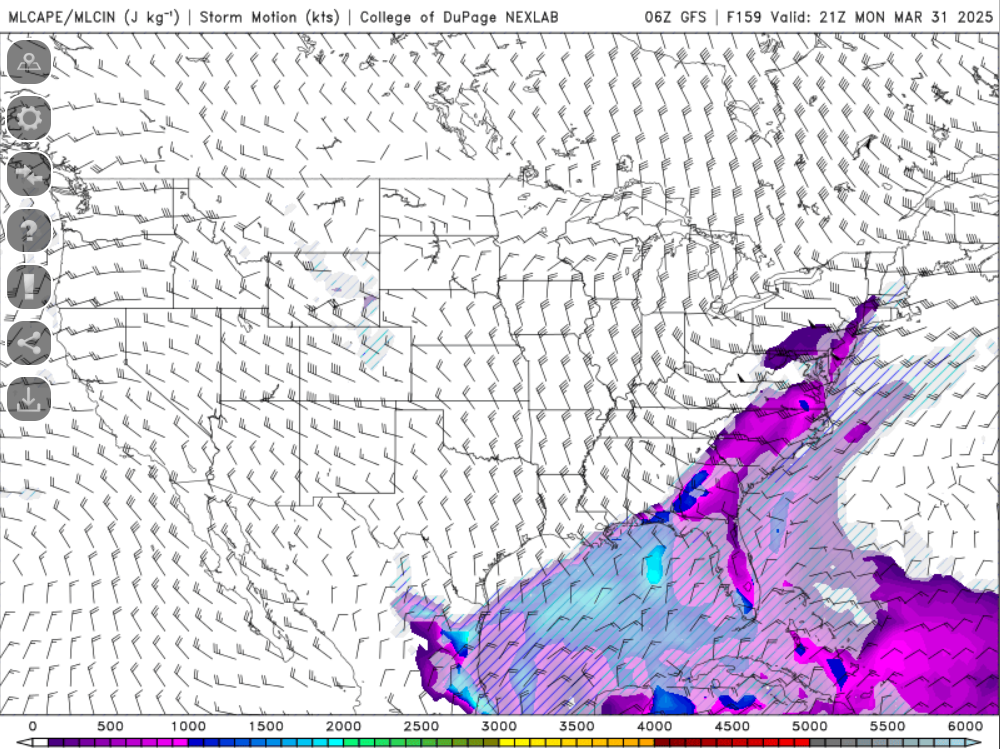
The map I posted is mixed-layer CAPE and the color shadings correlating to CAPE values (with increasing values left to right) which is a measure of energy (J/KG).
-
Can't wait until we start getting some greens and yellows/oranges over us
-
Too much
-
It's March...we enjoy the nice guys and suffer through the shitty days...but these shitty days with clouds/rain early in spring are needed so we don't burn come summer.
-
Best part about April is playoff hockey and baseball regular season begins. Unfortunately, we only get one of those this year.
-
Short-term guidance is laughable tomorrow from the OV through the Northeast/mid-Atlantic
-
It's a Monday and we need the rain so can't complain too much, as awful as the day is.
-
I would say the extended HRRR is out to lunch with some showers and flakes mixing in for the higher terrain tomorrow night but the Euro has it too.
-
Should be pretty snow squally up north tomorrow
-
I wouldn't be shocked if we are able to sneak in some super warm days for sure.
-
These signals though for some impressive ridging into the Inter-mountain West/Great Plains region makes me a bit nervous. Wouldn't take too much to get omega blockish.
-
I don't know about past the second week of April or so, but I don't see any "torches" upcoming, unless one wants to count a brief period ahead of a FROPA. I mean we'll still end up on the + side of departures but I don't see anything for prolonged or sustained torchy weather (which I would define as highly anomalous). With the way the northern hemispheric flow has been we really need to watch FROPAs too because we could end up wedged in and maybe even start introducing cutoff potential.
-
Cold, overcast, and gross out.
-
Actually much better now than it was even an hour ago.
-
Yeah it’s pretty chilly. Was going to do a few things outside but it’s not even pleasant in the sun.
-
This is some of the coldest, wind driven rains I think I’ve ever felt.