cptcatz
-
Posts
1,077 -
Joined
-
Last visited
Content Type
Profiles
Blogs
Forums
American Weather
Media Demo
Store
Gallery
Everything posted by cptcatz
-
2023 Atlantic Hurricane season
cptcatz replied to Stormchaserchuck1's topic in Tropical Headquarters
Lololol NHC literally said "no way Jose" in their discussion. But back in topic, GFS and Euro ensembles bring this MDR system awfully close to the east coast. Looks like we could get the first legit long tracking CV storm to threaten the US since... Irma? -
Head back to the 2023 thread, got another MDR system coming in the models.
-
2023 Atlantic Hurricane season
cptcatz replied to Stormchaserchuck1's topic in Tropical Headquarters
Euro, CMC, Icon, and UK all show MDR development in 5 days. I wonder when we get a new lemon. This looks like it could be a long tracker ACE maker. -
There's a nasty feeder band about to come through my house in Boca Raton. Should get interesting.
-
So the strongest winds are in the NE eyewall. Flight level recorded 71 kts, dropsonde recorded 68 kt at surface, although it had some mid-80's in between. Still not overly impressive.
-
SE eye dropsonde recorded 63 kt at the surface with max flight level wind of 65 kt. Where is NHC getting 80 mph from? Seems like even calling it a hurricane is a stretch based on measured winds.
-
GFS for the most part was the outlier for Ian. Lots of other models had it going between Tampa and Ft Myers. All the models are in agreement with Idalia.
-
I'm looking at that too. GFS deterministic showed it happening and Euro has roughly 1/3 of the members doing it. Only thing is it seems it would be pretty weak at that point.
-
lol well Euro always has trouble with intensity. But this is when GFS was seeing nada in the Caribbean.
-
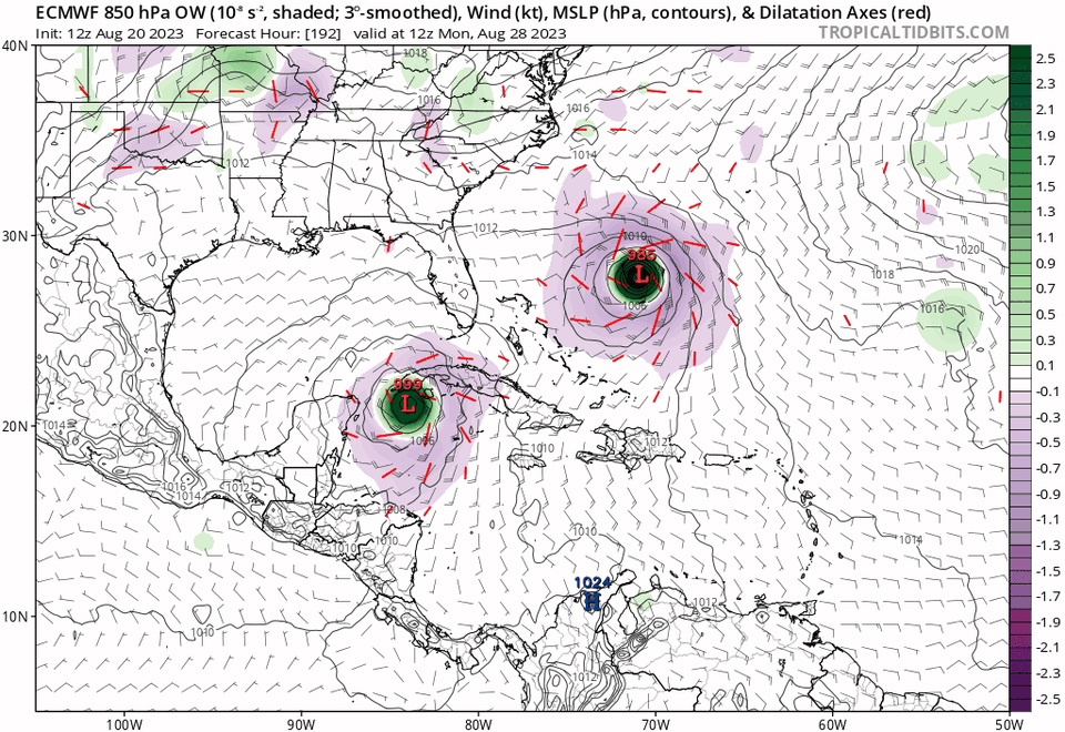
Just putting this model image out there, from August 20, eight days ago, for this exact time stamp. Compare to current satellite...this is why Euro always reigns supreme.
-
Nah the GFS shows and Franklin Idalia both long gone at that point, it looks like the tail of a front that gets left behind and develops.
-
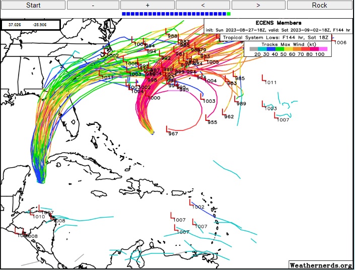
There are now 5 or 6 EPS members looping and ending with Franklin moving southwest back towards the US...
-
2023 Atlantic Hurricane season
cptcatz replied to Stormchaserchuck1's topic in Tropical Headquarters
Lol just make it like the 13th floor of buildings -
I gotta think even if it makes landfall around the Cedar Key area, with it forecast to be a large and east heavy storm, that would still bring in significant surge into Tampa Bay. The Tampa folks here can tell you they get surge flooding from anything more than a small breeze.
-
12z EPS with a significant shift south and east. Got a bunch of members going right through Tampa Bay and even more just to the north which would push the surge right into the Bay.
-
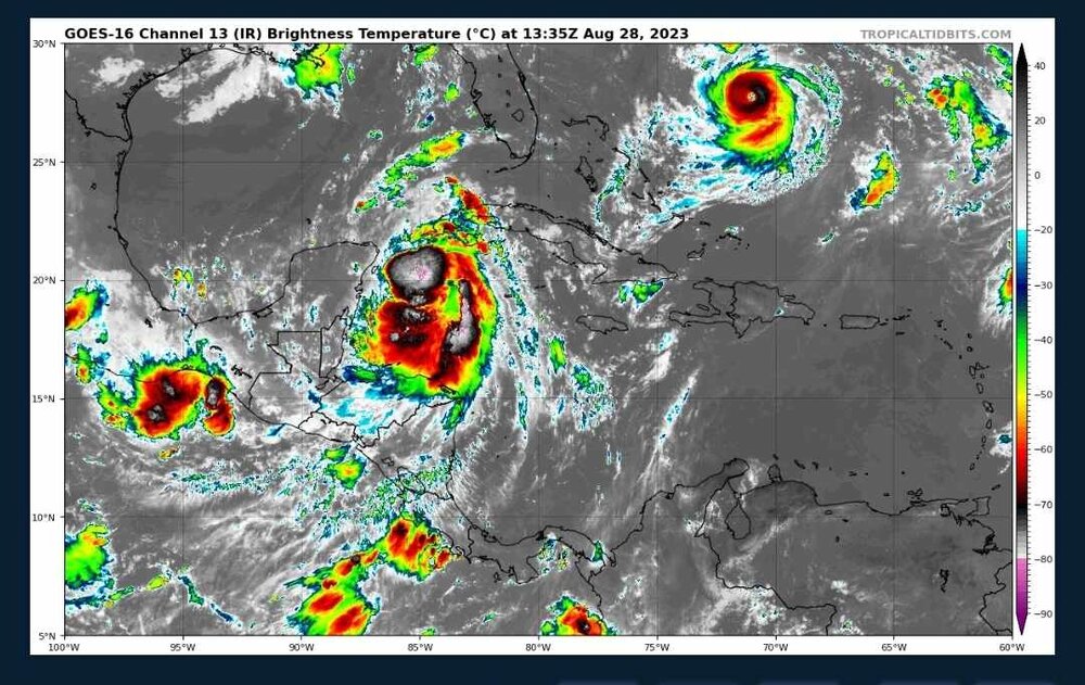
There's a nice area of convection popping up over the center as it appears on radar. The center appears to be well to the southeast of Cozumel and I don't see any land interaction happening as models were thinking might happen.
-
FYI here is the link to the radar Brian used: https://smn.conagua.gob.mx/es/observando-el-tiempo/radares-meteorologicos-separador/visor-radares-v3 Still looks like it's moving almost due south (maybe just a tad west of due south). Unless it makes a harder turn west, it should continue to stay off shore.
-
Yeah I mean getting Tampa Bay directly on the south side of a major hurricane is like a needle in a haystack, but if it were to actually happen here, I think a lot of people would brush off the warnings after what happened with Ian less than a year ago.
-
HAFS with a potentially catastrophic surge into Tampa Bay...
-
Looks like convection near the center is waning. I wonder if it's not as healthy as it looked a few hours ago.
-
12z HWRF and HAFS-1 both bring the pressure into the 930's. Knocking on cat 5 door...
-
I don't know something seems fishy to me about these model runs. Looking at how it looks on satellite right now, are we really supposed to believe it will look like this on Monday morning?
-
Best looking invest I've seen in a while. This thing could already be a tropical cyclone.
-
Yep, modeling totally blew the initial intensity forecast...
-
Michael?