TheClimateChanger
-
Posts
4,399 -
Joined
-
Last visited
Content Type
Profiles
Blogs
Forums
American Weather
Media Demo
Store
Gallery
Everything posted by TheClimateChanger
-
2025-2026 ENSO
TheClimateChanger replied to 40/70 Benchmark's topic in Weather Forecasting and Discussion
Snowfall is down across the board since 1989-1990, as shown by linear regression. So I don't think we need to posit some sort of "increase in moisture" was causing increased snowfall. I don't believe there is much evidence to support this hypothesis anyways. Winter precipitation is up less than one inch in most places since the 1800s, so that could only explain at most ~10-12" of additional snow since the 1800s [if temperatures permit], and the difference since the late 19th century is negligible. It was simply a period of natural variability favoring higher snowfall superimposed over a long term downward trend. Here is Boston, just for an example. At BOS, the linear regression goes from 52.5 -> 38.7. NYC has been a little luckier but still downward [maybe not statistically significant though]: 28.9 -> 25.9 PHL: 22.8 -> 19.9 DCA: 14.9 -> 11.2 BWI: 20.9 -> 15.1 A few additional inland sites: MDT: 33.0 -> 22.7 IPT: 42.1 -> 25.7 AVP: 47.4 -> 30.5 Why do we need to blame everything on climate change? The higher snowfall period in the 2000s & 2010s, like the one in the mid 90s, was likely natural variability imposed on a downward trend. Recent years show natural variability acting in the same direction as trend, amplifying low snowfall years. -
2025-2026 ENSO
TheClimateChanger replied to 40/70 Benchmark's topic in Weather Forecasting and Discussion
I didn’t start the discussion. Why don’t you instead call out the person or persons who did? -
2025-2026 ENSO
TheClimateChanger replied to 40/70 Benchmark's topic in Weather Forecasting and Discussion
Recent winters have been rather mild, although the most recent winter was colder. But in +1.5C world, they might actually be fairly ordinary winters. For all we know, last winter is as good as it gets in a +1.5C world. A warm winter in that world might bring even milder conditions. We just don't have enough data to say what a typical winter looks like in a +1.5C world, since we've only been at those levels for a couple of years. I mean the last glacial maximum was only ~6C colder, and that had mountains of ice burying many of these cities. Summer temperatures would have been hardpressed to get much above freezing for any extended periods of time, and snowfall would have been probable in every month of the calendar year. These days summers are warm and humid, with highs regularly in the 80s, and occasionally in the 90s. So, I don't think it should be controversial to say an increase of about 1/4 of the difference between pre-industrial average and glacial maximum is capable of causing a decrease in winter snowfall? -
2025-2026 ENSO
TheClimateChanger replied to 40/70 Benchmark's topic in Weather Forecasting and Discussion
Is there a mechanism by which snowfall can increase? I just don't understand what magical change is going to take place that we "cycle" into a snowier period. Makes zero sense in a rapidly warming world. Laughably stupid. Sure, there can still be snowier and colder winters from time to time, but I just don't see the current trend reversing? But maybe I am missing something? -
2025-2026 ENSO
TheClimateChanger replied to 40/70 Benchmark's topic in Weather Forecasting and Discussion
Cherrypicked? Please. Linear regressions from 1990 to the present show decreased snowfall at all of the closest stations. Say what you want about it being too short of a period, but the data clearly shows snowfall has decreased in my lifetime in the region. Regression of last 36 years (1989-1990 to 2024-2025), showing starting predicted value and ending predicted value. Toledo 39.0 -> 29.7 [excludes 1997/98 where only limited data is available; also, several years are missing altogether and there is other missing data, particularly 2003-2004, with no snow report prior to 1/1/04]. Erie, PA 109.9 -> 84.7 Mansfield, OH 53.6 -> 36.3 [excluding partial data in 97-98] Akron/Canton, OH 48.6 -> 41.3 [no data for 96-97] Pittsburgh, PA 44.2 -> 39.6 Even Buffalo, NY shows a negative trend over that period: 98.8 -> 90.1 Columbus, OH 29.0 -> 22.3 Dayton, OH 24.9 -> 23.4 Fort Wayne, IN 34.2 -> 28.7 Rochester, NY: 113.7 -> 80.4 Syracuse, NY: 151.1 -> 92.2 Cleveland, OH: 76.8 -> 44.0 Elkins, WV: 88.5 -> 45.4 Charleston, WV: 36.9 -> 18.6 -
I thought you wanted it hotter. Also, not sure about drier summers, volcanos typically cause colder, wetter summers, no? 1992 was the 3rd wettest summer on record following the Pinatubo eruption.
-
I don't know what trough was over the Ohio Valley last summer. The region saw the worst drought since the Drought Monitor began in 2000 for many areas, with the most 90+ days in decades [and hottest temps in decades in some spots].
-
Severe Weather Statement National Weather Service Pittsburgh PA 302 PM EDT Fri May 16 2025 PAC125-161915- /O.CON.KPBZ.TO.W.0012.000000T0000Z-250516T1915Z/ Washington PA- 302 PM EDT Fri May 16 2025 ...TORNADO WARNING REMAINS IN EFFECT UNTIL 315 PM EDT FOR SOUTH CENTRAL WASHINGTON COUNTY... At 302 PM EDT, a severe thunderstorm capable of producing a tornado was located 10 miles north of Waynesburg, moving east at 35 mph. HAZARD...Tornado. SOURCE...Radar indicated rotation. IMPACT...Flying debris will be dangerous to those caught without shelter. Mobile homes will be damaged or destroyed. Damage to roofs, windows and vehicles will occur. Tree damage is likely. Locations impacted include... Deemston, Marianna, Scenery Hill and Amity. PRECAUTIONARY/PREPAREDNESS ACTIONS... Move to an interior room on the lowest floor of a well-built building away from windows. If you are outdoors, in a mobile home, or in a vehicle, move to the closest substantial shelter and protect yourself from flying debris. && LAT...LON 4002 8024 4007 8024 4013 8011 4009 8008 4001 8006 4001 8020 TIME...MOT...LOC 1857Z 260DEG 31KT 4003 8025 TORNADO...RADAR INDICATED MAX HAIL SIZE...0.00 IN $$ Rackley
-
Clearly the coldest spring on record in Nashua! Oh wait, if the month ended today, it would be 11th warmest [of 157 years] in nearby Concord. And 5th warmest out of a shortened 67-year hit-or-miss POR at Manchester. 1998's average is missing the entire month of March and tossed.
-
Occasional Thoughts on Climate Change
TheClimateChanger replied to donsutherland1's topic in Climate Change
Anyways, I digress. Look at this carbon capture scam. They couldn't even capture enough carbon to offset their own emissions! -
Occasional Thoughts on Climate Change
TheClimateChanger replied to donsutherland1's topic in Climate Change
Not to mention, with no air conditioning or refrigeration, for that matter, climate change would have been much more devastating. There probably would've been billions of deaths already, so I think it would be viewed with much greater urgency. Of course, climate change wouldn't have progressed as it did without all of these modern amenities of industrial society in the first place. -
Occasional Thoughts on Climate Change
TheClimateChanger replied to donsutherland1's topic in Climate Change
This might be controversial, but I'm not sure air conditioning has been a net positive. It has resulted in a huge rush of population to the so-called sunbelt. These places used to be backwoods hillbillies. I don't think most people realize this, but just 100 years ago, a sizable number of southern white people were illiterate. Not even talking about freed slaves, but the white population. This caused great harm to the interior northeast and Midwest, with a flight of companies to the south where there are laxer labor laws, low taxes, anti-Unionism, etc. If, after the defeat of the South and the freeing of the slaves, we had let them leave the Union, history would have been significantly different. We would have likely had more pro-Socialist politicians. Perhaps instead of a Georgia peanut farmer, a pro-labor Mafioso from Chicago or Detroit would have become president in 1976. Reagan would have stood no chance. The Southerners had nothing to lose since poor education and poverty was endemic to the region, so they just wrapped themselves in a flag (often, ironically, not even the American flag) and a bible. Can you imagine the megalopolitan paradise that an independent North, Midwest and West would have established without this flight to the bottom of the barrel on taxes and labor protections? It's somewhat problematic when a region responsible for 400k American deaths - that has always been unrepentant - can be allowed to become a region of growth at the expense of places who fought against the Southern War of Aggression. I mean the South's biggest exports in the mid 20th century were what - cotton and the KKK? Kind of like Hank Williams, Jr. "If the South Woulda Won" but instead the North wins and kicks the South out after freeing all of the slaves. In this hypothetical, the Great Depression probably doesn't occur - at least not with the same ferocity - and so Roosevelt is not elected to 4 consecutive terms. With no term limits, Bernie Sanders (or another left-leaning populist) may have become essentially president for life. -
Not sure the heat was the cause of the power outage. Sounds like severe thunderstorms took out two high voltage lines at a major power plant. And the riots were caused by opportunistic criminals, likely poisoned by the proliferation of leaded gasoline.
-
Occasional Thoughts on Climate Change
TheClimateChanger replied to donsutherland1's topic in Climate Change
By mean temperature, it is typically the hottest in the CWA. Maybe other portions of New Jersey outside of the Upton CWA are warmer. The siting near the Bay probably elevates overnight lows enough to offset the slight cooling effect on daytime maxima. -
Upstate data confirms 1977 as a cold summer. Syracuse - mean temp of 66.9F, which is 11th coldest on record. Last matched in 2000, and exceeded in 1992 - both recognized as extremely cold summers. Albany - mean temp of 68.0F, which is 16th coldest on record. As in the case of Syracuse, not seen since 2000. Pittsburgh - mean of 67.9F, second coldest on record. There hasn't been a year since that was even close to it. Perplexing how Central Park could reach 104F, when places upstream barely topped 90F that summer? What generated that heat? As you said, it can't get hot on southerly wind... so it must have come from the west? Yet there were no hot temperatures to the west.
-
1977 would be a summer of yore [in terms of cold, not heat] today. Freezing cold compared to most summers nowadays. Sorry, I don't buy all of those 100s at Central Park. Central Park is typically one of the cooler spots, not the absolute hottest spot. That makes zero sense. Why would a park be hotter than an asphalt-ridden airport? 74.8F mean at EWR is COLD compared to most summers. This is not believable:
-
Occasional Thoughts on Climate Change
TheClimateChanger replied to donsutherland1's topic in Climate Change
Yeah, but like I said in the other thread, that might actually be a cold summer for a +1.5C world. Imagine when the weather gods bless us with the right pattern to maximize heat. It might blow way by those levels. -
Don't forget about natural variability. Like recent summers - well above historical norms - might actually be unusually cold summers for a +1.5C world. You need at least 30-50 years of data to get a full sense of what the climate of a given region is capable of producing in terms of extremes. Right now, we only have a couple of years' worth of data at +1.5C. It might be that, given the right pattern, we could see a summer far exceeding anything ever recorded.
-
Occasional Thoughts on Climate Change
TheClimateChanger replied to donsutherland1's topic in Climate Change
NCEI has last summer as the warmest on record for the Northern District of New Jersey, which is well supported by that data. 1993 was very hot, no doubt, but overall mean temperatures were somewhat higher last summer. So, it's funny to argue there's been a lack of recent heat waves when just last summer was one of the hottest on record in that area. -
Occasional Thoughts on Climate Change
TheClimateChanger replied to donsutherland1's topic in Climate Change
Newark is clearly the hot spot, but 1993 was next level. It's like going from Barry Bonds to Barry Bonds on steroids and human growth hormone. -
Occasional Thoughts on Climate Change
TheClimateChanger replied to donsutherland1's topic in Climate Change
For comparison, here are the two most recent summers where EWR was warmest but only by 0.5F over the second. To be honest, by mean temperature, last summer was very comparable overall to 1993 in NWS Upton's CWA. Some places with overlapping data were even warmer last year... Islip, for instance, was 1.7F warmer in 2024 than 1993. Even in 2023, Islip was 0.1F warmer than 1993. -
Occasional Thoughts on Climate Change
TheClimateChanger replied to donsutherland1's topic in Climate Change
It was the warmest site in NWS Upton's CWA by 1.7F that summer by mean temperature. It still tends to be the warmest site, but not nearly by that much. And the max temperature data from Wayne [second warmest mean] is highly suspect with nearly 20 more 90+ days than even EWR. Next closest was LGA, which was 2.3F cooler. -
2025-2026 ENSO
TheClimateChanger replied to 40/70 Benchmark's topic in Weather Forecasting and Discussion
Just look at Morgantown, West Virginia, it was 86F today. In 1882, the hottest temperature observed all year was 85F. I think some would greatly benefit by recognizing that not every summer is going to have 25-30 days of 90F. That's not typical at all.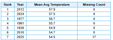
-
2025-2026 ENSO
TheClimateChanger replied to 40/70 Benchmark's topic in Weather Forecasting and Discussion
This has been a fine spring for Dayton, Ohio. A little on the wet side, but almost no snow and warm temperatures. In fact, if the month ended yesterday, this would go in the books as the 7th warmest spring at the Dayton International Airport (since 1936, excludes threaded records). And this doesn't even include today's torch. People like to act as though it's supposed to be in the 90s all summer long, but that's just not how the climate works. There have been entire years where the hottest temperature observed at Dayton was only a handful of degrees above today's warmth. So I would urge everyone to enjoy the next couple of days, instead of fretting over whether it's going to be in the 60s and rainy next week. As JB says, "enjoy the weather, it's the only weather you've got."
-
2025-2026 ENSO
TheClimateChanger replied to 40/70 Benchmark's topic in Weather Forecasting and Discussion
This jives with my recollections. It was much snowier as a child. Just look at the data for Cleveland. Snowfall has been in a free fall since 2014. This winter was considered a harsh winter, but just two decades ago, it would have been heralded as a very mild winter. I would expect that trend to increase with time.