ORH_wxman
-
Posts
93,093 -
Joined
-
Last visited
Content Type
Profiles
Blogs
Forums
American Weather
Media Demo
Store
Gallery
Everything posted by ORH_wxman
-
Def in your area for sure. Your area struggled a bit in December ‘02 after the 12/5 event. Not as bad as the coastline, but Xmas storm there was pretty sloppy and even the 1/3-4/03 storm was much higher totals northwest. So you didn’t build the huge snow pack that northwest of 495 in MA did. Pretty hard to beat Feb 2003 there though. I think the 2/7 event and PD II gave you 3+ feet.
-
What about Jan 26-27, 2015 there? You are pretty close to 495 so I thought that band that gave 30"+ from near or just south of ASH to Westford to ORH would have gotten you....but maybe you were just shy.
-
Yeah in a lot of places it does, that was an extremely cold winter...it was a full degree colder than this winter was and this winter was no slouch...top 15 coldest at ORH airport since it went online 1948. I don't think it quite beats this year right near here though for snow cover. Though it's close....this year also beats that season for having a lot of days with pack >= 18".
-
They should basically be tied....but you started in November so it is counting those days. Which is fair, but I was speaking from Dec 1st onward.
-
We hate this particular winter, but also 2009-10 went almost the entire way with pack over the interior (esp north of pike)...frustrating winter, but it had excellent pack retention over interior elevated areas.
-
Def further S and E it has this year beat because of December which was kind of iffy once inside 495 and south of here....I went most of December with snow cover, but you didn't have to go far for a lot of month not having it. Driving into Quincy, I always noticed it disappearing east of about Dover/Dedham in December. If you go further north north into ORH county, 2007-2008 will have this year beat. They went wire to wire there once the 12/3/07 storm dropped a few inches up there.
-
This might be the most days with snow cover over the interior MA (say, 495 belt to ORH county) since 2000-2001....as prolific as some of the other winters were, they found a way to have gaps. 2014-15 of course had a long stretch in December without pack and even January at times early in the month. 2002-2003 is pretty close though....it had some days in December without pack, but not many. Then it went well into March before bare ground again. This year would win on a tiebreaker using SDDs though. I think winter hill has had something like 6 days without snow cover since Dec 2nd.
-
March 2001 had some 40 burgers in interior SE NH.
-
40" happened in ORH county in Dec 1992....42" in Princeton I think. We had 35" on the level in Holden about 300 feet lower. It will happen there too....ORH county has orographic enhancement to help make up for being a bit inland....and it has the benefit of being the highest terrain between them and the Atlantic in both the easterly and the southerly direction.
-
He'll be throwing tantrums within a couple years if he doesn't land another 20 burger.
-
Yeah that aint happening again there in our lifetimes. Sure, there will be more 30-burgers here and there for C/E MA....those do happen occasionally. But 40 burgers for Fall River and PVD do not.
-
I was thinking the rad pits could have one last hurrah below 0F early next week. Cold high cresting over deep snow pack....that'll plummet regardless of when in the season it is occurring.
-
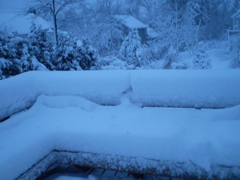
NYC was in the cross hairs for at least 36-48 hours out....it was iffier beyond that....the system did not have long lead time though....the huge retrograding bomb started showing up inside 4 days IIRC....it was kind o chaotic because we were focusing on the first threat which was like this marginal temp firehose into SNE....I had nearly foot of pure blue snow on winter hill in that first event. I took this pic early on the morning of 2/24/10.
-
Yeah I can see a reload near mid-month...mentioned this yesterday. PV starts to get pressed down into Hudson Bay on ensembles....if that verifies, that's a LOT of cold not far away, so we'd prob have an additional threat or two if that's where it starts to settle.
-
Sounds about right. I think we might get one more window at something significant not long after mid-month. Seems like PAC reloads and that PV starts pressing into Hudson Bay…if PV was on other side, I’d prob nearly throw in the towel but that can cool us off again quick which is what we’d need fighting second half of March climo.
-
Want to see the cold press just a bit more for more snow next week. Otherwise prob some icy mix inland with cold rain south and east of that. Euro suite is prob the coldest right now.
-
@CoastalWx, 18z Euro skynet with the CAD most of the run:

-
As impressive as the '82 temps were, I actually think the 4/5/95 cold outbreak was more impressive. It was bare ground and bluebird skies....full sunshine. ORH put up a 26/12 that day....that is beyond crazy for such conditions in early April. I remember that day vividly because I had to walk to and from middle school in that....across an open sports field too part of the way. The wind was like razor blades into your face.
-
Coldest April high on record for ORH in the '82 bizzard....high of 21F and low of 11F the second day of that storm as it was winding down.
-
<= 32F high temperature is difficult even at ORH in April...only 7 Aprils have pulled it off since 1990 (a couple of them did do it on multiple days like 2016)....they are significantly easier to pull off even 2 weeks earlier in the 3rd week of March.
-
Ensembles are slowly coming around to the idea of one last hurrah pattern starting sometime near mid-month and we'll see how long it can hold on against climo that turns hostile pretty quickly.
-
This used to be pushed a lot more in the mainstream years ago versus now. I think there was a study like 8-9 years ago that went viral in mainstream about decreasing snow averages from CC....it projected something like a 40% reduction in mean snowfall by 2035 for cities like BOS and ORH. The study didn't pass the smell test to anyone who knows anything about snowfall climo or how it relates to temperatures/QPF combo....but it didn't stop the narrative being spread far and wide. All this does is create misconceptions and distorted expectations....which then can be used cynically to discredit the idea of CC even existing. Some of CC's most enthusiastic proponents do the most to destroy its credibility in a twist of irony.
-
PHX has one of the highest documented UHI effects from development of any major station in the US. Not surprising though given its location.
-
GFS skynet is kind of interested in the 3/3-3/4 threat.
-
Mid-30s during mid-morning definitely feels like spring in New England....the snow pack this deep does not.