NorthShoreWx
-
Posts
5,514 -
Joined
-
Last visited
Content Type
Profiles
Blogs
Forums
American Weather
Media Demo
Store
Gallery
Everything posted by NorthShoreWx
-
31° here at 12:30. Mostly 28 - 31 on the PWS's around here. It'll crack 32.
-
Both of those storms were blizzards here.
-
I'll enjoy spring when it comes. In the meantime, I intend to continue enjoying winter. A pint by our rock fire ring next to the woods sounds good, but at the moment, I can't even tell where it is.
-
I have a 30 year old roof that's about to be replaced. I probably should have done it already. There will be ice shield with the new roof. Our first house was in West Babylon (back when a couple of kids could afford to buy a house) and the first time I ever saw water inside from a roof ice dam was in that house in February of 1994. I went up on the roof and shoveled the snow off it. This roof is much more difficult to access (and higher), plus I'm 30 years older now and my wife is very much against me going up there. We'll see; she's a wuss, but I think she will prevail this time.
-
It's a bitch to disappear those water stains from the ceiling. The slow meltout in the sun with below freezing temps is the worst, otherwise the ice dam melts too
-
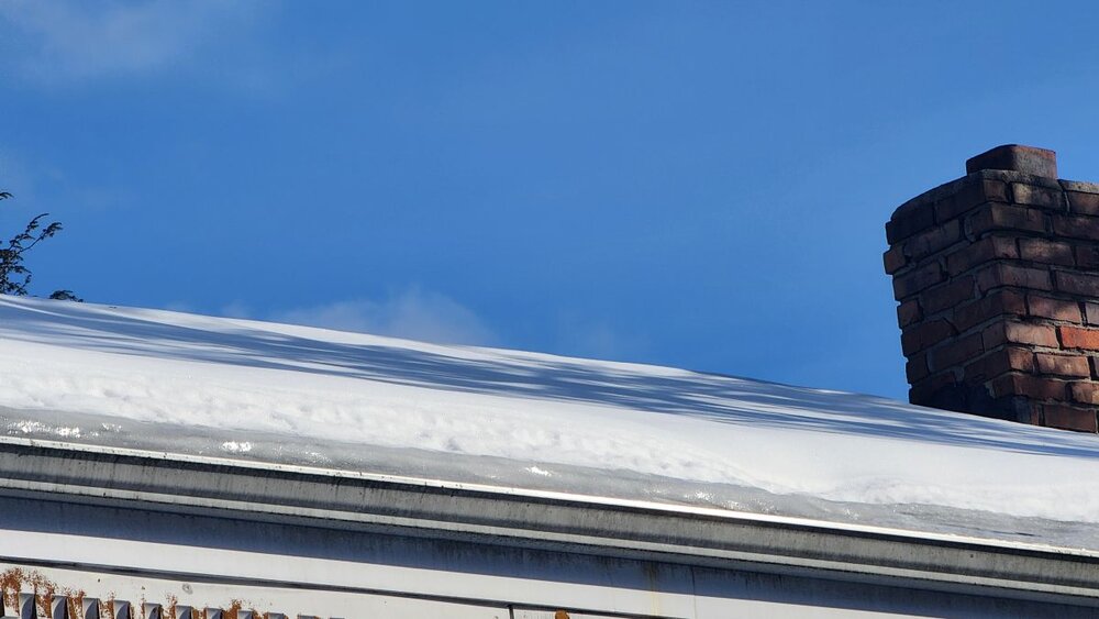
I don't like this look on the roof. I've seen it not end well in the past.
-
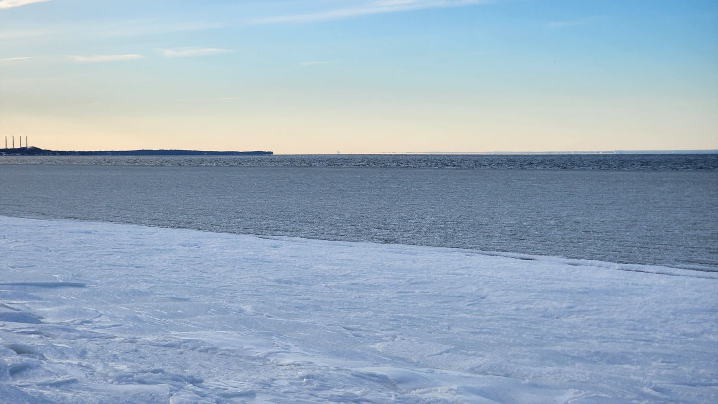
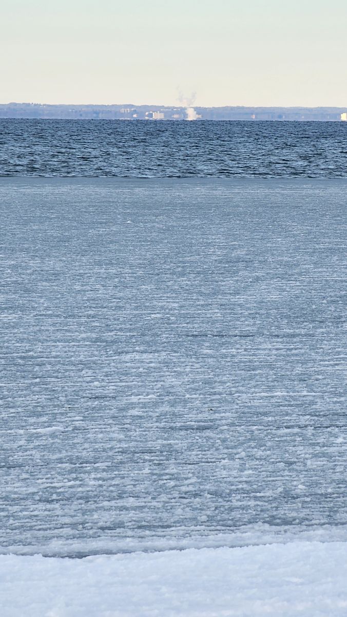
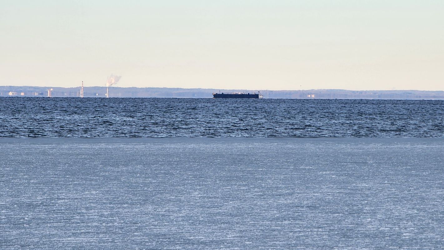
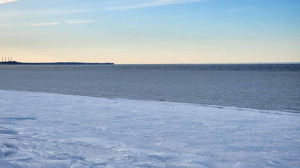
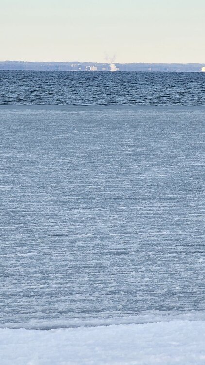
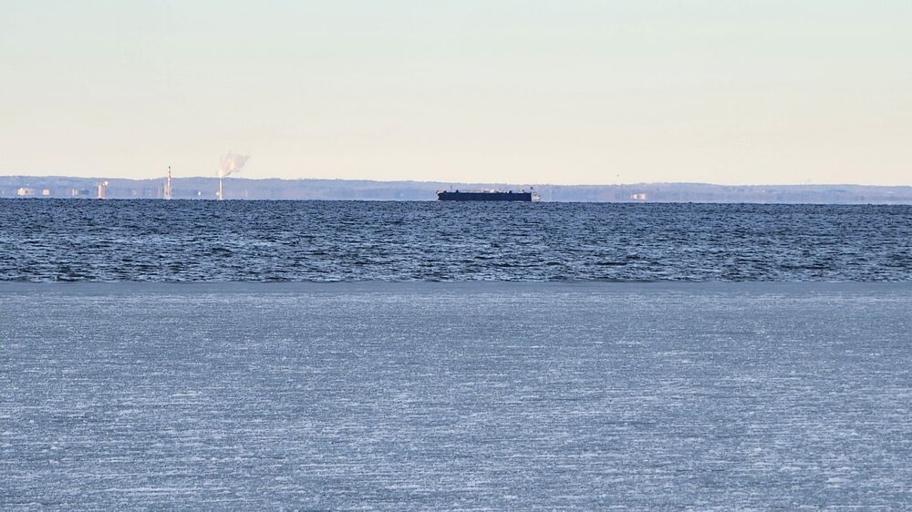
Long Island Sound was starting to slush over on Smithtown Bay yesterday. Any atmospheric physicists want to weigh in on whether that freezing process is keeping things a little warmer along the north shore than they would have been? On another note: although cold, a lot of days and nights recently have been running above forecast but today is running colder than forecast. Doesn't look like we'll make it any higher than about 20.
-
Possible coastal storm centered on Feb 1 2026.
NorthShoreWx replied to Typhoon Tip's topic in New England
And that blowing snow in the background! -
There were some places that got hammered and large screw zones in NC. Not saying we behave any better, but we've had more practice at dealing with these situations.
-
Of which year?
-
Gulf-effect rain showers at Key West with surface temps in the low 50s. Water temps around 70 (20/21c) and 850s there are slightly below 0. That's about as close to snowing as EYW is ever going to get. https://weather.cod.edu/satrad/nexrad/?parms=BYX-N0Q-1-24-100-usa-rad
-
October 1976 too. That was the last time Central Park got down to the 20s in October.
-
That's a low threshold for disaster
-
It's here.
-
It's here. Well, sort of. 12⁰ S-
-
Slush waves at Montauk Saturday: https://www.instagram.com/reel/DUMHASwDwzb/?igsh=MXVndmZwanFiMHozbA==
-
66" here that winter. 34" after March 1.
-
Another 8" needed here for average season. We're ahead of schedule and we have consistent cold. It will happen.
-
Bottomed at 7.9 around 1am and since then have been hovering around 11 - 12⁰. North shore close to the sound is the warmest part of the island this morning. Plenty of 0's elsewhere.
-
Waiting for the "radar is verifying north of the models" posts. Always a crowd pleaser.
-
I've been out xc skiing 3 days this week chasing daylight. It kinda sucks here with the crust, but it's better than not skiing. Temp is 11⁰ here now, but we still have the wind.
-
Ditto. 19.6 here. 20 with an asterisk
-
9⁰ low. I could hear the wind gusting all night. Tonight's temperatures should be interesting... Unless there's too many high clouds from storm Luca.
-
Should have waited to clear the snow. It's a lot easier to crack the ice off of powder snow than off the pavement.