chubbs
-
Posts
4,153 -
Joined
-
Last visited
Content Type
Profiles
Blogs
Forums
American Weather
Media Demo
Store
Gallery
Everything posted by chubbs
-
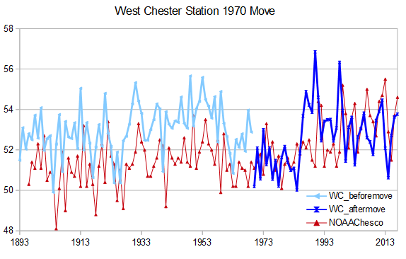
Of the stations over 550' only one is in Southern Chester County: West Grove (added in 2014) located at the top of the SECCRA landfill, well above the natural terrain. Another example of how the newer stations are different than the older COOPs. Glad you didn't find any problems with the chart. We know that the town-->rural changes are important because Coatesville and West Chester both warmed 2F when they were moved small distances from towns to more rural sites.
-
The 1980s drop to 7'th coldest at Coatesville and 10'th coldest at West Chester after the moves from town to more rural locations are are accounted for. (Coatesville in 1946/47 and West Chester 1970). Below is a graphic that summarizes the network you are using. A capital X denotes a full decade. Small x partial. Town or Human disturbance is judged by looking at a photo of the station or address. The stations are ordered from low elevation to high. Elevation increases as you move north and west in the county, generally to cooler locations. The station changes are massive with time and work in the direction of chilling the network. Completely unsuitable for detecting climate trends. Downright misleading.
-
I didn't see any evidence that the 1980s were the coolest data locally in Chester County. Quite the contrary, the raw data clearly showed 3-4F warming vs 100+ years ago. You need to ignore stations moves and other monitoring network changes to conclude that there is no warming in Chester County. A clear case of cherry picking on your part.
-
I am keeping an open mind. I suspect the main problem is aerosols. We are doing a better job of cleaning up air pollution than anticipated (mainly in China). Note that this is a relatively benign view. Since the aerosols are going to be reduced at some point anyway with reduced fossil fuel burning. Synergy or some other unanticipated or stronger feedback would be much more problematic in the long term.
-
A recent interview with Gavin Schmidt on the current global temperature spike. Good questions but experts don't have the answers. https://e360.yale.edu/features/gavin-schmidt-interview
-
Interesting paper, can't say I understand the details. While several lower ECS model perform best under the metrics developed, several high ECS also perform well and can't be discounted. All of this is based on 1970-2014 observations. My concern is that the results would be different if updated with 2014+ obs when warming has accelerated. Would be interesting to check in any case.
-
CERES solar radiation at top of atmosphere through July. A little to early to call the peak as post July months have been active. In any case, solar is a tailwind for global temps this this cycle.
-
Meanwhile, https://www.orlandosentinel.com/2024/07/05/textbook-authors-told-climate-change-references-must-be-cut-to-get-floridas-ok/
-
CERES net radiation updated through July. Trying to find the minima for this enso cycle as nino-related warmth is radiated away. The good news is a big drop from the pre-nino peak. The bad news is a minima that doesn't dip quite as low as other recent minima.
-
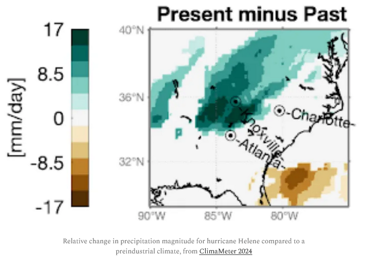
Here's a good summary of what is known about climate change impacts on precipitation in hurricanes and Helene. Wasn't aware that precipitation in hurricanes may rise even faster than extreme precipitation in general, which is roughly 7% increase per 1C warming. Early estimates of Helen's CC enhancement (below) are generally consistent with the science summarized in the blog. There will be more to come on Helene though. https://www.theclimatebrink.com/p/climate-change-made-helenes-rainfall
-
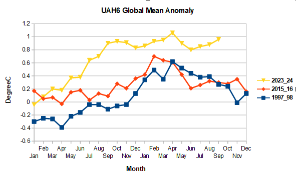
Below is a comparison of the progression of this nino vs 1997/98 and 2015/16 in UAH6. The tail end of this nino is becoming almost as unusually warm as the beginning, particularly in UAH, which unlike ERA, has September 2024 warmer than 2023, 0.95 vs 0.90.
-
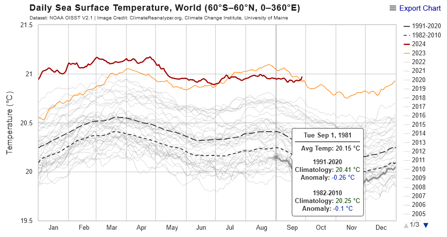
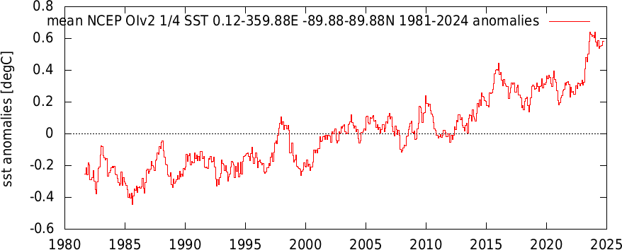
After a two month hiatus OI SST is back at record levels. Unusual this far into a nino-->nina transition
-
NOAA OIv2 SST including Sept to-date. Ticked up recently, as drop from nino peak continues to be slow. SST is consistent with the August precipitable water chart I posted above, with large increase in past 10-15 years.
-
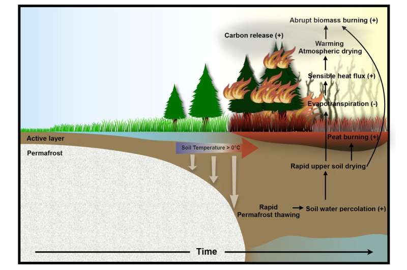
Climate models predict abrupt intensification of northern wildfires due to permafrost thawing With this ensemble modeling approach, the team demonstrated that by the mid to late 21st century anthropogenic permafrost thawing in the Subarctic and Arctic regions will be quite extensive. In many areas, the excess soil water can drain quickly, which leads to a sudden drop in soil moisture, subsequent surface warming and atmospheric drying. "These conditions will intensify wildfires," says Dr. In-Won Kim, lead author of the study and postdoctoral researcher at the IBS Center for Climate Physics in Busan, South Korea. "In the second half of this century, our model simulations show an abrupt switch from virtually no fires to very intensive fires within just a few years," she adds. https://phys.org/news/2024-09-climate-abrupt-intensification-northern-wildfires.html
-
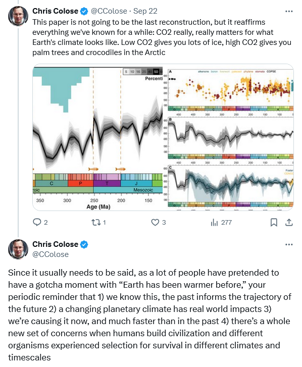
Chris Colose on recent paleoclimate study going back 500+ million years. See his twitter thread for his perspective on technical details.
-
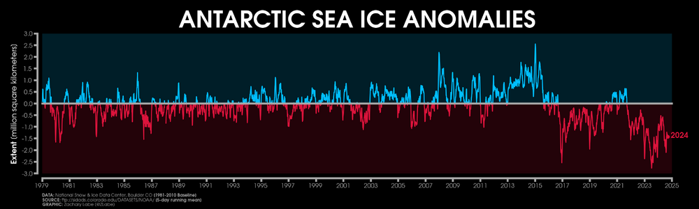
Yes, increasing winds played a role in antarctic sea ice gains up to 2015. Haven't seen anything on recent wind impacts or whether changing winds or temperature are driving recent decline.
-
Arctic and Antarctic sea ice has had a bit of a see saw in recent decades, often moving in different directions. The ocean overturning circulation is a potential link. Another factor to consider in evaluating Arctic and Antarctic sea ice trends.

-
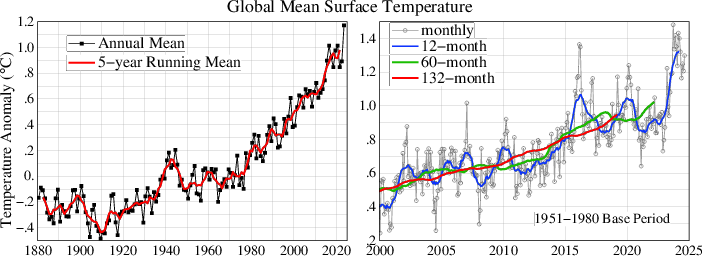
August GISS came in at 1.30C, another monthly record. The Jan-Aug mean is 1.29 well above last years record of 1.17. A new record this year is almost guaranteed, probably somewhere around 1.24 allowing for some cooling in the last 4 months. The left-hand chart will probably need a new yaxis.
-
As usual there is no beef in Martz' criticism. Of course you get a different answer for raw vs adjusted. That's why the adustments are made; to correct known bias in the raw obs. Here's a better task for Martz or yourself: find a bias adjustment that is NOT justified by raw data collected at other sites. There are thousands of stations in the US, with multiple bias adjustments per station. If they are "arbitrary", surely you can find one that isn't justified. We didn't find any problems with bias adjustment in our Chester County deep dive. We focused on the larger, most important, bias adjustments; and didn't find any that weren't completely supported by the raw data. Quite the contrary, bias adjustments were needed to get an accurate estimate of Chesco's recent climate. Finally, one interesting finding in our Chester County deep dive: station moves had a much bigger biasing effect than TOBS. That probably happened elsewhere in the US as cars replaced horses and people moved out of towns to more remote sites.
-
Chester County PA - Analytical Battle of Actual vs. Altered Climate Data
chubbs replied to ChescoWx's topic in Climate Change
You can't understand Chester County's recent climate history if you don't account for station moves at Coatesville and West Chester. Easier to spot the cooling associated with moves from built-up towns---> less built-up sites, by separating before- and after-move portions of the station records. The moves are easily identified by the difference in the timing of move-related cooling: Coatesville cooled between 1945 and 1948; while, West Chester cooled in 1970. NOAA's scientific approach, using raw data from additional stations, confirms that the move-related cooling is spurious.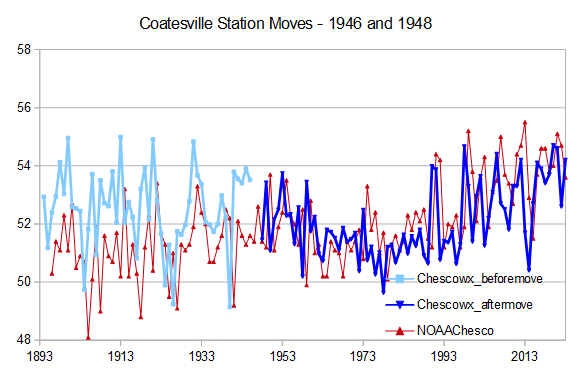
-
You are going to be the last guy to realize its warming in Chester County. Warming is clear as can be in the raw Chester County data. If you are willing to look at it carefully.
-
August's ERA5 water precipitable water chart from Ben Noll. The chart is similar to previous months with moisture well-above pre-nino levels, continuing the relatively rapid rise in moisture over the past 10-15 years. The nino infuence should start to wane soon. We'll see if moisture drops back to pre-nino levels like most ninas; or, stays elevated like the 2015/16 nino.
-
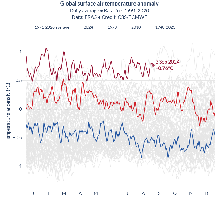
2023, 2010 and 1973 below, we've come a long way just in the past 10-15 years.
-
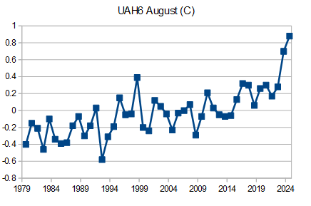
This nino has produced August UAH6 anomalies, this year and last, that are much higher than the previous high of 0.38 in August 1998 and even higher relative to recent Augusts. With the notable exception of 1998, enso effects on UAH6 have generally been weak in August and other summer month; but, this nino has maintained high UAH6 values through 2 summers. The $64 question is where will be next August, when nino effects are completely washed out.
-
Surface melt balance anomaly for Arctic ice caps relative to 1980-2010. The grey shaded area is one standard deviation. Melt was slightly above average for Greenland and well above average for the remainder. Record losses occurred from Svalbard through Franz Joseph to the Russian High Islands, mainly in July and August, showing the warmth near the Atlantic sea ice margin. https://www.climato.uliege.be/cms/c_5855702/fr/climato-arctic