chubbs
-
Posts
4,151 -
Joined
-
Last visited
Content Type
Profiles
Blogs
Forums
American Weather
Media Demo
Store
Gallery
Everything posted by chubbs
-
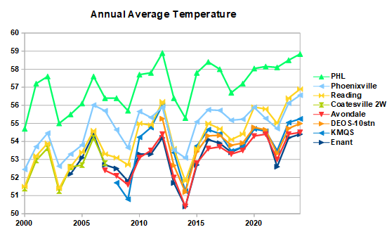
Notice that Charleston SC and New Haven, CT are "rural" stations. There were large reverse heat island effects at 2 of the COOP stations in "rural" Chester County. Bottom-line US historical weather data is very inconsistent. It needs to be carefully analyzed not cherry-picked.
-
Chester County PA - Analytical Battle of Actual vs. Altered Climate Data
chubbs replied to ChescoWx's topic in Climate Change
The science we are talking about is settled and you don't understand it. The average of Phoenixville, Coatesville and West Chester is as warm as the Philadelphia Airport and the Newark Ag station in the early 1940s. The COOP average dropped steadily after 1945 due to cooling moves at Coatesville (1946,48), Phoenixville (1948) and West Chester (1970). By the early 1970s the Coop Avg had dropped to just above Allentown. NCEI was much more stable than the COOP average, staying just above Allentown the entire period. NCEI isn't fooled by station moves. The mistake you are making is assuming that the average of the COOP stations is a good estimate of the county average temperature. That certainly isn't the case before 1970 when the COOP stations are much warmer than the County as a whole.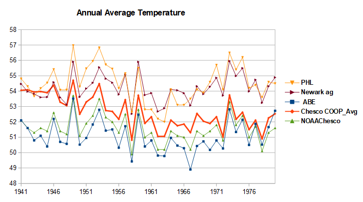
-
Chester County PA - Analytical Battle of Actual vs. Altered Climate Data
chubbs replied to ChescoWx's topic in Climate Change
You are criticizing an NCEI analysis you don't understand. Settled science no less. Station adjustments have nothing to do with the County Average temperature or the absolute temperature at any station. Instead they are made on an individual station basis to correct non-weather station changes like station moves. Plenty of station moves/changes through the years in Chester County that need to be accounted for.. We've discussed several of the biggest station moves in this thread. NCEI science nailed every single one. You haven't found a single problem with any individual NCEI station adjustment. The results in your table aren't surprising at all. Between 1927 and 1951, the County COOP stations are much warmer than the county average: Phoenixville already in a warm location, ran much hotter than nearby stations on sunny days in that period and also had time of day bias; while, Coatesville and West Chester were both in built up city/town locations. Both stations cooled by roughly 2F when they moved to less built up locations in 1946/1948 (Coatesville) and 1970 (West Chester). The NCEI county average being cooler than the average of these 3 stations is a good thing, exactly what I would expect. Even today the average of Coatesville, West Chester and Phoenixville is warmer today than the county average. Much moreso in 1927-51 when all 3 stations were in warmer locations or ran warmer than today. No the big mistake in your table is your value for the county average. You have Chester County as warm as the Philadelphia airport in some years. That's way off. Not even close. -
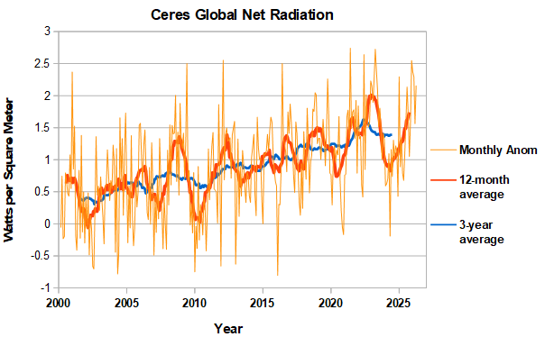
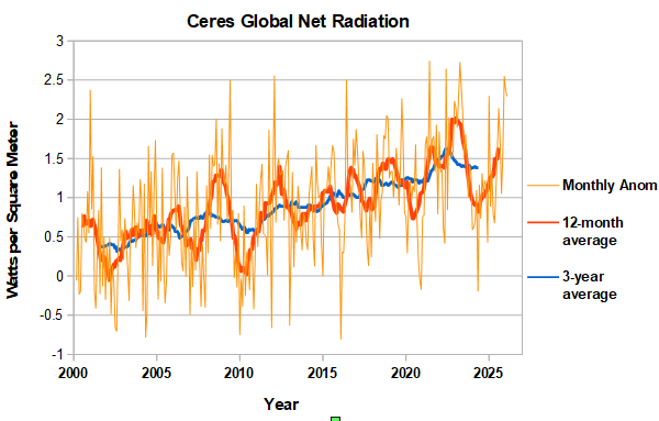
April was another month with very high global net radiation. The running 12-month average is getting closer to the 2023 peak, which occurred in August.
-
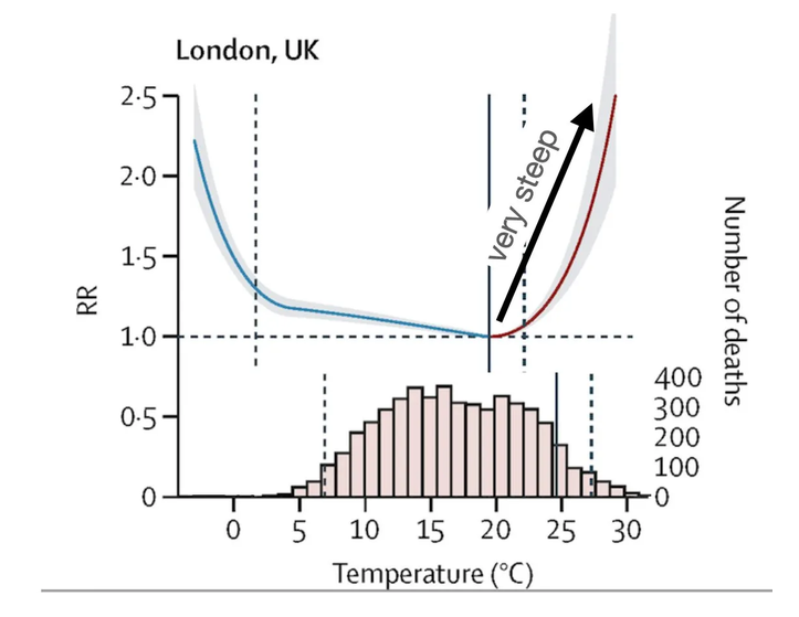
You have to be careful in extrapolating to the future because the relationship between temperature and mortality is highly non-linear. The curve for mortality is very flat in the middle and steep at the edges particularly on the hot side. The reason more people die due to cool weather is the average temperature in the US is below the optimum temperature for mortality of around 70F. The problem is that warm side mortality rises very steeply with temperature. The more we warm the more likely that increased hot weather deaths are going to outstrip cold weather benefits. Per the chart you posted, hot-weather deaths already tripled in the US in the past 20 years. Going forward probably better to assume the same percentage increase, i.e. another tripling in 20 years rather than a linear increase. Just a swag of course. Note that the US will differ from the London chart I posted. Same shape but we are more used to extreme hot and cold weather. https://www.theclimatebrink.com/p/unraveling-the-debate-does-heat-or?r=27daj&triedRedirect=true https://www.theclimatebrink.com/p/unraveling-the-debate-does-heat-or-982
-
2026-2027 Super El Nino
chubbs replied to Stormchaserchuck1's topic in Weather Forecasting and Discussion
Thinking about ONI and RONI. Surface winds like trades are driven by surface temperature difference, so RONI probably more relevent. Precipitation and heat release to atmosphere from condensation are driven by moisture content. Warmer air holds more moisture so ONI is probably more relevent. Jet stream should have some ONI influence due to extra warming of tropical deep atmosphere from condensation. Will be interesting to see how the two factors play out. -
2026-2027 Super El Nino
chubbs replied to Stormchaserchuck1's topic in Weather Forecasting and Discussion
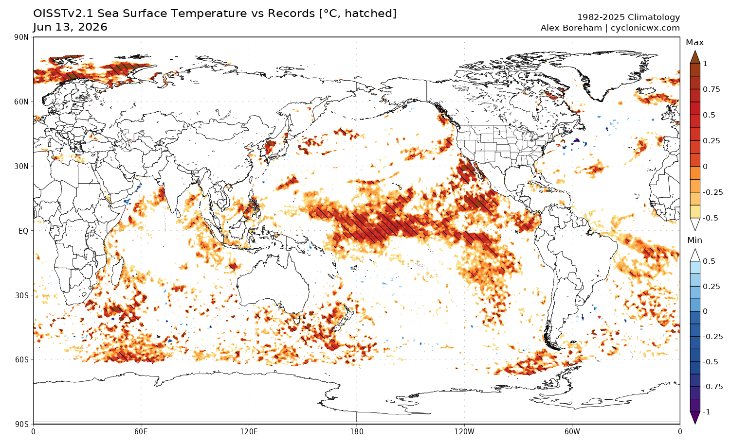
In the past couple of weeks, daily record SST from satellite have expanded from the PMM into the enso regions and nearby, mainly N of the equator
-
Chester County PA - Analytical Battle of Actual vs. Altered Climate Data
chubbs replied to ChescoWx's topic in Climate Change
The deep dive in Chester County has made me very suspicious of older high temperature records in the US. Non-aspirated thermometers used back in the day are sensitive to shelter placement. It only takes one poorly sited station on one day to make a max temperature statistic misleading. Phoenixville in Chester County is a good example. Much hotter max temperatures than surrounding stations for 20 years in the 1930s and 40s. Well documented in this thread. As you show above, Martz's chart of nationwide high temperature records has the same problem. This whole thread is about using inconsistent data past vs present, to present misleading information. -
2026-2027 Super El Nino
chubbs replied to Stormchaserchuck1's topic in Weather Forecasting and Discussion
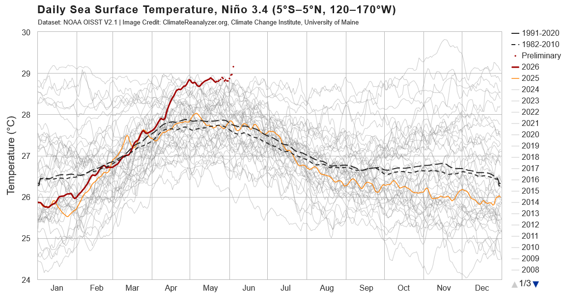
The recent spike has sent daily Nino 3.4 temps well into record territory.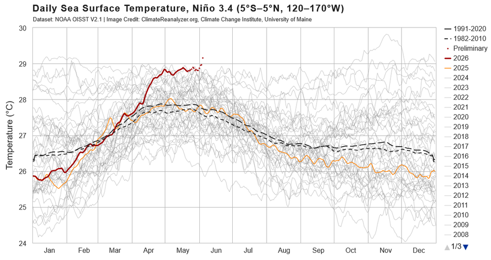
-
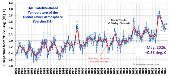
UAH6 spiked up in May. Matching the timing of the initial rise in other recent strong/super ninos (1997, 2015, 2023). The rise in UAH is a sign that tropical moist convection is increasing.
-
CERES net radiation through March. At high level in March, similar to February. Probably close to peak for this ENSO cycle.
-
Chester County PA - Analytical Battle of Actual vs. Altered Climate Data
chubbs replied to ChescoWx's topic in Climate Change
The mistake you are making is assuming that your viewpoint and calculations are correct without looking at the complete weight of evidence.. Over the 1978 to 2025 period Phoenixville warms at the same rate as Coatesville and NCEI Chesco. Its a red flag that you don't match Phoenixville or Coatesville or NCEI. No surprise either, the station network you are using is cooling with time. Well documented in this thread and shouldn't be this difficult to understand. You are giving "unrepresentative" Phoenixville a 25% weight in 1978 but only 6% weight in 2025. Devault, almost as warm as Phoenixville, also gets a 25% weight in 1978. Coatesville the coolest station in 1978 is an average station in 2025. You are using a different representation of the County in the 1970s and 2025. Different again in 1945 with Coatesville, West Chester, and Phoenixville all in much warmer locations.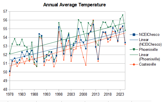
-
Chester County PA - Analytical Battle of Actual vs. Altered Climate Data
chubbs replied to ChescoWx's topic in Climate Change
But your Phoenixville chart shows increasing heat waves in the same 1978 to 2025 period. There are other explanations for the discrepancy. Station changes at Octoraro Lake being the most likely. You've been making the same cherry-picked comparisons with PHL for a decade now. Invariably the story changes when additional stations are included. Its about time for a KPTW update -
Chester County PA - Analytical Battle of Actual vs. Altered Climate Data
chubbs replied to ChescoWx's topic in Climate Change
The chart shows more heat waves at Phoenixville, when you consider the spurious warmth at Phoenixville in the 1930 to 1940 period that is well documented in this thread. -
Chester County PA - Analytical Battle of Actual vs. Altered Climate Data
chubbs replied to ChescoWx's topic in Climate Change
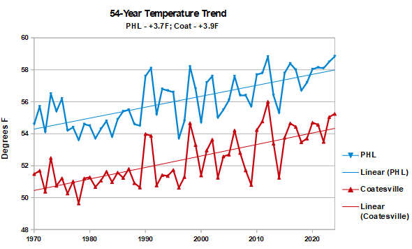
The Coatesville move from urban to rural occurred in 1948, well before the 1970-2025 period in the chart. Yes the Coatesville stations have different elevations, but there is little impact on annual average temperatures, hence the good agreement between the Coatesville series and NCEI over the 1970 to 2025 period. -
Chester County PA - Analytical Battle of Actual vs. Altered Climate Data
chubbs replied to ChescoWx's topic in Climate Change
I knew you would find some reason to dismiss. My stability assessment is based on comparing Coatesville to NCEI and other regional stations without station changes. Coatesville tracks NCEI closely. Yes there are three stations; but, the three stations are well matched for annual average temperatures; and, there are no major station changes. You would get the same answer if you used NCEI instead of Coatesville.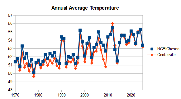
-
Chester County PA - Analytical Battle of Actual vs. Altered Climate Data
chubbs replied to ChescoWx's topic in Climate Change
Your "raw data" doesn't look like the raw data for individual stations that I posted upthread. Why? The station population that you are averaging is cooling with time which distorts the data. Here is a plot of Chester County stations minus Coatesville, the most stable station between 1970 and 2025. Positive values indicate that the station is warmer than Coatesville, negative cooler. The station population cools you are using with time. Over 55 years Coatesville goes from being the warmest station to an average station. The 19 station average warms by 1.5F between 1970 and 2025. That is larger than the "raw data" increase for PHL shown in your chart. Indicating that the positive slope in your chart is due solely to the change in station population. Reposting my table which shows that the raw data from individual stations doesn't show any difference in warming between Chester County and PHL. When you factor in the bias from the changing station population, your analysis agrees with mine.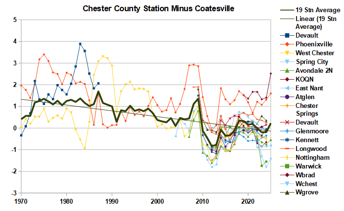

-
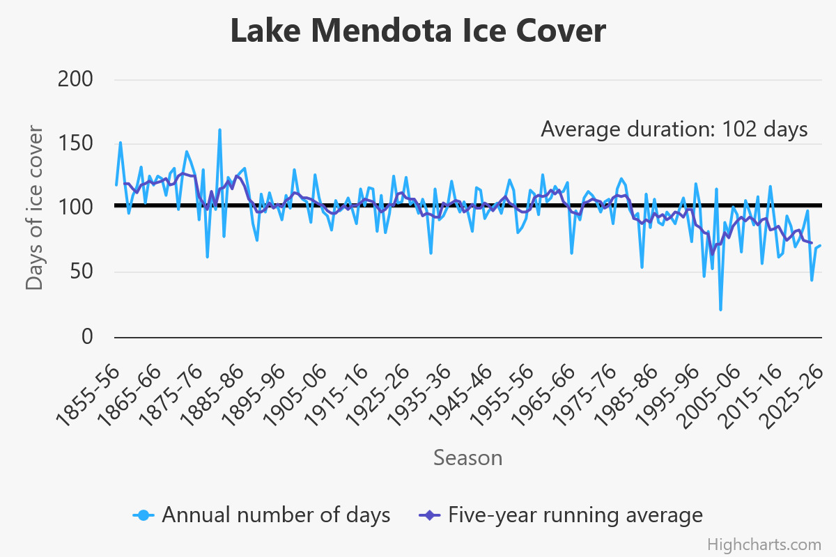
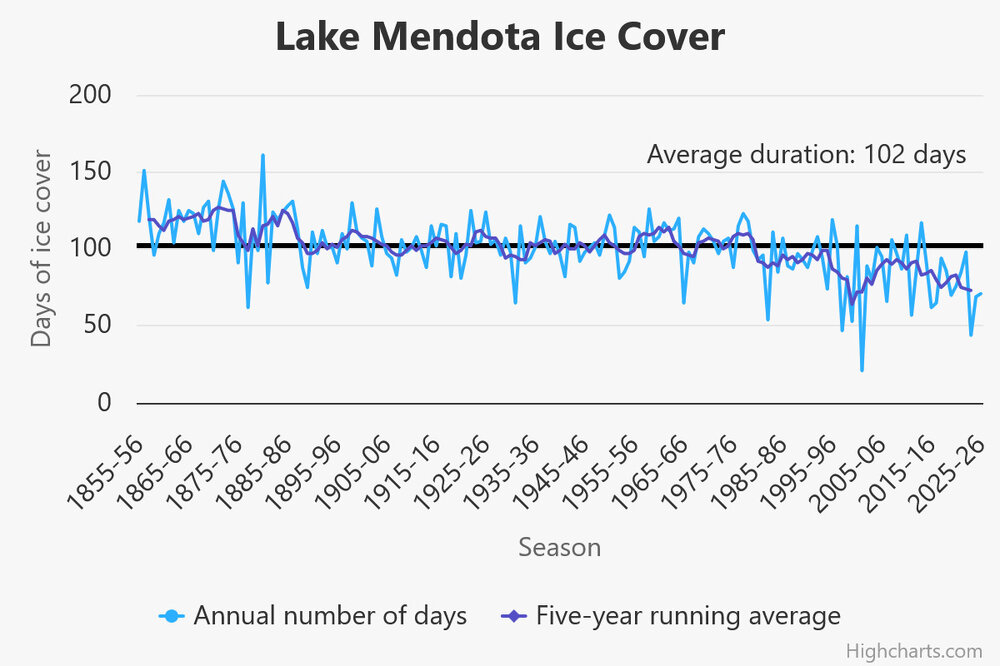
The Lake Mendota Wisconsin lake freeze season was similar to last year. Well below the long-term average despite the relatively cold winter. Similar story at the 2 other Madison Lakes. https://climatology.nelson.wisc.edu/first-order-station-climate-data/madison-climate/lake-ice/history-of-ice-freezing-and-thawing-on-lake-mendota/
-
Chester County PA - Analytical Battle of Actual vs. Altered Climate Data
chubbs replied to ChescoWx's topic in Climate Change
But it does matter how you slice it; and, you continue to cherry pick favorable comparisons and ignore the rest. I stated above that the slope difference between NCEI and PHL between 2000 and 2025 was not statistically different. Expanding the yaxis doesn't change that result. Looking over a longer period and re-normalizing the yaxis, we see that the delta between Chester County and the Philadelphia Airport has stayed the same since 1970. The delta goes up and down but without a long-term trend; 2000 just happens to be a minimum. Doesn't matter whether you use NCEI or high quality sites like Coatesville, Avondale USCRN, and DEOS. The answer is the same.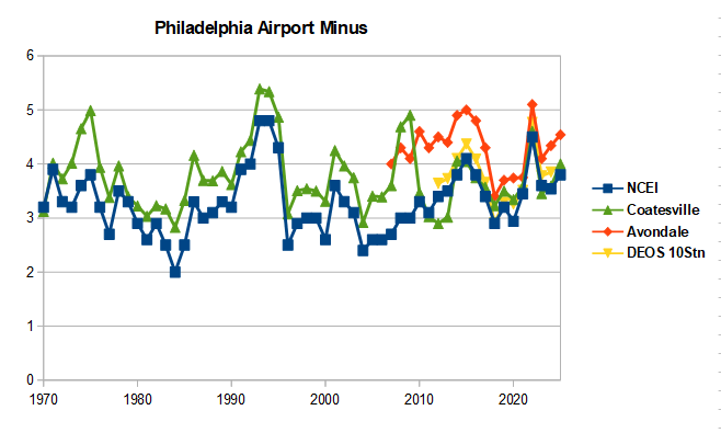
-
Chester County PA - Analytical Battle of Actual vs. Altered Climate Data
chubbs replied to ChescoWx's topic in Climate Change
The difference in slope is not statistically significant. That said, wouldn't be surprised if PHL had a some warming enhancement from UHI; but, based on comparisons to other sites it is small compared to the region-wide warming in recent decades. More data is needed to make the case though. Note that the Avondale USHCRN station has a higher slope than PHL. Are you saying that the warming there is due to UHI? -
Chester County PA - Analytical Battle of Actual vs. Altered Climate Data
chubbs replied to ChescoWx's topic in Climate Change
I have no problem with your current set of stations. As you say it provides good coverage and matches NCEI. The problem isn't the current stations, its the difference between the current stations and the older stations. There isn't a single current station in the county that is as warm as any of the 3 county stations in 1945. You can't get our climate history right without properly accounting for the changes in county stations with time. Note also that consistency is much more important than coverage when tracking long term changes in temperature. -
Chester County PA - Analytical Battle of Actual vs. Altered Climate Data
chubbs replied to ChescoWx's topic in Climate Change
No station moves is an improvement, but you are still using "fake math" by not maintaining a constant baseline in Chester County. Its very simple. Your simple averaging method only maintains a constant baseline if the stations stay exactly the same, no station moves; and, no station additions/deletions. For instance, if the network is Phoenixville and West Chester; and, Warwick is added. then the station average will cool independent of any weather effect. There is only one station from the 1970 network that remains in 2025 and the number of stations is much larger in 2025. On average the the 2025 stations are colder: DEOS vs COOP, or East Nantmeal vs Devault for instance. This distorts the Chester County raw data and creates an apples to oranges comparison with Philadelphia. My table on-the-other hand is an unbiased apples to apples comparison, exactly the same data treatment for Chesco and Philly. That shows no difference in warming between Chesco and Philly Airport.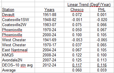
-
Chester County PA - Analytical Battle of Actual vs. Altered Climate Data
chubbs replied to ChescoWx's topic in Climate Change
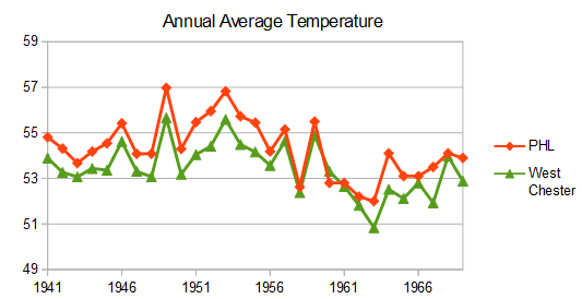
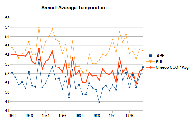
Your amateur "facts and math" are distorting the raw data by not accounting for the large changes in the Chesco station network with time. In 1941 all the Chester County COOP stations were much warmer than the county average. Phoenixville was had excessive 95+F days vs other local stations; while, both Coatesville and West Chester were located in built up areas. By not accounting for station location you have Chester County's past way too warm, as warm as the Philly Airport in 1941-45 on your chart. All 3 Chesco stations experienced cooling moves after WWII: Coatesville in 1946 and 48, Phoenixville in 1948 and West Chester in 1970. Your simple “math” is incorporating these station moves into our weather. The chart below covers the Coatesville and Phoenixville moves after WWII. The station moves are easy to spot because they occurred at different times. Between 1945 and 1949 both Coatesville and Phoenixville cooled by 2F vs West Chester and other local stations. Note that the Philadelphia Airport matched West Chester and other local stations over this period. The problematic data is in Chester County not the Philadelphia Airport. The final chart shows the Chesco Coop average vs Philadelphia and Allentown over the 1940-70 station move period. The Chesco Coops started as warm as Philadelphia in 1941, but ended as cool as Allentown by 1970. Meanwhile the Philly Airport matches Allentown and all of the other Mt Holly climate sites. The raw data clearly shows that the difference between Philly and Chesco in your chart is due to station changes in the Chester County Coops. There is no evidence to support your airport heat island claim. You have jumped to the wrong conclusion by cherry-picking your "facts". Using a broader range of data from outside of Chester County, shows that the Chester County COOPs and your simple “math” is where the problem lays.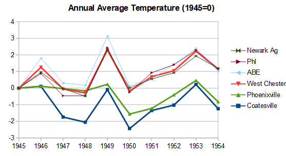
-
Chester County PA - Analytical Battle of Actual vs. Altered Climate Data
chubbs replied to ChescoWx's topic in Climate Change
Nope again. The linear regression trends in Chesco are the same as PHL. Raw data from 18 stations, 1941 to 2024. An apples to apples comparison.
-
Chester County PA - Analytical Battle of Actual vs. Altered Climate Data
chubbs replied to ChescoWx's topic in Climate Change
Nope. The 95F data in Chesco and Philadelphia are in agreement. when you factor in the hot years at Phoenixville and the cooling West Chester move in 1970. Reposting my raw data plots which show the airport warming at the same rate as Chester County.