chubbs
-
Posts
4,130 -
Joined
-
Last visited
About chubbs

-
Chester County PA - Analytical Battle of Actual vs. Altered Climate Data
chubbs replied to ChescoWx's topic in Climate Change
No station moves is an improvement, but you are still using "fake math" by not maintaining a constant baseline in Chester County. Its very simple. Your simple averaging method only maintains a constant baseline if the stations stay exactly the same, no station moves; and, no station additions/deletions. For instance, if the network is Phoenixville and West Chester; and, Warwick is added. then the station average will cool independent of any weather effect. There is only one station from the 1970 network that remains in 2025 and the number of stations is much larger in 2025. On average the the 2025 stations are colder: DEOS vs COOP, or East Nantmeal vs Devault for instance. This distorts the Chester County raw data and creates an apples to oranges comparison with Philadelphia. My table on-the-other hand is an unbiased apples to apples comparison, exactly the same data treatment for Chesco and Philly. That shows no difference in warming between Chesco and Philly Airport.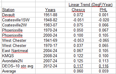
-
Chester County PA - Analytical Battle of Actual vs. Altered Climate Data
chubbs replied to ChescoWx's topic in Climate Change
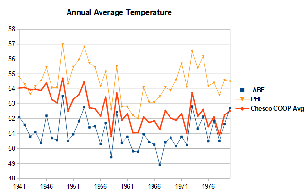
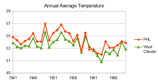
Your amateur "facts and math" are distorting the raw data by not accounting for the large changes in the Chesco station network with time. In 1941 all the Chester County COOP stations were much warmer than the county average. Phoenixville was had excessive 95+F days vs other local stations; while, both Coatesville and West Chester were located in built up areas. By not accounting for station location you have Chester County's past way too warm, as warm as the Philly Airport in 1941-45 on your chart. All 3 Chesco stations experienced cooling moves after WWII: Coatesville in 1946 and 48, Phoenixville in 1948 and West Chester in 1970. Your simple “math” is incorporating these station moves into our weather. The chart below covers the Coatesville and Phoenixville moves after WWII. The station moves are easy to spot because they occurred at different times. Between 1945 and 1949 both Coatesville and Phoenixville cooled by 2F vs West Chester and other local stations. Note that the Philadelphia Airport matched West Chester and other local stations over this period. The problematic data is in Chester County not the Philadelphia Airport. The final chart shows the Chesco Coop average vs Philadelphia and Allentown over the 1940-70 station move period. The Chesco Coops started as warm as Philadelphia in 1941, but ended as cool as Allentown by 1970. Meanwhile the Philly Airport matches Allentown and all of the other Mt Holly climate sites. The raw data clearly shows that the difference between Philly and Chesco in your chart is due to station changes in the Chester County Coops. There is no evidence to support your airport heat island claim. You have jumped to the wrong conclusion by cherry-picking your "facts". Using a broader range of data from outside of Chester County, shows that the Chester County COOPs and your simple “math” is where the problem lays.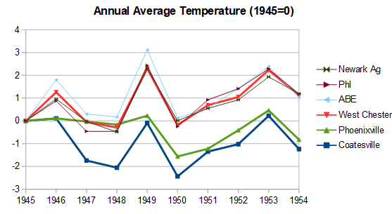
-
Chester County PA - Analytical Battle of Actual vs. Altered Climate Data
chubbs replied to ChescoWx's topic in Climate Change
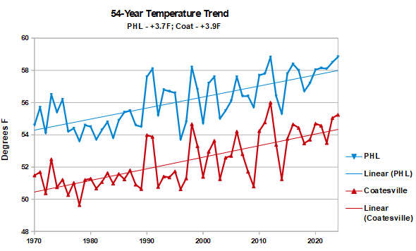
Nope again. The linear regression trends in Chesco are the same as PHL. Raw data from 18 stations, 1941 to 2024. An apples to apples comparison.
-
Chester County PA - Analytical Battle of Actual vs. Altered Climate Data
chubbs replied to ChescoWx's topic in Climate Change
Nope. The 95F data in Chesco and Philadelphia are in agreement. when you factor in the hot years at Phoenixville and the cooling West Chester move in 1970. Reposting my raw data plots which show the airport warming at the same rate as Chester County.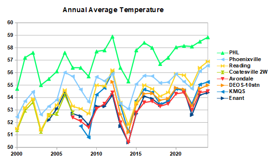
-
Chester County PA - Analytical Battle of Actual vs. Altered Climate Data
chubbs replied to ChescoWx's topic in Climate Change
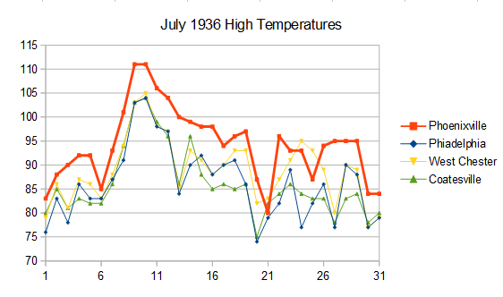
You continue to carefully pick your facts. There are many other days in the chart I posted when Phoenixville had excessive temperatures vs West Chester and Coatesville. For instance: July 22, 1934, Phoenixville 101, West Chester 86, Coatesville 88; or July 13, 1936, Phoenixville 100, West Chester 85, and Coatesville 86. In the 2 months that I posted Phoenixville had 9 days over 100, while West Chester and Coatesville only had 2. Finally the West Chester and Coatesville sites were also warm in this period. Both located in built-up towns. Unlike any site we have today. Very unrepresentative of Chester County as a whole. Our learnings in Chester County help in interpreting Martz chart: 1) Phoenixville shows that non-aspirated shelters can experience large spurious jumps in 90/95/100F days, and 2)Coop stations had frequent moves. In Chester County stations moved out of towns to cooler locations with time. Comparing Martz chart to the local data. He has fewer hot days in recent years vs Philadelphia and Chester County indicating a cooler station population overall. Meanwhile he has more hot days than Philadelphia or Chester County in the early years, an indication that factors 1 and/or 2 above are present in his data set. I'd like to see the individual station data before drawing any firm conclusions. As we have seen in Chester County simple aggregation of raw COOP data without careful inspection leads to misleading charts.
-
Chester County PA - Analytical Battle of Actual vs. Altered Climate Data
chubbs replied to ChescoWx's topic in Climate Change
But you aren't presenting all the climate data for the county, instead you are cherry picking out the information you like and ignoring the rest. For instance, you are ignoring all the information which comes from comparing stations. The fact that Phoenixville's daily high temperatures spiked much higher than other local stations in the 1930s and 40s, is not weather-related. Phoenixville didn't suddenly experience different weather. Critical information if you want to understand our climate history. Same with other information about changes in the station network with time, like the big station moves to cooler locations at Coatesville, Phoenixville and West Chester, between 1946 and 1970. All well documented in this thread. The City of Coatesville produces a much different set of records than Doe Run road, outside of Coatesville, or Warwick. -
Chester County PA - Analytical Battle of Actual vs. Altered Climate Data
chubbs replied to ChescoWx's topic in Climate Change
Your chart shows how the county station network that you are curating has changed over the years. Not surprising high temperature records peaked in the 1930+40s.. Phoenixville's high temperatures spiked in the 1930+40s, much higher than nearby stations. Low temperatures are impacted by the movement of COOP stations from built-up towns after World War II. The current station set contains many stations in remote locations with good radiating conditions. Shows how much recent warming Chester County has had that cold nighttime stations like Warwick they can't beat the suburban COOP lows from the 1980s and 90s. On-the-other hand precipitation isn't as strongly impacted by station changes as temperature and the station network picks up the wet conditions in recent decades. Not sure about network changes impacting snow as many of the temperature stations don't measure snow. We aren't getting much snow this decade despite the number of higher elevation stations that we didn't have in the past, your house a good example. Chester County is a great example of how misleading simple analysis methods can be when the station population changes.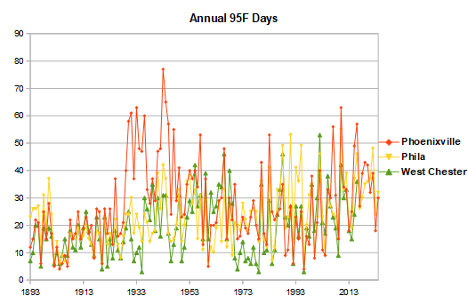
-
Manmade warming spreading from the upper ocean is the most likely cause of deep ocean warming. As implied by the following statement in the abstract: This finding reveals that deep ocean warming is gaining importance and that ocean heat uptake has now reached several regions below 2,000 m depth, notably the Northwestern Atlantic Ocean and Southern Ocean. Figure 7 in the paper shows where the deep warming is occurring. The warming regions are associated with ocean overturning circulations not seismic activity. The paper discussion mentions that the added heat in the deep ocean is needed to better match satellite measurements of the earth's energy imbalance. Finally the underlying paper doesn't mention seismic activity at all.
-
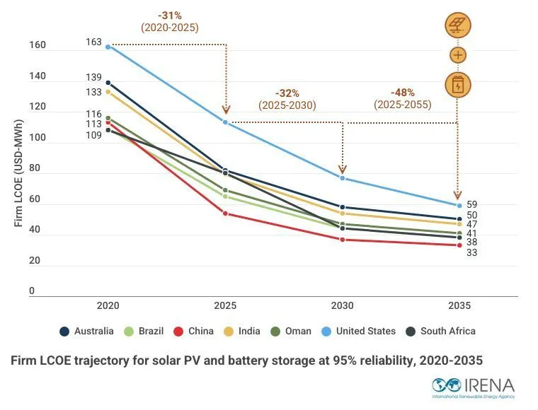
A while ago I linked a report that concluded that solar+batteries were becoming cost competitive in sunny locations for 24-hour a day firm power. Here's another report with the same findings. Solar/batteries are competitive now and will only become cheaper in the future. https://www.irena.org/Publications/2026/May/24-7-renewables-The-economics-of-firm-solar-and-wind
-
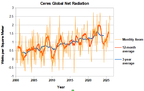
Another large positive net radiation balance in February, further increasing the running 12-month average. Should be near an enso peak in the running 12-month avg, as the transition to nino is underway. Combination of high net radiation and nino transition should fuel a healthy rise in global temperatures for the rest of the year. We will see. https://ceres-tool.larc.nasa.gov/ord-tool/jsp/EBAFTOA421Selection.jsp
-
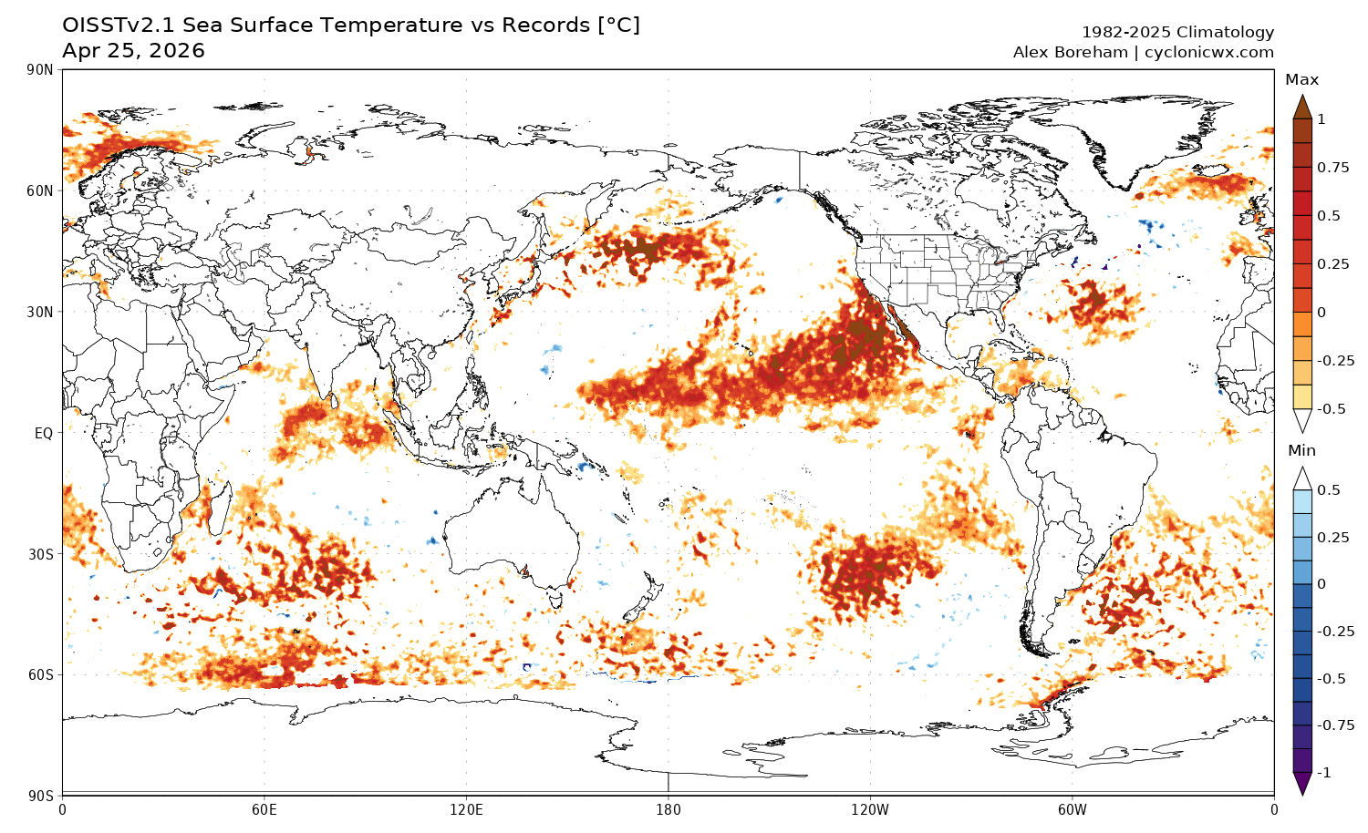
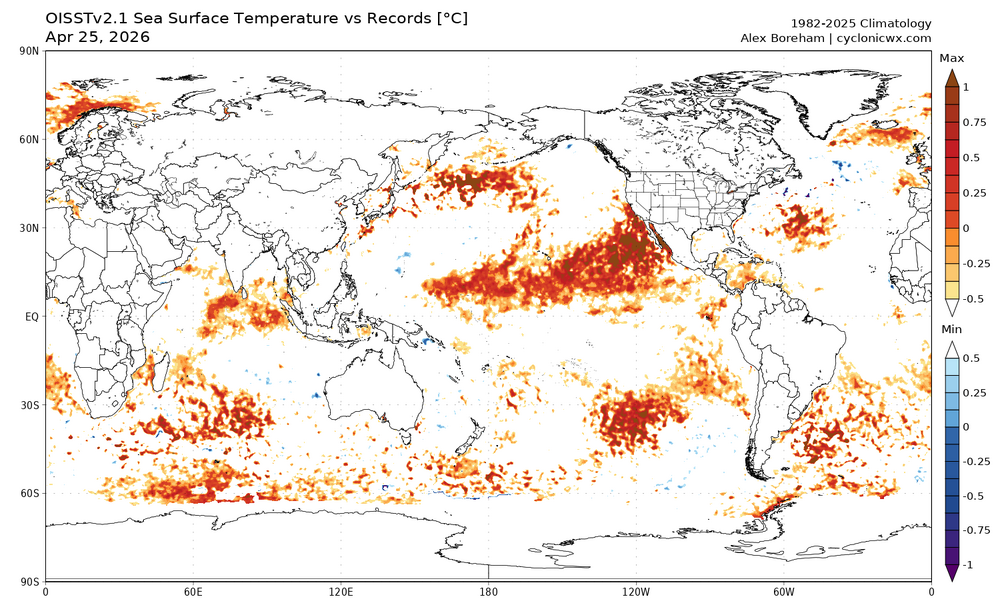
This chart shows where daily satellite SST is at record levels. Biggest feature is the large area of record warmth in the PMM area extending west of North America. An important area with nino conditions developing. There are also less extensive record temperatures in the southern hemisphere Pacific south of the enso region. https://cyclonicwx.com/sst/
-
Chester County PA - Analytical Battle of Actual vs. Altered Climate Data
chubbs replied to ChescoWx's topic in Climate Change
Very important to remove the station changes in Chester county. The county stations moved frequently and bigger changes were cooling. The station population has cooled with time mainly due a shift from towns to more rural sites. Our older stations are warmer than the county as a whole, particularly in the 1930-48 period when Phoenixville was much warmer than other local stations on summer afternoons; and, West Chester and Coatesville were in built-up towns. I can match NCEI perfectly by; 1) excluding the 3 big station moves: Coatesville in 1946+48, Phoenixville in 1948 and West Chester in 1970; and, by removing the temperature difference between stations by taking station anomalies to a common period. Raw data without the contamination of station changes. The chart below shows that NCEI has met their objective of taking out station changes to reveal the weather and climate signal in the raw data. Of course, if you leave in all the station changes you won't match NCEI or any other scientific analysis. This thread is a strawman based on bad analysis and confirmation bias.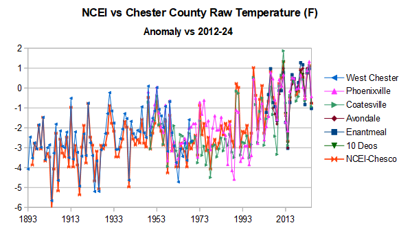
-
2026-2027 Strong/Super El Nino
chubbs replied to Stormchaserchuck1's topic in Weather Forecasting and Discussion
April RONI - 1982 - 0.48 and 1997 - 0.49. Closer to ONI as expected since tropics were cooler -
2026-2027 Strong/Super El Nino
chubbs replied to Stormchaserchuck1's topic in Weather Forecasting and Discussion
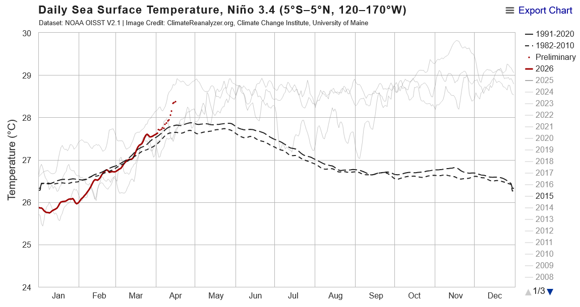
Recent rise in Nino 3.4 SST is similar in timing and magnitude to last 3 super ninos. Chart below shows 1982, 1997 and 2015 along with this year.
-
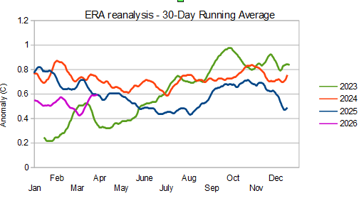
So far 2026 has been running cooler globally than 2024 and 2025, but warmer than 2023. If 2026 warms as much in the remainder of the year as 2023, then a yearly global record is likely. However, warming in 2023 was unusually large for an el nino onset year. We will need to see monthly records begin to be broken in the summer to have a chance of breaking a yearly record. Will be a good test of whether the unusual warmth in 2023 was anomalous or caused by the large earth energy imbalance.