chubbs
-
Posts
4,156 -
Joined
-
Last visited
Content Type
Profiles
Blogs
Forums
American Weather
Media Demo
Store
Gallery
Everything posted by chubbs
-
Chester County PA - Analytical Battle of Actual vs. Altered Climate Data
chubbs replied to ChescoWx's topic in Climate Change
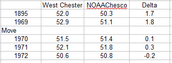
There is complete agreement on Chester County's climate between NOAA and ERA5 reanalysis. A big feather in NOAA's cap because the two series are independent, different data and methods.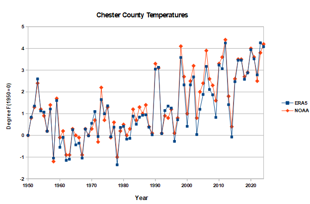
-
Chester County PA - Analytical Battle of Actual vs. Altered Climate Data
chubbs replied to ChescoWx's topic in Climate Change
Nope, can't agree. You are playing word games instead of addressing the technical content of my comment. We've been going over NOAA's Chesco climate analysis for some time now. Nothing is being changed or distorted by NOAA, On the contrary, bias-adjustment has made a big improvement in the information we have about Chester County's climate. NOAA nailed the big station moves at Coatesville and West Chester, and the warmth at Phoenixville in the 1930-50s. Of course the bias-adjusted values are different that the raw values. That is intentional, to separate station moves from real climate changes. You can't get our climate right without accounting for the changes in the temperature measuring network. You keep complaining about the how cool NOAA is vs. the raw Chesco data. But the data doesn't support your assertion. You can't draw conclusions about the raw data without considering where the measurement was made. We just went over the 1940 to 1970 period. There were only 4 stations in that period and all are warmer than Chester County as a whole: The built-up sections of Coatesville and West Chester, Phoenixville, and West Grove. All south and east. As warm as Wilmington or Philadelphia at times. Phoenixville is always warmer than NOAA today. Coatesville and West Chester cooled to NOAA's county average as soon as they moved to cooler locations. How about your analysis. You aren't getting the correct climate information from the raw data. Taking a simple average discards all of the information about where measurement was taken. The City of Coatesville is not the same as the rural area nearby, or Warwick, or any other station. The simple averages improperly combine the station and network changes into the climate estimate. That causes a large error given all the station changes in Chester County. You have made our past climate too warm, solely because the early station network is not representative of the county as a whole. Very easy to see in the chart I posted above. -
Chester County PA - Analytical Battle of Actual vs. Altered Climate Data
chubbs replied to ChescoWx's topic in Climate Change
What are you afraid of in the non-Chesco data? Its a red flag in any technical analysis when someone wants to exclude data without providing any technical justification, a sure sign of a flawed analysis. Not that non-Chesco data is needed to validate NOAA. Anyone familiar with the county can recognize the large shifts in the Chesco station network with time. The early network was restricted to warmer sites mainly towns in the south and east. The cooling station moves at Coatesville and West Chester are easily detected using Cherster County raw data. Chesco data also flags the warm readings at Phoenixville in the 1930-50s. Finally, as shown above, when the station moves are accounted for the Chesco station data tracks NOAA's series closely. The fact that both the Chesco and non-Chesco data validate NOAA's analysis is exactly what you expect from a technical analysis that reflects the real world. -
Chester County PA - Analytical Battle of Actual vs. Altered Climate Data
chubbs replied to ChescoWx's topic in Climate Change
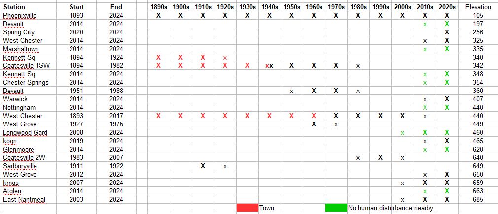
West Chester 2NW has al long history, many sites including the Daily Local. Here is a map of 2NW locations from the NOAA Observing Data Metadata Laboratory (link below). In 1970 the station moved from the middle of West Chester (site 6) to the Daily Local News office on the western outskirts of town (site 5). In 1998 the station moved to the observer's house (site 1). Easy to see the effect of the 1970 move by comparing West Chester to other County stations. Below is a plot of monthly data before and after the move for West Chester, Coatesville and Phoenixville. The West Chester station closed at the old location at the end of the year in 1969 and re-opened at the new location in May 1970. I removed the annual temperature cycle by subtracting Coatesville and Phoenixville from West Chester. A lower value means West Chester cooled relative to the other stations. The chart shows roughly 2F cooling at the West Chester station that coincided exactly with the move. The raw data is conclusive on the move effects. https://www.ncei.noaa.gov/access/homr/#ncdcstnid=20016596&tab=LOCATIONS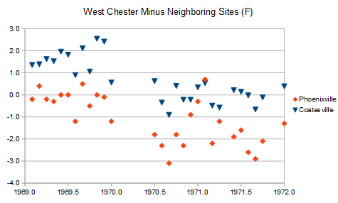
-
Chester County PA - Analytical Battle of Actual vs. Altered Climate Data
chubbs replied to ChescoWx's topic in Climate Change
Funny, ILG is only 12 miles from my house, closer than Coatesville, West Chester, East Nantmeal; hardly "far away". No you are the one who isn't supported by raw data. The year-to-year temperature change at Coatesville and West Chester tracks PHL, ILG, and ABE closely when there isn't a station change, making the Coatesville and West Chester station moves east to detect. In the early 1940s, Coatesville and West Chester were as warm as the Philadelphia airport. After the station moves moves both stations were as cool as Allentown: Coatesville after 1948, and West Chester after 1970. Between the 1948 and 1970 Coatesville was much cooler than West Chester. The chart info is not surprising. The atmosphere doesn't know or care about the Chester County border. Weather data is correlated for hundreds of miles. Year-to-year temperature changes at PHL, ILG and ABE are all highly correlated with year-to-year temperature changes in Chester County. There is no reason to reject valuable data from outside the county. Particularly when you consider the quality and consistency of the NWS main climate sites.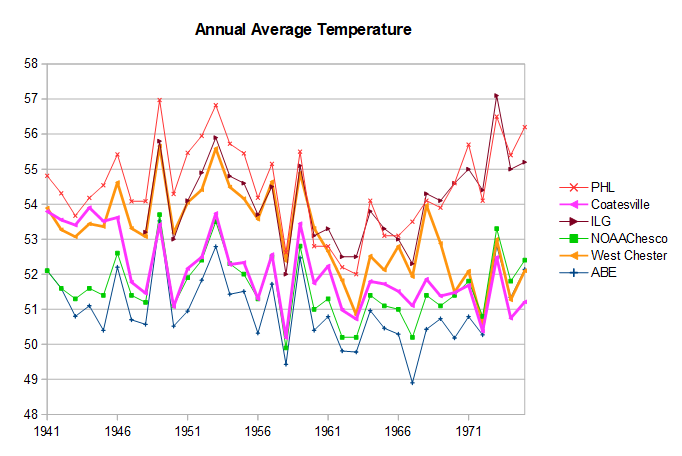
-
Chester County PA - Analytical Battle of Actual vs. Altered Climate Data
chubbs replied to ChescoWx's topic in Climate Change
I removed the fake data from your table (see post above) and updated what you are calling "Actual Chesco" by recalculating the network average. The fake data ran warm so the updated "actual Chesco" is somewhat cooler than your Table, closer to NOAA. However, even after the update, "Actual Chesco" is an outlier vs the other regional data. "Actual Chesco" is almost as warm as the Philadelphia Airport (PHL) and Wilmington (ILG) in the 1940s; but, cools with time, becoming almost as cool as Allentown (ABE) and NOAA in the 1970s. The relative cooling of "Actual Chesco" between the 1940s and 1970s is caused by the station moves at Coatesvile (1946-47) and West Chester (1970), and Phoenixville recovering from the warm bias of the 1930-50s. "Actual Chesco" is a a misnomer, doesn't follow our actual weather at all due to all of the changes in the station network that are not accounted for.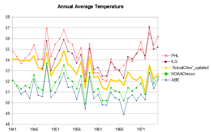
-
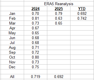
March was cooler than last year according to ERA5. Year-to-date, this year is running 0.05C cooler than last year.
-
Chester County PA - Analytical Battle of Actual vs. Altered Climate Data
chubbs replied to ChescoWx's topic in Climate Change
Every time I look at your stuff I find more problems. The table above has fake or estimated data for Chadds Ford, Glenmoore, and partially for West Grove. Per NCDC, Chadds Ford and Glenmoore were precip only, while West Grove only has temperature data after April 1963. With your method, removing the fake data will change your result. That will be the third or fourth change to Chester County's climate you have made in the past year or two. Meanwhile NOAA is spot on. -
Chester County PA - Analytical Battle of Actual vs. Altered Climate Data
chubbs replied to ChescoWx's topic in Climate Change
Glad to see Grok make good use of the information in the Table. The table was criticized as "unscientific" by our local "expert" when it was originally posted -
Chester County PA - Analytical Battle of Actual vs. Altered Climate Data
chubbs replied to ChescoWx's topic in Climate Change
You are in dismissal mode. Throwing out the same old whatabouts. What about this. What about that. If you want the answer to your questions look at the material I have posted above. As an example, between 1945 and 1948, Coatesville moved twice and West Chester didn't. Between 1945 and 1948, Coatesville cooled by 2.1F, while West Chester only cooled by 0.3F. Using West Chester data alone justifies a 1.8F cooling adjustment to the pre-move Coatesville data. But there are many more stations besides West Chester that support the Coatesville bias adjustment. NOAA and other groups use the year-to-year changes to make bias adjustments. Why?, year-to-year temperature changes are correlated for hundreds of miles. Within a region, year-to-year temperature changes that occur at all stations are weather-related; but, year-to-year changes that occur at only one station are due to station changes not weather. When you have thousands of stations, with overlapping correlation across the county, the procedure is bullet-proof. Per chart, Allentown agrees with West Chester on the flat temperature trend between 1945 to 1948; and, there are many more regional stations that support West Chester and Allentown. The correlation of year-to-year temperature changes goes way beyond the border of Chester County. A cool year in Chester County is a cool year in the entire Mount Holly service area and beyond. The adjustments are based entirely on raw data. No, there's no doubt that the Coatesville cooling between 1945 and 1948 was due to a station move and not weather. The raw data is the proof. Now its your turn. Where's your validation? You are treating the Coatesville cooling between 1945 and 1948 as completely weather-related. Where's the evidence to support that. Same question for West Chester in 1970. You also need to justify using the City of Coatesville, the Borough of West Chester, the Borough of Kennett Square and Phoenixville as a county average. Finally to justify a simple average, you need to show that the station network doesn't change with time. Good luck with that.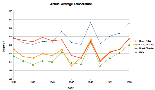
-
Chester County PA - Analytical Battle of Actual vs. Altered Climate Data
chubbs replied to ChescoWx's topic in Climate Change
When adjusted for the post-WWII station moves to a cooler location, the Coatesville data agrees very well with the NOAA county temperature series; over the entire record back to 1895. The move-adjusted series uses raw data from 3 Coatesville stations since 1948 and NOAA bias-adjustments before 1948 when the 1SW station moved between several Coatesville city sites. The Coatesville data, properly corrected for station moves, is a very good proxy for the county-average temperature. Once again NOAA is spot on.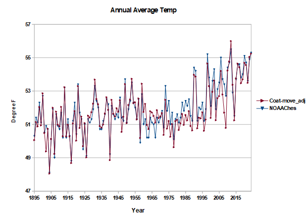
-
Earth's storage of water in soil, lakes and rivers is dwindling. And it's especially bad for farming Their paper, published Thursday in the journal Science, finds that global warming has notably reduced the amount of water that's being stored around the world in soil, lakes, rivers, snow and other places, with potentially irreversible impacts on agriculture and sea level rise. The researchers say the significant shift of water from land to the ocean is particularly worrisome for farming, and hope their work will strengthen efforts to reduce water overuse. Earth's soil moisture dropped by over 2,000 gigatons in roughly the last 20 years, the study says. For context, that's more than twice Greenland's ice loss from 2002 to 2006, the researchers noted. Meanwhile, the frequency of once-in-a-decade agricultural and ecological droughts has increased, global sea levels have risen and the Earth's pole has shifted. https://phys.org/news/2025-03-earth-storage-soil-lakes-rivers.html
-
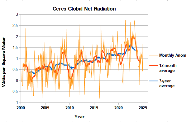
CERES net radiation spiked up in January reaching pre-nino levels of monthly positive imbalance. The series is noisy and the December value was relatively low. Will have to see if January is a merely a monthly outlier or signals a return to more rapid heat uptake.
-
Chester County PA - Analytical Battle of Actual vs. Altered Climate Data
chubbs replied to ChescoWx's topic in Climate Change
OK, but you need to understand the impact of the 1970 West Chester station move. Before 1970 there is a roughly 1.8F offset between West Chester and NOAA reflecting the warmer West Chester location in the middle of town. Per the chart below, NOAA tracks West Chester closely for the entire 1895-1969 period once the offset is removed. After the move, West Chester cooled and the offset disappeared. Once again NOAA is spot on. After the station moves are accounted for, Coatesville and West Chester validate the entire NOAA series. Phoenixville also confirms the warming over the 1895-2024 period, recognizing that Phoenixville ran too warm during the 1930s-50s, as we discovered last year. That is the vast bulk of the county long-term data supporting NOAA. Where's your validation?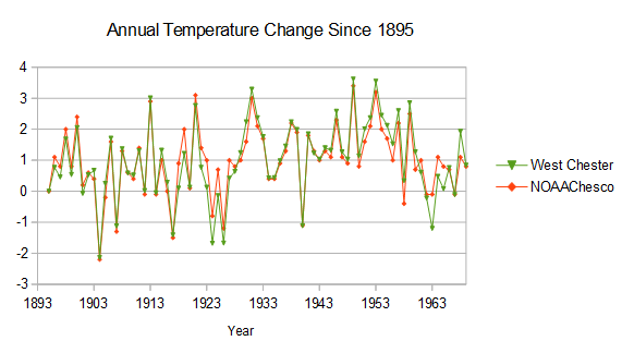
-
Chester County PA - Analytical Battle of Actual vs. Altered Climate Data
chubbs replied to ChescoWx's topic in Climate Change
LOL, you are using plenty of data that isn't "certified" NWS Cooperative, your own house to start with, also DEOS, airport ASOS, etc. You results can't be evaluated without knowing how the Chesco station network has changed with time and you don't provide that information. The first thing a technical group would want to see is something similar to the chart I posted above. How many of your readers know that the early Coatesville data is from the City of Coatesville or that the station cooled significantly when it was moved after the war. We've been discussing Coatesville for years and that was news to me until I found out for myself last year. -
Chester County PA - Analytical Battle of Actual vs. Altered Climate Data
chubbs replied to ChescoWx's topic in Climate Change
Interesting test of Grok. I'd give it a failing grade. This statement says it all: "@ChescoWx's refusal to share raw data or engage peer review undermines their case". How can you give "partial merit" to Chescowx's claims if you don't know what was done. The reality is that Chesco's claims are flat-out wrong. The raw data shows plenty of warming in Chester County, but he doesn't know how to analyze it. Per chart below, Chescowx's monitoring network has changed significantly. The stations of the past tended to be warmer. Chescowx takes a simple average and Its well known that a simple average of a changing temperature station network skews the results. No wonder he can't find the local warming. Recognize that it is hard for Grok to evaluate Chescowx, since the methods aren't fully disclosed and Chescowx is constantly overselling his analysis. A problem with Grok, though if it can't distinguish between BS and science. There is another technical problem here that Grok should detect even if they know nothing about Chescowx's methods. Weather data and climate trends are correlated over hundreds of kilometers. This was established long ago by testing temperature data. There is no indication that Chester county is behaving differently from nearby counties. Finally both NOAA and Chescowx have track records. No one complains about NOAA's climate analysis in a technical forum. On the contrary, there are many papers that demonstrate sound results, including independent tests with synthetic data. Meanwhile Chescowx has no publication in any technical forum and is constantly repeating climate denier talking points. Grok's performance here makes me question the value of AI. Can provide general information but no insight. Also can't distinguish BS. Perhaps the training on twitter is the problem. Garbage in garbage out.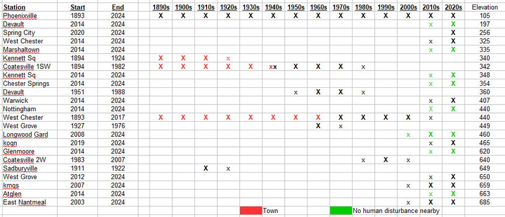
-
Chester County PA - Analytical Battle of Actual vs. Altered Climate Data
chubbs replied to ChescoWx's topic in Climate Change
Nice insult at the end. What I have come to expect when we exchange data/information. I have shown you umpteen charts which validate NOAA. You dismiss/deny them all. Here's another. After the big moves, Coatesville and NOAA had exactly the same warming between 1948 to 2024. Once again NOAA is spot on.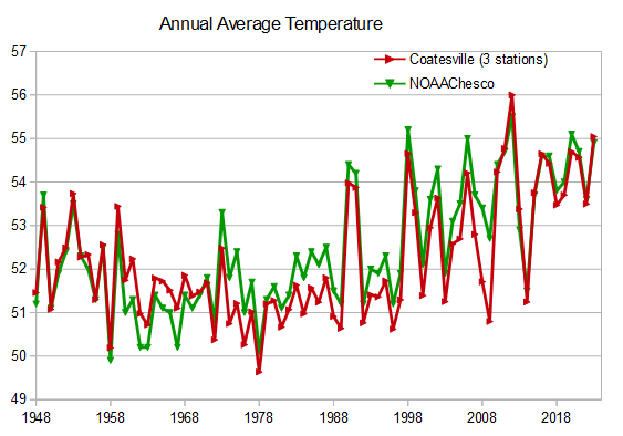
-
Chester County PA - Analytical Battle of Actual vs. Altered Climate Data
chubbs replied to ChescoWx's topic in Climate Change
The circled yellow numbers and your "post hoc adjustment" rows are meaningless and don't shed any light on NOAA's work. Why? The average of the city of Coatesville, Phoenixville, West Chester Borough, and West Grove is not the county average, not even close. Those stations are all warmer than the county as a whole. Of course the NOAA number is cooler, that isn't surprising at all. -
I don't follow your comment at all. I added NOAA to the chart I posted above. Per the chart, before 1947 the Coatesville station was much warmer than NOAA. As I stated above in #4 this is not surprising. Pre-move, the Coatesville station was located in a built-up area subject to heat-island warming. After the post-war moves NOAAChesco and Coatesville are very close, reflecting the roughly 2F cooling associated with the post-war moves. As I said above, the raw data completely verifies the Coatesville bias adjustment. There is no "chilling, no data alteration. On the contrary, the bias adjustments are completely derived from the raw data, the best climate information the raw data can provide.
-
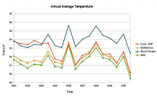
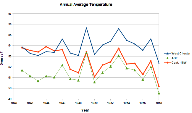
We've been over this at length. What you are showing isn't close to the station adjustments. You have been criticizing NOAA for months without understanding NOAA's methods. The data is your table only shows how warm the Chesco stations were in the period 1927-1951: Is it surprising that West Grove is warmer than Chester County. No not surprising. This site is in the S part of the County at low elevation. Is it surprising that Phoenixville is warmer than Chester County. No not surprising. The Phoenixville station is warmer than the county average today Is it surprising that the borough of West Chester is warmer than Chester County. No not surprising. West Chester is in the SE portion of the county. Between 1927 and 1951 the station was in a built up area. The station moved to a roughly 2F cooler location in 1970. Is it surprising that the city of Coatesville (1927-1945) is warmer than Chester County? No not surprising at all. Coatesville is at low elevation and has always been heavily built-up. My spot checks of current stations in the City of Coatesville are quite warm. Finally is it surprising that the rural Coatesville site (1948-1951) matches NOAA. No not surprising at all. The rural Coatesville site is a good proxy for county as a whole. Low elevation isn't as important at a rural site due to relatively cool nights which compensate for warm days. Bottom-line your table doesn't support the points you are making. The older Chesco coop data was collected at warm sites, mainly in towns in the south and east portion of the county. The warmth is illustrated by the 2 major station moves at Coatesville and West Chester, which cooled those stations by roughly 2F. We don't have to make any assumptions, the raw data shows the effect of the station moves. If you don't correct the Chesco data for station location, which has changed significantly over the years, you won't get the right answer.
-
Evade, evade, evade. Not a difficult question. Did the post-war move cool the Coatesville station?
-
As usual you are evading my point. Did the post-war move cool Coatesville by roughly 2F yes or no? The difference between NOAA and the individual stations in your table shows how warm our older stations are: in towns and the warmer part of the county. When Coatesville and West Chester moved out of built-up areas they cooled by 2F.
-
On the contrary, its very easy to verify the benefit of bias adjustments using the raw data that they were derived from. Take Coatesville (Coat 1SW in chart) for example, the station was moved twice between 1945 and 1948, from within Coatesville City to a rural site outside. Before the move, Coatesville temperatures were close to West Chester on an annual average basis. After the move, the Coatesville station was roughly 2F cooler, closer to Allentown (ABE) than West Chester. There are many other regional stations that agree with West Chester and Allentown on the 1940s temperature trend. The post-war cooling at Coatesville is spurious. Hardly "climate realism" to include this spurious cooling in climate analysis. It is the opposite of realism you are after.
-
Interesting non-expert blog article below. We've stepped-up to a new global temperature range. ENSO is the trigger; but, the root cause is the increasing earth's energy imbalance. The warmth spreads unevenly, so it will take a while for the full effects to be felt locally. https://hswildman.home.blog/2025/01/26/2024/
-
More evidence that it hasn't been this warm in at least 120,000 years. Paleoclimatologists can determine how long bedrock beneath a glacier has been covered by ice using measurements of specific isotopes. When rock surfaces are exposed, isotopes such as carbon-14 and beryllium-10 form due to bombardment by cosmic radiation. If, however, the rock is covered by an ice sheet, it is shielded from this radiation, and these unstable isotopes gradually disappear through radioactive decay (with half-lives of 5,700 and 1.4 million years, respectively). This method, known as cosmogenic radionuclide dating, has been well-established for decades. The new study applied this method to examine several glaciers in the tropical Andes. In rock samples collected at the edges of the glaciers, researchers found isotope concentrations close to zero. From this, they conclude that these rocks must have remained covered by ice throughout the entire Holocene, shielding them from cosmic radiation. This indicates that these glaciers are very likely smaller today than at any point in at least the last 11,700 years. The Andes are not an exception: according to current research, global average temperatures today are very likely higher than at any other point during the entire Holocene. Given that an ice age lasted for more than 100,000 years before the Holocene, today’s temperatures are probably the highest experienced in about 120,000 years. https://www.realclimate.org/index.php/archives/2025/03/andean-glaciers-have-shrunk-more-than-ever-before-in-the-holocene https://www.science.org/doi/10.1126/science.adg7546