chubbs
-
Posts
4,113 -
Joined
-
Last visited
Content Type
Profiles
Blogs
Forums
American Weather
Media Demo
Store
Gallery
Everything posted by chubbs
-
Shewchuk is telling us something we already know: raw COOP data in the US is biased. We've known this for decades. Deniers have been making the same complaint for decades; but they haven't provided a single document in a scientific forum to back up their claims. As we have found out in Chester County, NOAA's adjustments are completely justified. Stations moved, sensors/shelters ran warm, etc. Every time we checked, the raw data at nearby stations verified the adjustment. At this point you might as well complain that the sky is blue or the world is round.
-
Chester County PA - Analytical Battle of Actual vs. Altered Climate Data
chubbs replied to ChescoWx's topic in Climate Change
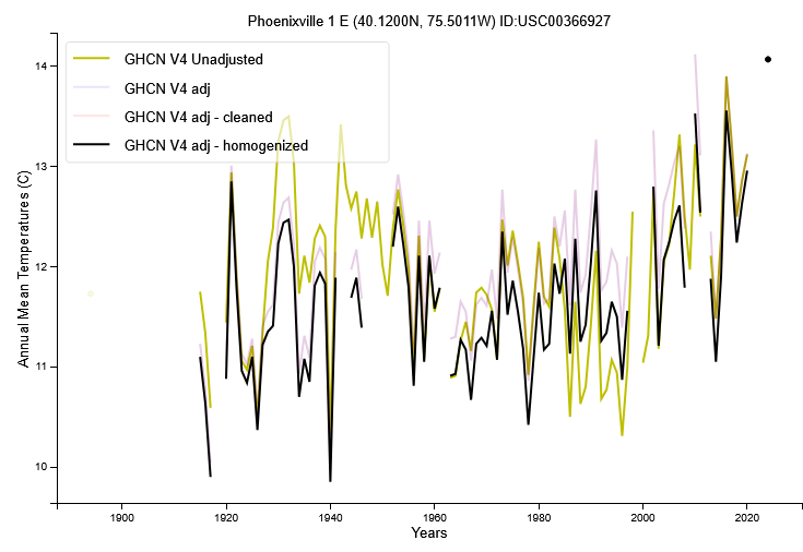
You are spouting conspiracy theory mumbo jumbo. The adjustments all come from the raw data. The two big moves are by far the biggest adjustments in Chester County. Completely justified as we have seen. Let's go through the adjustments in detail. The West Chester move in 1970 triggers large adjustments before the move. 70+ years of large warm adjustments that are completely justified in the raw data. The other west Chester adjustments are relatively minor. Not that when the West Chester adjustment is less than 2F in the pre-move period it is a cooling adjustment relative to the warm town baseline. Coatesville1sw is similar to Coatesville with the 1946-47 moves being the main adjustment. Again completely justified. Coatesville 2W gets a small cooling adjustment. Phoenixville gets a warm adjustment in the 1930-1950s period. Again completely justified. Other than that the adjustments are minor. Like Coatesville 2W, Devault gets a warming adjustment. The bottom-line is that the major Chesco Coop adjustments are completely justified. The other Chesco adjustments don't impact the long-term climate trend as they are: smaller, shorter duration, and go both ways. You have complained for over a year about a scientific method you don't understand. During that time you haven't provided any evidence to back up your claims. On the contrary, the County adjustments that we have looked at are all completely justified by the raw data. Coatesville and West did have major cooling moves. Phoenixville did run warm in the 1930-50s. Your complaint boils down to the fact that you don't like the answer. What about this adjustment, What about that adjustment. That doesn't move the needle. You need to look at the raw data that triggered the adjustment. Telling us that there adjustments that you don't like doesn't move the needle. Science isn't going to change because you don't like the answer.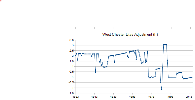
-
Chester County PA - Analytical Battle of Actual vs. Altered Climate Data
chubbs replied to ChescoWx's topic in Climate Change
We have thousands of weather stations in the US making it very easy to separate station changes from weather. Year-to-year temperature changes are correlated for hundreds of miles. If West Chester is 2F cooler one year, Coatesville will also experience similar cooling. Why? every station in Chester County and the region experiences the same weather. The effect of the Coatesville station move is very clear in the chart below. Other than the move years of 1946 and 1947, both stations have the same year-to-year temperature change. This illustrates the close correlation in the between nearby stations when there are no station changes. However Coatesville cooled significantly relative to West Chester in 1946 and 1947. Proof that a big station change occurred in that period. Station changes are permanent. The rural Coatesville Doe run location (1948 and later) is always cooler than the West Chester town location and the city of Coatesville (1945 and earlier). That's why the city of Coatesville gets an big positive adjustment every single year. Similarly before the 1970 move, West Chester always gets a large positive adjustment because it is warmer than the post move West Chester location. This isn't rocket science. Every NOAA adjustment that we have looked at has been spot on based on the raw data and other evidence. Is there something about the chart below you don't understand?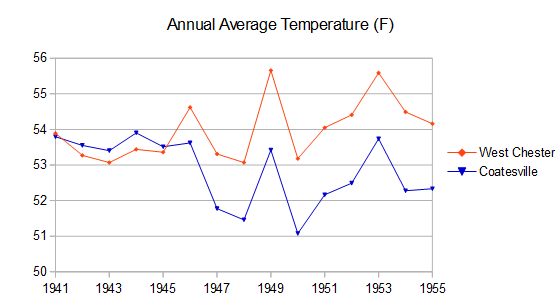
-
Chester County PA - Analytical Battle of Actual vs. Altered Climate Data
chubbs replied to ChescoWx's topic in Climate Change
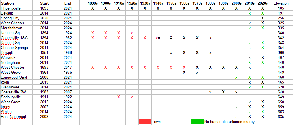
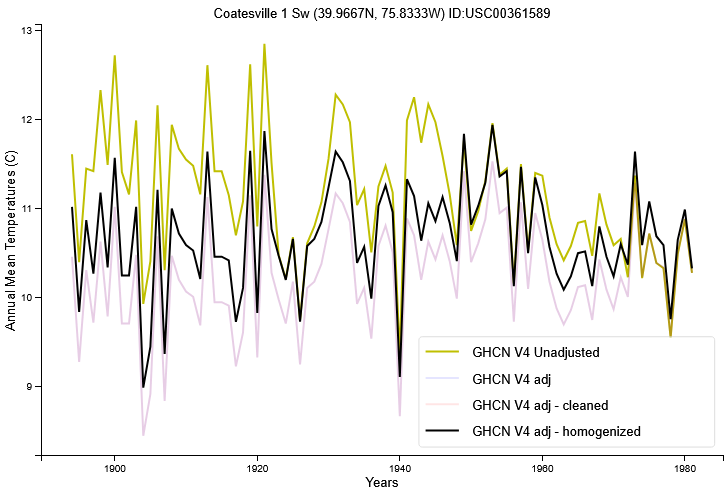
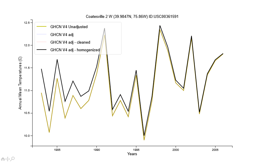
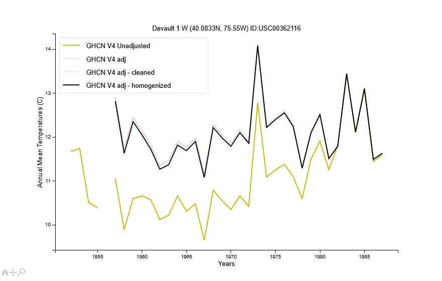
The thread is based on faulty analysis not faulty data. The data is complicated with numerous station changes (see table below). If you ignore the station changes, like Chescowx does, you don't get the right answer for Chester County. As an example, here's a comparison of the Chesco Coop average to Philadelphia (PHL) and Allentown (ABE). Between 1941 and 1945, the Chester County COOP stations were as warm on average as the Philadelphia airport, much warmer than Chester County as a whole. By 1970 the stations had cooled on average to the level of Allentown. The cooling corresponds to COOP station changes as the County network transitioned from built-up towns to more rural locations. The biggest changes were the Coatesville (1946+47)and West Chester (1970) moves to less built up sites. Both station cooled by roughly 2F as a result of the moves. Other changes included: Phoenixville cooling relative to other stations and new stations starting in West Grove and Devault both in less built up areas than the pre-1945 stations. NOAA is not fooled by the station changes, but Chescowx is.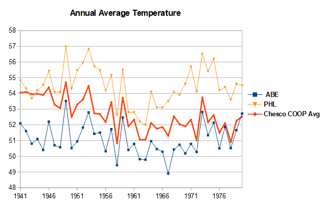

-
Chester County PA - Analytical Battle of Actual vs. Altered Climate Data
chubbs replied to ChescoWx's topic in Climate Change
I do have proof. I have showed it to you over and over again. It's the raw data from Coatesville or West Chester and other stations, before and after the moves. There is no need to guess or handwave. The raw data allows the effect of the moves to be determined very accurately. Per chart below the 1946 and 1947 moves cooled Coatesville relative to West Chester and Allentown (ABE). Before the moves Coatesville was close to West Chester. After the moves it was much closer to ABE. I have just pulled and plotted a few stations. NOAA's software checks thousands of stations. So there is much more proof available than what I have shown here. There could be tens or hundreds of stations that shed light on the Chesco moves. Your post demonstrates that you don't understand what NOAA does. There's nothing arbitrary about it. The raw data alone determines all the adjustments. Only stations that change their position relative to other stations get an adjustment. In the case of the big moves at Coatesville and West Chester the move effect is so large, roughly 2F, that it is impossible to miss. Very clear in the chart below.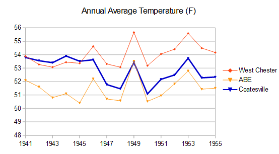
-
Chester County PA - Analytical Battle of Actual vs. Altered Climate Data
chubbs replied to ChescoWx's topic in Climate Change
Your chart isn't raw station data. It's a station network average.If the station network is changing the station average will not match raw data from a single station. Per table below, there are 3 major periods: 1893-1948 = all stations in towns and built-up areas, 1948 - 1970 = transition out of towns, 1971 - present = in suburban or rural. Your chart has spurious cooling in the transition period due to station moves and station start-ups in more rural areas. I have plotted raw data from West Chester before the move and Coatesville after the move because there is an overlap period between 1948 and 1969, which allows the stations to have a common baseline or zero point. This provides a dataset without major station changes from 1893 to present. Phoenixville also provides long-term data at a single location, albeit with periods with other station changes. That's the main difference between my chart and yours. I have taken the major station moves out and you have left them in. When the station moves are removed the pre-1948 data isn't that warm and there isn't a big drop in temperature between 1948 and 1970.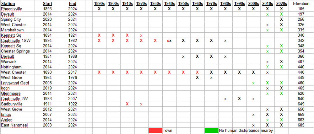
-
Chester County PA - Analytical Battle of Actual vs. Altered Climate Data
chubbs replied to ChescoWx's topic in Climate Change
You shouldn't criticize something you don't understand. The charts are 100% raw data. I've merely subtracted a constant from each station to set each stations to zero at a common point in time, either 1948-1969 or 1950. That removes the differences between stations which allows the year-to-year and long-term trends to be seen more easily. The year-to-year and long-term trends are not changed by the subtraction of a constant from each year. Phoenixville and Coatesville warm by exactly the same amount either way. West Chester, at the pre-move location, shows little change in temperature either way. -
Chester County PA - Analytical Battle of Actual vs. Altered Climate Data
chubbs replied to ChescoWx's topic in Climate Change
All I am plotting is NCEI and raw coop data. Are you saying that the County COOP data are "altered alternative facts". -
Chester County PA - Analytical Battle of Actual vs. Altered Climate Data
chubbs replied to ChescoWx's topic in Climate Change
Why? Because NCEI knows how to analyze weather data and you don't. Every time I compare NCEI to Chester County raw data they look damn good. Of course you need to take out the 2 big station moves. NCEI looks even better when data from outside the county is included. The evidence is overwhelming.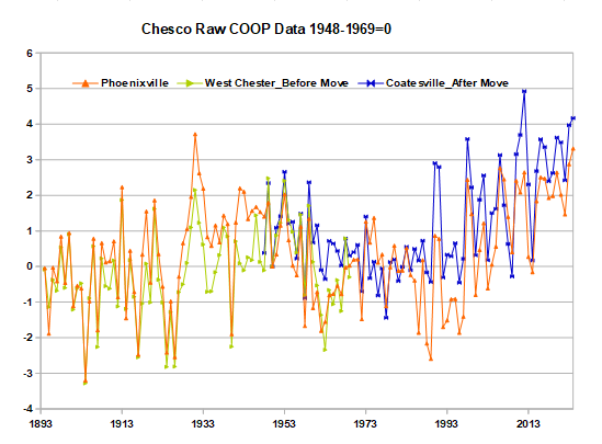
-
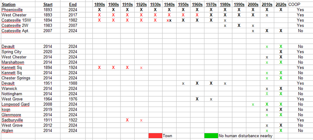
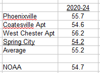
As usual your post is BS with no raw data provided. Per table below, the only stations in the county with long-term data are West Chester, Coatesville and Phoenixville. The main source of bias in these three stations are the station moves at Coatesville and West Chester. Remove the station moves and the three stations provide the only low-bias raw data that spans the entire period. Funny that you don't like raw data when it shows warming. We've only had one set of weather in Chester County. Any stations without biasing station changes will be in close agreement. No chance of a different non-biased dataset erasing the warming seen at West Chester, Coatesville and Phoenixville. Certainly not the small amount of pre-2010 data outside the big 3. Unlike the big 3, The other stations in the table have short records, don't span the entire period when combined, and are inconsistent: The earliest stations were coops in towns, while the most recent stations are mainly non-coops in parks. The only thing you are getting from the added stations is bias. You are averaging warm stations early and cooler stations more recently. No wonder you can't find the local warming.
-
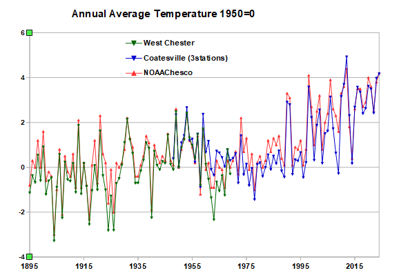
Your chart is mislabeled. Nobody measures the average temperature of Chester County and there is no raw data in your chart. Instead you are showing the results of NOAA's and your calculations. NOAA is completely open about their methods. Their goal is to remove the station changes from the raw data, leaving only the month-to-month weather. While NOAA has removed the station changes, you have left them in. Furthermore you have added a number of stations that NOAA doesn't use at the very end of the period, mainly 2014+. These stations don't contain much climate data due to their short record; but, do cool the present somewhat since they are cooler on average than the NWS coop stations. There isn't much difference between your results and NOAA's after 1970, steady warming of 3 to 4F over that period. The big differences is the period before 1970. There are only 3 COOP stations with significant data before 1970: Coatesville, West Chester and Phoenixville. All 3 were much warmer than the county average temperature. That's why your results are so warm before 1970. We have reviewed the raw data from those 3 stations over and over again. Coatesville and West Chester moved from towns to less built up locations and cooled by 2F. While Phoenixville ran much warmer than surrounding stations in the 1930s, 1940s and 1950s due to higher afternoon temperatures and time of day bias. The chart below shows raw data from the 3 main Chesco COOP stations with the Coatesville and West Chester moves removed. The chart is 100% raw data. To better isolate the long-term climate trend, differences between stations have been removed by subtracting the average temperature between 1948 and 1969 from each station. In complete agreement with NOAA, the raw data shows considerable warming in Chester county since 1893. There is no doubt that Chester County has warmed. The large cooling that you show between 1940s and 1970 is spurious. A result of the station moves at Coatesville and West Chester, and cooling at Phoenixville as it lost the warm bias of the 1930-50s. The bottom-line is that NOAA and you have both met your objectives. NOAA has removed the station changes and isolated the county long-term climate trend; while, you have altered our local climate to bring it into alignment with your worldview.

-
Yes, you can find a reason to dismiss the evidence; but, as usual you aren't providing any data analysis or statistics to back up your argument, just handwaving. You haven't shown that "The data is clearly materially and statistically close enough to all other available county data to validate the raw data as is." On the contrary, the biasing effect of the station moves is clear in the Chester County raw data. For instance, there is a roughly 2F shift in Coatesville relative to West Chester due to the 2 moves in 1946+47. The Coatesville station locations in 1945 and 1948 fully support the raw temperature data.

-
It's interesting that you make this point; because, I've shown over and over again that the Chester county data is sufficient to show bias in the local data. For instance in the case of the two big cooling moves: 1) After its move in 1948, Coatesville cooled by roughly 2F relative to Phoenixville and West Chester, and 2) after its move in 1970, West Chester cooled by roughly 2F relative to Coatesville and Phoenixville. The timing and nature of the moves fully support the in-county data. Data from outside the county isn't needed; but, does fully support the bias determination. There is a 100% ironclad case for bias in the raw Chesco data. You are helping to make bdgwx's point about confirmation bias.
-
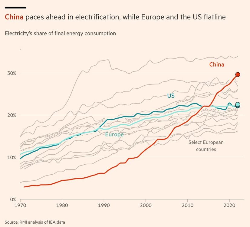
Agree its not altruism. They've also flipped the competitive script in cars. China wasn't going to catch up quickly to other countries in engine technology, but have gained a big advantage by switching to EV. The EV/batteries spurring growth in Vietnam, Thailand, Brazil and Indonesia all come from China.
-
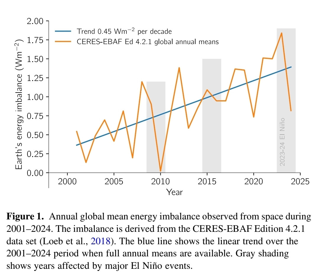
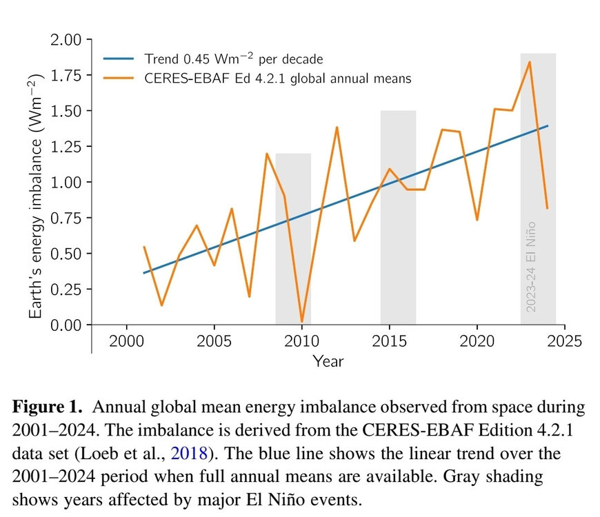
Shows the guy is in serious climate denial. When it comes to climate, the sun swamps the earth. Always has and always will. The big problem we have now is more energy coming in from the sun than is radiated away. A large and growing imbalance at the top of the atmosphere, roughly 0.5% of the suns energy, year after year after year. Crazy when you consider that the energy leaving the earth is rising rapidly as the world warms. If seismic was warming the earth, the earth would be warming from the inside out not the outside in.
-
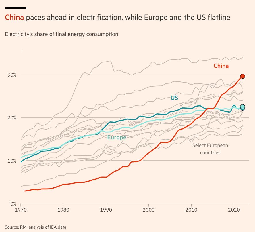
This is a good news /bad news chart. The world is moving quickly to clean energy technology, but the US is lagging and policy support in the US is being removed. We will be left with an outmoded energy system.

-
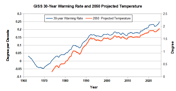
This chart shows how the recent increase in warming has changed the 30-year warming rate and projected temperatures in 2050 based on the 30-year warming rate. The past decade has sped up our journey to a new climate. A little over a decade ago we were going to hit 1.5C around 2050. Now it will be close to 2C by 2050 if we warm as we have in the past 30 years. Note that if the warming in the past decade is maintained, the 2050 estimate is conservative. Of course this is just a rough projection, a lot can change in 25 years to change our warming rate. Getting off fossil fuels for instance.
-
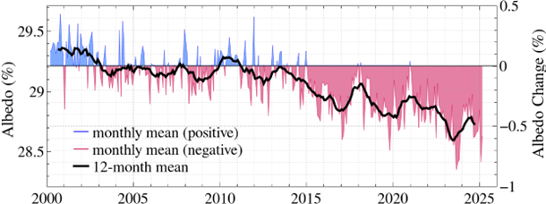
Hanson's latest mailing. The earth has gotten much dimmer in the past decade. The change is large, unexpected, and has big implications for our climate future. Hanson gives his side of the ongoing debate. Abstract. Earth’s albedo (reflectivity) declined over the 25 years of precise satellite data, with the decline so large that this change must be mainly reduced reflection of sunlight by clouds. Part of the cloud change is caused by reduction of human-made atmospheric aerosols, which act as condensation nuclei for cloud formation, but most of the cloud change is cloud feedback that occurs with global warming. The observed albedo change proves that clouds provide a large, amplifying, climate feedback. This large cloud feedback confirms high climate sensitivity, consistent with paleoclimate data and with the rate of global warming in the past century. https://mailchi.mp/caa/large-cloud-feedback-confirms-high-climate-sensitivity
-
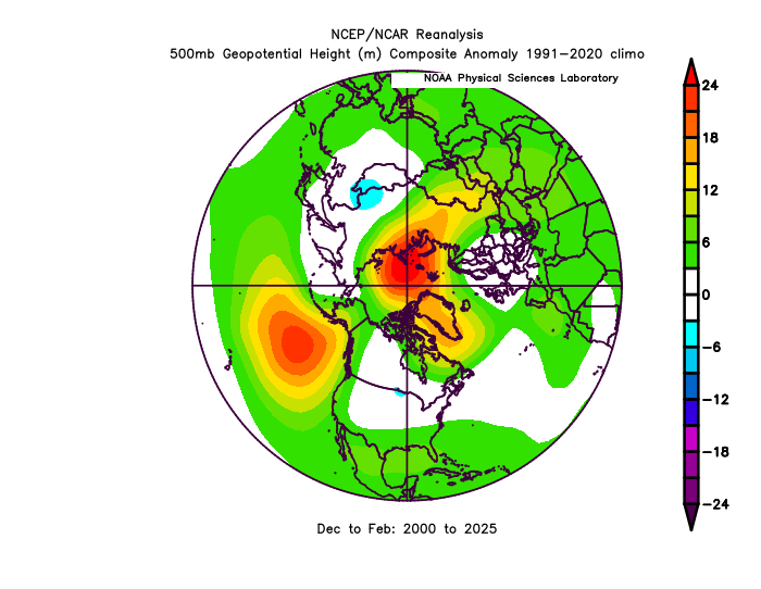
A better pattern for cool weather in US if you restrict to the winter months. It could have been worse.
-
No I don't agree. below are the current county stations that I have data for, the non-DEOS stations. Spring City is cooler than any of these corrent stations, consistent with its location in the far northern part of the county. Unlike your results, NOAA is cooler than the average of the current stations that I have. Shows how changing the station population changes the simple average. The non-NOAA DEOS stations cool the present on balance without adding any climate information due to their short period of operation. Results from your simple averaging method merely reflect the changing station population: relatively warm in the past and relatively cool now. You've obtained the "climate change isn't happening" result you are looking for. As I have said in the past you will be the last person to realize that Chester County is warming.
-
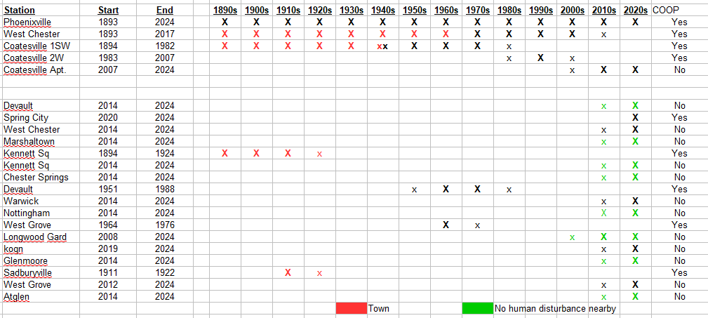
Only Phoenixville and Spring City are NWS COOP stations and used by NCEI. The others are not used by NCEI.
-
Chester County PA - Analytical Battle of Actual vs. Altered Climate Data
chubbs replied to ChescoWx's topic in Climate Change
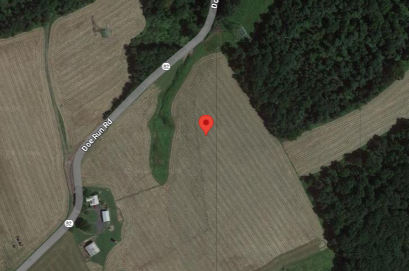
Once again you aren't addressing my criticism: the county stations have changed. According to NCDC here's the Coatesville station in 1945 and 1948. Big difference in local land-use on Chestnut St vs Doe Run Road. We don't have to guess or hand wave about the impact of the station moves. The nearby stations allow the impact to be determined. I have shown you the plots over and over again. Between 1945 and 1948 Coatesville cooled 2F relative to West Chester and other stations. The evidence is overwhelming.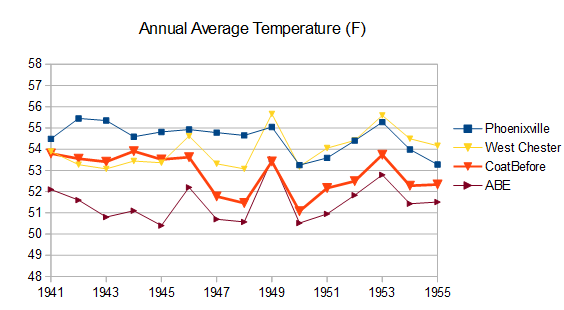
-
Here's another chart (from Financial Times) which shows how our fossil-fuel energy system is falling behind China's. Energy use and emissions are reduced with electricity due to higher end-use efficiency. For instance a gasoline car is 15-20% efficient while an EV has 90+% end-use efficiency.
-
Chester County PA - Analytical Battle of Actual vs. Altered Climate Data
chubbs replied to ChescoWx's topic in Climate Change
You aren't addressing my criticism. Yes, the new stations do a good job of covering the county, I never said they didn't. The problem is the older stations that make up the bulk of the county climate data. The older stations are located where people lived at the time: in towns, valleys, mainly in the east. We know the older stations are warm because when the Coatesville and West Chester stations moved a short distance to less built-up areas they cooled by roughly 2F. The DEOS stations that make up the bulk of your current station line-up are located in parks, nature preserves or similar, very different from the older coop stations. -
Most of those stations are giving you zero climate information because they don't have long records. Only Phoenixville has data before 2007.