chubbs
-
Posts
4,151 -
Joined
-
Last visited
Content Type
Profiles
Blogs
Forums
American Weather
Media Demo
Store
Gallery
Everything posted by chubbs
-
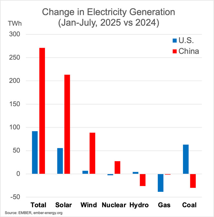
China's CO2 emissions are peaking not accelerating. That said China coal use is massive and coal interests are putting up a fight. Its unclear how China's policy towards coal will evolve. https://www.carbonbrief.org/analysis-record-solar-growth-keeps-chinas-co2-falling-in-first-half-of-2025/ https://energyandcleanair.org/publication/chinas-coal-is-losing-ground-but-not-letting-go/
-
Trump's speech showed how unprepared the US is becoming for the future. https://electrotechrevolution.substack.com/p/rewiring-the-energy-debate?utm_source=substack&utm_campaign=post_embed&utm_medium=web

-
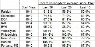
Here are some snow stats for I95 cities. Last 10 years have been below normal at all cities. Philly to Boston are above average over last 30 years. This year 95/96 will be dropped from 30-year average, so 30-year averages are likely to drop.
-
Wildfire smoke is having an increasing US health impact. Likely also cooling our summers. https://bsky.app/profile/shannonosaka.bsky.social/post/3lz4nvt3eqc2f https://www.nature.com/articles/s41586-025-09611-w#Sec4
-
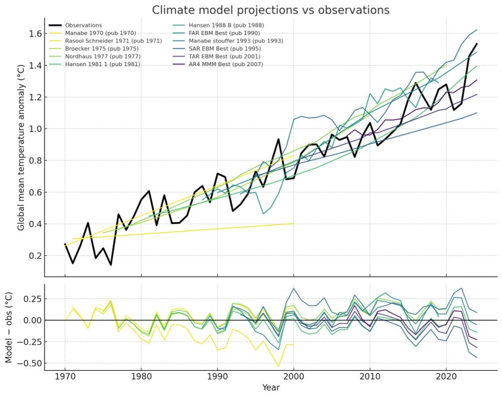
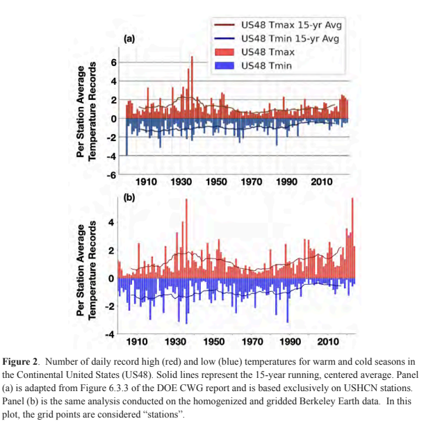
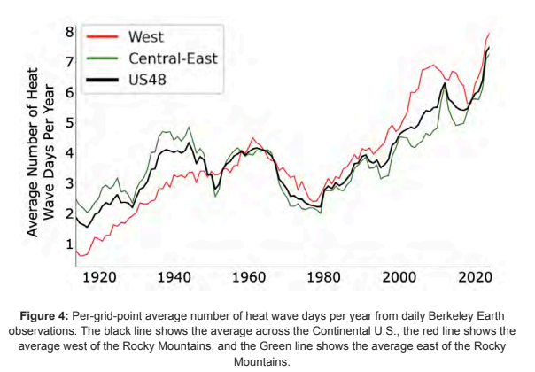
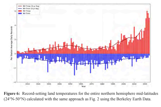
Some charts from the recent climate experts review of the recent DOE CWG report. The first chart shows how misleading taking an average of GHCN stations is because: 1) the stations are not spread uniformly across US and the 2) station network has changed with time both equipment and station locations. The second chart shows that a proper analysis shows heat wave days are increasing in the US and are now well above 1930s levels. The final chart shows that mid-latitude extreme temperatures are increasing much faster outside of the US. https://drive.google.com/file/d/1knIpC4vGrZXDsrF13RC2CujCjhbILgaa/view?usp=sharing
-
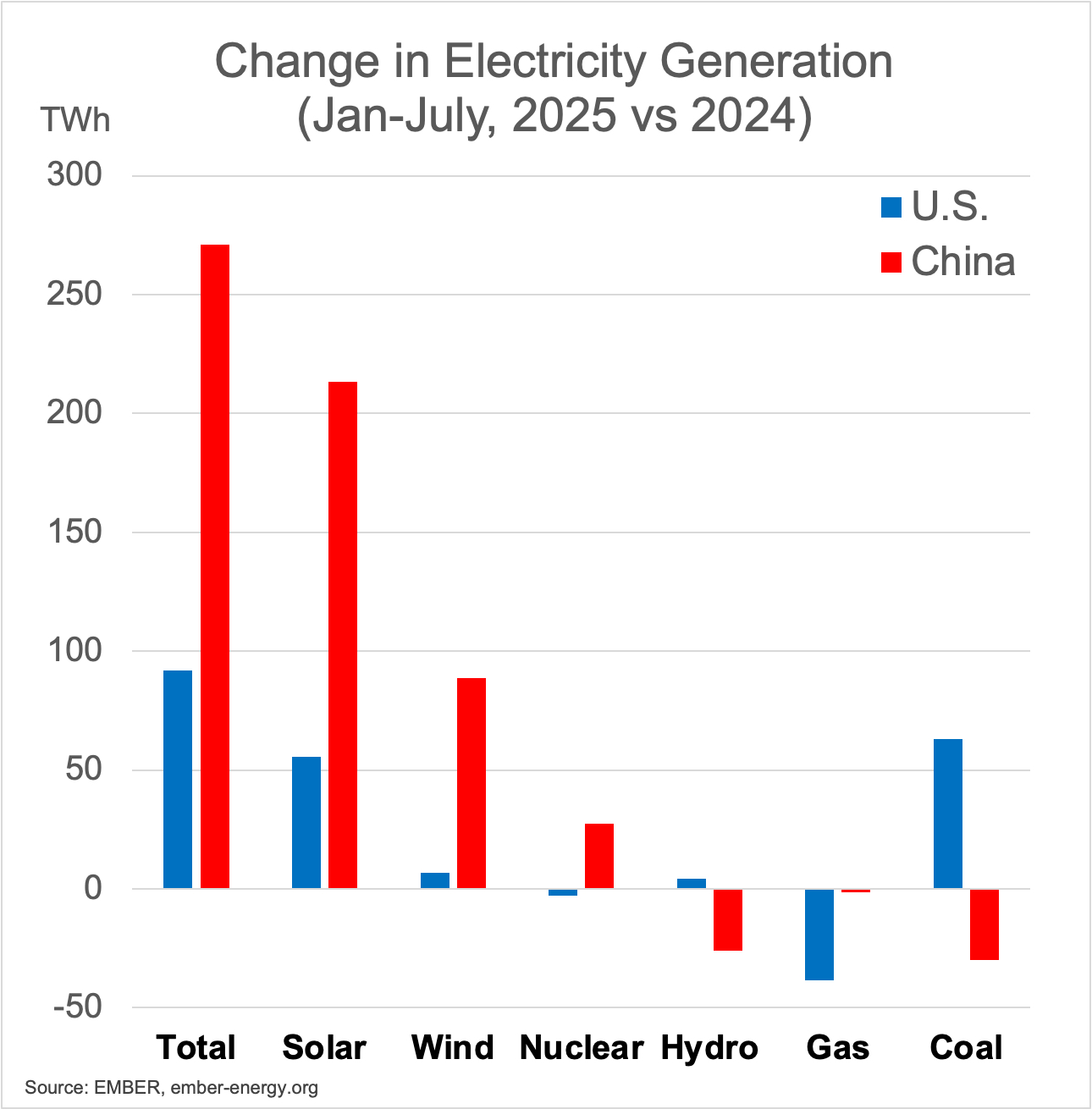
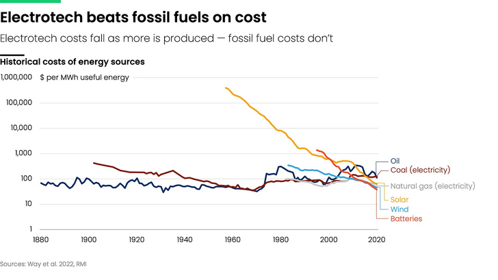
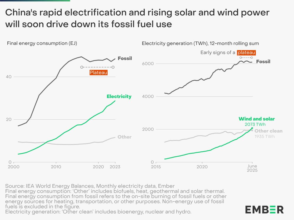
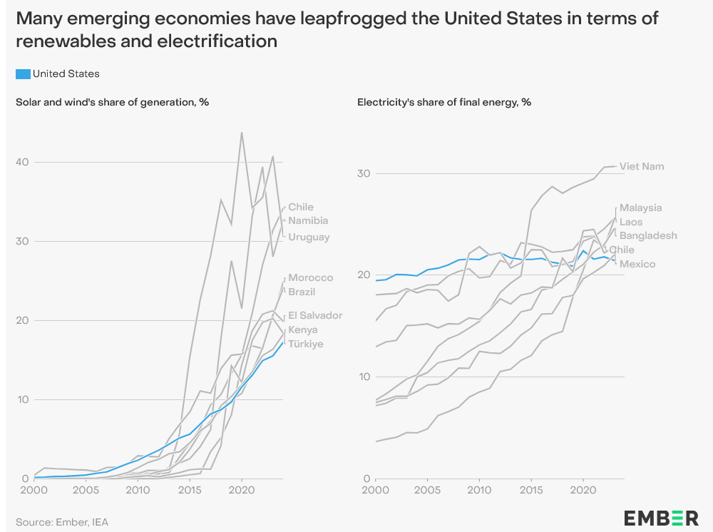
Clear we have passed an energy tipping point, with fossil fuels becoming increasingly uncompetitive. China's large manufacturing scale key in driving down costs. Countries without entrenched fossil fuel interests are leading the way and China will sell them the gear. https://ember-energy.org/latest-insights/china-energy-transition-review-2025/
-
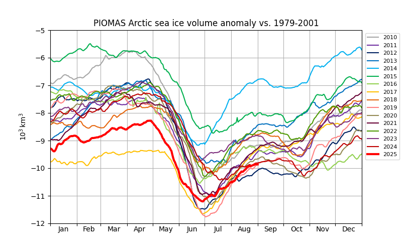
PIOMASS sea ice volume is currently number 2 behind 2012. Volume losses were unusually low this year in June, similar to 2017 in that regard.
-
-
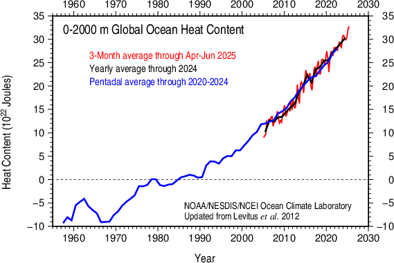
Ocean heat content in the 0-2000m layer has jumped up this year, recovering from a nino-related dip. A sign that warming at a fast clip continues.
-
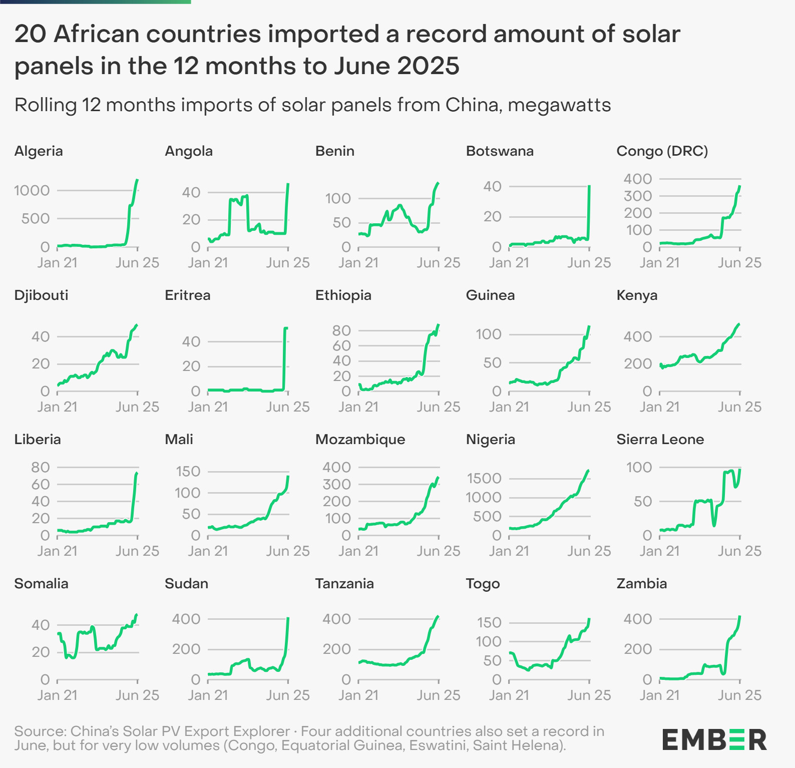
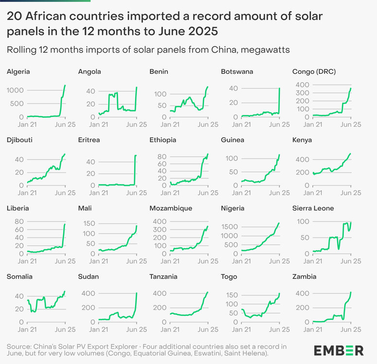
Solar is accelerating rapidly in Africa. This is mainly due to economics, lower cost of solar panels and batteries.
-
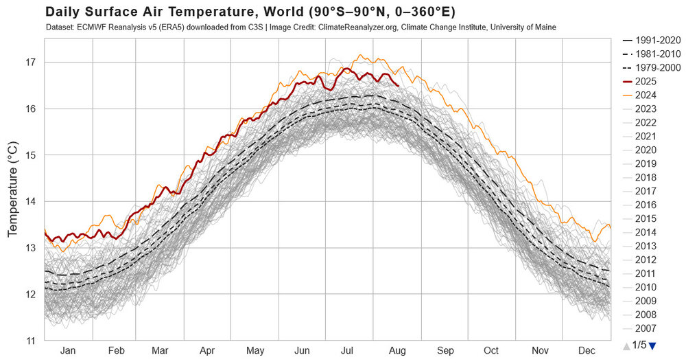
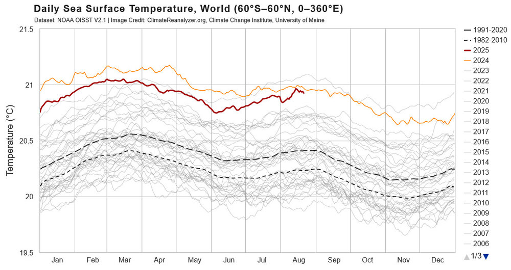
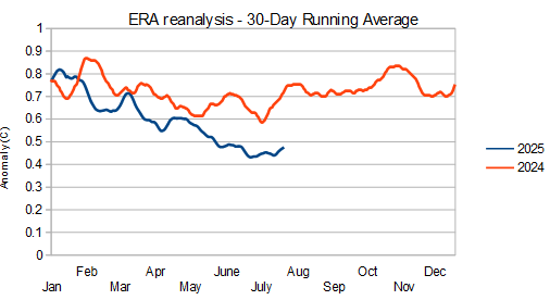
It is interesting to compare the current standing and recent trends in SST vs global temperatures. Comparing to 2024, SST have risen through the year particularly in summer months, while global temperatures have cooled relative to 2024. Difficult to compare 2025 to 2023 because of the strong rise in temperature in 2023, but just looking at August, both SST and global temperatures are somewhat cooler in 2025 vs 2023. Comparing 2025 to pre-2023 years, SST is currently warmer than any year by a good margin, while global temperatures are not well clear of the pre-2023 years. Taken as a whole, 2025 SST is like 2023, unusually warm for the enso condition; but, unlike 2023, global temperatures are not unusual for the enso state. Mid-latitude marine heat wave probably playing a role . Will be interesting to track as summer turns to fall. Guessing SST will cool will warm relative to other years and global temperatures will warm; but, we will see.
-
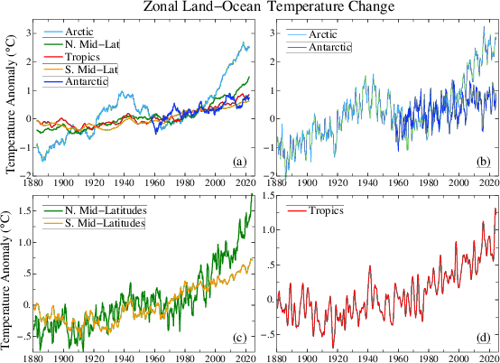
After several decades of rapid warming, arctic warming ground to a halt in the past 10-15 years. while warming in the NHemi mid-latitudes sped up. Consistent with recent trends in arctic sea ice and our recent winters.
-
Yes, UHI and global warming are both happening. The presence of one doesn't diminish the other. This thread/board is littered with whataboutism. What about this, what about that. Many things can be true at the same time. That doesn't change the big picture. Scientists from the 1970s would not be surprised by the warmer world we have today or that Phoenix has a heat island.

-
https://data.giss.nasa.gov/gistemp/station_data_v4_globe/
-
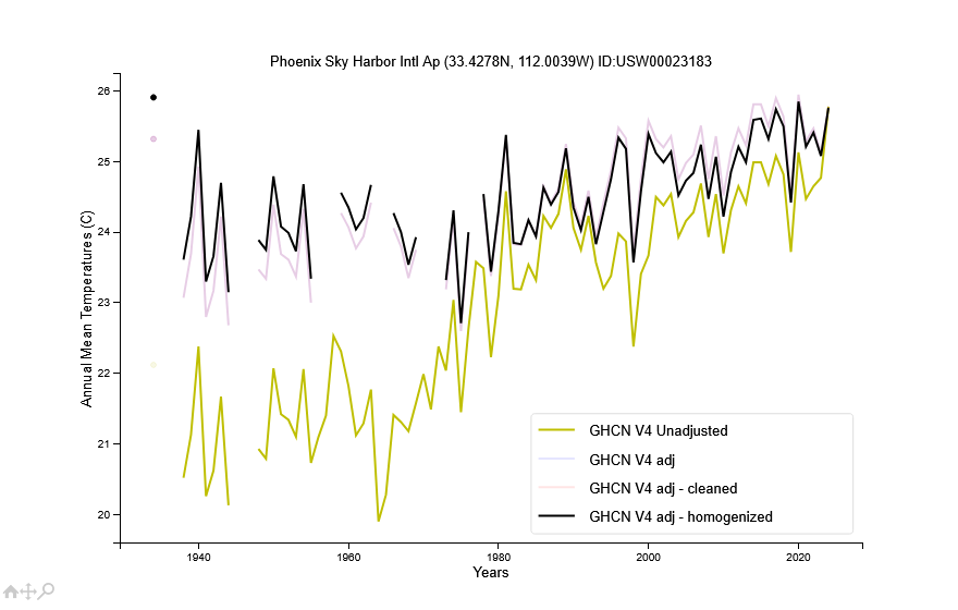
Not sure about Phoenix as a whole. But the heat island effect looks saturated at the Sky Harbor airport which isn't far from downtown. Actual and adjusted temperatures have warmed at the same rate since 1980. This means that the airport is warming at the same rate as regional sites outside of the Phoenix heat island. Before 1980 there is evidence of heat island warming at the airport (or some other site specific issue).
-
The arctic has much lower variability in the summer as melting sea ice holds surface temperature near freezing. That gives Antarctica more influence over the global mean in N Hemi summer. Unfortunately there isn't a similar plot for antarctica.
-
As the year has progressed, 2025 has cooled at an increasing rate vs 2024. Remember that 2025 stayed stubbornly warm as the el nino waned. My take is that some of the typical post-nino cooling was delayed until this year. We are still warm vs pre-nino conditions but not gobsmacking.
-
Chester County PA - Analytical Battle of Actual vs. Altered Climate Data
chubbs replied to ChescoWx's topic in Climate Change
Yes UHI at the Philly airport is saturated. UHI is non-linear with population density. Per chart below, the biggest UHI effect comes with the initial urbanization. In addition there isn't much year-to-year or decade-to-decade change in the area near the airport. Minor building in the flat part of the curve isn't going to move the needle.
-
Chester County PA - Analytical Battle of Actual vs. Altered Climate Data
chubbs replied to ChescoWx's topic in Climate Change
Here's a chart and table combining the Chesco, Berks and Philly Airport (PHL) data from the previous page or two. No doubt about it, Chesco, Berks, and PHL are all warming at the same rapid rate.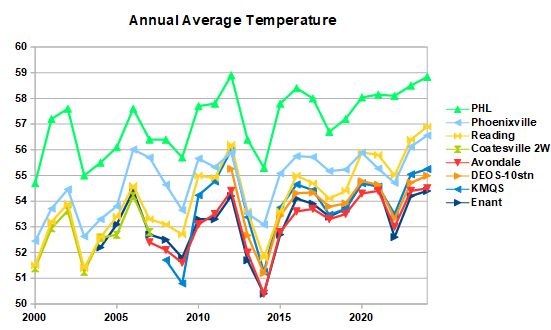
-
Chester County PA - Analytical Battle of Actual vs. Altered Climate Data
chubbs replied to ChescoWx's topic in Climate Change
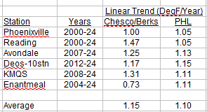
PHL isn't pulling away though. You are looking at the regression line, not the data itself. Reading (and Chesco) are warming as fast as the airport at the end of your chart., Note also that there are several years when Reading (and Chesco) is warmer than the Philadelphia Airport. That's a red flag for a data issue of some kind. Those years could have a big effect on the regression line. So what's going on here. I found two sets of data. COOP data from Xmacis starting in 1999, with the first year of full coverage in 2000; and, ASOS data from IEM which starting in 1943, but with many missing or incomplete years before 1973. Note that I was only able to find info on missing data at IEM with a one month resolution, So there may be some periods with missing data included in this analysis. The COOP data starting in 2000 shows a close match between RDG and PHL, with RDG warming faster than PHL, 1.3F/Decade vs 1.0F/Decade The ASOS data also shows a close match between RDG and PHL, but there is more scatter in the pre-2000 period, perhaps due to missing data. The difference between Reading and Philly is roughly the same in 1943 and 2024. You are beating a dead horse. There is plenty of high quality data that shows that the Airport is warming at the same rate as Chesco and the entire region. Sure you can find incomplete/inconsistent data or conduct a faulty analysis that says otherwise, but that doesn't negate the findings from the high quality data. You have to look at all the evidence. A piece of evidence that disagrees with consistent results from high quality data is inevitably flawed in some way.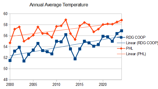
-
Chester County PA - Analytical Battle of Actual vs. Altered Climate Data
chubbs replied to ChescoWx's topic in Climate Change
The Chester County COOP data is contaminated by station moves and other station changes, particularly in the 1945-1970 period. The three COOPs in existence in 1945 all had major cooling moves in this period: Coatesville (1946-47), Phoenixville (1948) and West Chester (1970). The Coatesville and West Chester moves have been well documented in this thread. The Phoenixville move in 1948 was equally significant as shown in the chart below. During the 1941-54 period covered by the chart, PHL tracks West Chester closely, along with with ABE and the Newark Ag station. I showed above that the airport PHL tracks Chester County station data very well when station moves are excluded: West Chester 1941-69, Coatesville 1948-current, Phoenixville 2000-25, and all the other Chesco stations. There is no evidence of a major heat island problem at the Philadelphia airport in previous page or two of material. You can't understand Chester County's climate without recognizing and accounting for the station moves and other changes at the Chester County COOPs. Your charts are just highlighting problems in the Chester county COOP data and/or your analysis methods.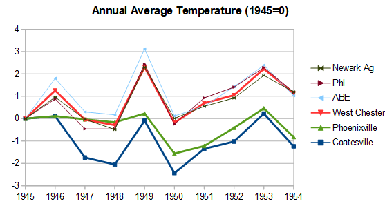
-
Chester County PA - Analytical Battle of Actual vs. Altered Climate Data
chubbs replied to ChescoWx's topic in Climate Change
Meh, your recent station table didn't include either station. Why the addition of these two stations now? Per NCDC Hopewell/Morgantown isn't even in Chester County and only starts in 1979, so has minimal impact on the 1970s. Can't find any information on Hopewell/Elverson at NCDC or IEM. Note that West Grove the highest of the other 1970s sites ended operation in 1976. Only the 4 lowest sites operated throughout the 1970s. So you are overstating the average 1970s elevation, potentially by a lot depending on when Hopewell/Elverson started-up. Its all a quibble anyway. PHL trends with Avondale for July high temperatures just like it did for annual average temperatures, I'm sure its the same story with the other Chesco stations. Why would July Highs be different than annual average temperature? One final point, The Phoenixville COOP is on the water company property. The water company property is not built up, with a few water company buildings, a small reservoir, woods and fields; and it doesn't change very much from year-to-year or decade-to-decade. Unlikely to have any heat island effects. Just another example of PHL doing a better job of matching individual Chesco station data than your network average. -
Chester County PA - Analytical Battle of Actual vs. Altered Climate Data
chubbs replied to ChescoWx's topic in Climate Change
I get 339' in 1970: Phoenixville- 105, Coatesville 1SW - 342, Devault - 360, West Chester - 440, West Grove - 449. -
Chester County PA - Analytical Battle of Actual vs. Altered Climate Data
chubbs replied to ChescoWx's topic in Climate Change
Yawn, Avondale and PHL are have similar trends for July Highs. All you are showing is that your station average doesn't match individual station data. Big change in the station network since 1970. The average station today is 100' higher.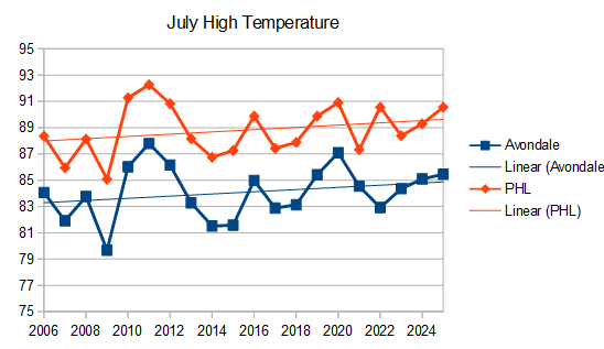
-
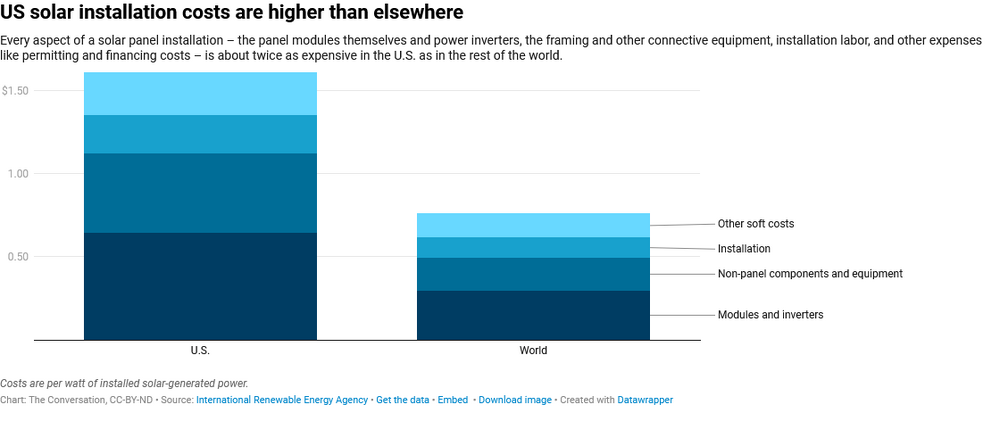
Yes, renewables and fossil fuel are completely different industries: extractive vs tech manufacturing. Fossil fuels are very profitable if you control a cheap resource. In renewables China is the low cost-supplier, with an ever widening lead. Making it difficult for the rest of the world to compete. We are a laggard in renewables from a cost standpoint due to tariffs, permitting costs and other factors. With the current administration we aren't going to catch-up either. Another factor is natural gas prices, which are well below global levels in the US due to our local production. Which also hurts the competitiveness of renewables. In the future as US LNG exports continue to increase, the difference between our gas prices and the rest of the world could shrink. We could easily end up with high cost power, vs the rest of the world, particularly China. Batteries and solar are becoming increasingly important to energy economics supplanting oil and other fossil fuels. We are way behind China and falling further behind. Hitching our wagon to the wrong energy horse. https://www.renewableenergyworld.com/solar/us-solar-manufacturers-lag-skyrocketing-market-demand/ https://about.bnef.com/insights/clean-energy/global-cost-of-renewables-to-continue-falling-in-2025-as-china-extends-manufacturing-lead-bloombergnef/