MN Transplant
-
Posts
17,625 -
Joined
-
Last visited
Content Type
Profiles
Blogs
Forums
American Weather
Media Demo
Store
Gallery
Everything posted by MN Transplant
-
Late January and February Medium/Long Range Discussion
MN Transplant replied to WinterWxLuvr's topic in Mid Atlantic
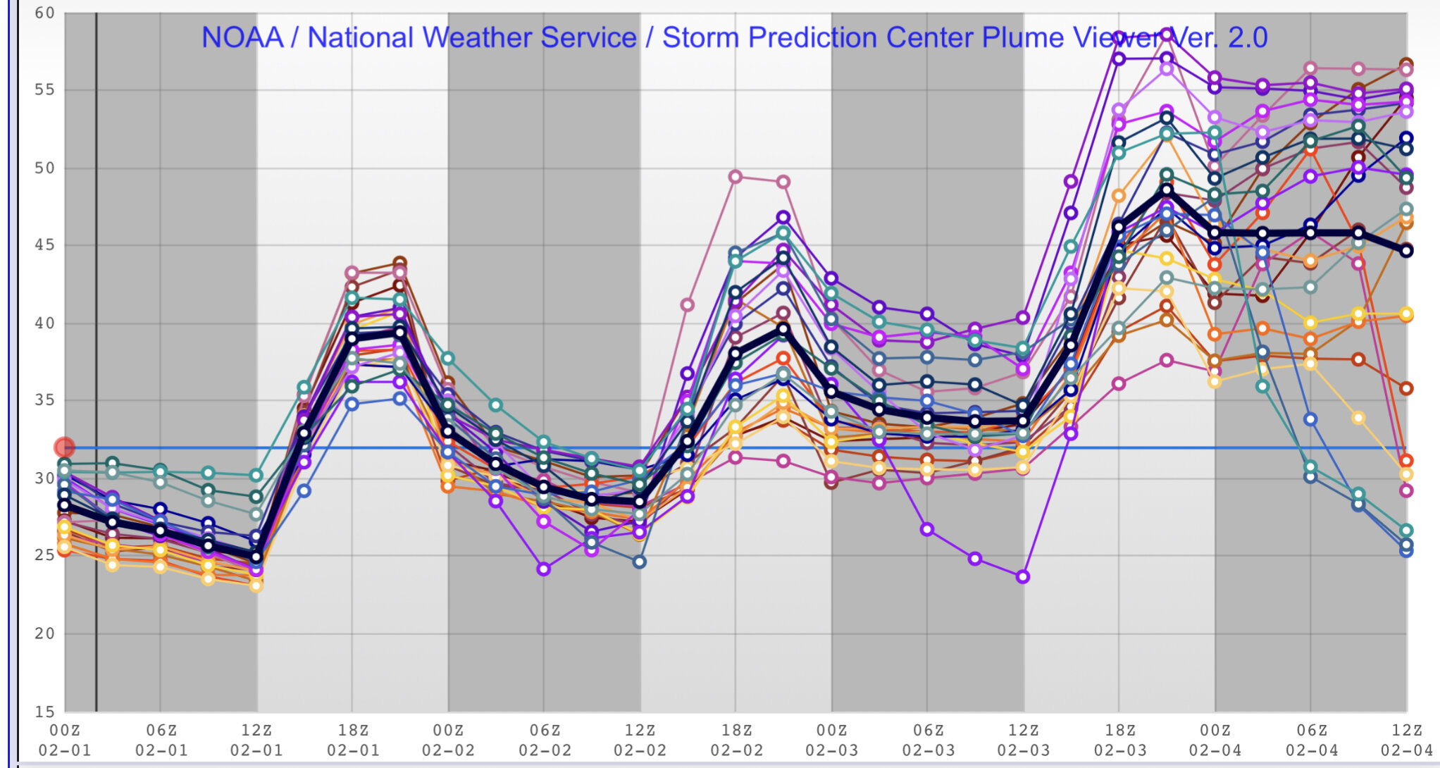
HRRR is still near 50. Makes no damn sense.- 4,130 replies
-
- 2
-

-
- prime climo
- cold canada
- (and 1 more)
-
Late January and February Medium/Long Range Discussion
MN Transplant replied to WinterWxLuvr's topic in Mid Atlantic
I know all eyes are on the precipitation, but I can’t get over what the 3km NAM is trying to do tomorrow. It holds us all near freezing all day, while the Euro, GFS, and HRRR all take us to the upper 40s.- 4,130 replies
-
- 7
-

-
- prime climo
- cold canada
- (and 1 more)
-
Late January and February Medium/Long Range Discussion
MN Transplant replied to WinterWxLuvr's topic in Mid Atlantic
I don’t actually know why they use that terminology. SREF is ensemble-based, so it uses slightly different initial conditions to see how robust the solutions are to model/observation error. It is an older system so they aren’t as advanced as other methods now. -
Late January and February Medium/Long Range Discussion
MN Transplant replied to WinterWxLuvr's topic in Mid Atlantic
2 of the 20 some members do give us snow, so, there’s a chance!
-
Late January and February Medium/Long Range Discussion
MN Transplant replied to WinterWxLuvr's topic in Mid Atlantic
- 4,130 replies
-
- 1
-

-
- prime climo
- cold canada
- (and 1 more)
-
Late January and February Medium/Long Range Discussion
MN Transplant replied to WinterWxLuvr's topic in Mid Atlantic
7am Friday DC temps: 18z GFS: 29 18z Euro: 56- 4,130 replies
-
- 7
-
-

-
-
- prime climo
- cold canada
- (and 1 more)
-
@mattie g USMNT game-time temp on Wednesday looks like it will be low single digits. I don't know who approved soccer in Minnesota in February.
-
Late January and February Medium/Long Range Discussion
MN Transplant replied to WinterWxLuvr's topic in Mid Atlantic
Wednesday afternoon - near freezing on the NAM nest, near 50 on the Euro.- 4,130 replies
-
- 6
-
-
-
- prime climo
- cold canada
- (and 1 more)
-
Late January and February Medium/Long Range Discussion
MN Transplant replied to WinterWxLuvr's topic in Mid Atlantic
One interesting difference between the 12z NAM/GFS and 06z Euro is the 00z Friday temps. Mid-40s from the American guidance while mid-50s from the Europeans. -
Late January and February Medium/Long Range Discussion
MN Transplant replied to WinterWxLuvr's topic in Mid Atlantic
The problem is, we are 4 days away and it isn't even close on any of the models. Most have rain, but the GFS pushes the cold air at the surface much more vigorously. This is a later afternoon Friday sounding from the GFS, which is the coldest of the models. It isn't going to snow.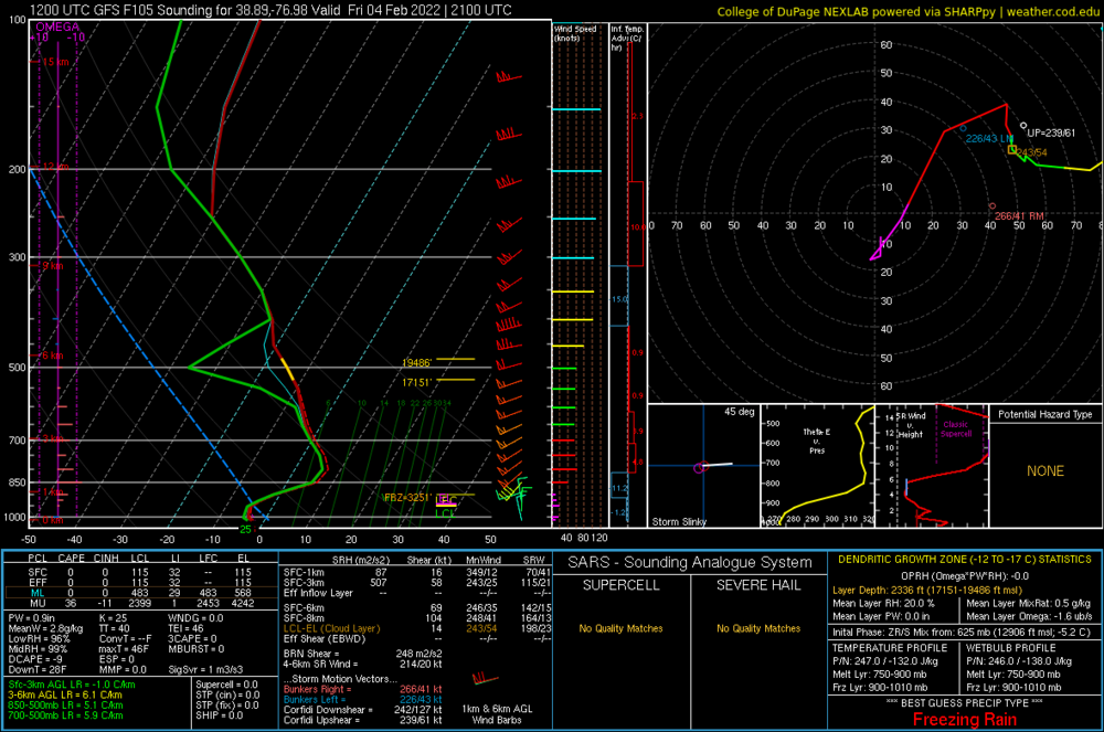
- 4,130 replies
-
- 4
-
-
- prime climo
- cold canada
- (and 1 more)
-
Looks like the climo stations will end up in the -2 to -3 range for January. That is somewhat muted because of the extremely high temps of Jan 1&2.
-
Mid-Atlantic forum winter 2021/22 snow totals thread
MN Transplant replied to North Balti Zen's topic in Mid Atlantic
Falls Church, VA 1/3/22 - 8.8" 1/7/22 - 2.8" 1/16/22 - 2.8” 1/28/22 - 1.2" Total: 15.6” (20" is roughly climo) -
January 28-29 2022 Miller abcdefu Storm Obs/Discussion
MN Transplant replied to mappy's topic in Mid Atlantic
Ended up with 1.2” on 0.14” precip. So, the temps didn’t hurt as much as the dud precip totals. It will be interesting to see the final totals for the three places that I had targeted (however imaginary) as a chase: Worchester, Riverhead (eastern LI), and Atlantic City. All of them are looking pretty good, especially LI. -
January 28-29 2022 Miller abcdefu Storm Obs/Discussion
MN Transplant replied to mappy's topic in Mid Atlantic
Nothing falling in Falls Church. Looks like 0.5” but I’ll do a real measurement later. Yet again we find out that temps don’t matter if rates are good, but if the snow is light, temps are crucial. -
January 28-29 2022 Miller abcdefu Storm Obs/Discussion
MN Transplant replied to mappy's topic in Mid Atlantic
Flake size is terrible and it is still above freezing. -
January 28-29 2022 Miller abcdefu Storm Obs/Discussion
MN Transplant replied to mappy's topic in Mid Atlantic
Now the ground is getting white. 34.0 -
January 28-29 2022 Miller abcdefu Storm Obs/Discussion
MN Transplant replied to mappy's topic in Mid Atlantic
Good thing we have a few more days before the event! 36.2. Snowflakes aren't melting as fast. -
January 28-29 2022 Miller abcdefu Storm Obs/Discussion
MN Transplant replied to mappy's topic in Mid Atlantic
So, over 6 hours. 38.4 here. Occasional snowflakes wafting down. -
January 28-29 2022 Miller abcdefu Storm Obs/Discussion
MN Transplant replied to mappy's topic in Mid Atlantic
Only place with 2"+ precip is right on the Cape. Kind of takes "historic" off the table. -
January 28-29 2022 Miller abcdefu Storm Obs/Discussion
MN Transplant replied to mappy's topic in Mid Atlantic
The latest HRRR puts DC into the 40s, but it still ends up ok because the precip is a bit delayed. -
January 28-29 2022 Miller abcdefu Storm Obs/Discussion
MN Transplant replied to mappy's topic in Mid Atlantic
I think there is still timing issues. Some of the data is coming later for free, but still, it does take a bite out of the full pay sites or the "upgrade" sites (Pivotal, Windy, Weather.us, etc.). -
January 28-29 2022 Miller abcdefu Storm Obs/Discussion
MN Transplant replied to mappy's topic in Mid Atlantic
35.8 College of Dupage has also added the 06/18z Euro! We are going to see a lot of the sites upgrade their Euro offerings with the news this week that ECMWF has opened up a bunch of their data for free. -
January 28-29 2022 Miller abcdefu Storm Obs/Discussion
MN Transplant replied to mappy's topic in Mid Atlantic
If you click on the floater segment from College of Dupage you can get to the 1 hr precipitation for the NAM Nest. There is a band mid-day tomorrow up by BOS that is ~0.30". Awesome stuff. I toyed with buzzing up to Atlantic City also, but it maxes out at about 0.10"/hr and is in the wee hours of the morning. While this would last longer and have more wind, I've already seen those rates this year on Jan 3rd. -
January 28-29 2022 Miller abcdefu Storm Obs/Discussion
MN Transplant replied to mappy's topic in Mid Atlantic
NAM things -
January 28-29 2022 Miller abcdefu Storm Obs/Discussion
MN Transplant replied to mappy's topic in Mid Atlantic
30.9 Laughing at the 06z NAM.