chubbs
-
Posts
4,165 -
Joined
-
Last visited
Content Type
Profiles
Blogs
Forums
American Weather
Media Demo
Store
Gallery
Everything posted by chubbs
-
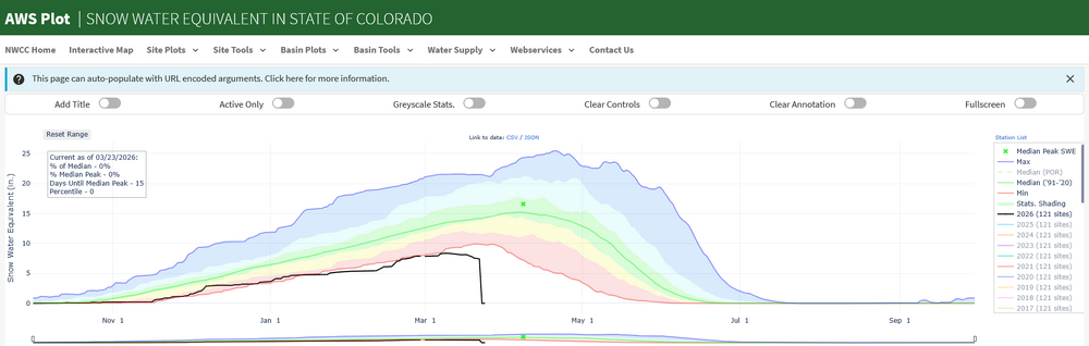
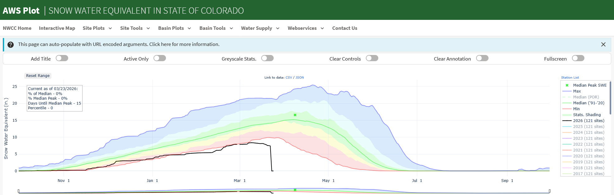
Here's a climate first. The Colorado snowpack is gone 15 days before the typical peak.
-
Animation showing the records tied or broken in the past 24-hours. Pink are March records.
-
A couple of points to add to Don's. The absorption bands of CO2 and H2O are different. There's overlap in some regions, but CO2 also absorbs in regions where H2O doesn't. More importantly H20 has a much higher boiling point than CO2 and is a liquid at atmospheric temperatures while CO2 is a gas. Because of the higher boiling point, the amount of H2O in the atmosphere is controlled by temperature. As Don points out, CO2 is more important relative to H2O in the upper atmosphere where heat is radiated to space and it is too cold to hold much water vapor. Per paper below, CO2 is the earth's thermostat. CO2 controls the amount of H2O in the atmosphere. If there was less CO2 there would be less water vapor and vice versa. As the paper states: Without the radiative forcing supplied by CO2 and the other noncondensing greenhouse gases, the terrestrial greenhouse would collapse, plunging the global climate into an icebound Earth state. https://www.science.org/doi/10.1126/science.1190653
-
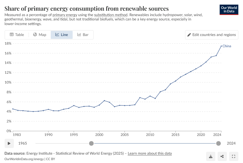
Funny people can take the same data and come to different conclusions. The point you are missing is that energy technologies: solar, wind, batteries, EV etc., are getting better and cheaper on well established technology improvement curves. Until recently these technologies weren't competitive with fossil fuels. However, going forward they are going to have an increasing cost advantage and subsidies will be less and less important. As an example, China is ending their subsidies of electric cars. Yes, China is still building coal plants, but renewable share of electricity generation is still growing rapidly, and coal use in China dropped last year.
-
No the big difference in my EV chart and yours, is the US vs global. The final numbers aren't in yet, but global EV sales grew by roughly 20% last year, held down by slowing sales in the US. The US is a laggard in both EVs and solar with costs higher than the rest of the world due to tariffs and other factors. Expect the global EV ramp to continue in 2026 spurred by the current oil crisis. https://www.instituteforenergyresearch.org/international-issues/ev-sales-grew-20-globally-in-2025/
-
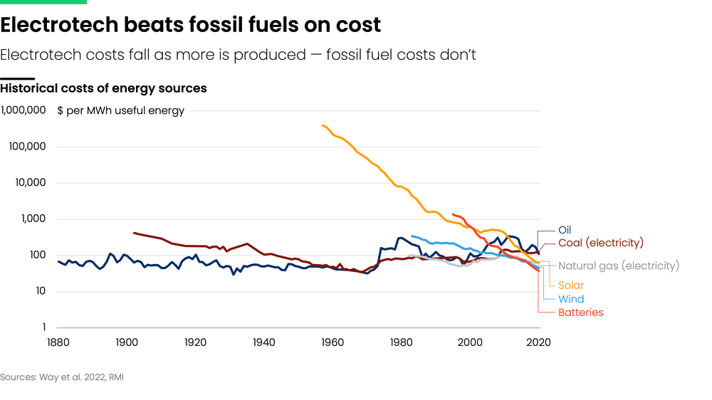
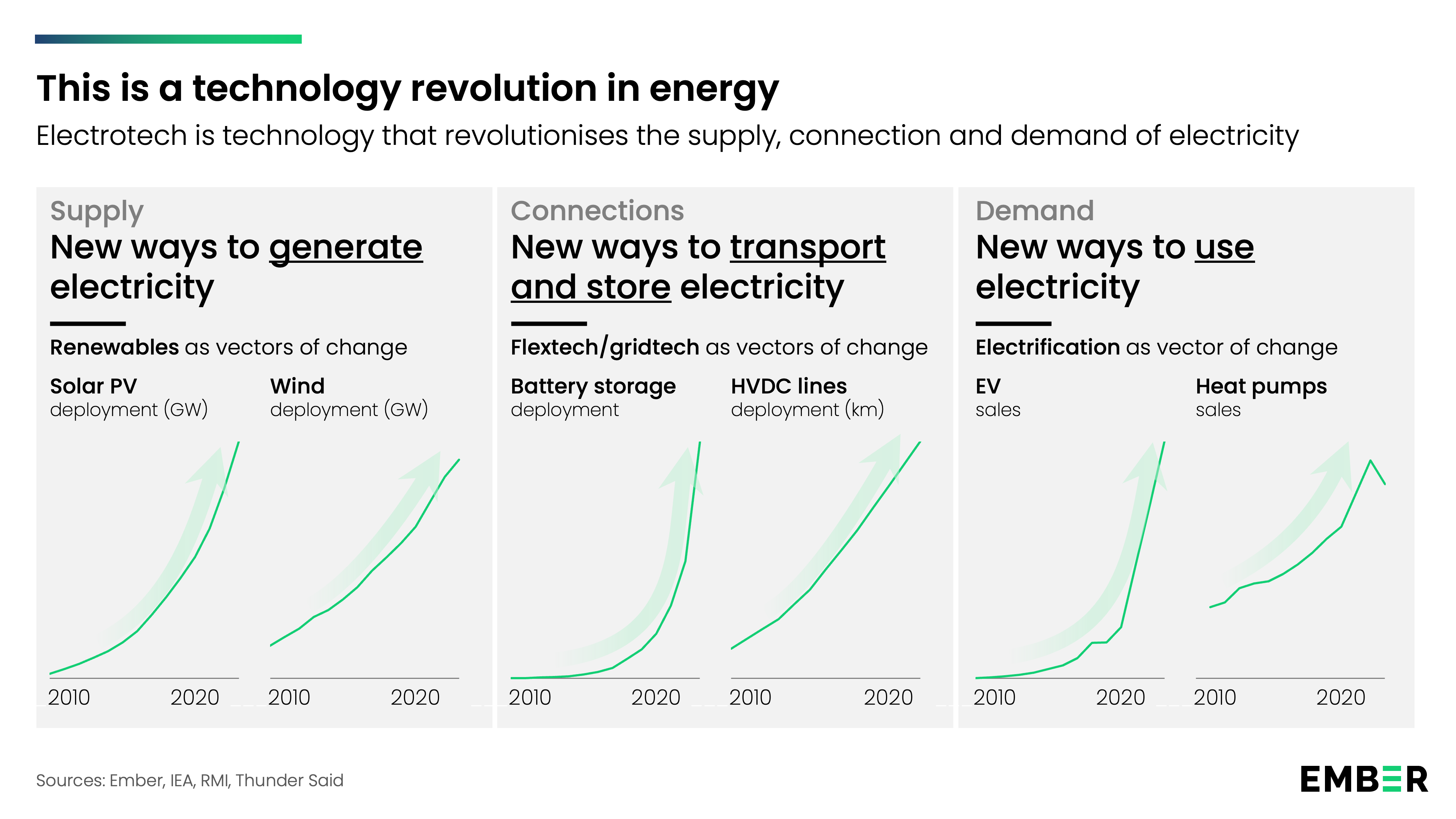
Most of the misleading information I see comes from fossil fuel and utility incumbents. For instance, per top link below, the "expense" of additional baseline power to backstop renewables is a fossil fuel fallacy. Renewables are becoming cheaper. Not everywhere and in every application; but, the long term trend is clear. In the future fossil fuels will be less competitive than they are today. Its not only renewables. A number of key energy technologies are on long-term improvement curves: batteries, EV, heat pumps etc. They work together to make energy generation, storage, transmission and use cheaper and more efficient. Meanwhile fossil fuel use is a mature technology; that uses a diminishing resource; and, that carries geopolitical and climate risk that isn't baked into the price. https://www.electrotech-revolution.com/p/renewables-allow-us-to-pay-less-not https://ourworldindata.org/cheap-renewables-growth https://www.electrotech-revolution.com/p/what-is-electrotech-and-what-will

-
The other problem for nuclear has been CO2 accounting. We'd have much more nuclear with stronger climate policy. I am bullish on nuclear long term reflecting ongoing technical progress; but, it isn't going to contribute much in the US in the next decade or two. We should be on a build everything path, with a cost penalty for CO2.
-
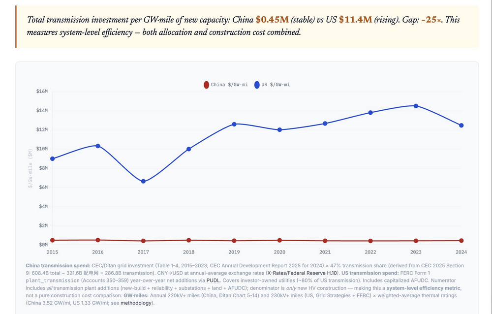
Yes the grid is a big problem in the US. Link below is a long thread on the US vs China grid. We aren't competitive, as an illustration per chart below, China gets 25x the payback from grid investment dollars. The thread doesn't mention batteries, which can mitigate grid investment somewhat. The developing global south, with abundant local solar, may avoid heavy grid investment. https://x.com/NiyerEnergy/status/2032265048723259781
-
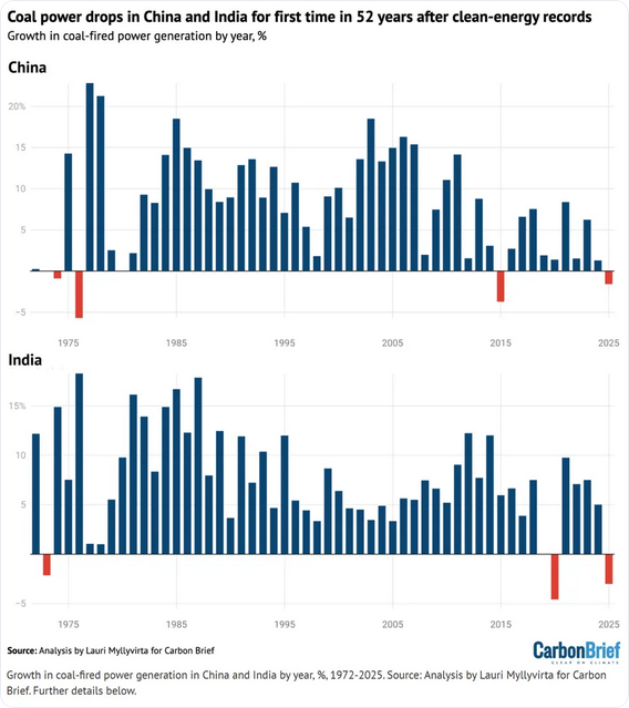
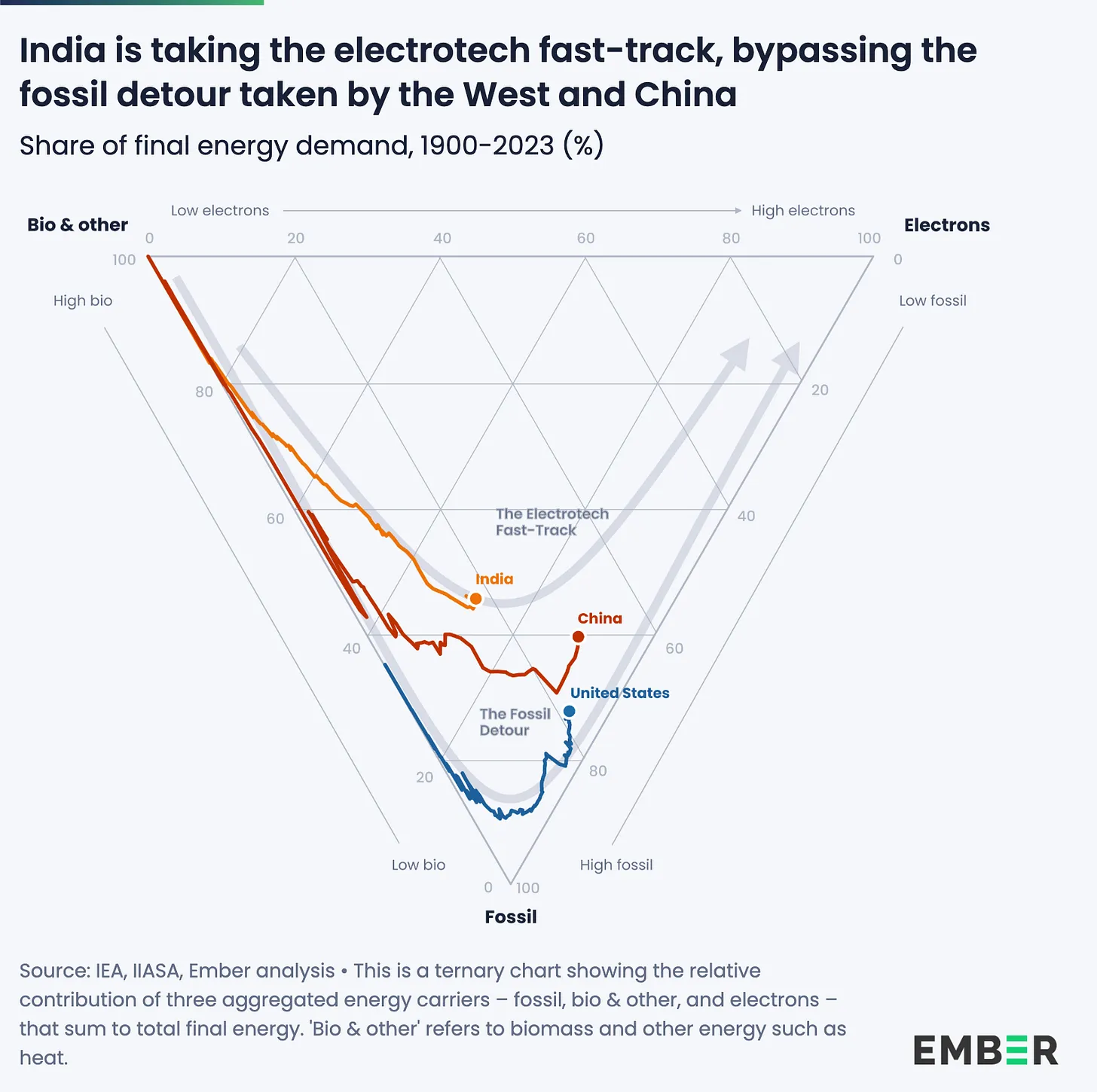
Yes fossil fuels are energy dense, but that is only one aspect of the comparison and its not very important; i.e. renewables are cheaper despite lower energy density. The energy density of solar is higher than the energy density of civilization; i.e., roofs, parking lots, etc could power our cities. Your chart of India and China reflects the past not the present, yes CO2 use grew rapidly as both countries industrialized. However, coal use has peaked in both countries. Oil has peaked in China; and, China's CO emissions decreased last year. India is only beginning to use EVs; but, EV use is ramping.
-
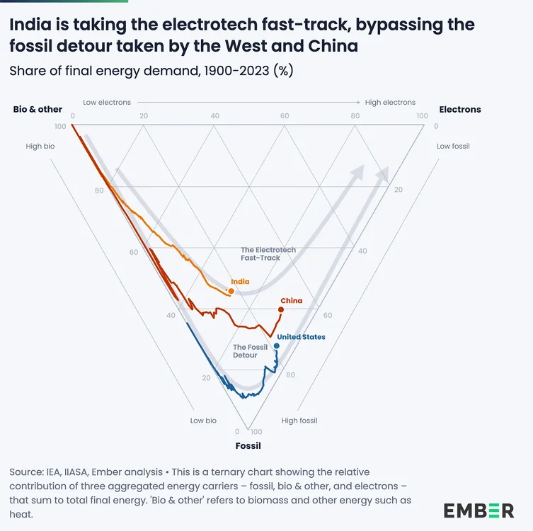
Not sure what "physics" you are referring to. Sure fossil fuels easily beat all comers for a long time; but, the day of clear advantage has passed, and fossil fuels continue to slip relative to competition. The combustion of fossil fuels is: inefficient, technically mature, and uses a diminishing natural resource. Meanwhile renewable energy and batteries continue on steady cost improvement curves. The current crisis only makes fossil fuels more costly and highlights the geopolitical risk. It isn't easy to replace fossil infrastructure; but, long-term costs are lower without the disruption risk. This will become more apparent as some countries move away from fossil fuels and flourish. Even the US with pro-fossil and anti-renewable policies isn't ramping fossil fuel use, only slowing the transition away. Linked a blog article that discusses India. Climate change is only the cherry on the non-fossil cake. https://www.electrotech-revolution.com/p/indias-electrotech-fast-track
.thumb.png.8502c0d63c891be686a17607790a1ee1.png)
-
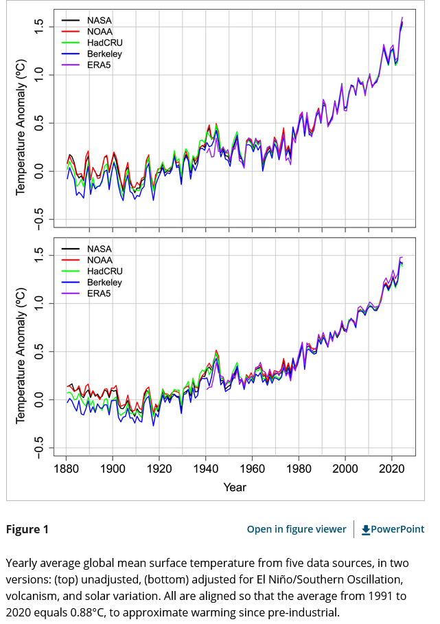
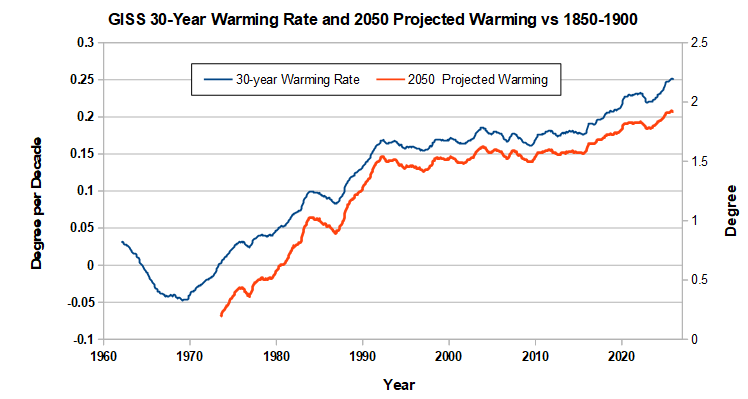
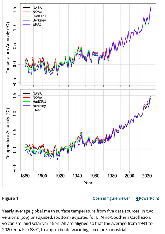
There's no doubt that warming is accelerating. The blue line in the chart below is the warming rate over the previous 30-years using GISS. The 30-year warming rate started to increase at the start of the 2015/16 nino and has been increasing steadily since then. The latest 30-year warming rate includes a little over 10 years of faster warming and roughly 20 years at the slower pre-15/16 nino rate, so the chart is completely consistent with the 0.35/decade rate for the past 10 years estimated in the paper. Note that it would take until 2045 for the current warming rate to be fully reflected in the 30-year rate, assuming it continues. When warming started to increase in 1970, the 30-year warming rate didn't stabilize until the 1990s. The red line takes the current 30-year warming rate and extrapolates temperatures in 2050 under the assumption that warming will continue at the same rate as the last 30 years. The projection is conservative as the faster recent warming rate isn't fully reflected in the 30-year rate. Warming will have to slow down somewhat to hit the latest 2050 number. Of course we don't know the future. The main factor determining 2050 temperatures is our emissions. The recent increase reflects increased man-made forcing as greenhouse gases continue to increase; while, cooling aerosols have dropped. We have agency, but our ability to influence 2050 temperatures decreases with time as more and more of our emission trajectory gets baked in. Our odds of staying under 2C are decreasing.
-
Here's a blog article on the "acceleration" paper that you linked above by a climate scientist who wasn't involved. Good discussion of what is known and not known about recent global temperature trends. Bottom line, we already knew that warming was accelerating; but, we don't know why with any precision which makes it difficult to extrapolate forward. Not a good position to be considering the amount of warming we have already experienced. https://diagrammonkey.wordpress.com/2026/03/07/for-a-rainy-day/
-
Yes, If you just used the past 10 years there would be a problem due to the short time period and natural variability; but, that's not what was done. Here's the underlying journal article and a blog which describes the procedure in layman terms. To summarize they are using: 1) data since 1880, 2) accounting for the predominant sources of natural variation (enso, volcanoes and solar), 3) Applying statistical models that allow the warming rate to change if justified by the data. Per chart below the acceleration is apparent after enso has been accounted for. https://tamino.wordpress.com/2025/06/08/picking-up-speed/ https://agupubs.onlinelibrary.wiley.com/doi/10.1029/2025GL118804
-
Let me clarify. I have no problem if someone makes a sound case using data. But often UHI is thrown out without looking at any data. That's when it is usually a red herring.
-
In my experience UHI is a red herring. Often raised; but, never documented with hard evidence. UHI is a local effect while climate change is global. There are thousands of stations in the US. Easy to determine if most of the warming is from UHI or not.There is UHI of course, but it doesn't have much impact at most stations. The urbanization occurred a long time ago or doesn't occur near the station. Lander appears to be one of those cases. The Lander airport weather station is well outside of the town's footprint. In a dry area like Lander irrigation or grass watering could have an effect. The photo shows greening from watering outside the built-up area. There could easily be a negative or small UHI impact there. Lander's population rose rapidly before 1970 but hasn't changed much since 1970; with ups and downs, and a small decline since 2010. Lander Airport temperatures have risen slightly since 1940, with most of the rise after population stabilized in 1970. There doesn't appear to be much correlation between temperature at the airport and local population, with flat or declining temperatures during the most rapid population rise in the 1950s and 60s. Note that the coolest year 2017 is impacted by missing data. Other regional stations weren't cool that year. Removing 2017 would increase recent warming somewhat. Bottom-line there isn't much evidence for a UHI warming impact in recent decades. Its possible that grass watering is counteracting other population effects; but, there isn't enough information to make a strong case.
-
2026-2027 Super El Nino
chubbs replied to Stormchaserchuck1's topic in Weather Forecasting and Discussion
AndyHazelton(@AndyHazelton)_X.png.60dc188bc20a0d9801430f65e138336a.png)
-
May have been wrong in calling for a new record in March. Only 0.01C off the record ytday.
-
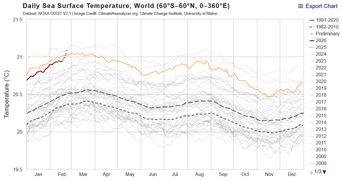
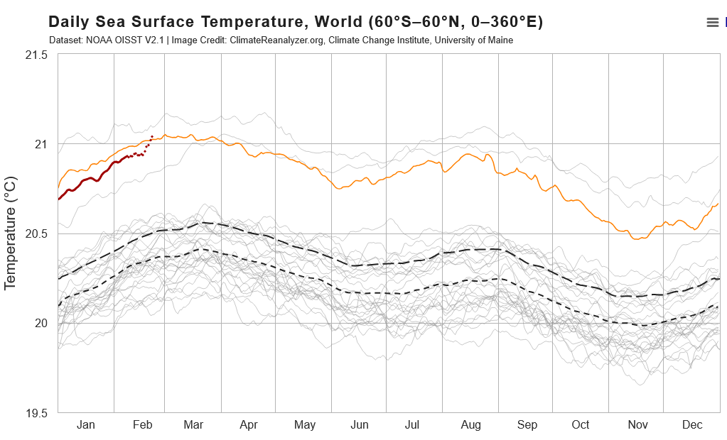
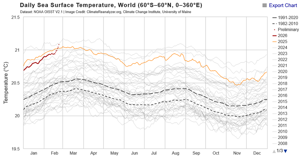
SST trend so far this year is consistent with a nino spike to record temperatures, with the caveat that it is early in the nino cycle. I took years between 2010 and 2022 off the chart to better isolate 2023 and later at the top of the chart. On the chart, 2023 is the coldest of the 4 recent Jan and Feb, red is this year and orange 2025. So far this year SST are tracking 2023, but roughly 0.15C higher. The recent spike in SST has brought 2026 above 2025, approaching record SST in 2024. 2023 moved into record SST territory in mid-March. This year is on a similar pace.
-
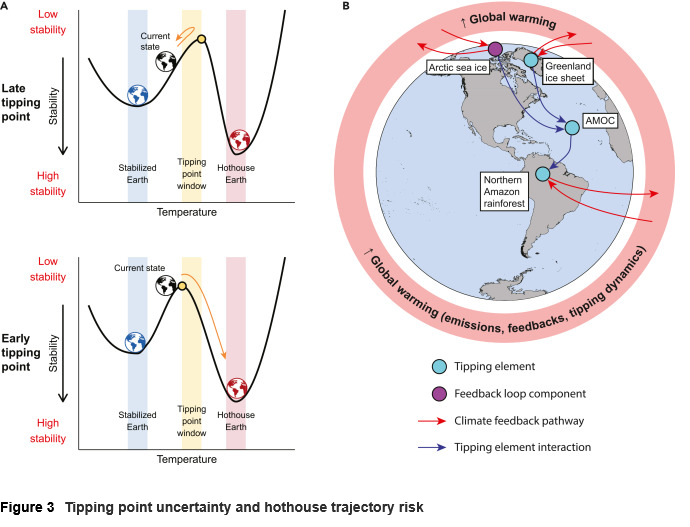
Recent paper on tipping points has good discussion on: our climate trajectory, the tipping point concept, how close we are getting to tipping, and the scientific uncertainty. https://www.cell.com/one-earth/fulltext/S2590-3322(25)00391-4
-
Agree with Don's comment. My problem isn't the facts he is citing, its the things he is leaving out or not aware of. I agree that CO2 is critical for plant growth and that fossil fuel reserves are finite. However, you need to look at all of the effects of CO2 not just the beneficial ones. Crop yield is one of the most well studied areas of human activity. Its just as easy to perform a controlled experiment on temperature, water, seed variety, fertilizer, etc as CO2. There is also a large amount of real world data on crop yield. To say that we only understand CO2 impacts on agriculture and can't quantify non-CO2 impact indicates a lack of knowledge on his part. The same thing can be said about climate science in general, he doesn't seem aware of the large body of scientific work on CO2 and climate change. The beneficial and harmful impacts of CO2 are well known; as is the balance between harmful and beneficial. There is also the tone of the response. He has proved his points with "indisputable science" while my response is "predictable" or "fake climate crisis RELIGION". Doesn't make me look forward to future exchanges.
-
Per Wikipedia the CO2 Coalition is a climate denial organization funded by fossil fuel interests. The CEO is a former head of the American Petroleum Institute. Sure plant life thrived when CO2 was higher but natural temperatures change occurred slowly which allowed accommodation through evolution. The idea that CO2 is plant food is climate denial myth. High temperature and intensification of precipitation counteract CO2 benefits on plant growth. The plants that thrived under higher CO2 were not the same plants in the same locations as today. For instance, If warming continues the Amazon rain forest and Boreal forests will transition to grasslands releasing large amounts of CO2. The same with animals, cold-blooded reptiles were favored in warmer times. Mammals were all small to shed heat. The bottom 2 links cover past mass extinction events. Notice how many where caused by episodes of volcanic activity that released CO2 and other greenhouse gases. https://www.theclimatebrink.com/p/is-co2-plant-food-why-are-we-still https://www.sciencenewstoday.org/10-mass-extinction-events-and-what-caused-them https://www.livescience.com/planet-earth/climate-change/19-mass-extinctions-had-co2-levels-were-now-veering-towards-study-warns
-
Let me rephrase. Of course we will continue to solve problems. The ones that will be difficult to solve will: be complex, need a political solution, have vested interests that hinder a solution, and which are beyond the experience or understanding of most people, i.e., subject to misinformation.
-
Yes, climate change is an amplifying factor. Its not a root cause, but makes problematic weather or problems in society worse. Likewise its emblematic of our ability to address complex problems. If we can't address climate change we won't solve other problems either.
-
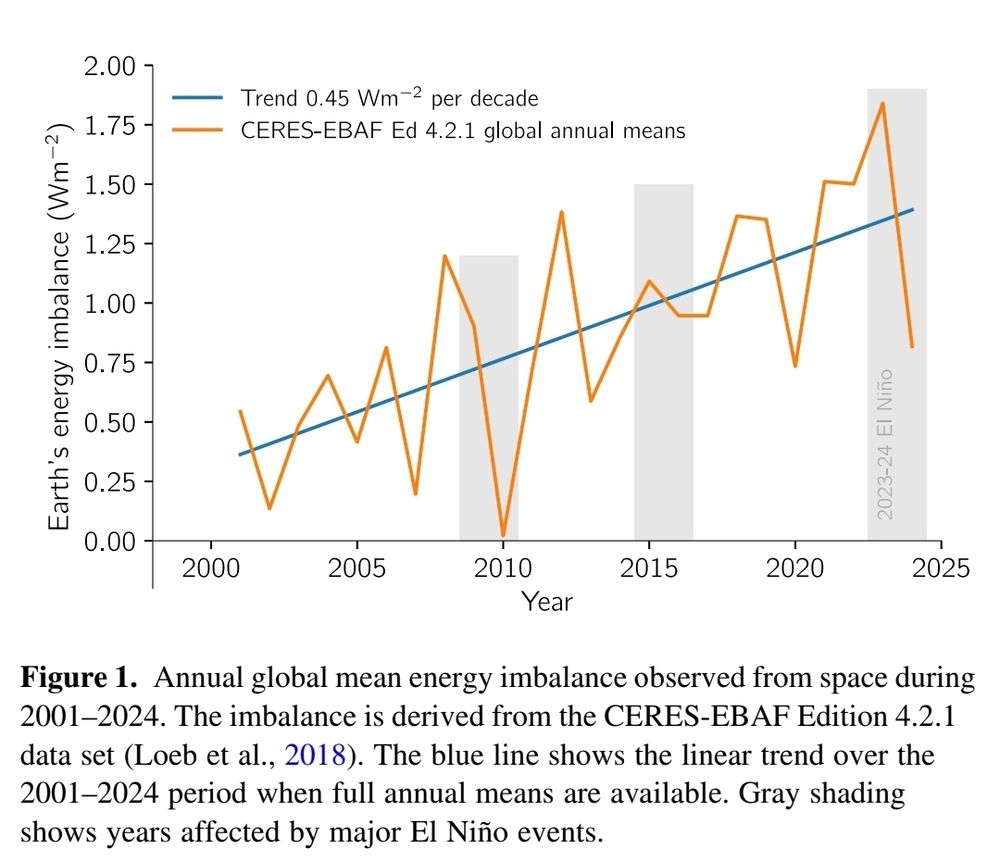
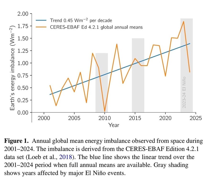
This chart shows the enso effect more clearly. Big dips in net radiation due to radiation to space occurred in 2010 and 2024 ninos. The correlation isn't perfect because there are other factors as well. Cloud cover for instance impacts the amount of sunlight that gets reflected back to space. Less clouds is contributing to the current increasing rate of heat build-up in the climate system. Reduced cloud cover is a positive feedback to warming temperatures. In-any-case the climate system isn't constant. As I pointed above, averaging over 11 years cancels out the short term variation.
-
I'd be cautious without a peer reviewed paper. There is a lot of misinformation on climate out there. We see it here all the time. Most of the published studies I've seen show a negative effect. One that will increase in the future. Warmth is a benefit in northern areas, but a negative further south. Here are a couple of links. https://www.nature.com/articles/s43017-023-00491-0 https://sustainability.stanford.edu/news/climate-change-cuts-global-crop-yields-even-when-farmers-adapt


.png.e5e8757ab7291d7f48a13f61541948f4.png)