radarman
-
Posts
14,464 -
Joined
-
Last visited
Content Type
Profiles
Blogs
Forums
American Weather
Media Demo
Store
Gallery
Everything posted by radarman
-
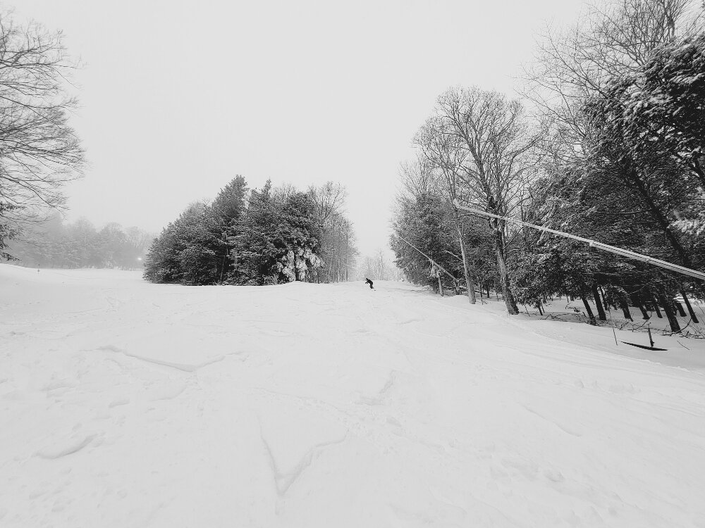
Heard the cord was amazing this morning. Yesterday heard the woods were a bit crusty, but maybe some of it has been skied in by now. East Glade got a lot of traffic. Not sure I'd try Tomahawk or Beast yet.
-
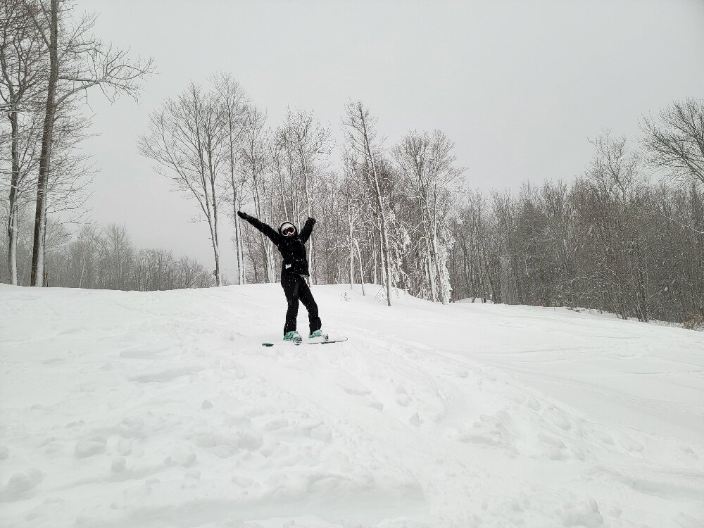
God bless em, they've made a serious investment and we certainly appreciate it. Just a blast at the Beast early this morning
-
10-12" dense up top, all the trails and East Glades open. Chairs loaded at 830, SN+ til 10AM, then maybe 15 mins of -RN that made things sticky. But right back to heavy snow, huge flakes. Still pounding now as we head off to work.
-
Heavy snow at Berkshire East and quite a bit on the ground
-
6" is already a win and I was glad to see your obs this AM. We'll see how Charlemont did shortly... thinking pretty well.
-
3" and pinging
-
Awesome, glad you enjoyed it. They have done a really good job with the snowmaking and hopefully get 6+" tonight and tomorrow. The trails are so well groomed that folks will be able to ski the powder aggressively on trail. Can't decide whether it's worth going to S VT tomorrow or just heading there.
-
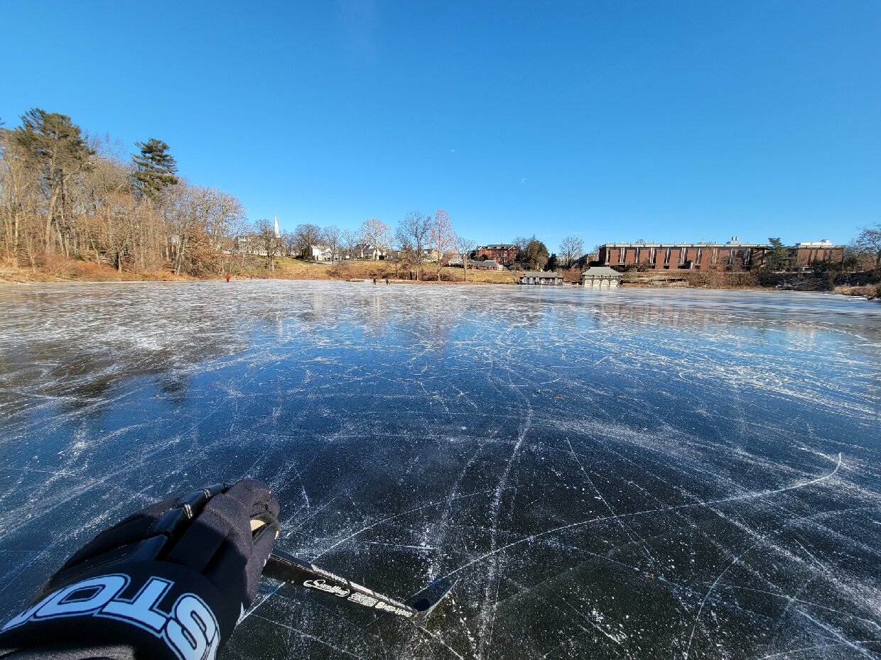
Primo today. I heard the Oxbow was wonderful also. Only the lowest bodies of water were smooth and black, my usual spots here in Btown are shot. This page has some pretty good reports, lots of folks were out in Noho today, everybody commenting how nice it was to see so many smiling faces. https://m.facebook.com/groups/hilltownpondskaters/
-
I didn't either but a history of skiing does seem to quicken the learning curve. I would think that some of the kettle ponds in SEMA should be pretty good to go after the next cold shot, if not already.
-
Ice like this only come along every 3 or 4 years. Definitely improves the winter grade. Alas we hardly knew ye

-
Almost perfect skating. 3" of black on Paradise Pond at Smith College in Noho, can skate all the way up the Mill River like a canal in Ottawa
-
Reports of wonderful pond ice in the valley... today's the day... after this it's shot.
-
Monitoring a potential important TV to East Coastal storm: Jan 17
radarman replied to Typhoon Tip's topic in New England
Maybe 1/4/18 the last one? -
The GEFS have a split camp down south, up north the hp is centered further west and wouldn't be so quick to retreat I don't think.
-
given where the euro is, there is no reason to panic just yet
-
That was the bruins offense exploding
-
1.25" in the center of town. Wrapping up now.
-
I think they just missed it. A little too far north. And also, their location pretty much sucks orographically, or at any rate, it's a local min. It's all snowmaking I think. At any rate, they didn't report any new this morning. With that said, it wouldn't be the first time they'd slacked on the snow report. But the conditions are getting pretty decent now regardless.
-
SN, big fat flakes, heavy coating. At elevation Plainfield, Ashfield, Conway must be getting croaked.
-
steady light snow here at the tip, thing must run 200mi
-
lolz
-
How about a small thursday night event with a n stream disturbance?
-
Berkshire East just got a heavy duty streamer. They could use it.
-
4.5" final with a extra inch falling over the course of the morning. 2.5" at the Beast made for some pleasant skiing earlier. Definitely ramped up west of Greenfield, poor Chris deserves a microbomb snaking down from Brattleboro kind of like Burlington VT got in Jan 2010.
-
Even in GC schools are closed already. I mean maybe they get some east slope magic, but they could also have a run of the mill 1-2", of which they get 20x a year. I guess when you have nobody to drive buses and plow and teach and go to class, you might as well bag it.