

GaWx
-
Posts
20,005 -
Joined
About GaWx

Recent Profile Visitors








-
2026-2027 Record-breaking El Nino
GaWx replied to Stormchaserchuck1's topic in Weather Forecasting and Discussion
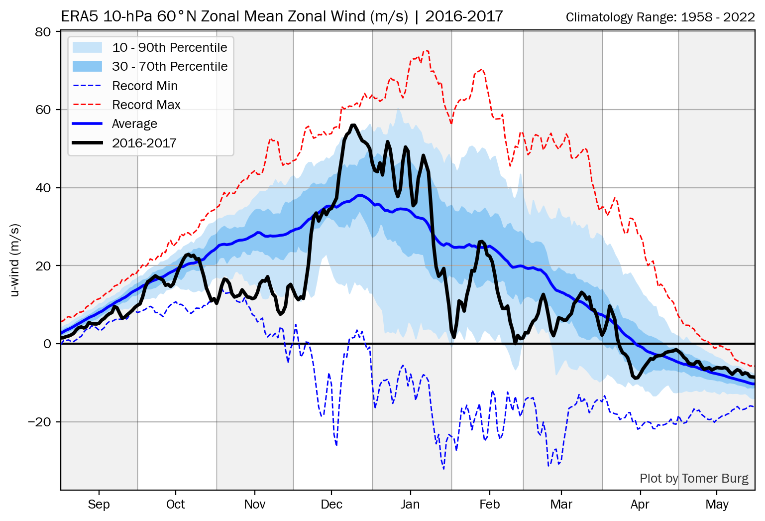
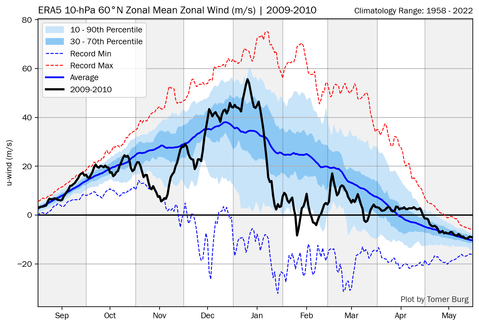
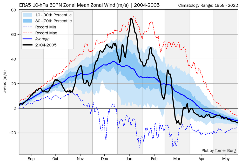
John, There is a record weak SPV for early Nov being modeled, which would result in anomalies of ~-20 m/s. It may not result in an actual wind reversal (<0 m/s), but, say, a +5 m/s event would still be record shattering. -
2026-2027 Record-breaking El Nino
GaWx replied to Stormchaserchuck1's topic in Weather Forecasting and Discussion
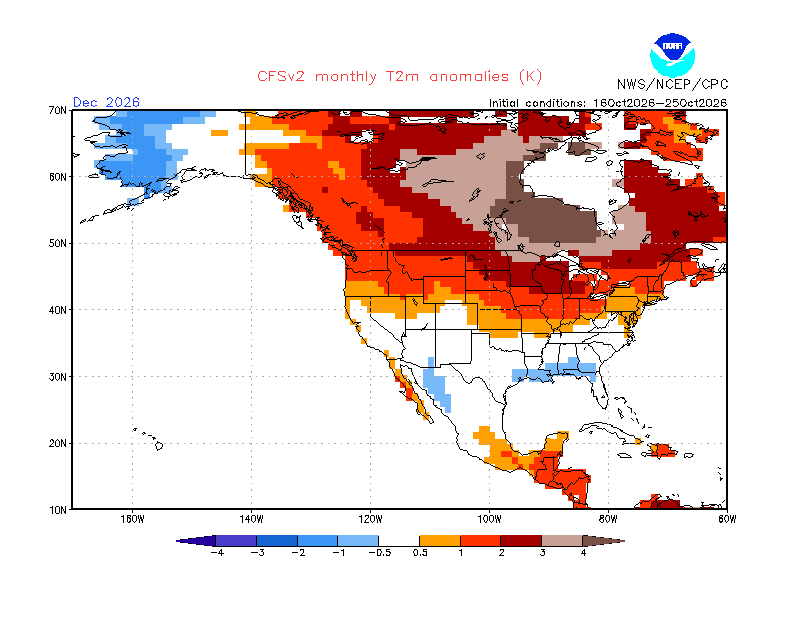
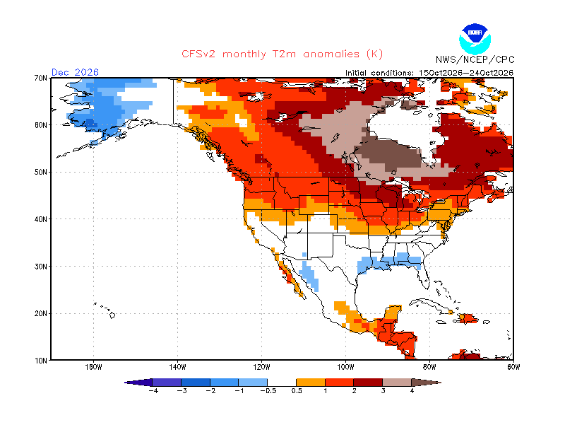
With this record breaking and possibly even record shattering weak early Nov SPV very likely, what do you and others think that leads us to for Dec? Previously I was thinking based on @snowman19+QBO/Nino analogs that Dec overall would likely be mild in the E US outside of possibly NN in the SE. But, I noticed that while Nov warmed considerably on the latest 10 day mean CFS (2-3F) since the runs from ~3 weeks ago, it has also cooled considerably (~2F) for Dec since just 10 days ago. I’m wondering if this is related to the 35-40 day @Stormchaserchuck1typical cooling lag for the E US after an SSW this time of year: CFS 10 day mean from 10 days ago: torchy Latest CFS 10 day mean for Dec: ~2F colder E US: not torchy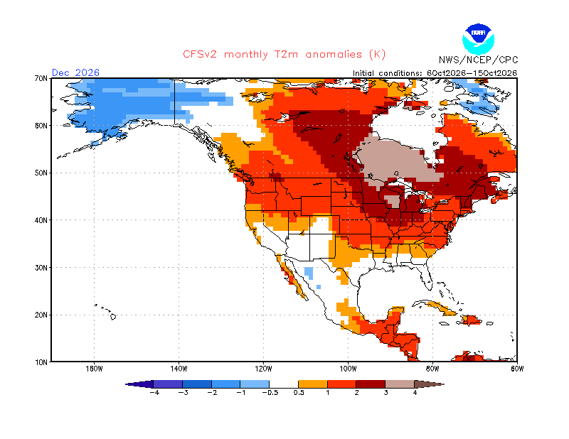
-
2026-2027 Record-breaking El Nino
GaWx replied to Stormchaserchuck1's topic in Weather Forecasting and Discussion
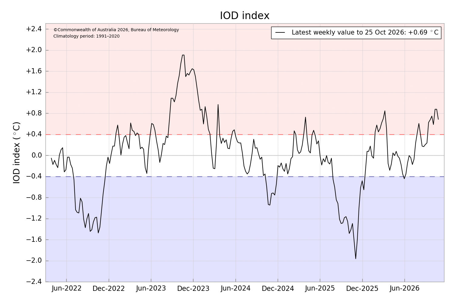
Today’s IOD release (avg for 10/19-25) came in at +0.69 vs the +0.88 of the prior week: 20260831,20260906,0.24 20260907,20260913,0.63 20260914,20260920,0.68 20260921,20260927,0.75 20260928,20261004,0.59 20261005,20261011,0.88 20261012,20261018,0.88 20261019,20261025,0.69 https://www.bom.gov.au/clim_data/IDCK000072/iod_1.txt?1791781094025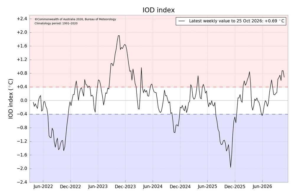
-
2026-2027 Record-breaking El Nino
GaWx replied to Stormchaserchuck1's topic in Weather Forecasting and Discussion
The NOAA relative weeklies released this morning: -Nino 3.4 warmed slightly to +2.5. It remains at record levels for the time of year with it way ahead of the 2nd warmest, +2.0 of 2015. The record for any week is +2.9 of 12/29/82. -Nino 3’s +3.6 is much warmer than the 2nd warmest for the week, +2.9 of 1997 and it also ties the warmest for any week, 12/29/1982. -Nino 1+2’s +4.4 remains much warmer than its 2nd warmest for the week, +3.6 of 1997. Its warmest for any week is the +4.6 of 1998. 30SEP2026 4.5 3.3 2.3 0.1 07OCT2026 4.4 3.4 2.4 0.2 14OCT2026 4.4 3.5 2.4 -0.1 21OCT2026 4.4 3.6 2.5 0.0 https://www.cpc.ncep.noaa.gov/data/indices/rel_wksst9120.txt -
2026-2027 Record-breaking El Nino
GaWx replied to Stormchaserchuck1's topic in Weather Forecasting and Discussion
Yes, Mitch, the latest EW (10/25) is slightly weaker than the 10/24 run. -
2026-2027 Record-breaking El Nino
GaWx replied to Stormchaserchuck1's topic in Weather Forecasting and Discussion
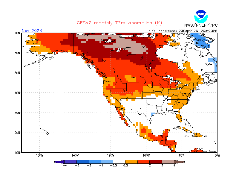
Indeed, although Nov on the CFS has warmed, the 10 day mean Dec has cooled ~2F in the E US since 10 days ago. 10 day mean as of 10 days ago: Latest 10 day mean: 2F cooler. Could this be related to the even weaker early Nov SPV when considering the 35-40 day lag Chuck mentioned?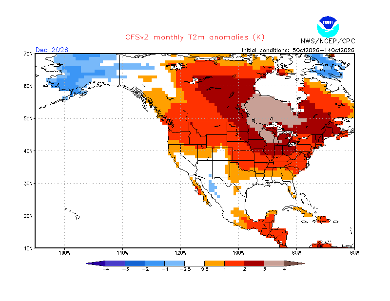
-
2026-2027 Record-breaking El Nino
GaWx replied to Stormchaserchuck1's topic in Weather Forecasting and Discussion
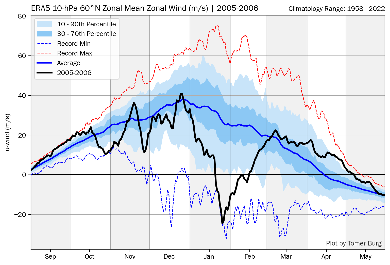
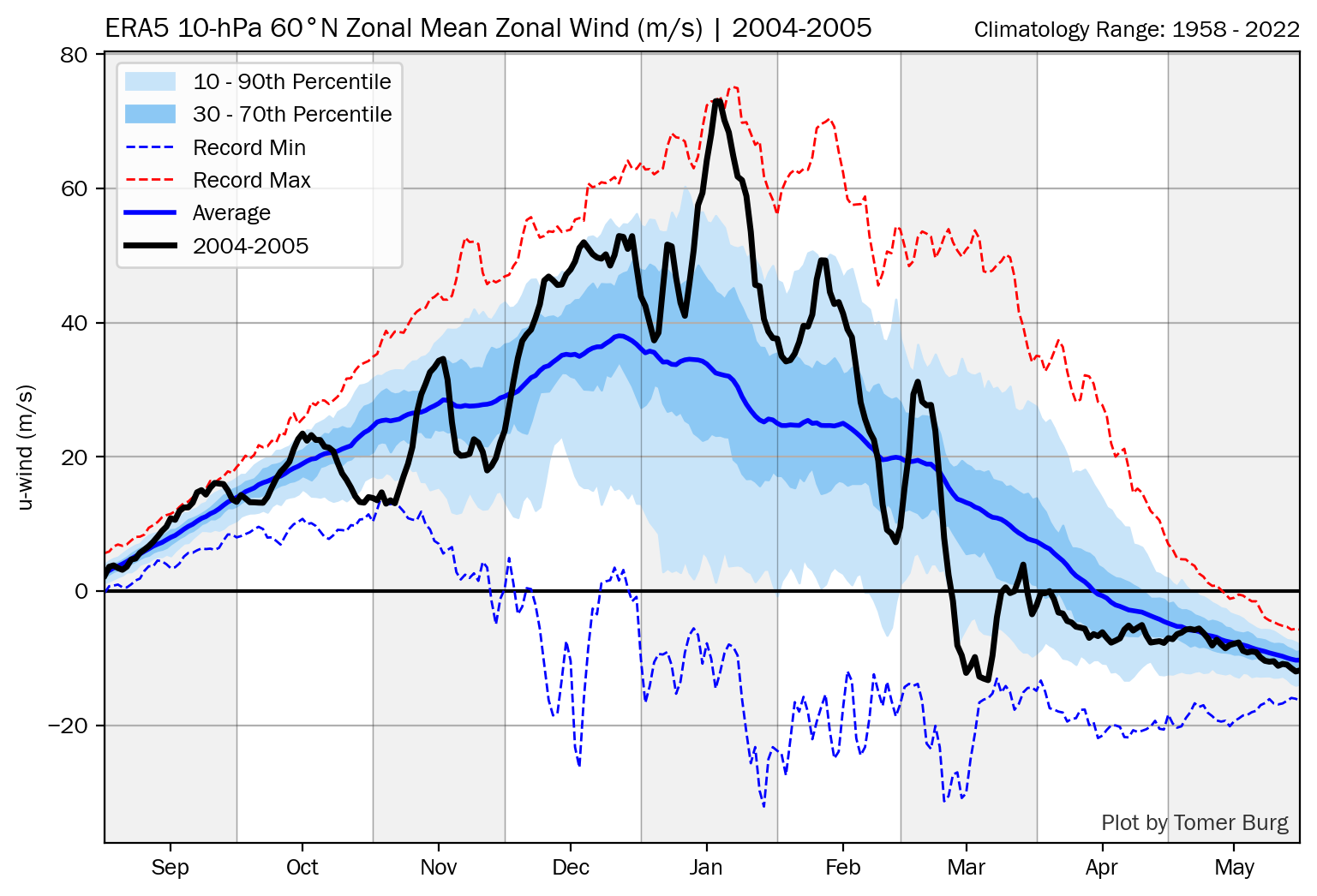
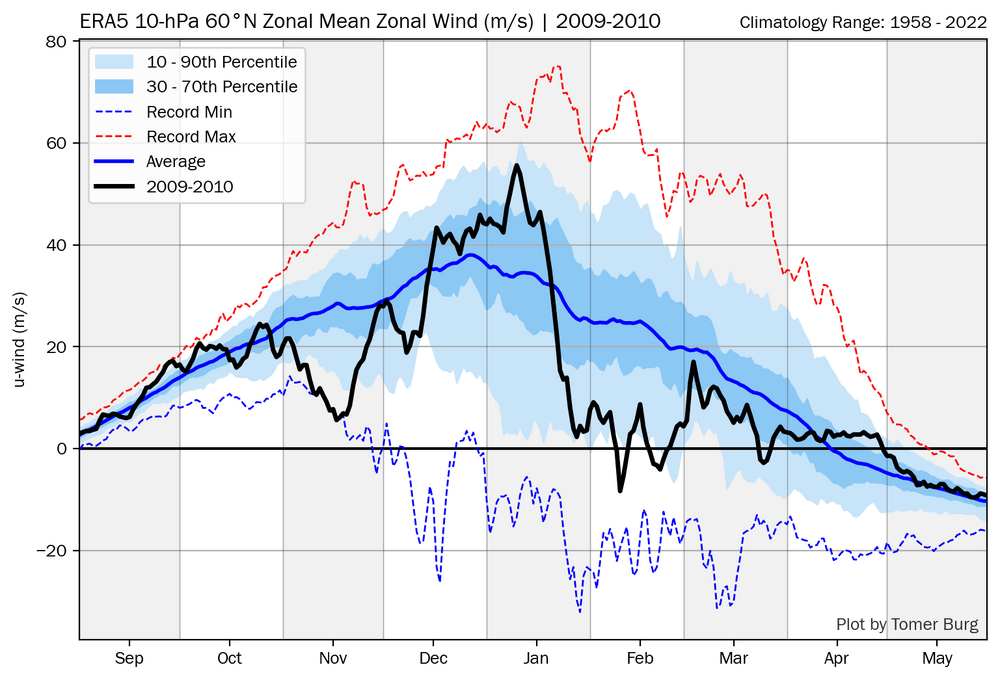
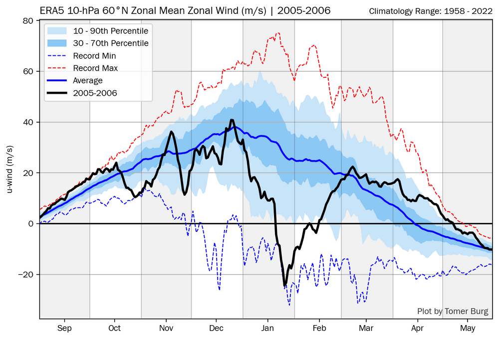
Here are the lowest for the four years hitting record lows (since these graphs started in 1978-9) during the first 10 days of Nov: 2016-7: ~11 low (+QBO, the only one of these four years with QBO similar to 2026) 2009-10 (El Nino): ~11 low during Nov 1-10 only (-QBO) 2005-6: ~12 low (dropping +QBO) 2004-5 (El Nino): ~13 low (-QBO) The 0Z 10/25/26 progs are suggesting these +11 to +13 dips will likely be exceeded and quite possibly by a wide margin of 5 to 10. *Edited to correct typos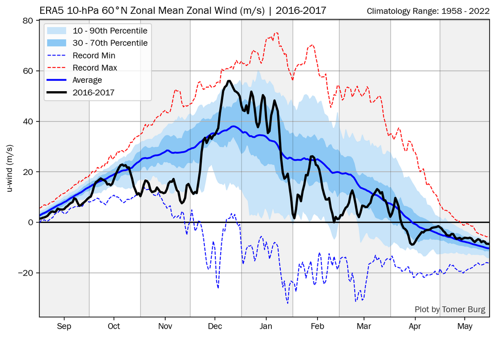
-
2026-2027 Record-breaking El Nino
GaWx replied to Stormchaserchuck1's topic in Weather Forecasting and Discussion
The CFS 10 day for Nov has warmed 2-3F since 20 days ago: Latest: 20 days ago: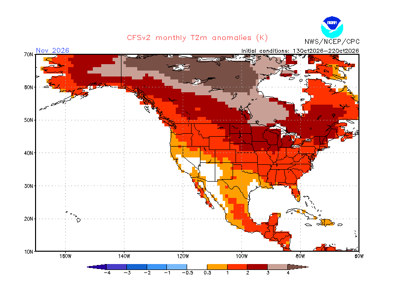
-
2026-2027 Record-breaking El Nino
GaWx replied to Stormchaserchuck1's topic in Weather Forecasting and Discussion
Indeed, the -SOI went + on Oct 24th (today) making it 72 days: https://data.longpaddock.qld.gov.au/SeasonalClimateOutlook/SouthernOscillationIndex/SOIDataFiles/DailySOI1887-1989Base.txt -
2026-2027 Record-breaking El Nino
GaWx replied to Stormchaserchuck1's topic in Weather Forecasting and Discussion
My answer: That’s why I prefer to compare 30 year normals rather than compare absolutes since temps are obviously warming due to GW, which is why I did that in my reply to Chris. Now in terms of 30 year climo based anomalies for Oct, ‘26 is coming in a bit warmer than the avg super Nino anom. at ATL for sure. So, I agree with Chris’ general idea about that. -
2026-2027 Record-breaking El Nino
GaWx replied to Stormchaserchuck1's topic in Weather Forecasting and Discussion
Ray, I personally don’t think it is all that big of a deal that ATL is projected to be ~1.8 F above normal for the FULL Oct of ‘26. I didn’t mean to imply that. After all, Oct of 1991 was almost as far AN with it at 1.6F AN. Of course he was just referring to Oct 1-22, which came in ~2.2 AN vs the normal of 66.4F. But even that isn’t a strong warm anomaly. -
2026-2027 Record-breaking El Nino
GaWx replied to Stormchaserchuck1's topic in Weather Forecasting and Discussion
Thanks, Chris. Good find! I went further and looked at all ATL Octs for +1.3+ Ninos back to the late 1800s (24 of them) and found only three that were 1.8+ warmer than normal, which is ~where the full Oct 2026 is projected. But they were all only higher end moderate: 1918 (+1.4 Nino): 65.8 (3.1 AN) 1941 (+1.3 Nino): 69.4 (5.9 AN) 2002 (+1.3 Nino): 65.4 (1.8 AN) The full Oct 2026 is projected to come out to ~66.1F or ~1.8 AN, which would tie with 1899 for the warmest vs normal for any Nino stronger than +1.4 peak. (I count 17 of them back to late 1800s). The warmest ATL Oct anomalies for El Niños stronger than +1.4 peak are: 1899 (1.8 AN) 1991 (1.6 AN) 2023 (1.4 AN) 1986 (1.2 AN) 1994 (1.1 AN) -
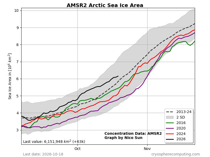
Latest Arctic ice falling back closer to the mean as the Arctic N of 80N anoms have warmed considerably:
-
2026-2027 Record-breaking El Nino
GaWx replied to Stormchaserchuck1's topic in Weather Forecasting and Discussion
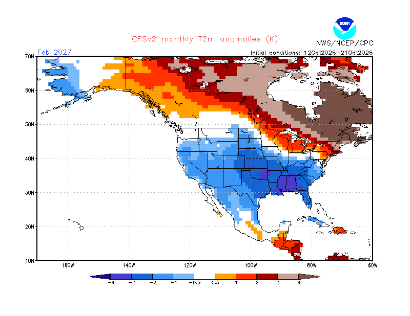
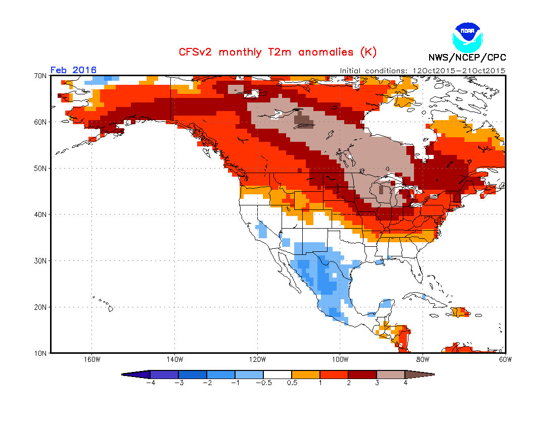
Feb in the E US will likely be heavily affected by the Feb NAO. The CFSv2 is implying a strong -NAO in Feb ‘27. -These Ninos had a strong +NAO in Feb: 1992, 2016, 2024 Here’s the Feb temp anom composite: -These Ninos had a strong -NAO in Feb: 1958, 1966, 2010 Here’s the Feb temp anom composite: -
2026-2027 Record-breaking El Nino
GaWx replied to Stormchaserchuck1's topic in Weather Forecasting and Discussion
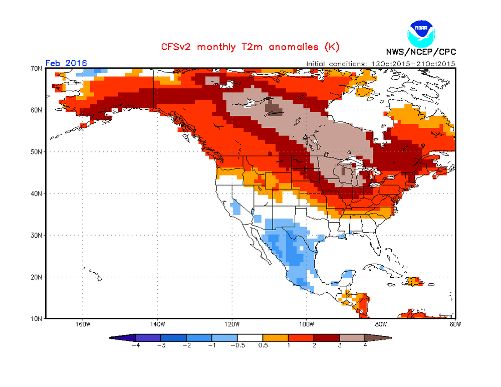
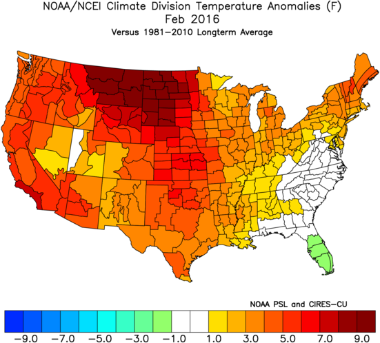
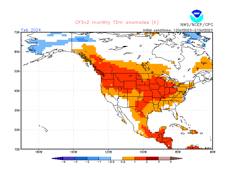
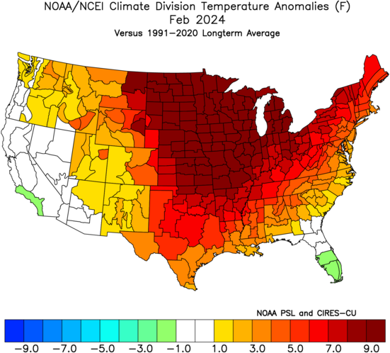
-2016: much less E based Nino In the E US, the mid-Oct ‘15 forecast mean CFSv2 for Feb ‘16 actually verified slightly too warm overall in the E US! Verification of Feb ‘16 (vs 1981-2010): -2024, much weaker and less E based Nino: The mid-Oct ‘23 mean CFSv2 forecast for Feb ‘24 verified too cold NE but wasn’t too far off in the SE and was very close deep SE: Verification of Feb ‘24 (vs 1991-2020): How will it do for Feb ‘27? We’ll see! Yes, although I’m not at all trusting any model, I’m excited about the Feb potential (not Dec at all and not much for Jan though that could very well be transitioning):