michaelmantis
-
Posts
283 -
Joined
-
Last visited
Content Type
Profiles
Blogs
Forums
American Weather
Media Demo
Store
Gallery
Everything posted by michaelmantis
-
Bit too far west in N IL for this but always interesting to see things come together on the East side of Lake Michigan for lake effect, doesn't happen often. Interested to see the snow maps once this thing is over, going to be some killer cutoffs.
-
Feb 12-14th V-Day Weekend Potential Stuff
michaelmantis replied to Chicago Storm's topic in Lakes/Ohio Valley
2/14 will be the one year anniversary of my divorce... I had to laugh when the court assigned that date... A snowstorm would be a nice distraction... -
Been snowing cotton balls for last 90 minutes. Slow pretty flakes. No wind, melting issues, just pretty snow. Looks like I'm in the sweet spot (about 10 miles north of I-88)
-
Debating if I’m going to head out later today for a drive to my parents. Roads snow covered (salt not working at these temps) and just thinking that even 1-2 of blowing fluff at these temps can cause problems.
-
Feb 3rd - 5th Potential strong stm threat
michaelmantis replied to Brian D's topic in Lakes/Ohio Valley
Same... 15 minutes roads covered and literal cotton balls falling... -
January 30-February 1 Winter Storm Part 2
michaelmantis replied to Hoosier's topic in Lakes/Ohio Valley
Just some mood flakes from the Lake where I am (30 miles from Lake Michigan in N IL) and my parents who live near O'Hare said its snowing pretty good there. In all, most of the forecast turned out to be pretty on the mark. Also looks like the chance of a big rainer for N IL later this week has gone down a bit (know that is another thread!). After the snow that is on the ground now, a rainstorm would not be good. -
January 30-February 1 Winter Storm Part 2
michaelmantis replied to Hoosier's topic in Lakes/Ohio Valley
Can we bottle this excitement, put it in a time capsule, and then open it during next snow drought the Lakes/OV region that will occur next winter? Starting to rip by me and expecting/hoping 2-3 hours of nice accumulation before bedtime. -
January 30-February 1 Winter Storm Part 2
michaelmantis replied to Hoosier's topic in Lakes/Ohio Valley
I'm 15 miles NE of that location (88-355) and it does look like some of the heavier returns are going to go south a bit. My take is the big break in the totals (totally forecasted) is going to be the IL-47 to IL-39 line. With the way the radar looks, there is just no way I see getting less than 6 inches. -
January 30-February 1 Winter Storm Part 2
michaelmantis replied to Hoosier's topic in Lakes/Ohio Valley
That just passed over me! ;-) The radar to the SW just looks so so so pretty... -
January 30-February 1 Winter Storm Part 2
michaelmantis replied to Hoosier's topic in Lakes/Ohio Valley
In a bit of a dry spot about 30 miles west of you. Most of the heavy stuff was targeted around 6 PM in NE IL anyway so hopefully this picks up in the next hour or two... -
January 30-February 1 Winter Storm Part 2
michaelmantis replied to Hoosier's topic in Lakes/Ohio Valley
We don’t need an app when we have the guy writing the AFD! ;-) Great write up last night. Get some sleep and thanks for all the updates. -
January 30-February 1 Winter Storm Part 2
michaelmantis replied to Hoosier's topic in Lakes/Ohio Valley
Is the “NWS only provides data and not public weather products” policy still is effect? I thought I read somewhere there is an actual law or statute saying the NWS can’t do things like make their own mobile app even! -
This seems like the models are in agreement unlike the last storm in the Midwest (Madison getting 6 inches!?!?!) I could see a scenario where the tracks are wrong but the models all changing in a similar way or is that too simplistic of a view? Not sure what I'd do with 2 storms in a week. But hey, the kids still got a "snow day" even with remote learning!
-
So I shouldn't plan on 18 inches in NE IL this weekend? Ha-Ha... Someone needs to combine this forum with Draftkings and we can use betting markets to try to predict model reliability. Like Nate Silver's 538... Or better yet, we could call it the 540line or something... ;-)
-
Jan 25-26th Potential Something Part 3
michaelmantis replied to Chicago Storm's topic in Lakes/Ohio Valley
Nicest flakes of this storm (and season) so far. Now just need that dry slot around Joliet to fill in. 2-3 hours of this and I’ll be happy. Will see what the morning brings! -
Jan 25-26th Potential Something Part 3
michaelmantis replied to Chicago Storm's topic in Lakes/Ohio Valley
Am I seeing the radar returns right in N IL? Looks like the snow is just drying up around I-88 over the last hour. -
Jan 24-26th Potential Something Part 2
michaelmantis replied to Chicago Storm's topic in Lakes/Ohio Valley
I'm smack dab in the middle of the "too far west in NE IL for the extra 2-4 Lake enhancement" and too close to the lower amounts in DeKalb! Now that the flakes are falling, thanks so much for all the updates the last week or so on this. Love having some insight into how this thing is forecasted by the professionals. Let it snow!!! -
Jan 24-26th Potential Something Part 2
michaelmantis replied to Chicago Storm's topic in Lakes/Ohio Valley
My uneducated now-cast for NIL is going to be "enough snow to justify bringing out the snow blower" and "enough to go sledding". Happy just to get a few inches to cover up the few week old icy mess! Enjoy everyone! -
Jan 24-26th Potential Something Part 2
michaelmantis replied to Chicago Storm's topic in Lakes/Ohio Valley
At least with this one I don’t have to wait for your “here comes the rain again” post... ;-) Any more detail or background to how this is changing? -
Jan 24-26th Potential Something Part 2
michaelmantis replied to Chicago Storm's topic in Lakes/Ohio Valley
Are there any specific maps or charts that focus in the lake effect side of things separately from the main event (know they are really all combined). Asking as I’m in far NE Kane county in IL and there are times the lake enhancement even helps us out here around 30 miles from the lakeshore. -
Jan 24-26th Potential Something Part 2
michaelmantis replied to Chicago Storm's topic in Lakes/Ohio Valley
As posted by others, timing seems to be the bigger impact vs. double digit amounts. For most in N IL, this will be the biggest impacting system in 2 years so props to the NWS for not being sticklers to the “warning criteria”. Regardless of the totals going from 15 to 8 to 6 or others in between the fact that there was a good idea of the storm location days in advance is the biggest win in my layman’s view. -
Awesome... ;-) Hopefully cooler heads prevail and everyone chills out on the track for 24ish hours until this thing becomes more clear... Whole bunch of people are potentially in the money, we all have bingo cards with 4 in a row, just waiting on that 5th number. Some will win, someone will lose. Give me 2 inches of totally frozen precip vs all the mess storms we've had in N IL thus far and I'm a happy man. Happy Friday everyone!
-
I'm going to mute this thread until the 4 PM forecast and AFD updates as the roller coaster of the snow maps where I'm at (N IL) is just too much! ;-)
-
Love your AFD details, they are the highlight of my 4 PM each day when a potential storm is out there. All I want is a storm with nothing liquid falling from the sky, it's a simple wish. Looking forward to the future updates. You rock.
-
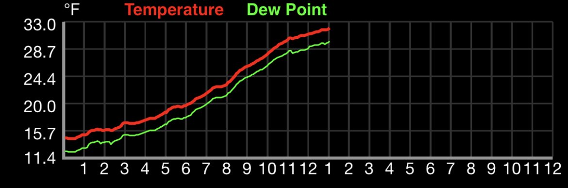
Just hit 32 in my backyard. Freezing line looks to be a bit north than LOT initially forecasted (infamous I-88 line). Now just an inch or two of backside snow to cover the icy slop would be nice. At some point this winter we will have a fully frozen storm in the N IL region!