

chubbs
-
Posts
3,894 -
Joined
-
Last visited
Content Type
Profiles
Blogs
Forums
American Weather
Media Demo
Store
Gallery
Posts posted by chubbs
-
-
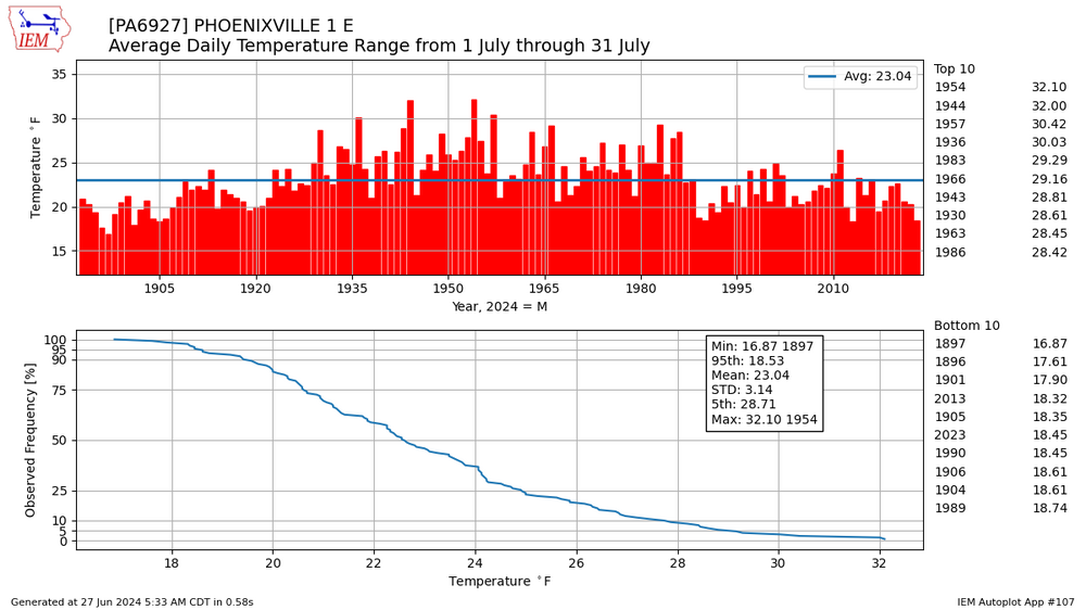
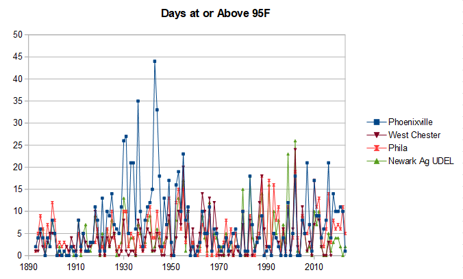
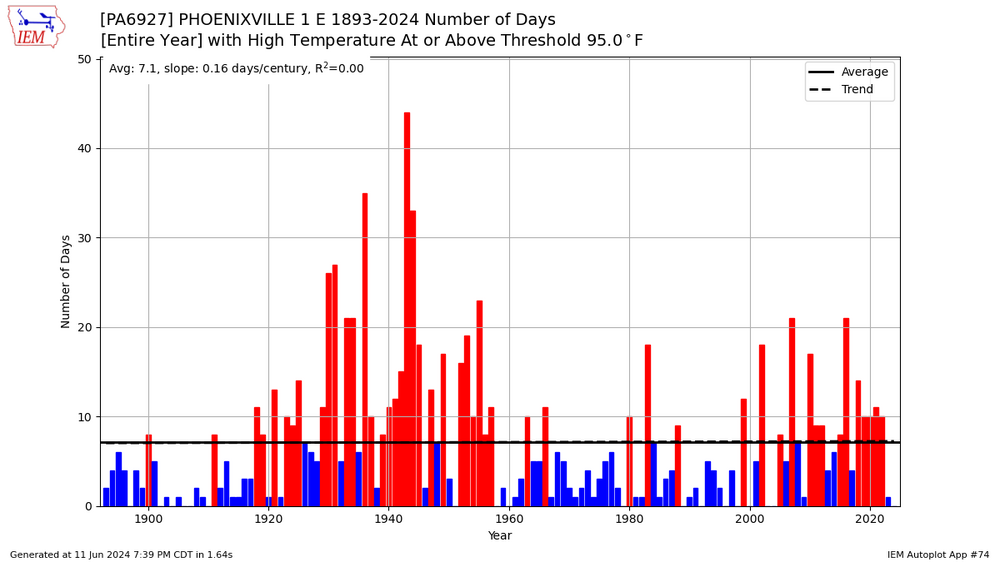
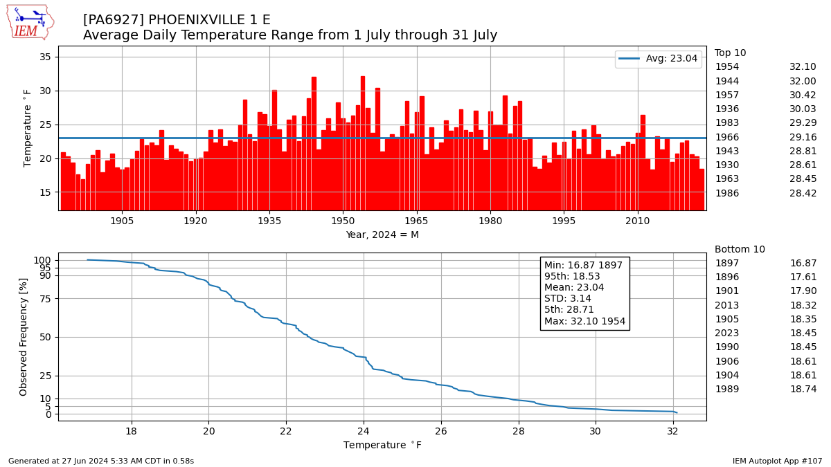
Remember the big spike in 95F days in Phoenixville in the mid-20'th century that didn't occur at other regional sites (posted upthread). Per chart below, the July diurnal temperature range also increased in that period. The increase in diurnal range isn't matched at West Chester or Coatesville. Probably shelter-related as a non-aspirated thermometer will be more prone to shelter problems. Resetting the max/min thermometer in the late afternoon and evening as was the usual practice back in the day would compound the problem. In any case its clear that the raw data need a bias correction.
-
 1
1
-
-
2 hours ago, GaWx said:
Check this out CC and others for something fascinating at Augusta, GA (Bush):
-noon was 93 with a dewpoint of 76 on a SE wind at 9
-1PM was 99 with a dewpoint way down at 58 on a SW wind at 13 gusting to 22!!
That’s a heck of a boundary that went through there last hour, a dry line of sorts! And the drier air came in on SW winds!
Could be mixing of dryer air from aloft. As the ground warms the depth of mixing increases.
-
1
-
 1
1
-
-
10 minutes ago, Bhs1975 said:
Is Chesco Co on planet Earth? Just checking.
.Its on a flat earth with a green sky

-
 1
1
-
-
32 minutes ago, ChescoWx said:
There were a lot more low elevation stations in the 50's....we are much more balanced with the cooling from the 1990's to the 2010's
LOL. Weather station data is highly correlated over hundreds of miles. All the stations in Chesco should move the same way. If they don't there is a problem with the measurements or analysis or both.
33 minutes ago, ChescoWx said:Nope! no comment on the world only Chesco....i am sure someday we too will realize the same scary climate change and all of those horrible unprecedented events we are seeing occurring across the planet.
You live in a different Chesco than I do. All I see is steady warming just like the rest of the world. Your own Chescowx data says so.
-
2
-
1
-
-
11 minutes ago, ChescoWx said:
Great question!! I guess those rapid changes are clearly just not penetrating the climate fence that is securely around the Chester County PA border....
So your whole worldview depends on Chesco not warming. No wonder you ignore all the cracks in the edifice.
-
1
-
1
-
-
16 minutes ago, ChescoWx said:
Below is the by decade split of average temps since the 1950's by elevation. As expected very cyclical in nature with cooler decades followed by warmer rinse and repeat. The lower elevations during the 2010's were within 0.2 degrees of the 1950's....both the higher and lower spots have unsurprisingly cooled a bit since the 1990's peak warmth!

LOL so the low elevation stations cooled dramatically in one decade 1950s--->1960s, while the high elevation stations warmed.
-
1
-
-
23 hours ago, ChescoWx said:
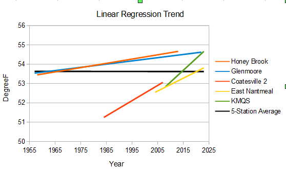
Once again Charlie I will produce the source data. Below is detailed map coordinates and elevation of all NWS/ AWOS / MADIS stations included in the data set. All of the data produced is derived exclusively from this data set. There is clearly a station mix like the older County data favoring the relative lower elevation sites with 16 of the 27 (67%) below 450 ft in elevation with just 11 at above that level. In addition of the current 15 stations moving forward 8 of those 15 are below 450 ft asl. A great go forward mix of higher and lower stations.

Instead of "apples to apples" I see a lot of station changes that you aren't analyzing properly. The chart I posted previously illustrates the point. There are other differences between these stations besides elevation. For one thing the older data is from Coop stations, while the modern data is predominantly non-Coop. As an example Glenmoore Coop and your house are very similar in location and elevation, but differ by almost 2F on average. Simply taking an average of a group of stations skews the results if the stations operated over different periods. Per chart below all the "elevated" stations are warming but the average is flat.
-
2
-
1
-
-
9 hours ago, TheClimateChanger said:
Saw this tweet on the paper
![Screenshot 2024-06-26 at 06-05-48 Chris Colose on X Ple[...].png](https://www.americanwx.com/bb/uploads/monthly_2024_06/1988555849_Screenshot2024-06-26at06-05-48ChrisColoseonXPle....png.da5c5591a23e884606965de32afe7bd2.png)
-
1
-
1
-
-
1 hour ago, bluewave said:
Yeah, it was a very impressive heatwave for June. My take on what caused the unprecedented talk were some of the social media posts showing the ECMWF model output. It has been running too warm recently and had highs for the heatwave in excess of 105° which would have been unprecedented this early in June. I was posting on this in the local NYC Metro forum and was skeptical of the model output since none of the other models were close. This was almost like a warm season version of what happened when model snowfall output for our region was posted on social media several winters ago. The NWS had to come out and say these amounts were unlikely but the heavy snowfall images gained traction and the talk began on social media. So we have been seeing more and more examples of unlikely raw model output getting onto social media and then getting picked up by others as if it was an actual likely outcome.

Yes, a hot week and the models were even hotter fueling the hype. Funny thing is, in our current climate it probably wasn't that hot.
![Screenshot 2024-06-24 at 17-26-45 SERCC Climate Perspec[...].png](https://www.americanwx.com/bb/uploads/monthly_2024_06/1815710737_Screenshot2024-06-24at17-26-45SERCCClimatePerspec....thumb.png.cf7a5dc5bb395af75e7061b04742b552.png)
-
2
-
-
54 minutes ago, ChescoWx said:
Charlie you still choose to ignore that the current NWS MADIS station mix is actually still stilted more to the warmer lower elevation sites not the cooler higher elevation sites.....just as it was in the older observations. I can still compare relative apples to apples by segregating low vs high vs location which I have done. The only variable not included is the machine based adjustments to arrive at the altered data to get the warming answer.
You haven't provided any evidence that you are comparing "apples" to "apples". No maps of station locations. No plots of station data. None. All you are providing is meaningless rhetoric like "machine based adjustments". All the evidence I have seen in this thread says you are way off: your own Chescowx series, The Mt Holly climate sites. the obviously excessive number of 95+ days at Phoenixville, etc. You have Chester County warmer than the Philadelphia airport at times in the past. No wonder you can't find much warming.
-
3
-
-
2 hours ago, ChescoWx said:
Funny Don the difference in those summer charts in my section of the Northeast USA.... if we eliminate the after the fact computer adjustments to chill those nagging hot summers in the US back in the 1930s and 1940s in blue....now if we allow for altered data in red- there is the warmth you speak of.

All that chart shows is that you don't understand how to analyze weather station data. Below is a recent blog article that provides good background. As described in the article, Its very difficult to determine the average temperature of a geographic area. Move a non-aspirated shelter closer to a house or in the shade of a tree and you get a different answer. Yet that is exactly what you are trying to do, determine the average temperature in Chester County. Furthermore you have collected a station population that changes dramatically with time making it unsuited for your task. In particular the older station population is very limited and clearly too warm: south and east, low elevation, in towns, and with older equipment. Much different than your modern stations.
NOAA on-the-other-hand focuses on the change in temperature with time. Much easier to determine, as the changes with time are well correlated over hundreds of miles if the stations don't change. If the stations do change, the changes are easy to spot by inter-comparing stations. NOAA takes advantage of the dense station network in the US. If it is a relatively warm month in Chester County, it is also relatively warm in the surrounding counties and states. Hundreds of stations can provide information on the year-to-year change in Chester County's temperature.
In short there is a night and day difference between NOAA's methods and your own. NOAA is informed by science and focusing on the easy with proven methods and a large dataset. You are uninformed by science and trying to the hard with a much smaller and poorly constructed dataset. It shows in the results.
https://diagrammonkey.wordpress.com/2024/06/16/sticking-em-where-the-sun-dont-shine/
-
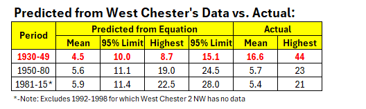
4 hours ago, donsutherland1 said:
I agree. There is very likely an issue with the earlier Phoenixville numbers for 95F days.
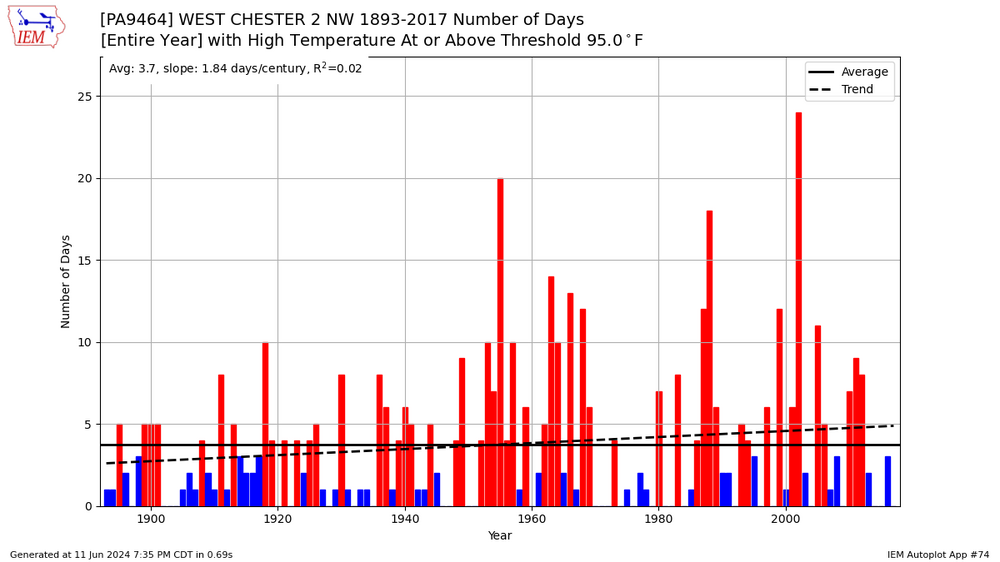
To look further into the matter, I ran regression equations based on the 1950-1980 period testing West Chester and Phoenixville and West Chester and Coatesville.
The West Chester - Phoenixville equation broke down badly when applied to the 1930-1949 period, ballooning from 2.8 days to 12.4 days. The West Chester - Coatesville equation held reasonably consistent. This disparity suggested that the issue concerned Phoenixville, not West Chester.
To determine whether the 1950-1980 period was an issue, I also tested that equation for 1981-2015 for West Chester - Phoenixville. The equation held up reasonably well. The Coatesville data record ended in 1982, so I could not test the West Chester - Coatesville relationship.
In sum, the combination of the consistency of the West Chester - Phoenixville equation for the 1950-1980 and 1981-2015 periods and the consistency of the West Chester - Coatesville equations for the 1930-1949 and 1950-80 periods strongly argues that Phoenixville's 1930-1949 measurements were at issue and are not reliable.

The Phoenixville station history can be found here: https://www.ncdc.noaa.gov/cdo-web/datasets/GHCND/stations/GHCND:USC00366927/detail and https://www.ncdc.noaa.gov/cdo-web/datasets/GHCND/stations/GHCND:USC00366927/detail
In terms of predicted vs. actual 95F days, the 1930-1949 period for Phoenixville was wildly out of line, even vastly exceeding the 95% confidence limit. Considering that the average number of 95F days exceeded the predicted figure for maximum such days during the entire period, it is very likely that the 1930-1949 data for Phoenixville is not reliable. Moreover, based on the predicted values, it is more likely than not that Phoenixville is experiencing an increase in 95F days in line with the other sites.
Yes, Phoenixville clearly was too warm in the middle of the 20'th century. Other stations don't have the spike in 95 degree days that Phoenixville does. You get the wrong answer about our local climate if you don't bias adjust the Phoenixville data. Same with many of the other Chesco coops. Fortunately, we have a dense regional network to catch the mistakes. As I said above thank goodness for NOAA.
-
5
-
1
-
-
Long video (10 min), but a good depiction of on-the-ground conditions in Broward County Florida during ytday's flash flooding. Note that several flooded homeowners had damaging flooding last year.
-
On 6/9/2024 at 2:48 PM, ChescoWx said:
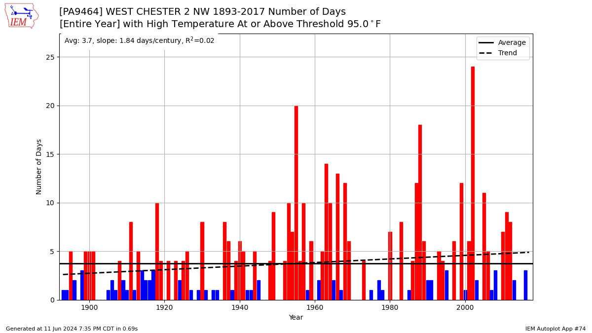
I was asked to also look at hot days >95 degrees over the same time frame. Plus I added in the average number per station as the number of stations have changed by decade with a dramatic increase in stations in the 2010's . Again the hottest decades were as we all know back in the 1930's thru 1950's.

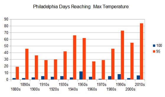
Finally got a chance to look at some of the Chesco coop high temperature data. Chescowx's averaging hides a lot of sins. There is a big disparity among the two main long-term stations that I checked: West Chester, and Phoenixville, Most noticeable, the Phoenixville data in the 1930s and 1940s has many more 95F days than West Chester and the other Chesco stations. Phoenixville is also much warmer than Philadelphia in this period, with over 3x the 95 degree days as Philadelphia in the 1930s and 40s. With only a handful of Chesco stations, Phoenixville skews the county average, giving Chester County many more 95F days than Philadelphia in the 1930s and 40s. A silly result.
Of course this isn't the only problem. The shifting station population also skews the results. Many of the modern stations, at higher elevation like Chesco's house, rarely reach 95.
This data is a good advertisement for bias adjustment. Problematic data, like Phoenixville's in the 30s and 40s, is easy to spot and correct by inte-rcomparing stations. That is the benefit of a dense US station network. A benefit completely lost on climate deniers. Thank goodness we have NOAA to provide unbiased estimates of our past climate.
-
3
-
1
-
-
Philadelphia shows a clear increase in 95F days vs 100+ years ago. The trend in 100F days is less clear, but certainly no decrease.. The linear trends since the 1880s are: +2.9 days per decade reaching 95 and +0.2 days per decade reaching 100F.
Plenty of caveats in this data. The station equipment was different: non aspirated, different shelters, and mercury vs digital thermometers. The station locations are also different. Chescowx's results are skewed by the changing station population. The older stations are warmer with the biggest changes in occurring after 1980. It wasn't uncommon for the old Chesco stations to run hotter than Philadelphia. That is rare in the current station population. Of course the Philadelphia station locations also changed. The move from center city to the airport in 1940 being the most important. However there were also multiple station changes before 1940. Finally unlike Chesco, the Philadelphia data has one site per year.
-
1
-
-
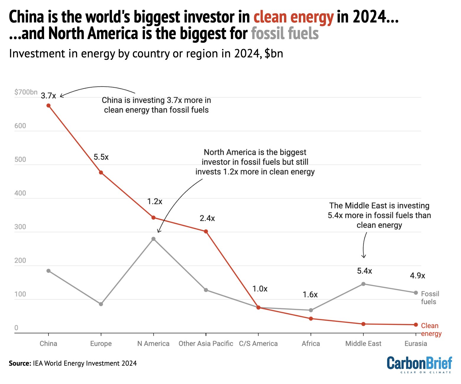
As fossil fuels lose competitive advantage, investment is increasingly shifting from fossil fuels to clean energy. Our clean energy investment is growing but we are far behind China and Europe. Drill baby drill.

-
1
-
1
-
-
6 hours ago, GaWx said:
- There looks like an acceleration in the rise since 2011.
- The largest annual rises (based on peak to peak) have been associated with the four strongest El Niño years but also in 2012 (following a two year La Niña) and 1999. 1999 is hard to explain. 1999’s rise over 1998 was so large that it nearly rose back to the 1997 peak, which is weird since it was in the midst of a similar strong La Niña to the 1998 Niña!
- The biggest annual drops (based on peak to peak) were after the three strongest El Niño years. Thus, there’d be a nice drop for the 2024 peak vs 2023 peak assuming the pattern holds.
Edit:
- Looking at the animation, the annual peaks have been mostly in Oct (22) although I see 4 in Sep. and 4 in Nov. Why are the peaks almost always in autumn?
- The one exception to the autumn peaks is 1998, which technically peaked on Jan 1st as it was slowly dropping from the big late Sep 1997 El Niño related peak. The 1998 autumn peak, which was in mid Sep, wasn’t able to quite reach the Jan 1st level. This can be clearly seen by slowing the animation way down. This slowdown can be done by pausing the animation and then manually controlling the animation via the bottom scroll bar.
- So, summary of the annual peaks:
-22 in Oct
-4 in Sep
-4 in Nov.
-1 in Jan
- There’s also a very minor secondary peak in most years within a month of March. Why? My hypothesis is that it is related to the typical 60N to 60S annual global ocean SST peak, which is in/near March as per the image at this link:
https://climate.copernicus.eu/july-2023-global-air-and-ocean-temperatures-reach-new-record-highs
- Based on peak to peak rises, 2015 looks like it was pretty close to 2023. Both peaks rose over 1 cm from their respective prior year peaks.
- This article attributes El Niño related rises to more rainfall over the oceans. But I would have thought it would be due to spikes of warmth during El Niño leading to ocean expansion. Any opinions about this?
NASA also gives shifting rainfall as the main enso sea level effect
https://sealevel.nasa.gov/faq/10/how-does-el-nino-fit-into-the-sea-level-rise-picture/
-
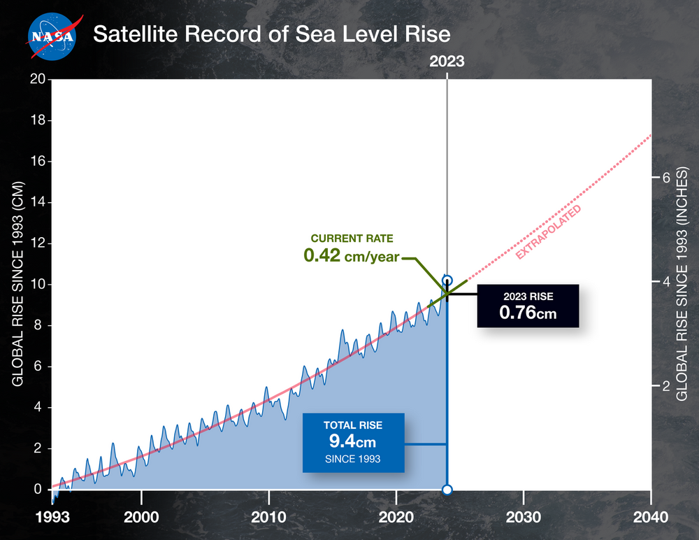
Sea level rise was a record last year with a boost from el nino.
https://www.jpl.nasa.gov/news/nasa-analysis-sees-spike-in-2023-global-sea-level-due-to-el-nino
-
1
-
 1
1
-
1
-
-
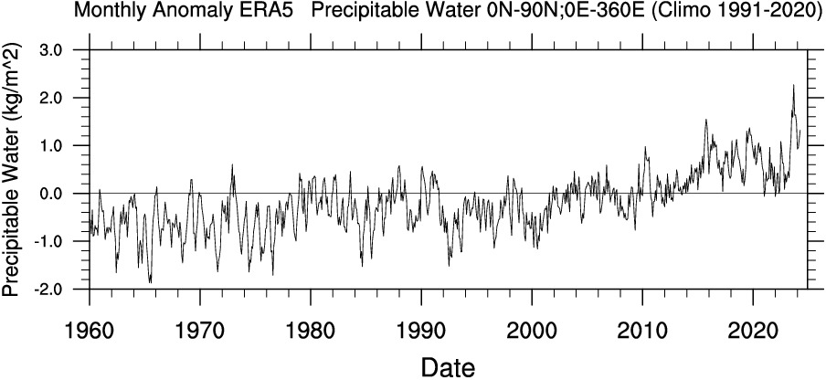
19 minutes ago, bdgwx said:
The global average dewpoint for May 2024 was the highest for any May on record.
Precipitable water from ERA5. Another metric that this nino has outperformed on. Not surprising considering warmth of tropical oceans.
-
1
-
-
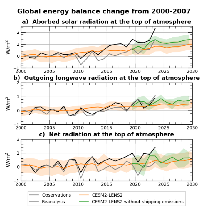
Thread with additional background from shipping study co-author
https://x.com/DanVisioni/status/1798314631771164817
-
1
-
-
Per this preprint out for comments, the reduction in sulfur emissions from shipping in 2020 has boosted forcing and temps recently; helping explain 2023. Much more important than the volcano from a forcing standpoint.
https://egusphere.copernicus.org/preprints/2024/egusphere-2024-1417/
-
1
-
-
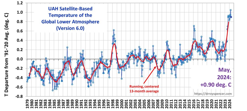
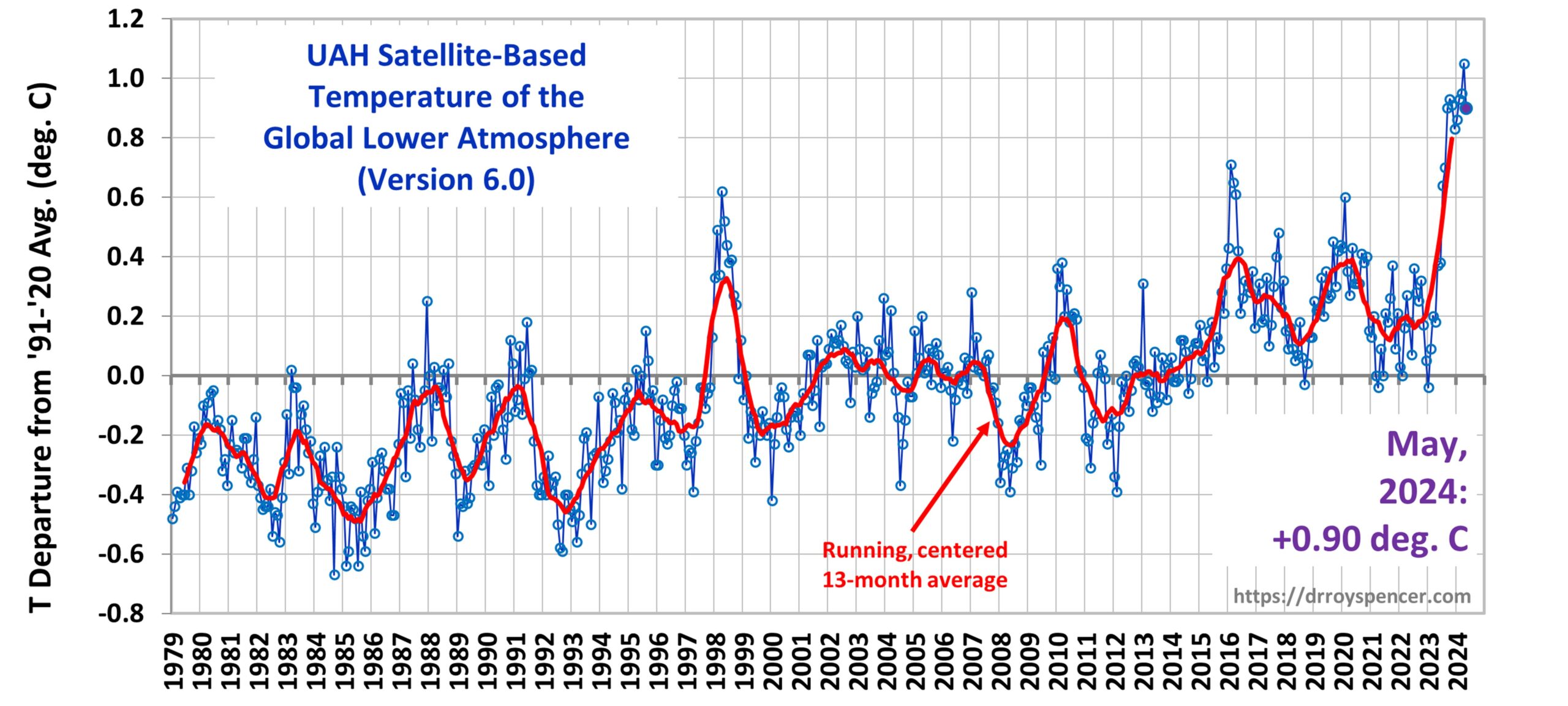
UAH dropped in May, but remains near the peak. UAH thinks this nino packs an unusually strong warming punch and the warmth has stayed near the peak longer than other ninos.
-
3
-
-
12 hours ago, donsutherland1 said:
I didn't mean that the data in the chart is not meaningful. However, there are better ways to judge overall temperatures for subseasonal and seasonal periods. For example, using only metrics such as used by Heller, there could be a July where the temperature spikes to let's say 100° in Philadelphia, but the month overall could wind up cooler than normal. Heller's type of analysis would flag it as "hot" if he is scoring things based on 100° days. Meanwhile, there could be another July where the monthly anomaly is +2.5°, but the highest maximum temperature is 97°. If Heller is using 100° days, his analysis would flag the month as "cool." Period average highs, lows, and means do a better job in assessing the outcome for the period in question.
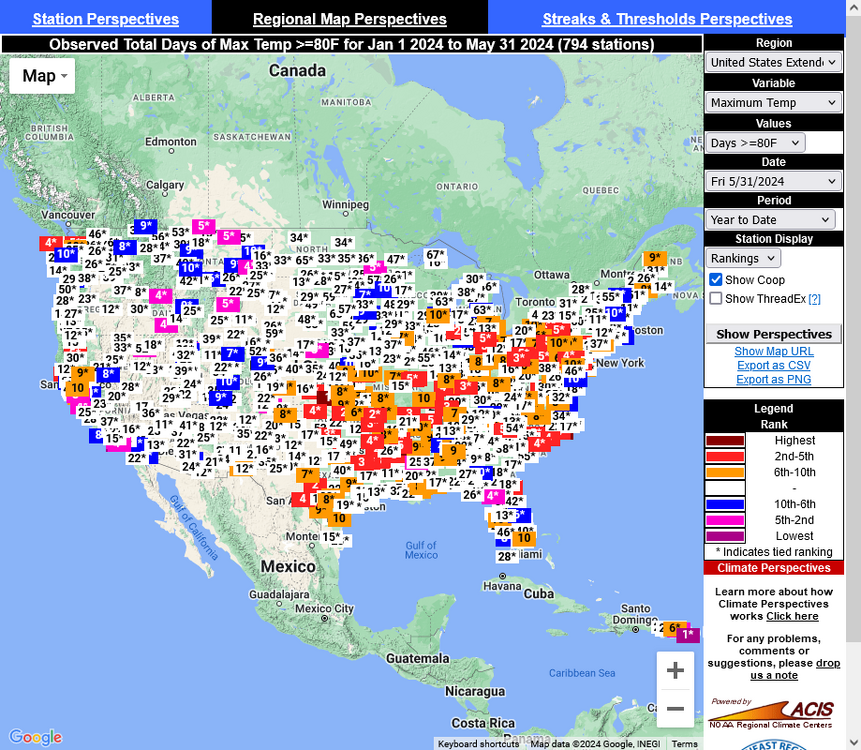
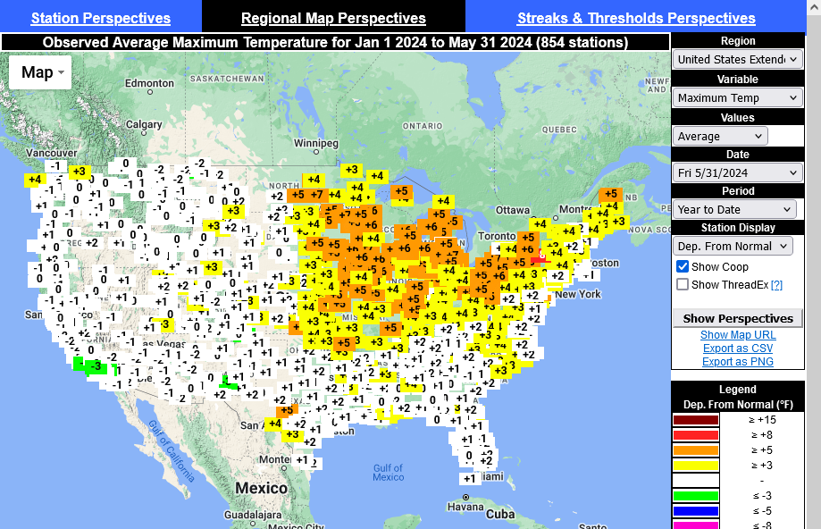
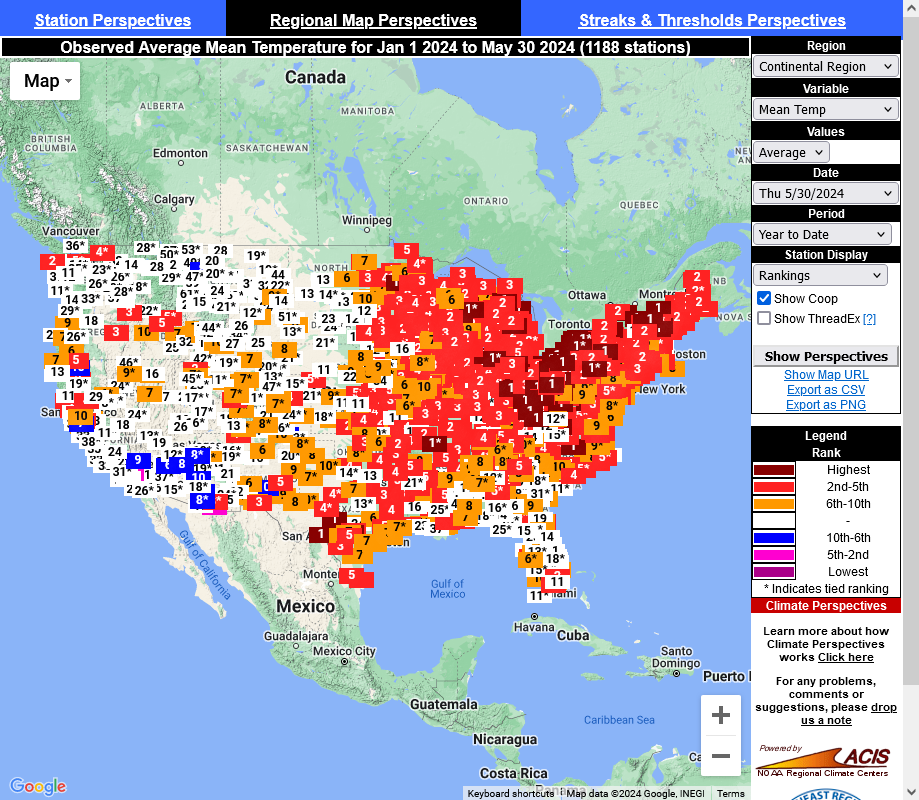
I'm calling BS on the chart, a typical Tony Heller cherrypick. The charts below shows rankings for 80F days this year and the departure from normal for high temperatures. The only area that didn't reach 80 was Alaska. Most of the US has had an average or above average number of 80F days this year and almost the entire US had average or above average high temperatures. Its been a warm year so far. Tony picked the best stat he could find to hide it.
-
1
-
-
11 minutes ago, ChescoWx said:
of course.....with the adjustments applied to arrive at the official altered data.
Nope. He is tracking the daily temperatures on ACIS. Here's the year to-date from ACIS

-
2
-


![Screenshot 2024-06-24 at 17-26-45 SERCC Climate Perspec[...].png](https://www.americanwx.com/bb/uploads/monthly_2024_06/250093433_Screenshot2024-06-24at17-26-45SERCCClimatePerspec....png.9051fd8c0a642b3946f54c85af36fc14.png)


Occasional Thoughts on Climate Change
in Climate Change
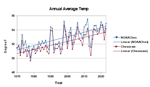
Posted
Here are the annual average temperatures for the 3 main historic coop sites in Chester County. Further evidence that Phoenixville ran warm in the mid-20'th century. Not that the other sites don't have potential data inconsistencies. Need to include other stations to fully resolve. When I look at the Chesco coop data I don't see any reason to worry about the NOAA bias adjustments. Every one that I have checked in detail is justified.