


chubbs
-
Posts
4,231 -
Joined
-
Last visited
Content Type
Profiles
Blogs
Forums
American Weather
Media Demo
Store
Gallery
Posts posted by chubbs
-
-
16 hours ago, WolfStock1 said:
I think you're generally reinforcing my point, which is that this thing is much harder than most people thought it would be, and we're making less progress than people thought we would even given the increase in the use of renewables that we've seen.
You say "Renewables only began to move the needle in this decade.", but there is no "this decade" in that chart - there is only "this year", which happens to be an extreme outlier w/El Nino, showing anything other than the same trend upward. I think that's likely the main factor, and not primarily due to energy policy. Only time will tell though, in the years ahead. If it's truly due to energy policy then we should see a continued bending-down of the curve.
My additional assertion would be - this is also turning out to be more economically disruptive than anticipated; vis a vis the increases we've seen in electricity prices, and the resulting economic headwinds that have been experienced, in particular by countries that have had more aggressive renewable policies.
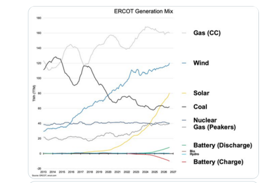
Nobody thought it would be easy to replace fossil fuels. Ten years ago low carbon emission scenarios depended heavily on carbon capture, nuclear and biofuels. It has proven difficult to advance those technologies. On the other hand solar, batteries and EV have advanced much faster than anticipated and it is easier to replace fossil fuels with those technologies than anticipated.
Your views on the cost of renewables are outdated. The energy cost increases we are seeing are due to fossil fuels. Supply disruptions and the inability to meet increasing demand in a timely manner being the biggest problems. Energy costs would be even higher without renewable, batteries and EV. Countries that have to import fossil fuels are trying to find a cheaper more reliable alternative. Even in Texas, where local natural gas is plentiful, met 80% of new power demand with solar last year.
-
 1
1
-
-
9 hours ago, WolfStock1 said:
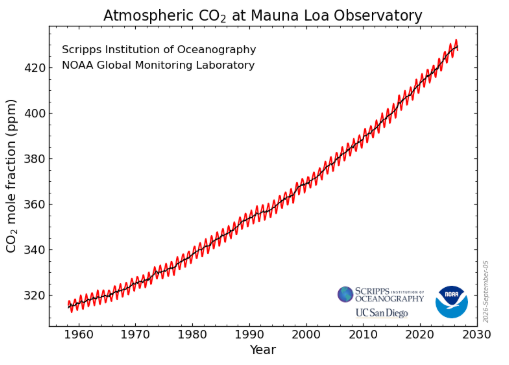
I'm not seeing any slowing in the growth rate:
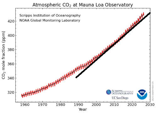
(black line is a straight line)
There *might* be a down year this year, but that's clearly just noise if so. Trends like this don't change that rapidly. Even the early 90's apparent flattening was clearly just a noise fluke.
Yes trends don't change that rapidly. Also CO2 accumulates in the atmosphere. As long as CO2 emissions increase, even very slowly as they have in the past few years, the rate of CO2 increase in the atmosphere also increases. To see a decrease in the rate of CO2 accumulation, need to see a decrease in emissions and that hasn't happened through 2025. This year CO2 emissions are projected to decrease slightly, but emissions are still higher than they were 10 and 20 years ago. To see a decrease in CO2 accumulation in your chart, CO2 emissions would need to flat line or decrease for a longer period of time.
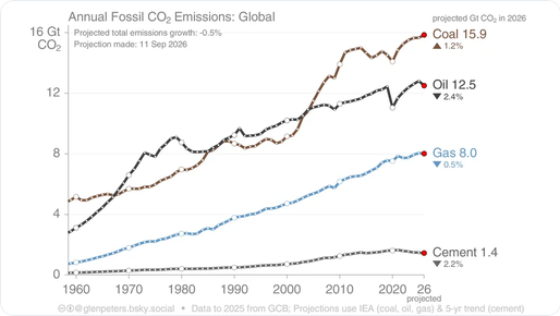
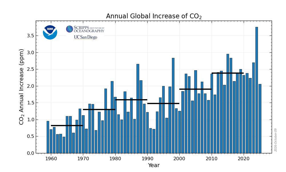
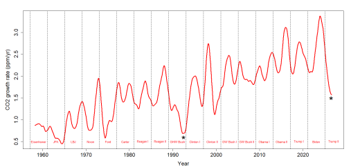
You'll see the impact of emission changes more easily in this chart. CO2 emissions and CO2 accumulation increased steadily through the 2010s. Renewables only began to move the needle in this decade. This years CO2 increase, when posted, will be the smallest in 15 years. If CO2 emissions flat line or decrease slowly in the remainder of this decade, then decade average emissions will still be larger than the 2010s. So would expect a small increase in the decade average CO2 accumulation which would set us up for a decrease in the CO2 accumulation rate in the 2030s.
Like I said above don't want to minimize the size of the problem. We are fighting growth in energy use, the long life of fossil-fuel emission sources, and the persistence of CO2 in the atmosphere.
-
 1
1
-
-
21 hours ago, Typhoon Tip said:
We should bear in mind that as of 2023, if we consider all transport vs the total of all of the industrialized world, fossil fuels is a lot less than that used to power industrialized civilization. Yeah, EV will shorten the car/light truck load, but seeing as some 70 or so % of fossil fuel energy consumption is outside of the transportation sector, and 70 % is still above what is the geophysical harm threshold... bigger eggs to fry. It's not hurting, no -
I read that a long while ago. I ran this inquiry past Luna/AI and it's still the case per Stanford studies. Industry, et all, is the bigger problem in the carbon footprint of humanity.
The same Luna Q/A resulted in this as far EV offsetting ... "Using 2024, the best-supported estimate is roughly 60%: about 17 million electric cars, plus roughly 1 million electric light commercial vehicles, out of a total near 29 million electric road vehicles when electric two- and three-wheelers, buses, and trucks are included. "
That's A
B, the surge in EV is notable, but has a long way to go. For the sake of morality and virtuosity, a surge may be an indicator of shitting attitudes and acknowledgements ... may be. It would need more sociological/geo-political type review of course. But even so, considering current on the road usage were a small minority as recent as 2024. We'll see if a surge closes the gap very much but it had a long way to go. By early 2025 only about 4% of the world’s passenger vehicles. So good (possible) indicator of an awakening state; vastly insufficient.
Based on all this, I would be surprised if oil spike shifts lower based upon EV surging. Obviously it would effect the curve some small amount... What is needed to turn the curve down is forcing humanity to objectively acknowledge that CC is tantamount to the stench of shitting on their own dinner table - metaphor.
Yes, transportation is only part of the CO2 emission pie and it will take time to replace the large existing fleet of fossil-fuel vehicles. Meanwhile CO2 accumulates in the atmosphere. Our climate outlook is better than it was a decade ago; but, it is not rosy. We have a hard time coming to grasp with the scope of the problem.
-
3
-
1
-
-
18 hours ago, WolfStock1 said:
I'm sensing a cognitive disconnect here. We keep hearing about supposedly-good shifts in CC trends, for years now, and yet this most-important trend - the end result - seems to be unaffected by these shifts:
No inconsistency, the CO2 growth rate has slowed in the past decade as the growth in CO2 emissions has slowed. The CO2 growth rate this year is unusually low. Note however that It is too early to tell how much of this years decrease is emission-related as there are large year-to-year variation in CO2 sinks.
Renewables/batteries/EV will have a much bigger impact on CO2 emissions in the future than in the past. Renewables/EV were uncompetitive and a small fraction energy use a decade ago. Now they are competitive in many markets and capturing almost all the growth in global energy use. The cost advantage vs fossil fuels will only increase with time leading to increased market penetration.
I don't want to minimize the problem however. CO2 accumulates in the atmosphere and there is continuing strong global growth in energy use. The CO2 growth rate won't begin to decline until non-fossil energy captures all the growth in energy use and begins shrinking the population of older fossil fuel burning units.
https://tamino.wordpress.com/2026/10/04/co2-growth-and-el-nino/
-
1
-
1
-
-
The current price spike may be a turning point for oil demand. Global EV sales have surged, mainly outside of China and US. This is the first oil crisis where an alternative was widely available.
-
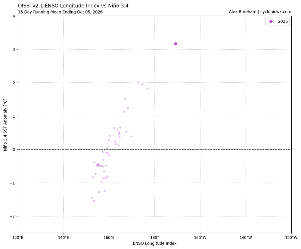
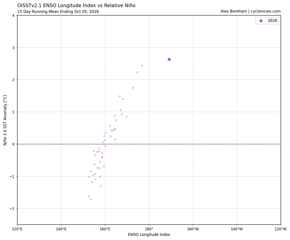
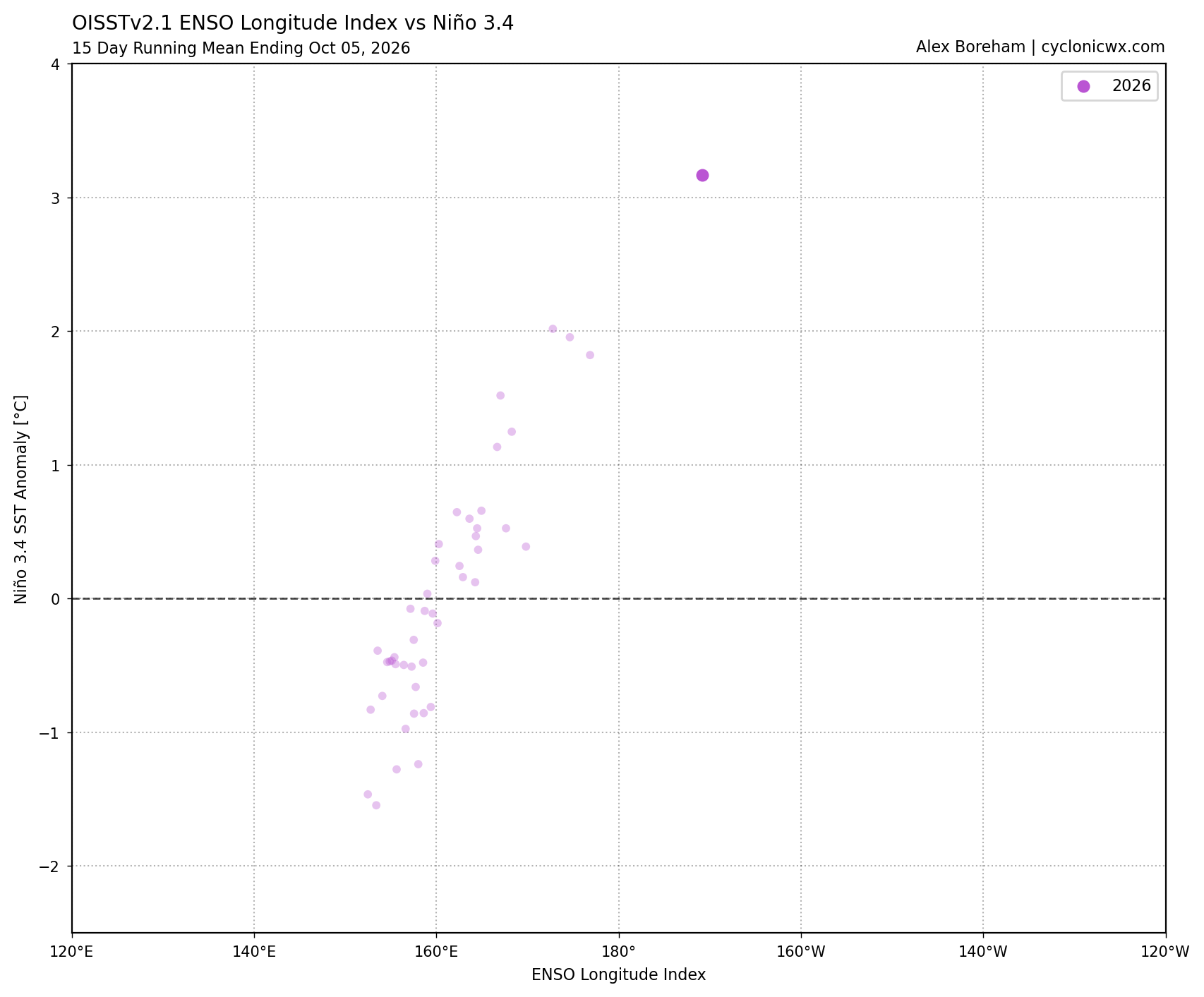
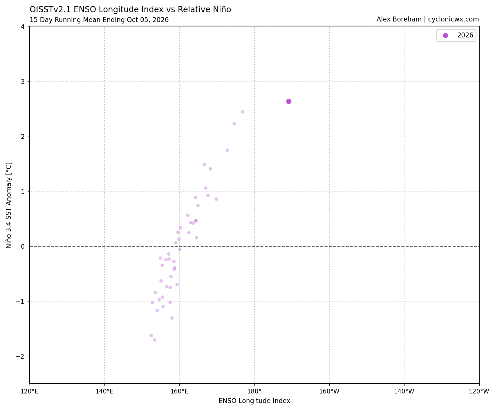
The current ENSO longitude Index lines up better with other years using ONI vs RONI. A couple of possible explanations: 1) This nino is unusually east-based for its strength and/or RONI isn't a great strength indicator for this particular nino. In any case this year is an outlier.
-
1
-
-
9 hours ago, WolfStock1 said:
Hate to be the bearer of bad news then - coal's of course not the only fossil fuel in play:
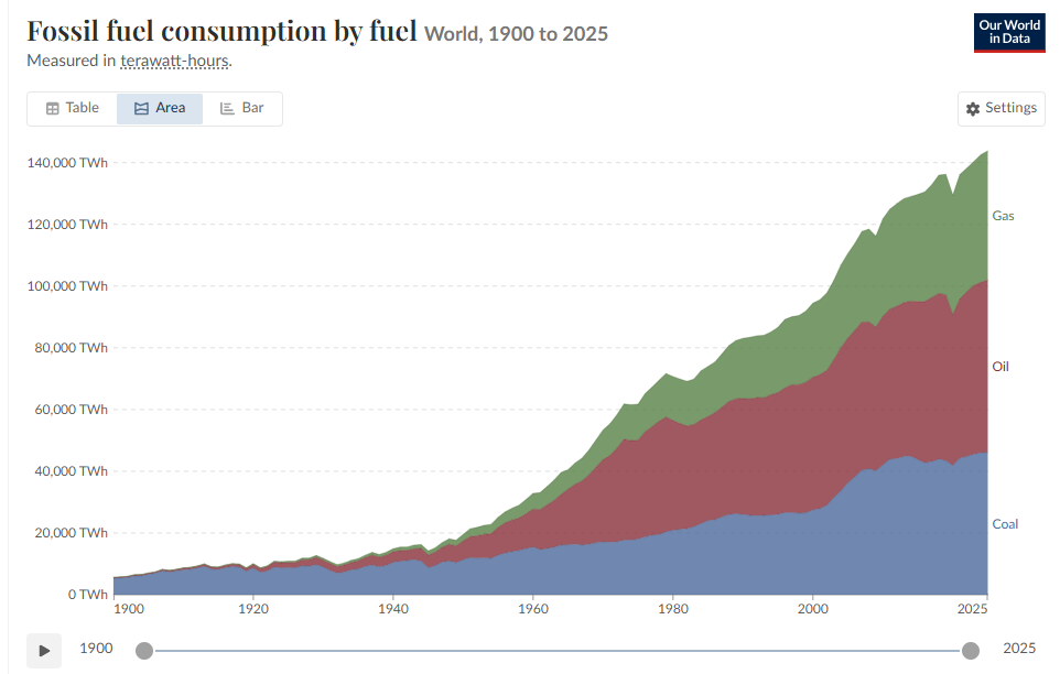
Net zero by 2050's not looking so likely.
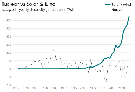
IMO the *only* thing that really has real potential to bend that curve down is nuclear - not solar, not wind, not hydro. Those can make dents, but only small ones.
Physics - specifically energy density - really, really matters. If you don't have density you have to make up for it with size - but you can only go so big before you start running into problems.
Agree that we aren't going to reach net zero by 2050s on our current trajectory. Not even close. But that isn't because renewables/batteries/EV can't replace a significant fraction of the fossil fuels used today by then. Its a question of political will not technology.
Solar and wind grew 3X faster last year than nuclear did in its best year ever 40 years ago. Energy density doesn't translate into cost or offset other negative aspects. I'd love to see more nuclear but what is going to change to improve nuclear's trajectory?
-
1
-
-
13 hours ago, WolfStock1 said:
Without hope of what?
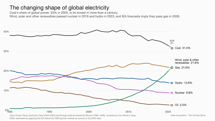
Re: the chart - that's only for electricity production. Now do *all* energy, and in nominal not percentage terms, which is what really matters.
I'll start with coal, the use of which isn't actually going down:
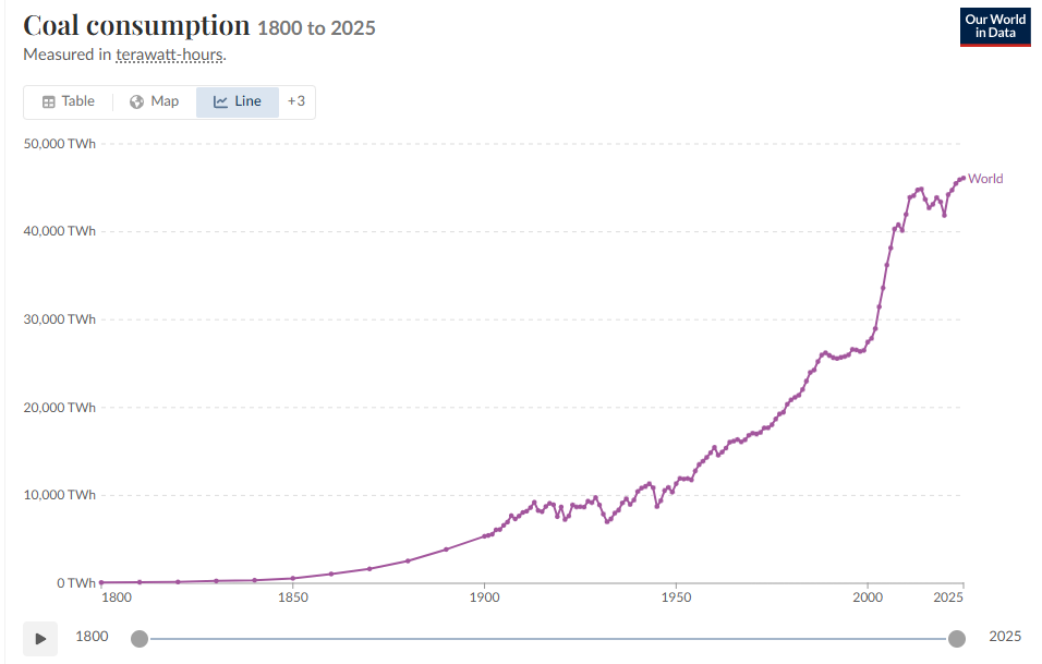
Your chart shows a big improvement in coal's trajectory, from exponential increase to flat. Without renewables coal use today would be much higher, mainly in China and India, who are both adopting renewables aggressively. Furthermore we would be locked in to a dystopian future of increasing coal and fossil use. Now that renewables and batteries have reached economic scale, growth should continue, enabling a peaking of fossil fuel use in the near future. A more rapid turn down is feasible with stronger policy and/or continuing fossil fuel supply problems. That's what gives me hope. Of course my hope may be misplaced, we will see.
-
1
-
-
Zeke Hausfather asks the question, where would we be without renewables?. The answer is: on an energy trajectory without hope. As fast as renewables have increased, we could ramp even faster with more supportive policies. That's how superior the technology has become vs fossil fuels.
https://www.theclimatebrink.com/p/what-if-the-world-hadnt-built-wind
-
1
-
-
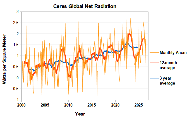
CERES net radiation (available thru July) is behaving as expected in a nino, topping out as global temperatures rise and outgoing radiation increases. The 3-year average indicates that net radiation has stabilized at a high level in the past couple of years. Rapid global warming will continue until there is a drop off.
-
-
10 hours ago, GaWx said:
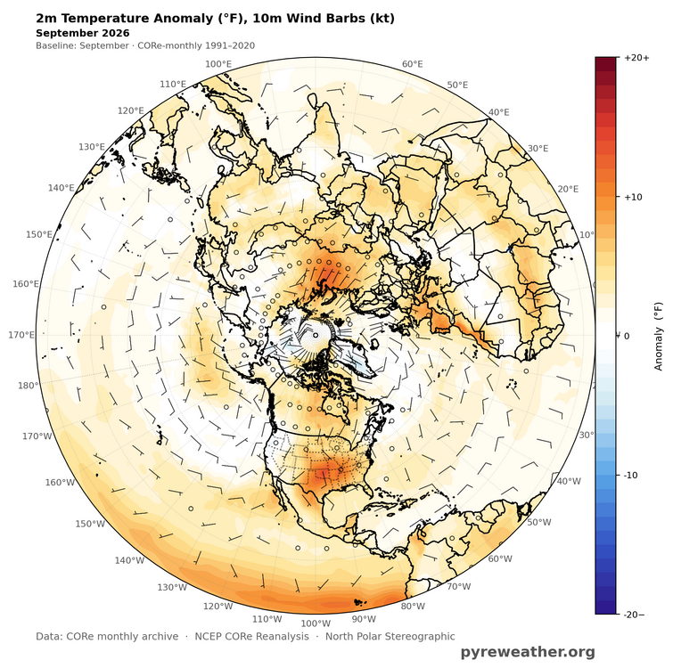
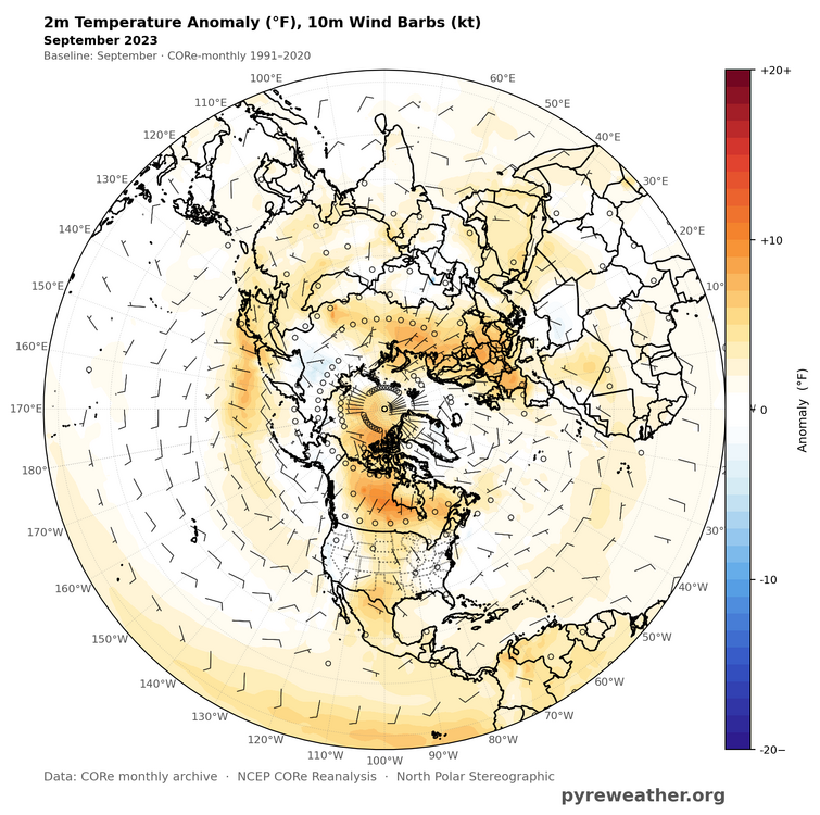
26 is also notably colder than 23 in the Arctic.
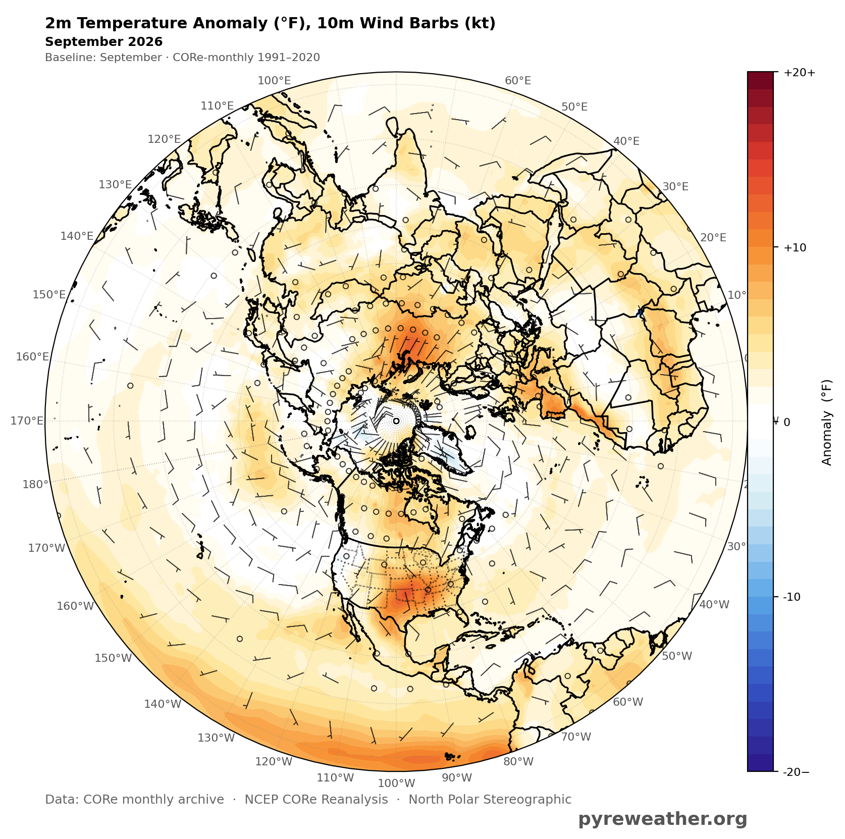
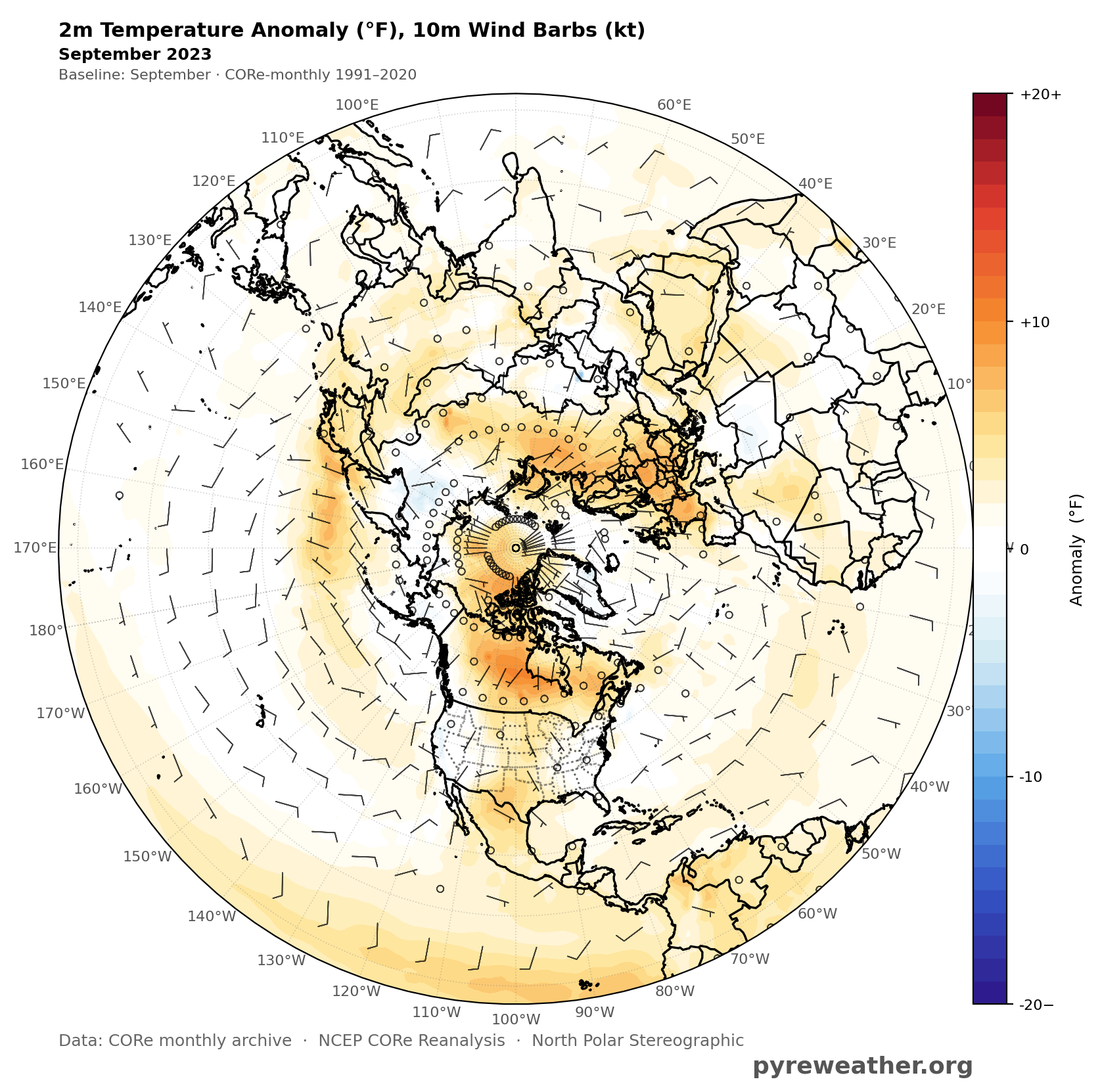
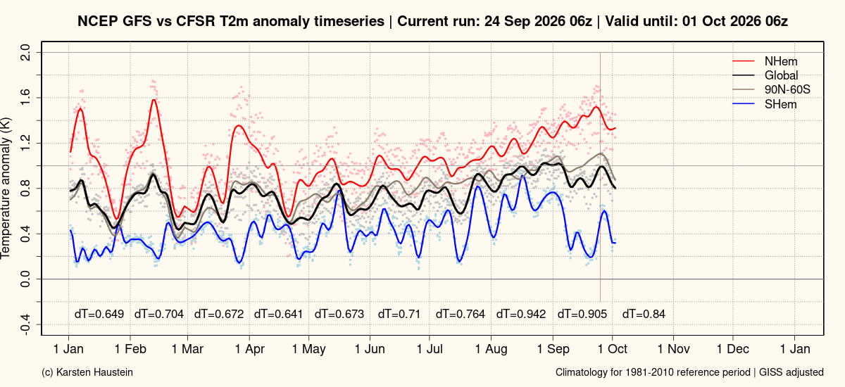
Yes, compensated by more NHEMI warmth in the US, and the tropical and sub-tropical Pacific this year. The antarctic had a bigger impact on global and SHemi temperatures than the arctic because it has strong anomalies and its influence extends to nearby sea ice and ocean.
-
1
-
-
-
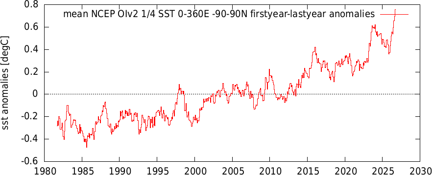
The spike in global satellite sea surface temperatures is similar in magnitude to 2023. This September is 0.15C warmer than Sept 2023 and 0.14C warmer than the peak in Jan 2024.
-
4 hours ago, Mike Cycle said:
An updated version of BEST is available, write up is here: https://essd.copernicus.org/preprints/essd-2026-412/
Berkeley Earth Surface Temperature – High-Resolution (BEST-HR): a 0.25° Global Gridded Temperature Data Set for Climate Monitoring
Abstract. We present version 2 of the Berkeley Earth Surface Temperature dataset, a global observational temperature record that now features enhanced spatial resolution (0.25° × 0.25°) and a new regression Kriging framework that incorporates physically informed predictive fields. The land analysis uses 58,311 weather stations, updated to reflect the latest source archives, and includes separate reconstructions for TAVG (1750–present), TMAX, and TMIN (both 1850–present). Sea surface temperatures are derived from HadSST4, with spatial detail improved using predictors from the ORAS5 ocean reanalysis. The land and ocean fields are merged into a unified product with a refined coastal blending method. A new uncertainty ensemble is introduced to quantify reconstruction and coverage uncertainty, enabling propagation of errors into derived metrics. The resulting Berkeley Earth Surface Temperature – High-Resolution (BEST-HR) dataset offers a globally complete, monthly resolved temperature product suitable for applications ranging from global trend analysis to regional climate impact assessments. The current BEST-HR dataset described in this paper has been archived at Zenodo DOI: 10.5281/zenodo.20428381 alongside the merged weather station data used to generate it DOI: 10.5281/zenodo.20427092. Monthly updates to these datasets will be provided primarily through the Berkeley Earth website.
Here's warming since 1850 for the Mid-Atlantic in the new Berkeley dataset. Chester County has similar warming to the region as a whole. The Berkeley warming in good agreement with NCEI, and other groups.
https://dashboard.theclimatebrink.com/#map

-
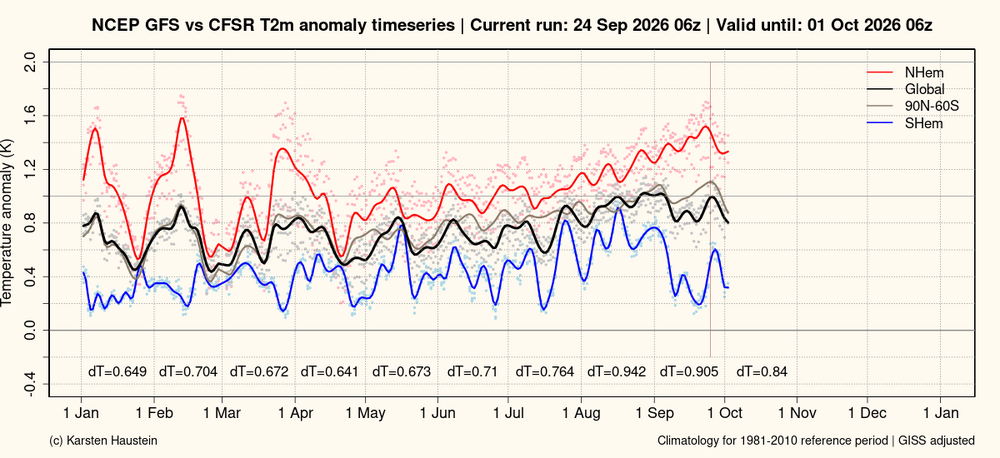
Globally September will end up cooler than August, due to a cool Southern Hemisphere paced by Antarctica. In strong contrast to September 2023 when a very warm Antarctica contributed significantly to "gobsmacking" warmth.
-
1
-
-
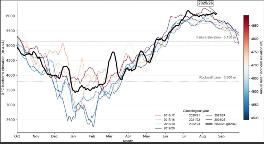
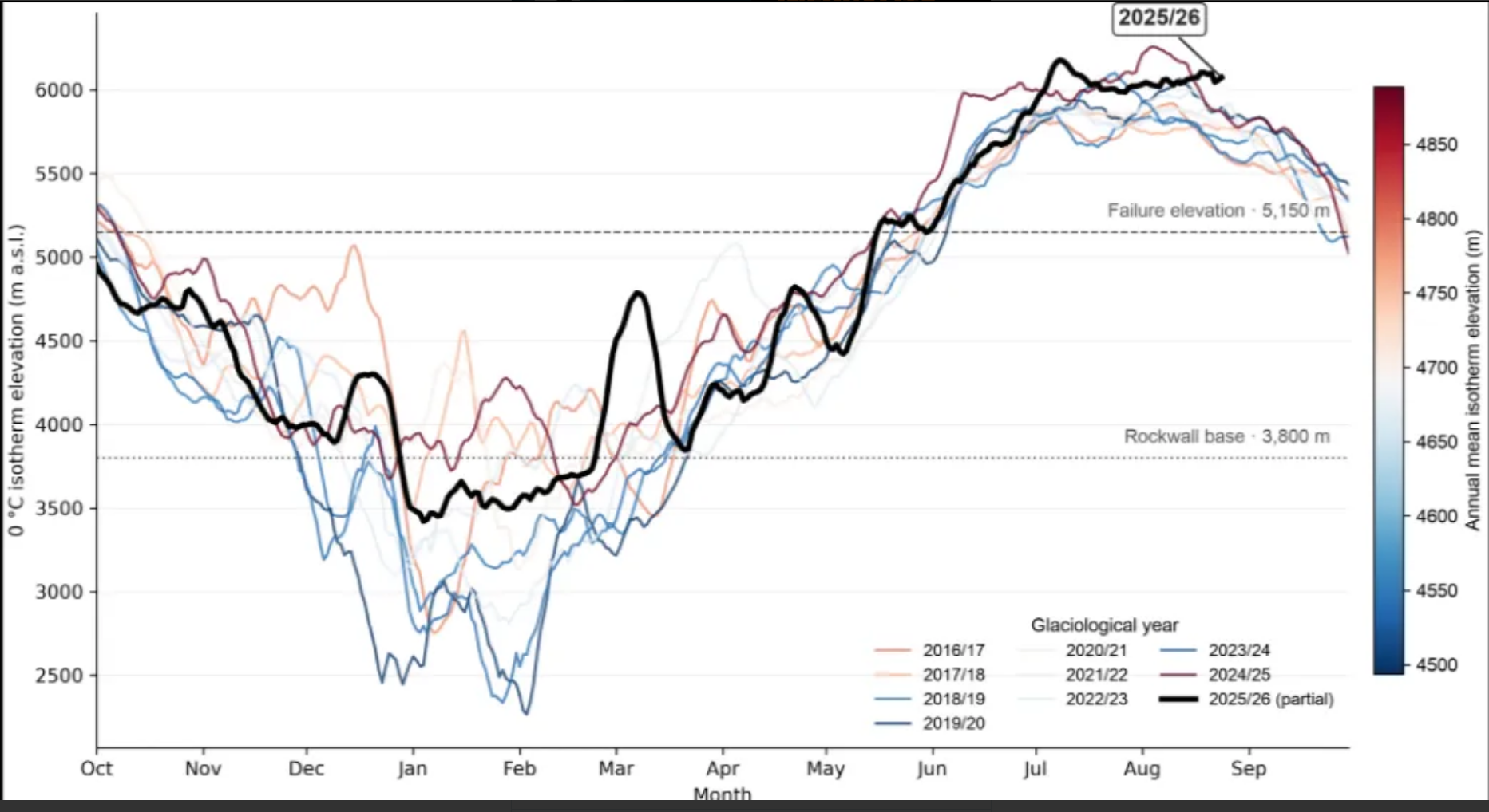
World Weather Attribution report on the Nepal landslide. Too early for definitive attribution; but, report covers the various climate-related modes of slope de-stabilization. Also shows that strong melting was present at and well above the zone that failed. In agreement with the melting discussion upthread. A strong earthquake in 2015 also may have pre-disposed the slope for failure.
-
1
-
-
12 hours ago, Mike Cycle said:
There is significant difference between the nClimGrid annual Tavg that can be downloaded at Climate at a Glance, and the individual cells that make up the nClimGrid and that are averaged to make the Chester County data at CAAG. An example is provided below. What this means is that comparing raw data from a station list that changes over the years to a stable average from nClimGrid that always includes all cells will allow the raw data to incorporate shifts in lat/lon, but not the adjusted data. I have not had time to do the work yet, but what needs doing is to make time series from the nClimGrid cells that matches the raw data dates and locations. Since this thread is "battle-of-actual-vs-altered-climate-data". Another step would be to find the average elevation of each cell, and use the station elevation to apply a lapse rate to the nClimGrid cell data.
Here is a comparison of Phoenixville raw (complete years only) to the nClimGrid cell data. Also, a closer look at the Phoenixville raw data sheets might shed some light on how Phoenixville collected the state's record for high temp.
.thumb.JPG.9d9edd1a4361428954a4d577a67aeb3d.JPG)

TavgwithPhoenixvilleRaw.thumb.JPG.8cc4f31ff5475cd291018c23578daa94.JPG)
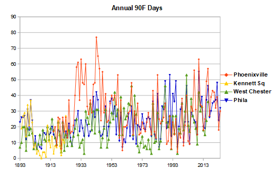
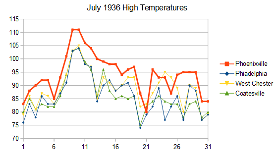
Why Phoenixville has the state record is covered in this thread. Phoenixville ran much warmer than other local stations on summer afternoons between the mid-1920s and the 1948 move. Probably due to a shelter that didn't provide adequate sun shielding. The spike in 90F days in the 30s and 40s shows the time period when Phoenixville ran warm. In the month when the state record was set, July 1936, high temperatures were 6-7F higher in Phoenixville than other local stations. Another reason why the raw data in Chester County requires bias adjustment.
-
3
-
-
13 hours ago, donsutherland1 said:
Using @TheClimateChanger's inspirational mapping work using AI, I ran a map for Colorado. As noted on numerous occasions regarding Denver, summers have grown hotter with the frequency of 90° days increasing dramatically.

Mean Number of 90° or Above Highs Each Year:
1872-1999: 27.6 days
2000-2025: 50.7 days
2000-2026: 51.2 days (64 days in 2026 through September 10; mean summer 2026 high: 90.4°)Is the rising heat largely confined to Denver or are summers warming across Colorado? Here's how Colorado's most recent 30-years (1997-2026) compare with the preceding 30-year period. The data show that some of the mountainous regions have seen more rapid summer warming than Denver. In sum, Denver's rising heat is part of a larger story of ongoing climate change.

"The long-duration warmth in Colorado continued in August 2026, which was the hottest August on record statewide. The entire state was warmer than average, and the Front Range, mountains, and western slope all had their warmest August on record. It was the third record-breaking month of 2026 so far, with February and March also being the warmest on record. It was the 15th consecutive month of above-average temperatures in Colorado"
https://climate.colostate.edu/monthly_summary.html

-
2
-
-
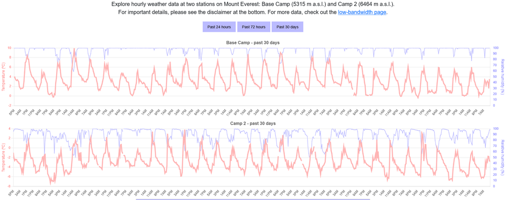
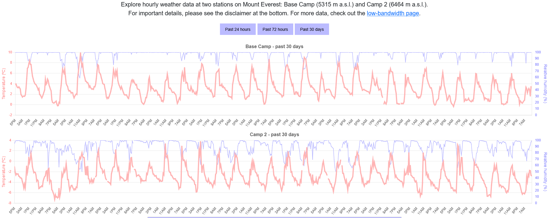
Here' the past 30 days temperature data for the Everest Base Camp. All days are above freezing, reaching as warm as 10C. Temperatures below freezing have been rare in the past month. Even Camp 2 at 6464m has been above freezing most days. It took me a few seconds to google up this data.
https://scidata.appstate.edu/everest/
-
1
-
-
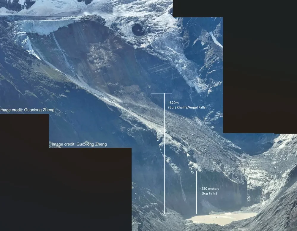
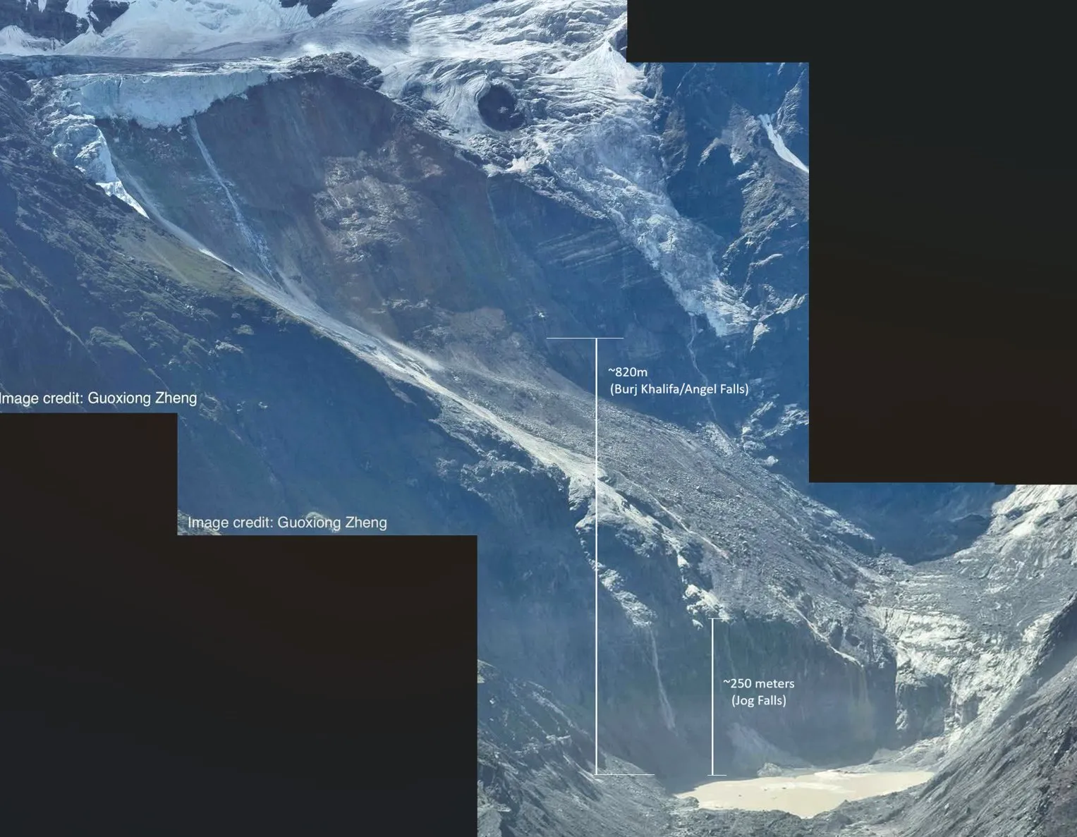
A post-collapse picture of the Nepal avalanche site shows multiple meltwater streams from the glacier remains. Including those clearly sourced from cooler elevations above the collapsed zone. Further supporting the above freezing temperature estimates for the site.
-
1
-
-
10 hours ago, donsutherland1 said:
I may be referring to a different article. I was citing a ClimateBrink piece by Zeke Hausfather, which didn't mention bias correction.
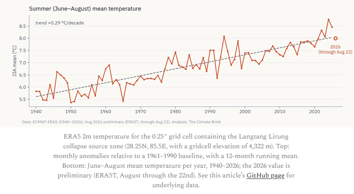
https://www.theclimatebrink.com/p/what-we-can-and-cannot-say-about
That chart is roughly 5C higher than the one I posted, 8C vs 3C for 2026 for instance. The 5C difference makes sense given the 900m difference in the elevation basis of the estimates.
-
1
-
-
5 hours ago, donsutherland1 said:
Here's where I think the issue lies. The graph is based on where the collapsing rock/glacier hit the valley (around 4,300 meters above sea level). The bedrock, glacier was about 5,200 meters. So, the graph is correct in that the region has been warming, but it is not the mean temperature of the actual glacier. Nevertheless, preceding the collapse, temperatures had reached 90° or above in Kathmandu. At standard lapse rates, that would suggest readings in the middle 40s at the altitude of the glacier. During the June 1-August 25 period, Kathmandu had 77 days with highs of 80° or above. At standard lapse rates, that would amount to highs of 35° or above at 5,200 meters. So, at least using the standard lapse rates and Kathmandu's data, most of the summer days saw at least some melting where the collapse took place.
The graph says the temperatures were estimated with ERA re-analysis bias corrected to 5200 feet using regional high elevation weather stations.
-
30 minutes ago, GaWx said:
Thanks. But this graph has avg for entire summer well over 0C? This is far warmer than what Chris Martz was suggesting about the site of the collapse (i.e., only occasionally reaching to barely above freezing), isn’t it?
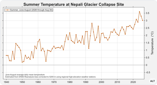
The temperature chart is consistent with the pictures of the collapse site, posted above, which show evidence of both short and long-term melting. The glacier itself is a remnant of a much larger glacier. The info I posted above also shows that local glacier losses have accelerated since 2000. I don't see evidence that the cooler and distant Everest site is relevant.
-
 1
1
-

.JPG.d6dd0e0767f0c505553be988a5918c3f.JPG)

TavgwithPhoenixvilleRaw.JPG.2ce32c32da5fcd927dbbf70316c885f9.JPG)

Occasional Thoughts on Climate Change
in Climate Change
Posted
Your viewpoint on renewables is outdated and misinformed. Yes,renewables were not competitive in the past and required subsidies. Now however they are fully competitive in many markets, without considering climate and energy security benefits. Renewable/EV competitiveness vs fossil fuels will only improve in the future as fossil fuels deplete, renewable and battery technology improves, and climate impacts compound.
The investment in renewables has paid off in spades. Now we have additional low cost energy supply at a time when fossil fuels are struggling to meet increased demand. Per study linked below, Europe saved 100 billion euros due to renewables in 2021-2023 when energy prices spiked due to the Russia/Ukraine war. That cost saving has only increased since.
https://www.iea.org/reports/renewable-energy-market-update-june-2023/how-much-money-are-european-consumers-saving-thanks-to-renewables