griteater
-
Posts
9,635 -
Joined
Content Type
Profiles
Blogs
Forums
American Weather
Media Demo
Store
Gallery
Everything posted by griteater
-
We've had several +AO winters with +IOD, but it's hard to figure out if the IOD is the culprit because there were other issues in there that could have caused +AO (Pinatubo / Descending Solar). To that point, the composite on the JMA site for +IOD is a -AO, and that matches some of my own research going way back (1900).
-
It's a rough start to the strat PV, there's no doubt about it. Is it attributable to Hunga Tonga? - possibly, but if yes, I don't know if/how it can be proven unless it is heavily studied later. Anyway, as Amy indicates there, a ramped up strat PV may be subject to wave propagation / heat flux down the road a bit...I don't know the science behind that sequence.
-
In other news, Nino 3.4 is down to +1.62 from a high of +1.81 on Oct 30
-
-
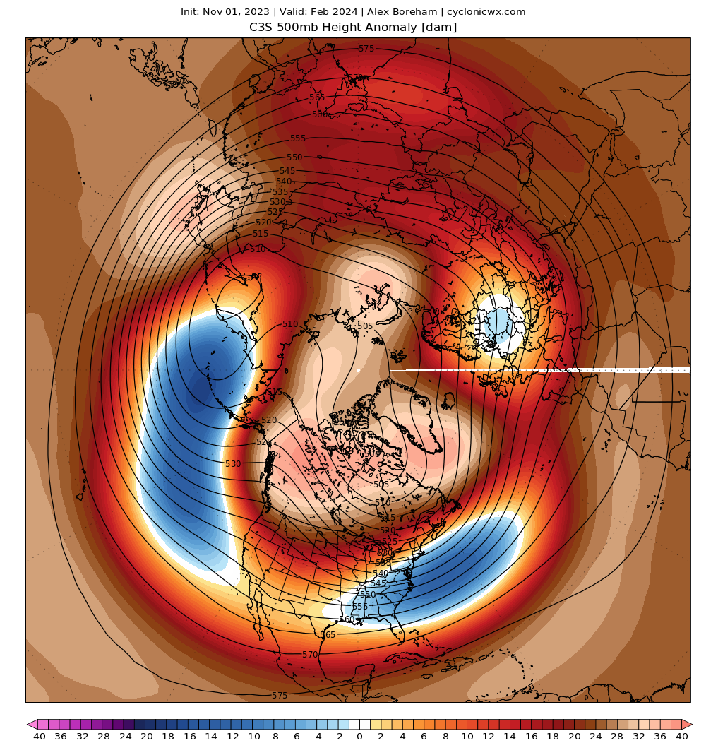
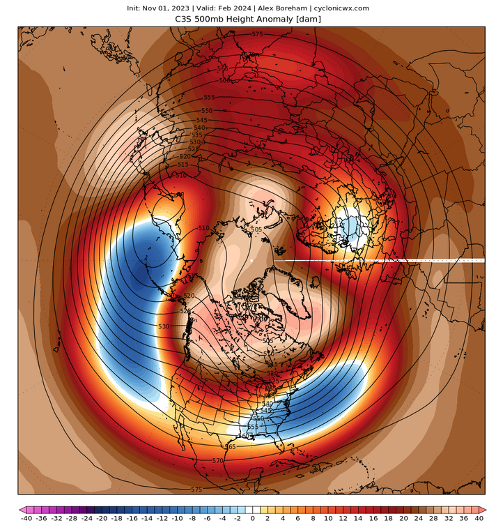
February currently looking like dynamite in a powder keg on a lot of the modeling. Here it is on the Copernicus Ensemble Mean
-
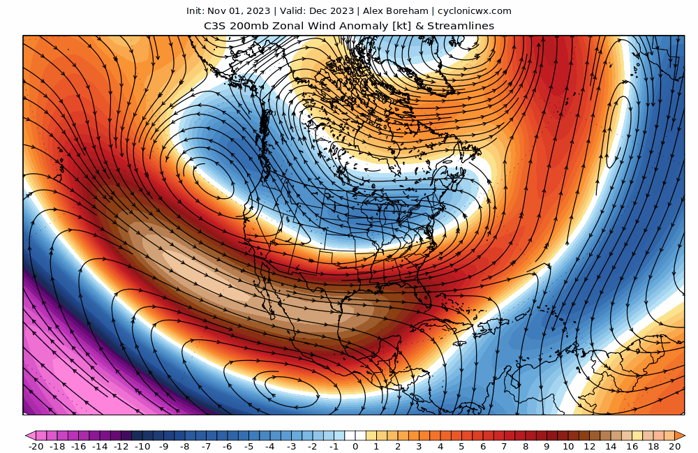
Dec-Feb 200mb zonal wind anomaly on the Copernicus Ensemble Mean. Solid split flow / subtropical jet stream shown here
-
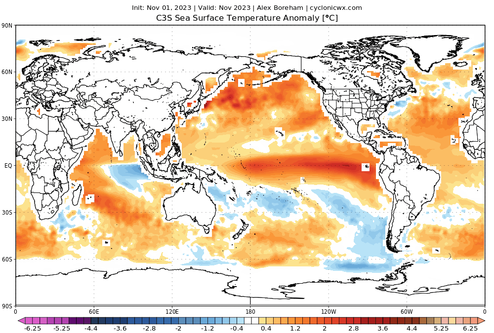
Nov-Mar SST anomaly progression on the Copernicus Ensemble Mean
-
Those 850 wind anomalies are from the daily release of the Euro Weeklies from ECMWF - can get it toward the bottom of this page: https://charts.ecmwf.int/?facets={"Product type"%3A[]%2C"Parameters"%3A[]%2C"Range"%3A["Extended (42 days)"]%2C"Type"%3A[]}
-
Good point and the current developing pattern in November of lower than normal surface pressure over Siberia and colder than normal temperatures in the lower strat also over Siberia tends to have some staying power and favors +AO in early winter.
-
They cover it at the bottom of the page: The plots show: the actual model predictions in box and whisker form in purple: + the box represents the middle tercile, + the whiskers represent the upper and lower terciles (the limits of the whiskers are the 5th and 95th percentiles), + the black line represents the median. the model climatology in box and whisker form in grey, + the box represents the middle tercile, + the whiskers represent the upper and lower terciles (the limits of the whiskers are the 5th and 95th percentiles), + the black line represents the median the "hindcast" of the analysis distribution is shown by coloured bands: + orange band represents the middle tercile, + yellow band represents the upper and lower terciles (the limits are the 5th and 95th percentiles), + the red line represents the median. This presentation allows a quick visual estimation of whether the coming months are expected to see teleconnection indices that are higher or lower than average, and the degree of confidence in that prediction as revealed by the spread of the forecast distribution.
-
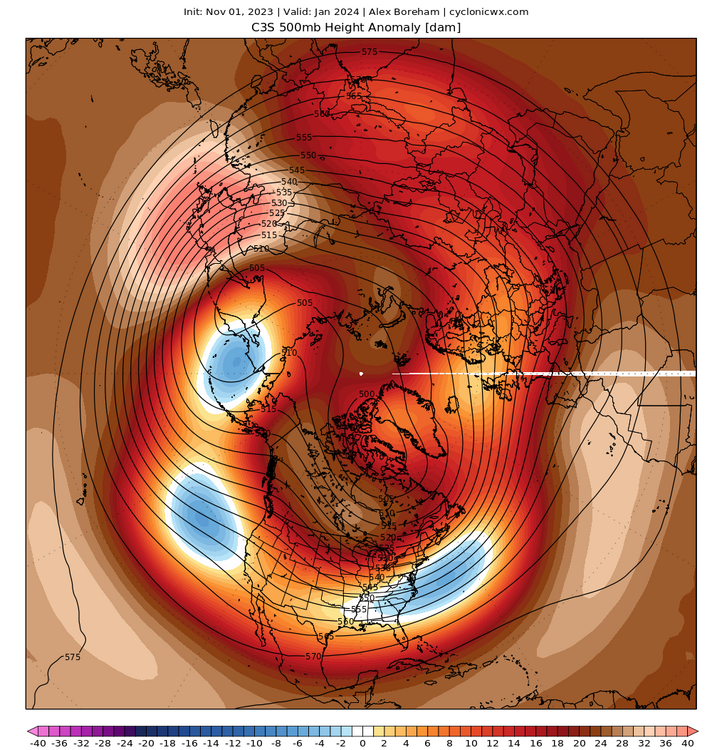
The individual Copernicus models are spitting out some slightly varying solutions, but the JMA for Jan-Mar looks hawt here with split flow combined with big red over AK and the Yukon
-
Euro Seasonal shows a very ramped up and strong SPV here upcoming in Nov, then it undergoes notable weakening thru December into early January. I like the Euro the most with its handling of stratosphere parameters. Having said that, the Euro is more aggressive with this weakening than any other model currently.
-
Will fix here shortly. Guess it’s an issue with the link to the photo hosting site
-
-
Meteo France subtropical jet stream for JFM
-
Meteo France 3-run trend for February
-
3-run trend on the Meteo France model for JFM Aleutian Low weaker and headed west. East coast trough farther north...+PNA pattern This is occurring with the Meteo France among the warmest models in Nino 3.4....peaking here in NDJ at +2.59
-
Can do it this evening
-
Ha, yeah, he was right in saying that ENSO is best viewed in a multi-month sense, but in the end, it actually hurt his own argument for this year
-
Agree. It’s almost like he’s pushing for a certain outcome cause that’s what he predicted all along, but I don’t know
-
@stadiumwave I want to get on board with Roundy's lowpass tool here...I like the concept...but it's always seemed to end up a bit off the mark when I've looked at it / tried to use it (others may have had more success with it). In this particular case, the thing that looks off to me is that the tool is going with a more east-based look with the lowpass / base state convection in blue there centered farther east than what we've seen this summer and fall, and what is forecasted on the Euro Seasonal (2nd image). This is important as the end result in Roundy's tool is showing the big, east-based Aleutian Low look with above normal heights over the Great Lakes and SE Canada like 82-83 / 97-98. I suppose it's still possible for us to go in that direction if we were to have a last gasp major push like Nov/Dec 1991, but I don't think that will materialize.
-
I'm going to go ahead and launch a pre-emptive strike here as P Roundy is using the word "extraordinary" to describe the next westerly wind burst in the forecast charts. Seems like we've been using those types of terms most of this year, but the big push into Super just hasn't been realized to date. I was scanning the historical Nino 3.4 charts since the early 80's on StormVista, and one year that rose sharply late was 1991. It rose a full degree from early November to early January. Here is a westerly wind burst in the timeframe of Nov 15 - Dec 31, 1991
-
What I would suggest is that you first search for a list of top snowstorms in Tulsa. Once you have those dates, you can go to this reanalysis site and view the 500mb and Surface maps together on one screen (you just have to select your dates from the dropdown at the top) - NCEP/NCAR v1 Reanalysis / North America (meteocentre.com) Once you do that, you will get a feel for the types of setups where Tulsa gets hit. I would think an El Nino type split flow would be good there with low pressure tracking from Southern California into Texas, with cold air to the north. Also, big -EPO setups where cold air is diving down just east of the Rockies, and there is a weak wave running the boundary - probably lighter events, but very cold at times
-
See if this is what you recall: https://www.americanwx.com/bb/topic/58841-el-nino-2023-2024/?do=findComment&comment=7046338
-
Griteater’s Winter Outlook (23-24) Link to PDF: Griteater's Winter Outlook (23-24).pdf - Google Drive