

LithiaWx
-
Posts
9,977 -
Joined
-
Last visited
Content Type
Profiles
Blogs
Forums
American Weather
Media Demo
Store
Gallery
Posts posted by LithiaWx
-
-
.png.781b5b6b39eb477a66701cd07ea25bcf.png)
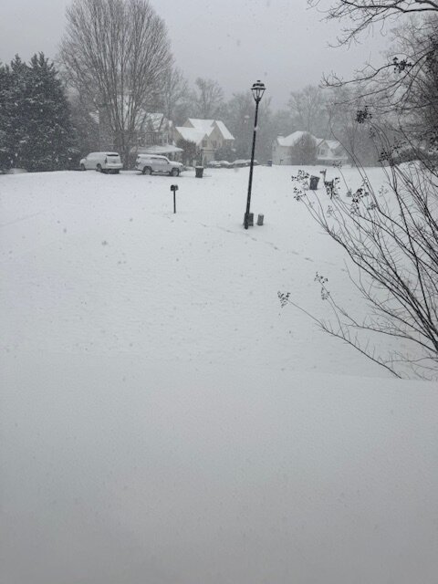
Total about 4" with sleet and a layer of ZR on top.
-
 12
12
-
-
-
8 minutes ago, StantonParkHoya said:
6z GFS just a total dumpster fire
N. GA front end snow thump followed by ice ice baby.
-
1
-
 1
1
-
-
WSW for North Ga
4-6 mtns
2-4 I-20 corridor
-
1
-
-
Just now, suzook said:
Yup, my biggest concern for us. Gonna be a shitshow.
Atlanta really needs that 29 and slow steady rain and close to .75” To get the really catastrophic stuff.
-
1 minute ago, StantonParkHoya said:
For RDU, if we’re going to deal with mixing, we may as well go all in and burn the boats. Let the big dog eat even if it means less pure snow.
Leave one lifeboat that is destined to the cliff.
you might need it.
-
 2
2
-
-
I'm taking the wife to NYC Central Park Manhattan area the next time a snowstorm is projected to hit the NYC area. I'm tired of waiting for it to happen here.
-
5
-
-
1 minute ago, wncsnow said:
Was it though?
.thumb.png.d8f02843a712ef8db6dfee95f4d15d69.png)
Perspective I guess.
-
all or nothing.....well dayum.
-
As the speed goes up the force and amount of energy required is insane. We are somewhere around 3/4 the way down this chart. going from 20mph to 40mph is nada compared to going from 140 to 160. or 160 to 180 etc....

-
3
-
-
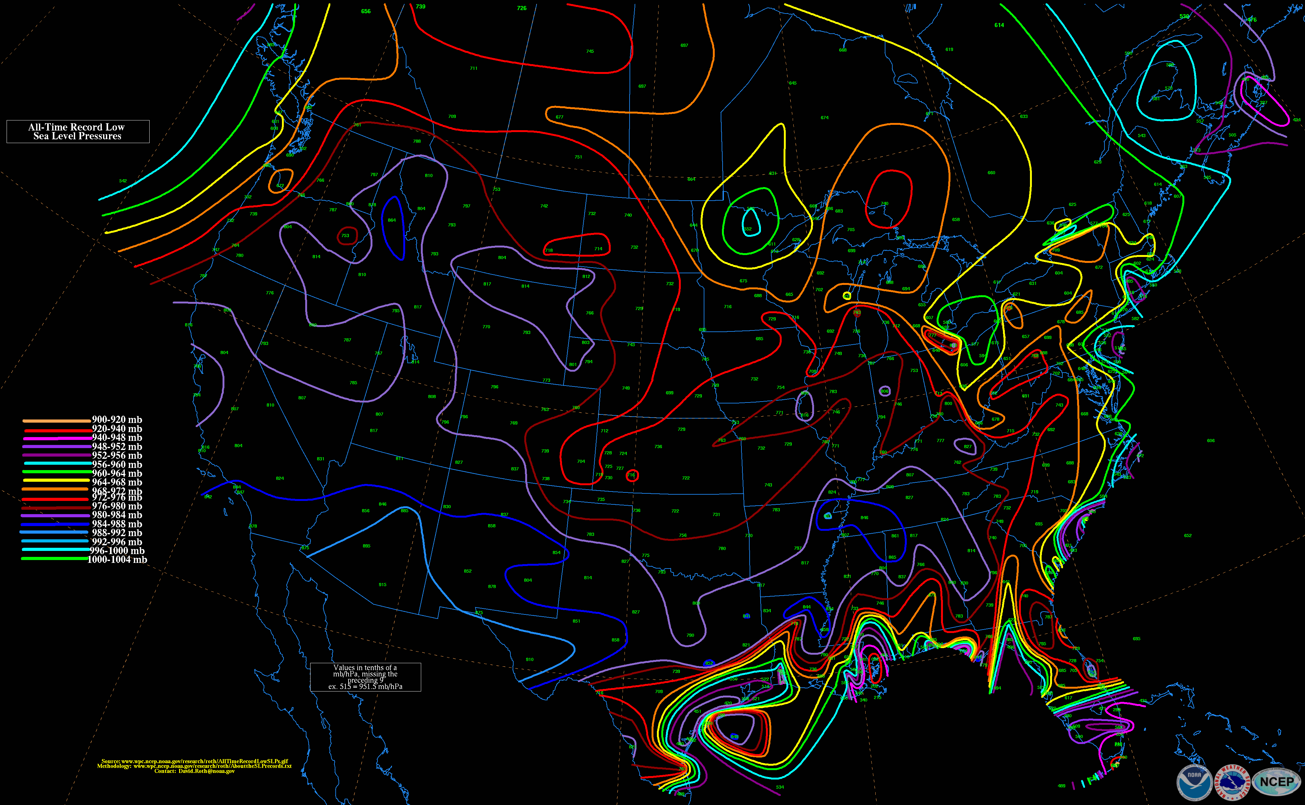
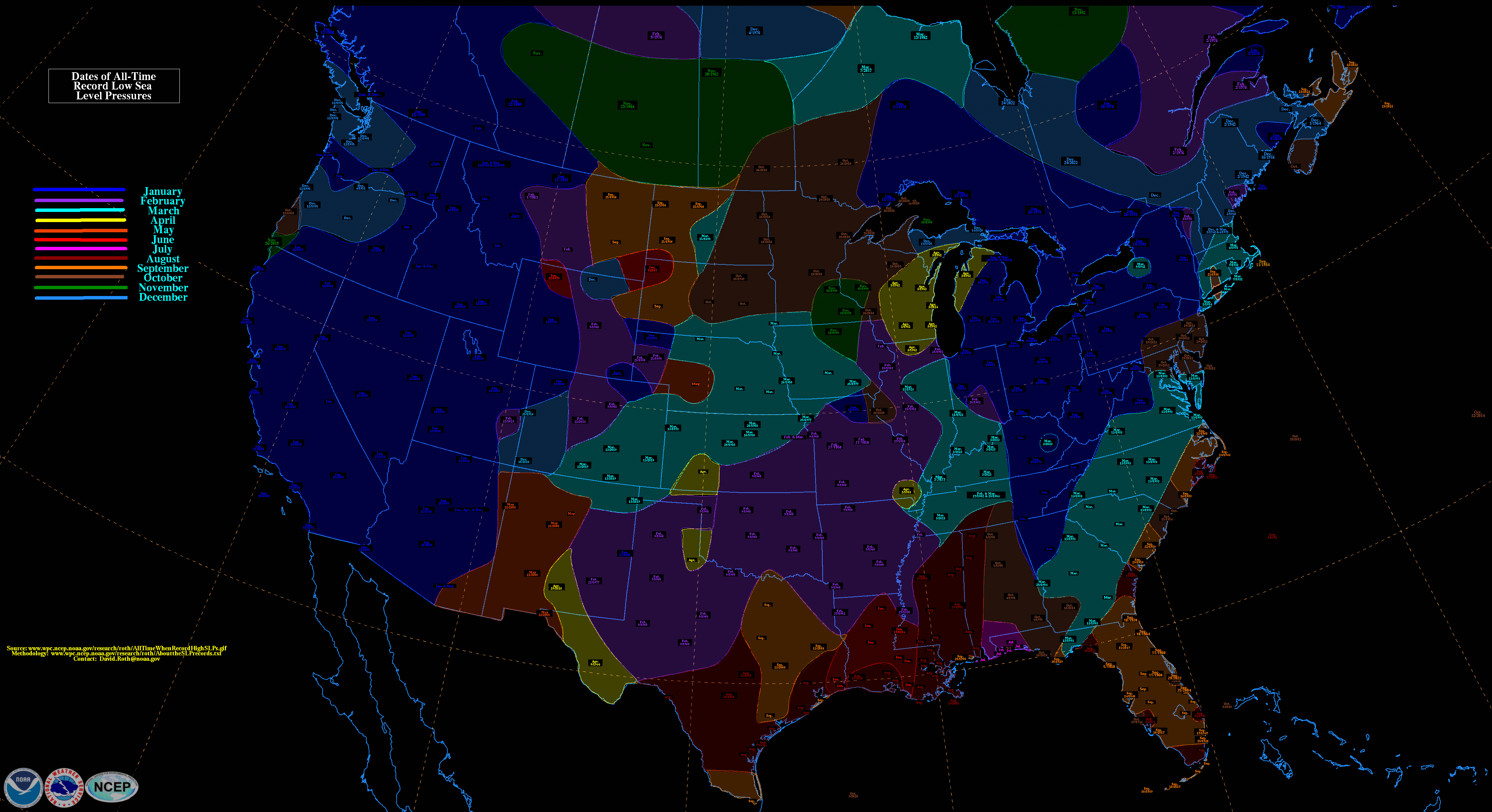
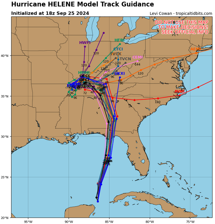
14 hours ago, GaWx said:
When comparing to the pre-Helene low SLP records of all time for any month and from any kind of system (see below), it looks like new all-time record low SLPs have likely been established by Helene in/near the corridor from the FL Big Bend through the GA cities of Valdosta, Warner Robbins, Macon, Milledgeville, and Athens. Helen, GA, probably just missed its record. The prior records were Idalia of 2023 (1049 mb) in the FL Big Bend and mainly from the 3/13/1993 “Storm of the Century” for the listed GA cities.
Record low SLPs (pre-Helene)(map will change once Helene is incorporated):
Dates of record low SLPs (pre-Helene): (3/13/1993 in green) (map will change once Helene is incorporated):
ended up just sub 980 imby from Helene. Pretty remarkable being on the west side of Atlanta.
-
 1
1
-
-
45 deaths so far with only 2 deaths reported in NC. I'm afraid that number will go way up in NC as we get access to the most hit areas. The area of the country we are talking about is rural, spread-out and sometimes isolated places. They can easily be cutoff.
-
5 minutes ago, jm1220 said:
Parts of Atlanta particularly E and S side have 7 to almost 9” rain so far. And the interaction with the upper low means rain likely continues there until the center passes. Wind probably misses them but maybe 12” of rain will be plenty bad enough.
Yep wide 5-6" totals across downtown. isolated 8+ near milner SE.
-
1
-
-
weird that on radar worst appears on the north and northwest side but most winds on the east side.
-
1
-
-
Cat 3 120
-
2
-
-
1 minute ago, SchaumburgStormer said:
We’ve seen time and time again where we have sig pressure drops in between recon passes. Certainly can be a quick process.
Larger storms have winds that tend to react slowly to fast pressure drops. I am not on the windshield wiper ride on intensity though. I'm here to watch and learn, the GoM can escalate storms quickly. If we have an organized hurricane hitting primo water there is no telling how strong she can ramp up in the short time over water.
-
1
-
-
wishcasting the worst of this thing right into mby. Bring it.
-
1 minute ago, beanskip said:
Yeah, lol, almost didn't include ICON in my list, but it's a carbon copy of the other three. I guess I need to learn more about those spaghetti plots. They have all been consistently west of their operational brothers and sisters.
If you think about it models specifically designed for the tropics should be more accurate than globals. Why have them if not?
-
26 minutes ago, NorthHillsWx said:
It’s probably been said on here but Atlanta to the upstate and Asheville need to prepare for extended outages and tree damage on top of historic flooding. This is going to be one those areas never forget, sadly. Seems pretty locked in at this point
I'm in my 40's and still remember Opal. Smaller storm at different angle but that was memorable in Atlanta.
-
6 minutes ago, OSUmetstud said:
Theres no issue with the nhc forecasts. They are consistent with the hurricane models in terms of track and landfall position.
nasty track for Metro ATL for winds if the core passes just west of the city.
-
Is RI still forecast overnight?
-
12 hours ago, BooneWX said:
One thing is clear. The PNA is going to cooperate. There’s probably no single teleconnection more important than that. I love how tall that ridge becomes too. It should at least give the northern energy more opportunities to dig and mingle with the pieces of energy coming out of the Baja area.
I would like to see these diving in towards Texas and not Arizona/New Mexico.
-
2
-
-
3 hours ago, Coach McGuirk said:
February can't be any worse than January, right?
Meh, historic cold spell over Xmas, we all know the balance that tries to restore itself. We were due for boring and possibly warm following that. Timing and flips are legit and we could be headed toward a flip/reshuffle in late January based on pattern flips and timing.
-
Light snow flurries in Dallas, ga again. Pretty.
.png.ca27395ad062b54a65873932ebcfdbda.png)

Mid to long range discussion- 2025
in Southeastern States
Posted
It could turn into a raging sunshine storm by tomorrow.