

WarmNose
-
Posts
1,125 -
Joined
-
Last visited
Content Type
Profiles
Blogs
Forums
American Weather
Media Demo
Store
Gallery
Everything posted by WarmNose
-

The December to Remember 7th-8th blue turd winter threat thread.
WarmNose replied to lilj4425's topic in Southeastern States
Imo It looks like the NAM caved to the GFS. The GFS has had that snow zone in LaGrange for a couple of days now with everyone else getting zilch. That's exactly what the last NAM run looks like -
The December to Remember 7th-8th blue turd winter threat thread.
WarmNose replied to lilj4425's topic in Southeastern States
When does the German model initialize? -
The December to Remember 7th-8th blue turd winter threat thread.
WarmNose replied to lilj4425's topic in Southeastern States
North of I85 bust -
The December to Remember 7th-8th blue turd winter threat thread.
WarmNose replied to lilj4425's topic in Southeastern States
Chris Justice is about to delve into what's on the way here in the upstate. Whatever he says here in the next 5 minutes is set in stone. Snow or no snow, it all hinges on what Chris Justice says -
The December to Remember 7th-8th blue turd winter threat thread.
WarmNose replied to lilj4425's topic in Southeastern States
GFS still a crappy outlier. Idk how any Met could use the GFS to blend any sort of forecast right now -
The December to Remember 7th-8th blue turd winter threat thread.
WarmNose replied to lilj4425's topic in Southeastern States
Bobby Mac said pingers on the radio -
The December to Remember 7th-8th blue turd winter threat thread.
WarmNose replied to lilj4425's topic in Southeastern States
Wintry mix being reported in Spartanburg..foreshadowing for an over performer this weekend? Hmm -
The December to Remember 7th-8th blue turd winter threat thread.
WarmNose replied to lilj4425's topic in Southeastern States
Small hint at a warm nose on the SC GA border then it does something funny as you get up into east central NC -
The December to Remember 7th-8th blue turd winter threat thread.
WarmNose replied to lilj4425's topic in Southeastern States
NAM looks to be ramping up a little sooner on this run. Looks juicy. Someone is about to get hammered -
The December to Remember 7th-8th blue turd winter threat thread.
WarmNose replied to lilj4425's topic in Southeastern States
I apologize for posting PBP on the old NAM run. Smh carry on -
The December to Remember 7th-8th blue turd winter threat thread.
WarmNose replied to lilj4425's topic in Southeastern States
Hoping this doesn't break any posting rules. Looks like Joe B is riding the NAM..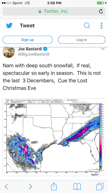
-
The December to Remember 7th-8th blue turd winter threat thread.
WarmNose replied to lilj4425's topic in Southeastern States
Lmao Puerto Rico -
The December to Remember 7th-8th blue turd winter threat thread.
WarmNose replied to lilj4425's topic in Southeastern States
Exactly my thoughts. I85 and points north/west unless we get lucky and somehow don't have to fight rain and 45 degree temperatures at the onset of precipitation -
The December to Remember 7th-8th blue turd winter threat thread.
WarmNose replied to lilj4425's topic in Southeastern States
Euro looks great imo. It's always a huge plus when the Euro jumps on board with wintry precip. And I hope Lookout is right about the warm nose being modeled too strong -
The December to Remember 7th-8th blue turd winter threat thread.
WarmNose replied to lilj4425's topic in Southeastern States
That LP in 87' looks really close to the SC coast. Curious as to how that produced a snow event for areas south and east of I85? Stronger cold air source west of the Apps? Thanks Grit -
The December to Remember 7th-8th blue turd winter threat thread.
WarmNose replied to lilj4425's topic in Southeastern States
Any veterans on here have examples of winter storms where cold air came from west of the Apps where a warm nose wasn't an issue? Thanks -
The December to Remember 7th-8th blue turd winter threat thread.
WarmNose replied to lilj4425's topic in Southeastern States
That was my all time favorite winter storm. Several hours of 28 degree cotton balls followed by .25 inch of sleet and freezing rain -
The December to Remember 7th-8th blue turd winter threat thread.
WarmNose replied to lilj4425's topic in Southeastern States
Without CAD we are set up for failure every time. If our cold air source is west of the apps, it's a no go -
The December to Remember 7th-8th blue turd winter threat thread.
WarmNose replied to lilj4425's topic in Southeastern States
CMC has the warm nose eating right into the southern Greenville county screw zone Climo wins again -
The December to Remember 7th-8th blue turd winter threat thread.
WarmNose replied to lilj4425's topic in Southeastern States
Yep the warm nose is clearly there -
The December to Remember 7th-8th blue turd winter threat thread.
WarmNose replied to lilj4425's topic in Southeastern States
This storm is starting to look like a "Buncombe County Schools: Closed" special "Greenville County Schools: 2 hour delay" -
The December to Remember 7th-8th blue turd winter threat thread.
WarmNose replied to lilj4425's topic in Southeastern States
Snow south of LaGrange? Toss -
The December to Remember 7th-8th blue turd winter threat thread.
WarmNose replied to lilj4425's topic in Southeastern States
If I'm not mistaken It has a lot to do with the topography. As the low spins it's hard to get cold air in fast enough when the cold air source is coming from the north and western side of the apps as opposed to an eastern cold air source damming event -
The December to Remember 7th-8th blue turd winter threat thread.
WarmNose replied to lilj4425's topic in Southeastern States
NAM looks atrocious. Less amped system with mostly rain. Wouldn't a less amped system equal more blue than green? -
The December to Remember 7th-8th blue turd winter threat thread.
WarmNose replied to lilj4425's topic in Southeastern States
If I remember correctly, last year before our January event the GFS sniffed out our warm nose 24-48 hours in advance. It showed it on the SC GA border sneaking up into the southern part of upstate SC. Edit: it could have been the NAM I don't remember

