WolfStock1
-
Posts
242 -
Joined
-
Last visited
Content Type
Profiles
Blogs
Forums
American Weather
Media Demo
Store
Gallery
Everything posted by WolfStock1
-
OK thanks. I see the description of the two: "Sea ice extent is the integral sum of the areas of all grid cells with at least 15% ice concentration, while sea ice area is the integral sum of the product of ice concentration and area of all grid cells with at least 15% ice concentration." I *think* I get the distinction but not sure. Is it the case that "extent" include 100% of every grid cell, for cells with > 15% concentration; whereas "area" includes only the area of ice itself within all those cells? (thus why extent is larger than area) (I had been using the NSIDC page which only shows extent - https://nsidc.org/sea-ice-today/sea-ice-tools/charctic-interactive-sea-ice-graph)
-
Guess I haven't seen the other - the actual area thing. Got a link? I'm wondering how they would define that. Presumably the 15% thing is because there's no well-defined line of the "edge of the ice" eventually the ice starts just breaking up into a bunch of floating icebergs, that extend out for hundreds or even thousands of miles (all the way down to Bermuda even sometimes); how would one measure the "area" of such a thing, especially on a daily basis? Would they just sum up the total of the surface area of all icebergs? (including "the big one in the middle") That seems like an impossible task.
-
Not sure what you mean. There is no "versus". It is area - that's what km^2 is. The extent is the measure of the area - i.e. over how much area the ice extends, with coverage of 15% or greater. Perhaps I'm missing something?
-
Occasional Thoughts on Climate Change
WolfStock1 replied to donsutherland1's topic in Climate Change
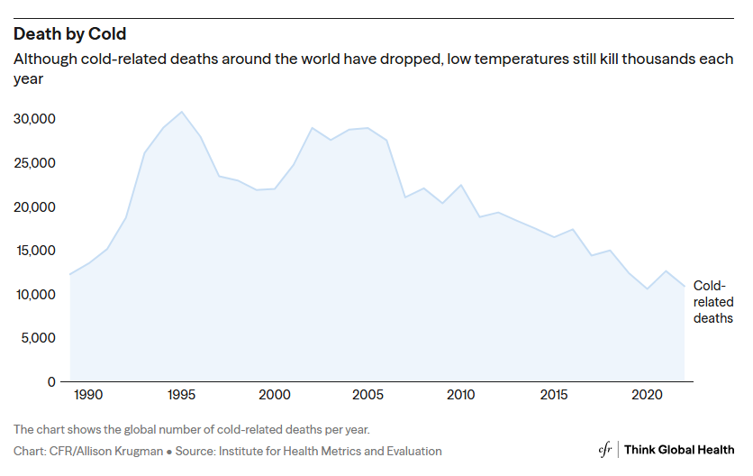
One thing of note is that data doesn't take into account demographics. Specifically: - The rate of change is not population-adjusted - It does not account for age As our population ages (boomer bubble) the rate of deaths from both heat and cold, all other things being equal, are going to rise, since older people are more susceptible: https://www.thinkglobalhealth.org/article/out-cold-most-common-wintertime-injuries-warming-world It's also very much a measurement problem. Whether or not someone has died as a cold-driven or heat-driven factor is very subjective. E.g. that same data shows a far lower number - and decreasing not increasing - for worldwide cold-related deaths: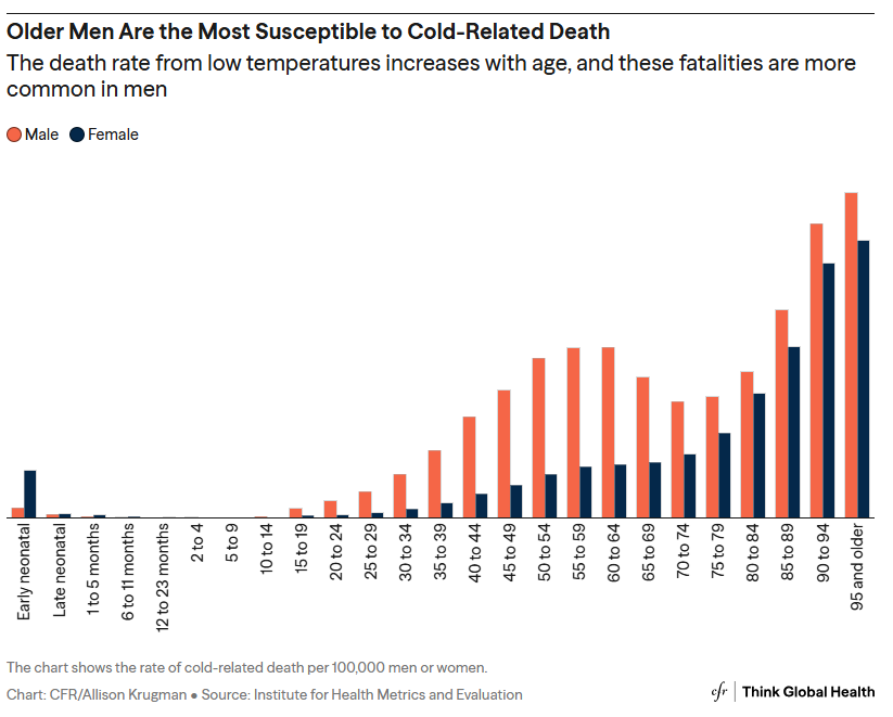
-
Occasional Thoughts on Climate Change
WolfStock1 replied to donsutherland1's topic in Climate Change
Related how? The data presented shows they very much are related, in time. I didn't intend to address/imply a *causal* relationship - that increased CO2 / global warming actually causes increased food supplies. While there is probably some driver there (e.g. myriads of data shows that higher levels of CO2 generally results in more plant growth, and warmer temperatures could open up new areas to agriculture that were previously too cold) - the main driver has been simply higher levels of production - more yield per acre. As you say this is due to a myriad of factors including hybridization etc. One big factor certainly has been mechanization - the development and more ubiquitous use of more efficient harvesting and processing tools (combines etc.), more efficient transportation (trucks, trains, ships, etc.) - things that rely on fossil fuels. The main point of the data presented is to disprove the notion that climate change will not be causing "food shortages" - i.e. making food production trend downward relative to population. There is zero evidence of that, as the data makes clear. -
Occasional Thoughts on Climate Change
WolfStock1 replied to donsutherland1's topic in Climate Change
As the planet's been warming food supplies have been going up. Way up. https://ourworldindata.org/data-insights/food-supplies-have-grown-even-faster-than-the-population-on-every-continent Try again. *Please* don't be so brainwashed by the scaremongers. Look at the data behind the claims. It simply does not support the claims of some growing apocalypse. -
Occasional Thoughts on Climate Change
WolfStock1 replied to donsutherland1's topic in Climate Change
Part of the means of having the resources to have AC is access to abundant inexpensive energy. In less-wealthy countries that means one thing - fossil fuels. Deaths from heat are often caused by excessive strain from physical activity. Activity that can be relieved by machines that are powered by fossil fuels. But that aside - let me reiterate that more people die of cold than from heat each year. You seem to be willfully ignoring that fact. -
Occasional Thoughts on Climate Change
WolfStock1 replied to donsutherland1's topic in Climate Change
Holy moley - this thread is starting to get quite extremist, I have to say. You folks do realize that a lot more people die of *cold* each year, than die of *heat* - right? I don't think you really want to go where you're going. Let's be pragmatic here. MMGW, while certainly an issue, is not a practical threat to human life, in any way, shape or form. People are going to die from extreme heat waves - just as they have since the beginning of time. As the planet warms *less* people will die (and have been dying) due to weather events, not more. -
Occasional Thoughts on Climate Change
WolfStock1 replied to donsutherland1's topic in Climate Change
Orlando is the only one of those cities that's inland, and thus is by its nature hotter than almost every other Florida city. Florida had almost no inland population then; so best comparison would be to some cities in Georgia. (there wasn't a single city in FL off the coast - including Orlando - that was over 10k population) (I used to live in FL, and noticed how the coast of FL rarely got into the 90's compared with inland; they got less 90+ degree days in fact than central NC where I had come from) -
Occasional Thoughts on Climate Change
WolfStock1 replied to donsutherland1's topic in Climate Change
Google is your friend. https://www.agweb.com/opinion/doomsday-addiction-celebrating-50-years-failed-climate-predictions https://bradleyhook.com/why-extreme-climate-change-predictions-failed-what-we-can-do-now/ https://reason.com/2025/04/16/3-apocalyptic-climate-change-predictions-that-failed-to-come-true/ https://www.forbes.com/sites/michaelshellenberger/2019/11/25/why-everything-they-say-about-climate-change-is-wrong/ (does include some Al Gore stuff) etc. etc. Just search on "climate change failed predictions" -
Occasional Thoughts on Climate Change
WolfStock1 replied to donsutherland1's topic in Climate Change
Wow. But... he's a climate scientist with over 55 peer-reviewed publications! https://en.wikipedia.org/wiki/Guy_McPherson Al Gore on steroids -
Occasional Thoughts on Climate Change
WolfStock1 replied to donsutherland1's topic in Climate Change
You said "I don't have time to write my own posts." That sounds to me like the whole post, not just the headline. -
Occasional Thoughts on Climate Change
WolfStock1 replied to donsutherland1's topic in Climate Change
Wait - so we're basically having discussion with AI, with TCC as a proxy? No thanks. Can we perhaps start a separate "No AI" thread? -
Occasional Thoughts on Climate Change
WolfStock1 replied to donsutherland1's topic in Climate Change
OK thanks - that's the raw data at least. Don't want to provide a link to a larger more readable version of your analysis? -
Occasional Thoughts on Climate Change
WolfStock1 replied to donsutherland1's topic in Climate Change
Can you be more specific? There's a ton of stuff on their site, and I'm not finding that. https://www.weather.gov/buf/ There's a Rivers and Lakes page, but generally that just seems to have gauge data for water levels and flows - not seeing anything with regards to temperatures, including those charts. -
Occasional Thoughts on Climate Change
WolfStock1 replied to donsutherland1's topic in Climate Change
Any chance you could post a link to the data and/or a full-size pic of that? Pretty hard to read as is. -
Occasional Thoughts on Climate Change
WolfStock1 replied to donsutherland1's topic in Climate Change
OK fair enough. I see there are factors that result in differences between the hemispheres, though 3 degrees C (about what's shown on that chart) just seems like a bigger range than one would expect as variation. It doesn't seem like the physics would be such that land-vs-water heating rates would be a factor - it should even out should it not? Yes the land heats faster than water, but it also cools faster at night. I could be wrong but I wouldn't think that the cause of heating faster during the day is due to higher level of actual heat absorption, but rather due to the higher level of thermal conductivity of the oceans (they absorb just as much heat - it just spreads out mostly across the depth vs remaining on the surface) Biggest factor though would probably be Antarctica reflecting the energy from the sun back to space. I see another factor is currents; one would think that factor would be minimal, as most currents don't cross the equator; though I know it's complex and there is some crossing. -
Occasional Thoughts on Climate Change
WolfStock1 replied to donsutherland1's topic in Climate Change
Yes I know. I was talking about the annual seasonal fluctuations. E.g. if you set up a series of sensors in Iowa and monitored them for 86 years you could show the same type of data, with the same chart showing the seasonal variability as well as a general yearly upward trend. My point is that you wouldn't call that "global air surface temperature", because you're not measuring the whole globe with evenly-spread sensors - you're just measuring Iowa; and that explains why it goes up and down with the seasons - because all of your sensors are in the northern hemisphere. If instead the data was actually the whole global temperature - you shouldn't see the seasonal up-and-down like that, because the temperature rise in the southern hemisphere in the winter should match the temperature rise in the northern hemisphere in the summer - because that's the way the seasons work on earth. -
Occasional Thoughts on Climate Change
WolfStock1 replied to donsutherland1's topic in Climate Change
No offense but - seems like you ought to know such things if you're posting so much on the subject. It's hard not to be skeptical of the data you post otherwise. If it's just a general global singular heating trend - shouldn't we just cross 16C once or twice and be done with it, forever more above that level? (Aside from ENSO, which would cause us to cross that level a couple of times during the transition) -
Occasional Thoughts on Climate Change
WolfStock1 replied to donsutherland1's topic in Climate Change
Hmm - this implies annual oscillation of the Earth's temperature, does it not? I didn't think that was a thing. I know there are oscillations, but they tend to be correlated with ENSO cycles and such, do they not? IOW - seems to me this is just a subset of global mean temperature - e.g. the northern hemisphere only, is it not? -
Wow big last-minute drop at my place near Leesburg. Had leveled off at 35-36 for a couple of hours and even started rising a bit, then starting at 5:30 plunged down to 32 within 90 minutes.
-
Thanks guys! Both of those are great.
-
Occasional Thoughts on Climate Change
WolfStock1 replied to donsutherland1's topic in Climate Change
You're missing the point and whole picture here though. The scope of the original point wasn't actually about consensus on science. Allow me to re-quote what I was addressing: "The scientific consensus is that the long list of CO2/warming debits far outweigh a couple of benefits. " That's a misleading statement. Note that it's NOT specifically addressing the *science* of CO2/warming, but rather it's addressing the *whole* of pros vs cons - generally this is going to refer more to the societal pros and cons (economic, social, and political) than it is to the scientific. One could have complete 100% consensus (if one found some way to reasonably measure it) on the science of AGW (if that were possible), but still not have any consensus on the other aspects, vis a vis the policy prescriptions. And of course the debits vs benefits very much includes the non-scientific aspects. Stated in the form of a question: Is it scientific consensus that mankind, as a whole, would have been better off - through all of time, both historic and future - if we never emitted any CO2? I have see no such claim made by anyone, let alone any documentation of "consensus" of such a claim. If such a thing exists - please show the measurements, given that this is a scientific thing. -
Occasional Thoughts on Climate Change
WolfStock1 replied to donsutherland1's topic in Climate Change
Sorry but the notion that *any* person or organization could have enough information to make such a judgment - let alone there be "consensus" on it, is laughable. This kind of judgment requires essentially omniscience - a full and complete view of the long lists of benefits and drawbacks, with appropriate weighting, and timescales, applied to each. This is some that people and organizations - even collectively - don't have. Let alone on an individual basis, such as what would be required for "consensus". In case you're wondering why there's so much pushback - this is why. People don't like baseless statements like this. -
Occasional Thoughts on Climate Change
WolfStock1 replied to donsutherland1's topic in Climate Change
Given that the greater Kyoto area has a population of 3.6 million people (with I'm sure a similar but upward-sloping curve), and is thus subject to UHI effect - I'd say yeah you could adjust that. Not saying UHI accounts for that - just saying that it can account for some portion of it. I'll reiterate what I have often before - IMO the only fully valid datasets with regards to MMGW are ones from truly remote areas. Sea ice, ocean temps, and fully-rural sensors - thumbs up. City-based or even suburban sensor data - not so much.