Buckeyes_Suck
-
Posts
2,693 -
Joined
Content Type
Profiles
Blogs
Forums
American Weather
Media Demo
Store
Gallery
Everything posted by Buckeyes_Suck
-
Upstate/Eastern New York
Buckeyes_Suck replied to BuffaloWeather's topic in Upstate New York/Pennsylvania
Lock this in please -
Upstate/Eastern New York
Buckeyes_Suck replied to BuffaloWeather's topic in Upstate New York/Pennsylvania
Ill take a number 5, 6,8,10,12,and 18 with fries. -
Upstate/Eastern New York
Buckeyes_Suck replied to BuffaloWeather's topic in Upstate New York/Pennsylvania
That's a cool view...reminds me of The Matrix when Neo visits the Architect -
Upstate/Eastern New York
Buckeyes_Suck replied to BuffaloWeather's topic in Upstate New York/Pennsylvania
Forecast discussion hinting at possible high wind event for thanks giving coming to fruition... -
Upstate/Eastern New York
Buckeyes_Suck replied to BuffaloWeather's topic in Upstate New York/Pennsylvania
I went to school at McKinley when this happened, me and some friends left at 1 and never made it home. Drove around until 1am and couldn’t find a rout to s buffalo. Must have pushed out 50 cars while never getting stuck in my 1990 4 door lumina with studded snows. What a night lol. -
Upstate/Eastern New York
Buckeyes_Suck replied to BuffaloWeather's topic in Upstate New York/Pennsylvania
Isnt that where we need a low for sw flow lake effect? -
Upstate/Eastern New York
Buckeyes_Suck replied to BuffaloWeather's topic in Upstate New York/Pennsylvania
Chautauqua ridge gets some love in that graphic. -
Upstate/Eastern New York
Buckeyes_Suck replied to BuffaloWeather's topic in Upstate New York/Pennsylvania
Keep coming back cutoff and just sit for days -
Upstate/Eastern New York
Buckeyes_Suck replied to BuffaloWeather's topic in Upstate New York/Pennsylvania
You're correct in that it comes down to money. Here's the issue though, if american government forced/subsidized every american person and company to be completely green rather than allowing it to become economically viable two things would happen. Our economy would collapse and the rest of the would continue to pump CO2 into the atmosphere as their economies would likely collapse as well due to ours collapsing. We will become carbon neutral as technologies cheapen and as it becomes economically viable. -
Upstate/Eastern New York
Buckeyes_Suck replied to BuffaloWeather's topic in Upstate New York/Pennsylvania
exactly. -
Upstate/Eastern New York
Buckeyes_Suck replied to BuffaloWeather's topic in Upstate New York/Pennsylvania
I believe that we are contributing to climate change but charts like these are garbage and in my opinion contribute to empowering denialists. The lines on the first two charts were placed arbitrarily, a linear regression on those might in fact slant downwards. The data was cherry picked as well. The third chart us of a metropolitan area that has sprawled over the past 140 years shown, of course the average temperature should be higher as metro areas are giant heat sinks. (id be curious to know how much this is contributing but don't dare say cities are bad for the environment). If you have to try selling something by manipulating data then it raises questions. All that said we need to stop trying as hard to curb climate change and C)2 emmisions and instead start preparing for the consequences. This is because there is a real chance that either we cant stop the trend or the trend isn't man made. In wither case we will be better served by being ready. And while warming is bad, coming up with some sort of crazy aerosol/solar shield etc cooling plan that sends this earth back to a snowglobe is much much worse. -
Upstate/Eastern New York
Buckeyes_Suck replied to BuffaloWeather's topic in Upstate New York/Pennsylvania
Rochester going to run away with the golden snowball with that track. Buffalo gets nothing -
Upstate/Eastern New York
Buckeyes_Suck replied to BuffaloWeather's topic in Upstate New York/Pennsylvania
Stopped snowing, but good for a quick inch an interesting drive in. Maybe later we get another surprise... -
Upstate/Eastern New York
Buckeyes_Suck replied to BuffaloWeather's topic in Upstate New York/Pennsylvania
Snowing moderate to heavy in Lancaster. Roads covered. Is that lake effect setting up? -
Upstate/Eastern New York
Buckeyes_Suck replied to BuffaloWeather's topic in Upstate New York/Pennsylvania
Some nice tea kettle lake effect out over erie right now. -
Upstate/Eastern New York
Buckeyes_Suck replied to BuffaloWeather's topic in Upstate New York/Pennsylvania
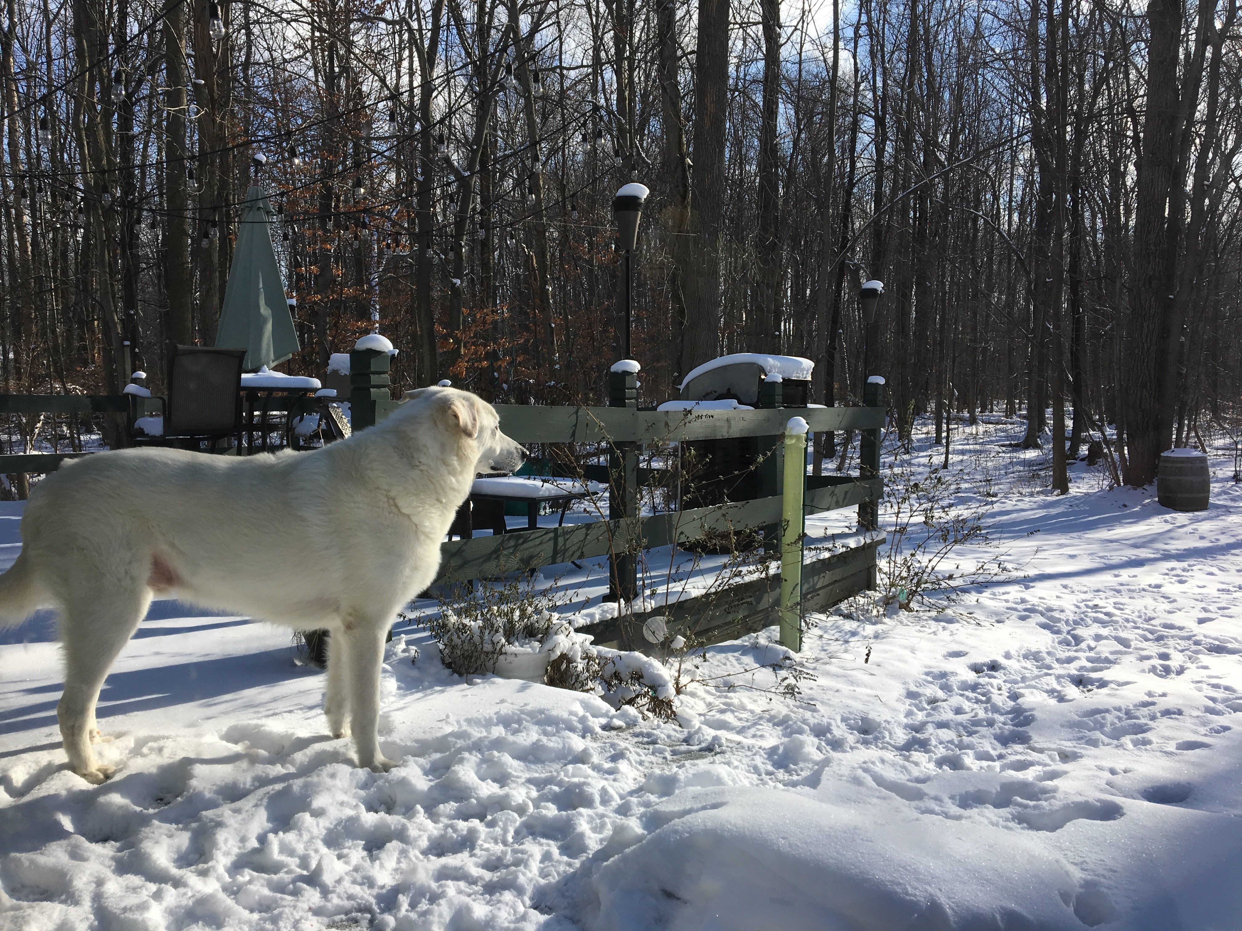
Yep couldnt help myself lol. My wife named it optimus prime. -
Upstate/Eastern New York
Buckeyes_Suck replied to BuffaloWeather's topic in Upstate New York/Pennsylvania
If its just the motor one of the funnest projects ive done was swapping the tired old 8hp motor of my grandfathers snowblower and replacing it with a 13hp harbor freight engine for $300. I couldnt stop laughing the first time i used it. I forget for sure but pretty sure it bolted right up and i just needed a longer belt. -
Upstate/Eastern New York
Buckeyes_Suck replied to BuffaloWeather's topic in Upstate New York/Pennsylvania
Did it just bog? -
Upstate/Eastern New York
Buckeyes_Suck replied to BuffaloWeather's topic in Upstate New York/Pennsylvania
Pretty heavy stuff, too much for my tractor with plow. Had to get out the snowblower. -
Upstate/Eastern New York
Buckeyes_Suck replied to BuffaloWeather's topic in Upstate New York/Pennsylvania
Pouring snow right now in Clarence. -
Upstate/Eastern New York
Buckeyes_Suck replied to BuffaloWeather's topic in Upstate New York/Pennsylvania
Not showing up on radar but a steady light snow has been falling the past couple hours in Clarence, about an inch on the grass. -
Upstate/Eastern New York
Buckeyes_Suck replied to BuffaloWeather's topic in Upstate New York/Pennsylvania
Home Depot pickup FTW. Same price as the trailer with less hassle. -
Upstate/Eastern New York
Buckeyes_Suck replied to BuffaloWeather's topic in Upstate New York/Pennsylvania
Give them time to settle dow. They just stopped the browns from the 1 like 8 times... -
Upstate/Eastern New York
Buckeyes_Suck replied to BuffaloWeather's topic in Upstate New York/Pennsylvania
winter of 76 started with a big ice storm... -
Upstate/Eastern New York
Buckeyes_Suck replied to BuffaloWeather's topic in Upstate New York/Pennsylvania
Finally snowing in west falls.


