chubbs
-
Posts
3,920 -
Joined
-
Last visited
About chubbs

-
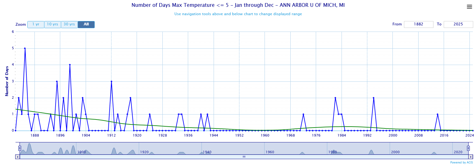
If you want to look at long-term trends, Its important to separate station changes from weather changes. The city to airport transition in Detroit introduces a bias. The City airport is warmer than Metro, particularly for low temperatures. I've looked at Ann Arbor, Pontiac, Detroit City and Detroit metro. Pontiac and Ann Arbor both go back 100+ years. I see a warming of winter extreme temps at each site. Less at the city airport and most at Pontiac. Note that I showed data for daytime highs, because low temperatures are more likely to be impacted by heat island and other local site radiating conditions. One final comment. Decade data can be misleading because 2010-2019 gives a different answer than 2015-24. In the case of extreme winter weather the difference in 10-year snapshots is amplified by large natural variability. We are still going to get cold shots and no question the 2010s had an unusual concentration. Don't see evidence though that Detroit is getting the same degree of extreme cold that it did in the past.
-
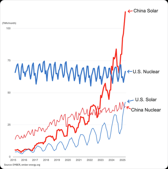
If your goal is energy abundance nothing can scale like solar. Not even close. Our solar resource (sunshine) is much better than China's.
-
Chester County PA - Analytical Battle of Actual vs. Altered Climate Data
chubbs replied to ChescoWx's topic in Climate Change
The Avondale USCRN station which started in 2007 shows a slight upward trend. KMQS starting in 2008 is also increasing slowly. Given the noise in the 90F data these short-term trends may not be significant. Most of the other stations that are collecting data today started in 2012 or later, not 2010. Starting a 90F trendline in hot year like 2010 is misleading. Bottom-line - Considering how noisy the 90F data is there isn't much evidence that the long-term increasing trend established by Phoenixville and West Chester has changed.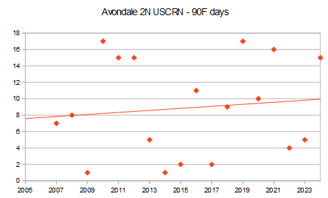
-
Chester County PA - Analytical Battle of Actual vs. Altered Climate Data
chubbs replied to ChescoWx's topic in Climate Change
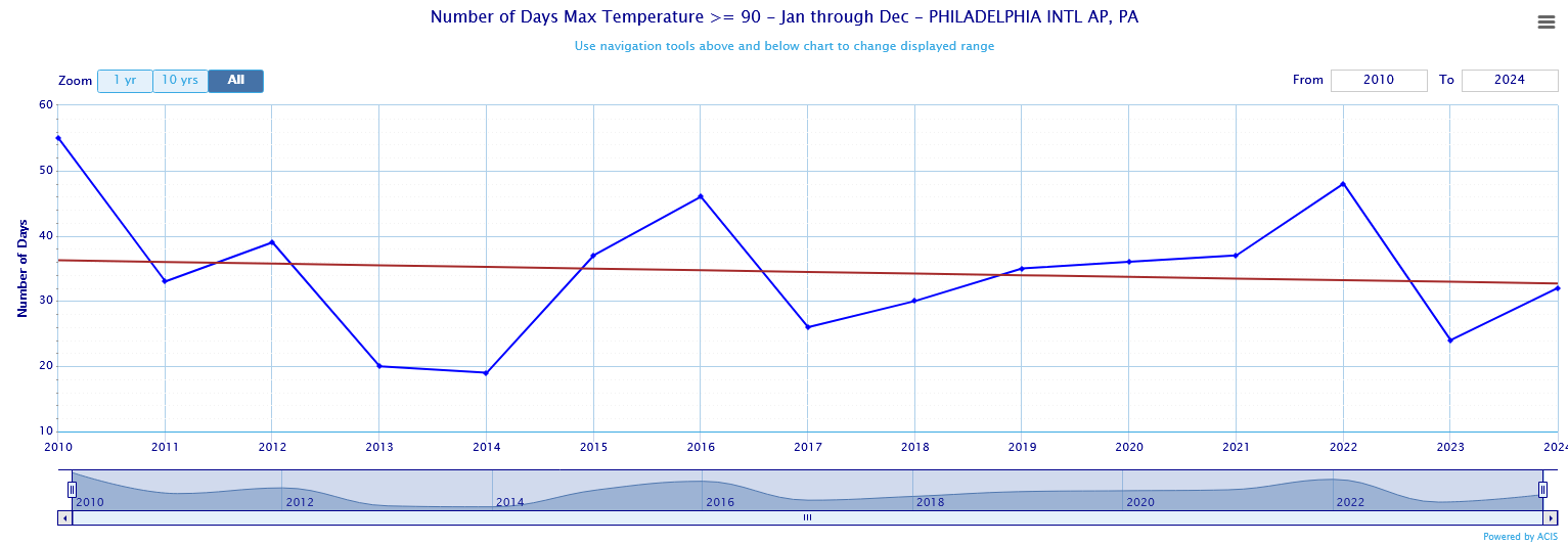
Typical Chesco, very misleading. Starts in 2010, a hot summer and per his table, many of the stations didn't operate over the entire period. Philly airport also shows a declining trend starting in 2010.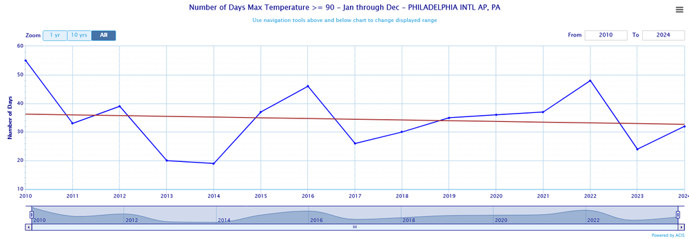
-
Chester County PA - Analytical Battle of Actual vs. Altered Climate Data
chubbs replied to ChescoWx's topic in Climate Change
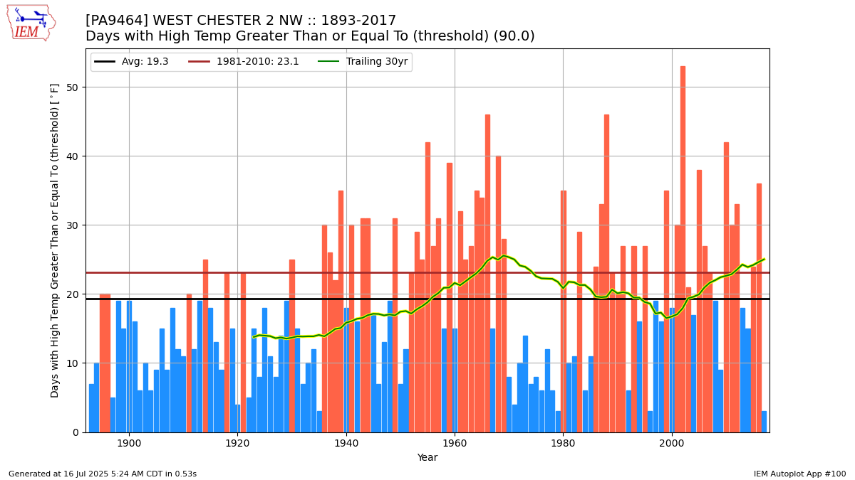
Once again you are jumping to the wrong conclusion. West Chester, Philadelphia and Kennett Square all agree well with the Phoenixville "ghost" data in the 1896-1914 period. All 3 stations show that the area had relatively few 90F days 100+ years ago. Makes sense, the "ghost" data is an IEM re-analysis product that uses nearby raw data. The chart also shows that Phoenixville had a big spurious spike in 90F days starting in 1925. Starting your regression line in 1915 gives the bad Phoenixville data a big impact. Other than the 1925 and 1950 period, West Chester, Phoenixville and Philadelphia are all in reasonable agreement. The area has had a slow and irregular increase in 90F days. Of course the data isn't perfect: Phila transitioned from city to airport, West Chester cooled in 1970, and Phoenixville was too warm from 1925 to 1950 and too cool in the 1990s. All of those data problems worked to limit the increase in 90F days. The real increase may be even larger than the plot indicates. As I stated above your analysis is biased by changes in the station population. As an illustration the 12 DEOS stations added between 2008 and 2014 only average 11 90F days per year. Much less than the Phoenixville, West Chester and Coatesville COOPs that dominate the county historical data. All you are showing is that rural parks are cooler than built up towns.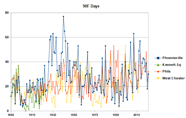
-
Chester County PA - Analytical Battle of Actual vs. Altered Climate Data
chubbs replied to ChescoWx's topic in Climate Change
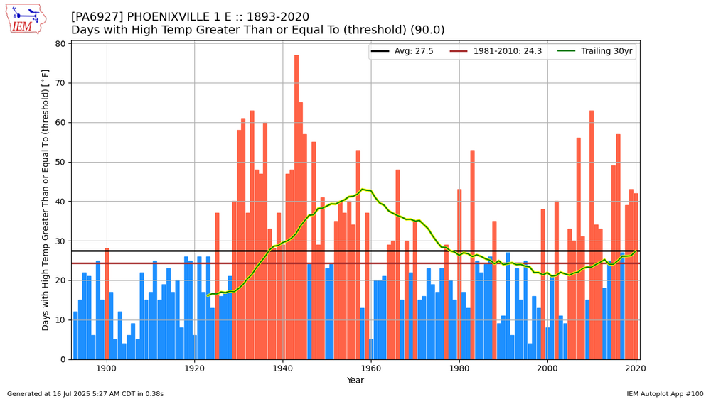
It's a sure sign of local hot weather, when you are making bogus claims about 90F days. If you want to look at long-term trends you need to have a consistent station population. Instead you are making wholesale changes from a warmer to cooler station population. We have two stations with long-term data. Neither show a decrease in 90F days. Note that these stations are biased due to station changes: West Chester cooled by roughly 2F in 1970, while Phoenixville ran hot in the 1930s-50s and cool in the 1990s. So if anything these charts underestimate the increase in local 90F days in recent decades. One final point. The year-to-year disagreement between the two stations shows how local station changes have biased the raw data. Making Chesco raw data unusable for local climate analysis.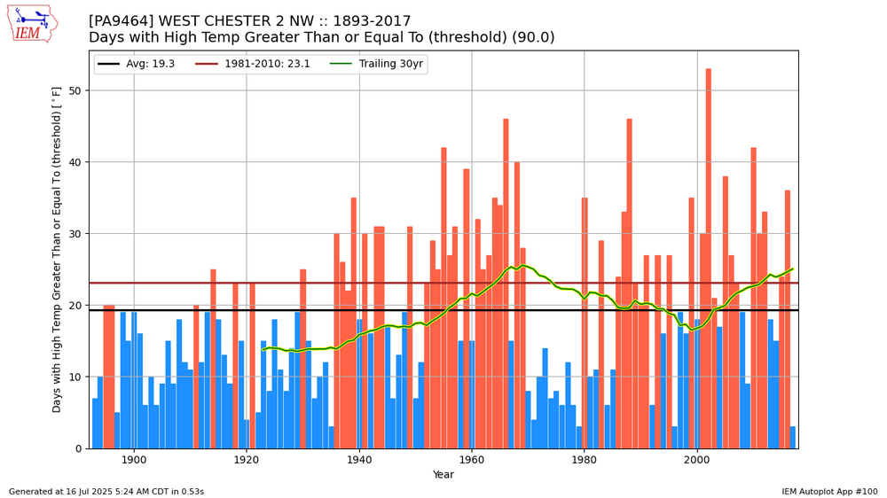
-
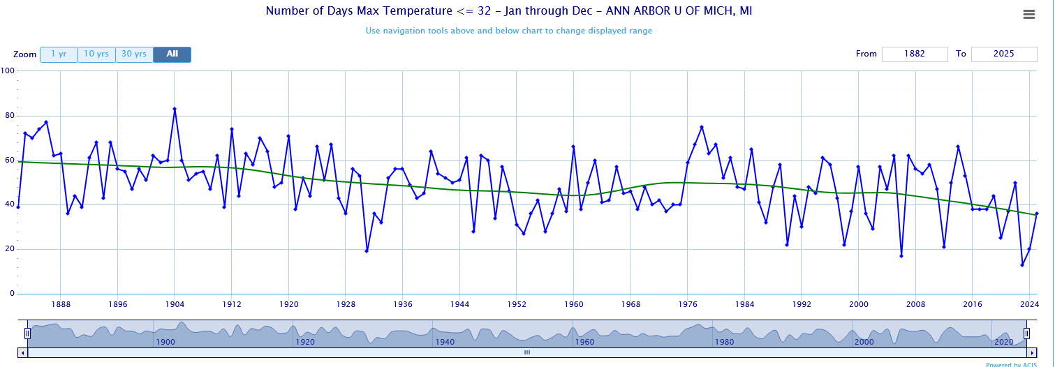
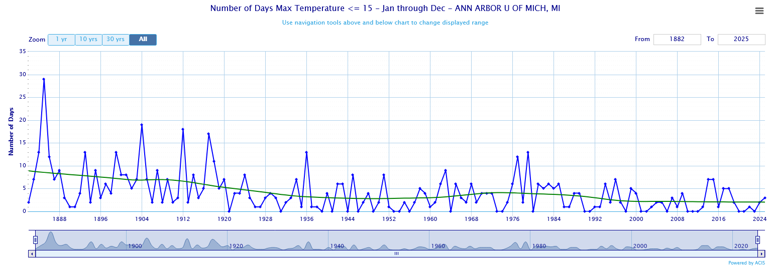
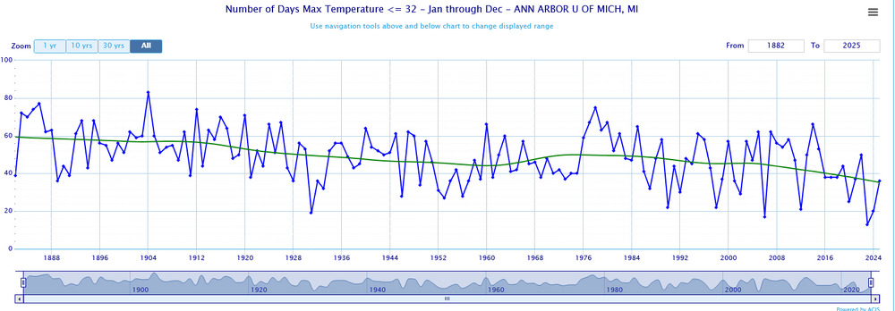
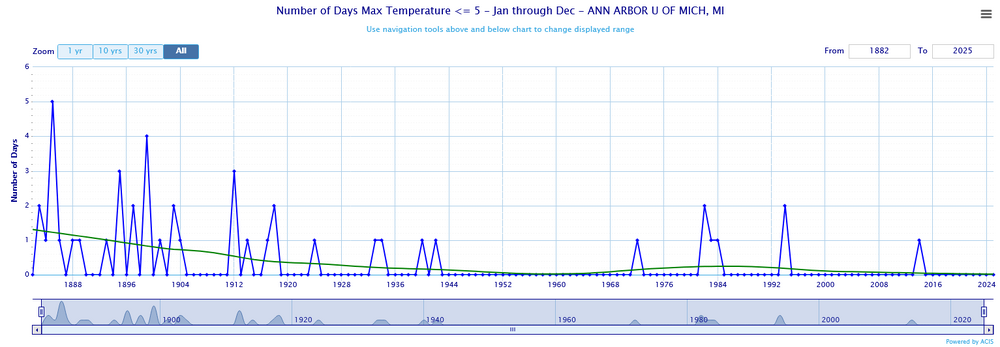
You are mixing city and airport. Days with highs below 32, 15 and 5 at Ann Arbor, indicate that last winter would have been unusually warm 100+ years ago.

-
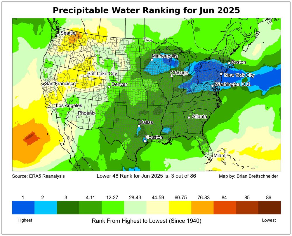
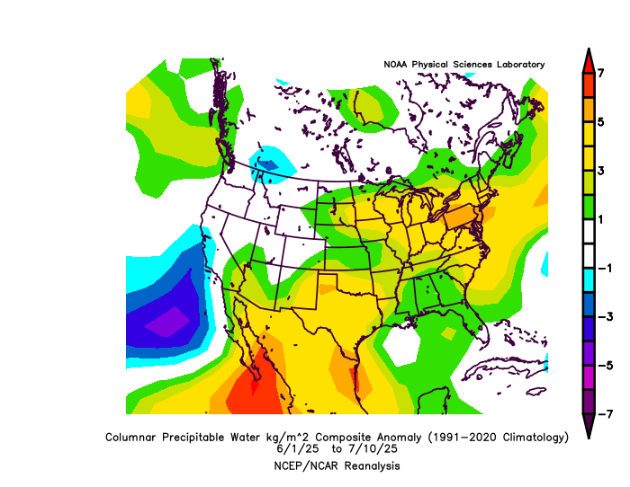
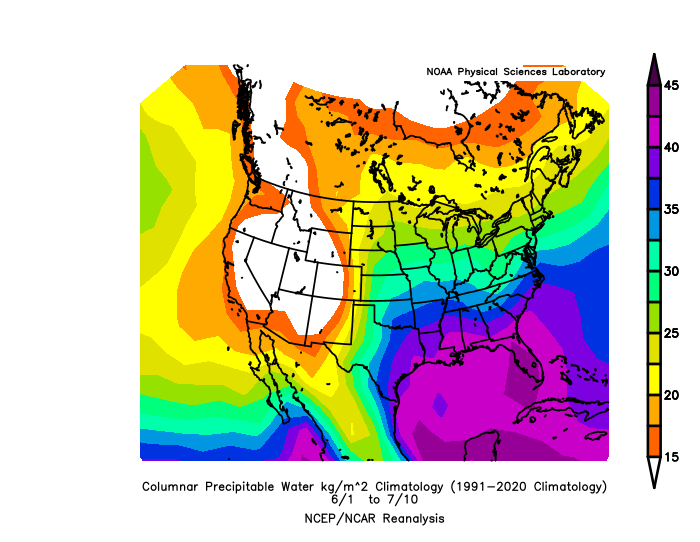
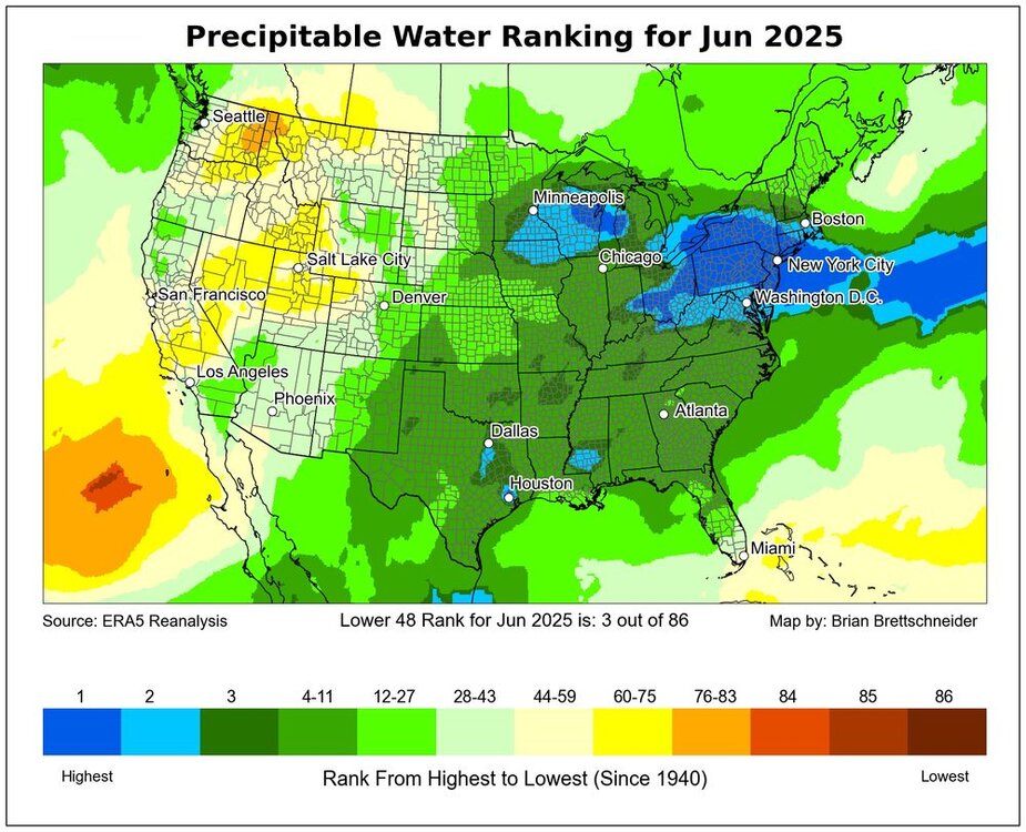
Below is precipitable water anomaly for this summer and the 1991-2020 normal. Here in PA the atmosphere has had roughly 15% more moisture than normal this summer.
-
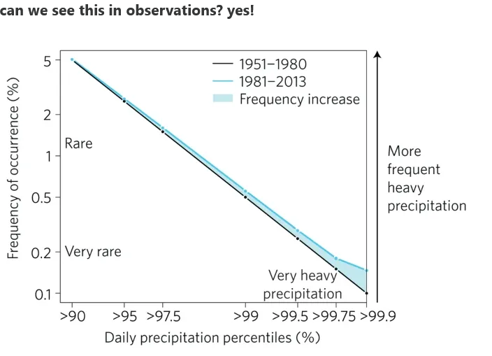
Yes, climate science predicted decades ago that the increase in precipitation due to climate change would be focused in the heaviest events and that is exactly what we are seeing. Extreme rain events are increasing much faster than precipitation as a whole. Climate change doesn't cause any one single event; but it makes individual cases worse and extreme events much more likely. https://iacweb.ethz.ch/staff/fischer/download/etc/fischer_knutti_16.pdf https://www.theclimatebrink.com/p/update-on-texas-flooding
-
This is a good recent review article. Anthropogenic intensification of short-duration rainfall extremes https://hal.inrae.fr/hal-03838107v1/file/2021_Fowler_Nature reviews earth%26environment.pdf
-
From Brain Brettschneider. Moist east of the Rockies
-
Chester County PA - Analytical Battle of Actual vs. Altered Climate Data
chubbs replied to ChescoWx's topic in Climate Change
So for Phoenixville what is the difference between ghost and actual? -
Chester County PA - Analytical Battle of Actual vs. Altered Climate Data
chubbs replied to ChescoWx's topic in Climate Change
It isn't clear what you did. What stations were used for the red line? The stations listed in your post: Phoenixville, West Grove, Coatesville, Glenmoore, Honey Brook, West Chester and Devault? If so it's a much different set of stations vs the blue that could easily explain the differences between the two lines. -
Chester County PA - Analytical Battle of Actual vs. Altered Climate Data
chubbs replied to ChescoWx's topic in Climate Change
How IEM estimates missing values is explained on the IEM site. Likewise NOAA/NCEI's method is explained in peer reviewed articles and other documentation. No sleuthing, no tin foil hat, needed. You didn't answer my question about the stations used for your red and blue lines. Wonder why. -
Chester County PA - Analytical Battle of Actual vs. Altered Climate Data
chubbs replied to ChescoWx's topic in Climate Change
Yes, the facts. Can you list the stations that the red and blue lines were derived from?