

Jns2183
-
Posts
5,869 -
Joined
-
Last visited
About Jns2183

-
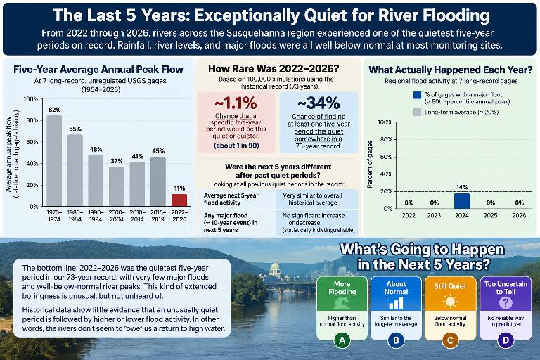
we have had an absolutely unbelievably boring past 5 years and I mean just earth-shatteringly boring weatherwise compared to any semblance of normal. the single most consequential weather thing to happen to me unfortunately was this summer being without power for 4 days it sucked it also was the only exciting weather event in The last 5 years. Five Years of Hydrological Boredom in South-Central Pennsylvania From water years 2022 through 2026, the Harrisburg region has experienced a remarkable absence of major river flooding. Not that it never rained, or that individual storms didn't cause problems. But the annual flood peaks across our rivers and creeks have been astonishingly subdued. In a consistent seven-gage network covering 1954–2026, the past five years rank as the quietest five-year stretch in the entire 73-year record. Even the Susquehanna at Harrisburg recorded an exceptionally low annual peak in 2026. How unusual is that? In simulations that preserve regional flood relationships, a particular five-year period this quiet occurred roughly 0.6%–1.1% of the time, depending on how consecutive years were resampled. And here's an interesting historical observation: among 13 unusually quiet five-year windows with follow-up data, nine were followed by five years of above-median flood activity. However, those windows overlap and represent only six distinct episodes, so this is not proof that a flood-rich period is coming. Rivers do not accumulate unpaid flood debt. So here's the question: After five extraordinarily boring years, what will 2027–2031 bring to south-central Pennsylvania? A. More of the same: another unusually quiet five years. B. Back to ordinary: a fairly typical mix of wet and dry years. C. A flood-active stretch: above-normal river flooding returns. D. The pendulum swings hard: one or more major, memorable regional floods. What's your prediction? Sent from my SM-S731U using Tapatalk
-
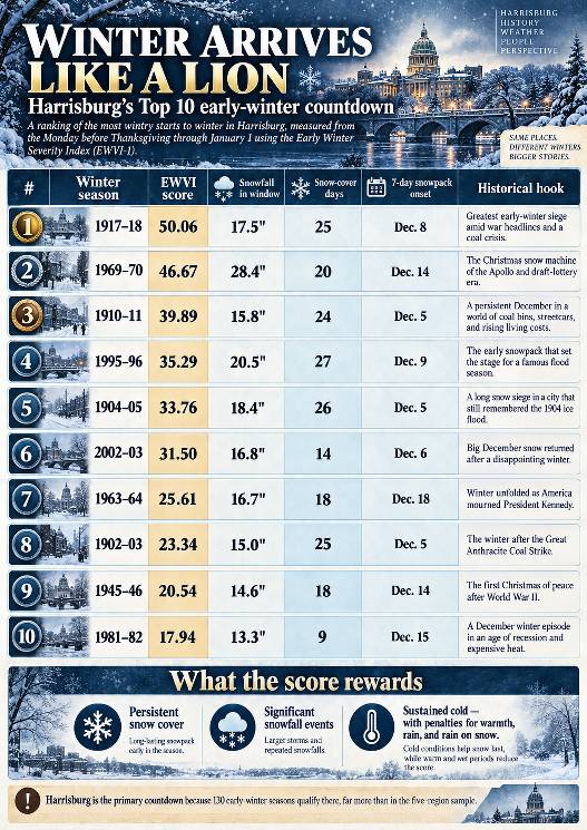
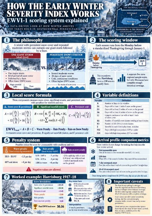
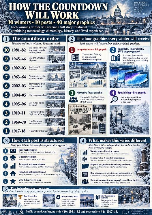
WINTER ARRIVES LIKE A LION Ten of Harrisburg's Most Wintry Starts to Winter, 1895–2026 TWO DECEMBERS. TWO VERY DIFFERENT WAYS TO REMEMBER WINTER. Imagine it is December 1917, and Christmas is approaching in Harrisburg, Pennsylvania. The United States is at war. Headlines speak of battles overseas, troop mobilization, and a newly declared war against Austria-Hungary. At home, people have a much more immediate concern: COAL. For many families, coal is not a quaint old-fashioned detail or a decorative fireplace accessory. It is what keeps the house warm. The warnings have been building for weeks. On November 26, the Harrisburg Telegraph reports that city officials are considering coal cards to manage an anthracite shortage. On December 4, it announces a 35-cent-per-ton increase in domestic anthracite prices. By December 18, the paper is reporting promised coal-car shipments for Harrisburg and Steelton, while ice on the Susquehanna interferes with river coal deliveries. Now think about what that means in a household with a coal-burning furnace. It is not even Christmas. The question is no longer whether the holiday will be white. It is whether the next coal delivery will come before the bin runs too low, and whether the household can afford it when it does. And the weather is not cooperating. Harrisburg records 6.6 inches of snow on December 8, followed by 7.0 inches on December 14. Snow cover establishes itself on December 8 and survives 25 consecutive days through New Year's Day, every one of those days maintaining at least three inches on the ground. There is a kind of winter that delivers a beautiful holiday scene. And then there is a winter that takes possession of the landscape while the people living in it are wondering how they're going to keep warm. Keep that December in mind for a moment. Now jump forward almost a century, to December 19, 2009. For many weather enthusiasts around central and southeastern Pennsylvania, the great pre-Christmas snowstorm is still a treasured memory. The Harrisburg station in our study measured 8.8 inches from that storm, with far greater totals farther southeast. For a little while, winter seemed to have arrived in spectacular fashion. But our full Thanksgiving-to-New-Year's analysis tells a surprising second story. Harrisburg accumulated 14.1 inches of snowfall during that 2009–10 scoring window, yet had only 11 days with at least an inch of snow on the ground, and its longest uninterrupted snow-covered stretch was seven days. Warmth, rain, and rain falling on snow outweighed much of the snowfall's positive contribution. Its final score was −4.88, placing it 44th among 130 eligible early winters. The December 2009 storm was memorable. The entire early-winter period was something else altogether. THAT IS THE CONTRAST AT THE HEART OF THIS PROJECT. One tremendous storm can make memories for a generation, while an older winter with less total snowfall can establish itself so thoroughly that the snow, the cold, the transportation problems, and even the fear of running short of heating fuel become part of everyday life. We're not ranking which storm was the most spectacular. We're asking something different: WHICH YEARS DID WINTER TRULY ARRIVE LIKE A LION, TAKE HOLD BEFORE THE NEW YEAR, AND REFUSE TO LET GO? HOW WE INVESTIGATED IT We examined 131 Thanksgiving-to-New-Year's periods, from 1895–96 through 2025–26, and found 130 with sufficient Harrisburg-area observations for our primary ranking. For consistency, each scoring window begins on the Monday before a standardized fourth-Thursday Thanksgiving and continues through January 1, inclusive. We use that calendar rule even in historical years when Thanksgiving was observed on a different day. We developed the Early Winter Severity Index (EWVI-1). Rather than simply adding up snowfall, it rewards three things. SNOW COVER AND STAYING POWER (UP TO 55 POSITIVE POINTS) Days with at least 1, 3, or 6 inches on the ground, plus the longest uninterrupted snow-covered run. SIGNIFICANT SNOWFALL EVENTS (UP TO 30 POSITIVE POINTS) Especially accumulating clusters of six inches or more. These clusters are defined from daily observations and are not automatically the same thing as individual meteorological storms. PERSISTENT COLD (UP TO 15 POSITIVE POINTS) Days when the high temperature remains at or below freezing, with additional credit for highs of 25°F or colder. Then the index subtracts points for strong warm-ups, confidently classified rainfall, and rain falling on existing snow cover. An otherwise impressive storm can belong to a disappointing overall early winter. Scores can even be negative, as our 2009 example shows. We also developed a separate winter-arrival profile. This examines the first measurable snow, the date by which 10% of the eventual October–May snowfall has accumulated, and the first confirmed seven-consecutive-day snowpack. Those are different clocks. A winter can deliver snow early without establishing lasting cover, and it can establish lasting cover before the bulk of the season's snow has arrived. These timing measurements add insight without changing the original EWVI rankings. This is a specific Harrisburg-area index, not a declaration about the ten greatest full winters in Pennsylvania history. A wider five-region investigation exists, but only 28 of 131 seasons currently meet its full overlapping data requirements. We'll use trustworthy regional observations to enhance the stories, without allowing missing early historical records to erase well-observed Harrisburg winters. WHAT THE THREE OPENING INFOGRAPHICS SHOW INFOGRAPHIC 1: THE HARRISBURG TOP 10 All ten ranked seasons, their EWVI scores, snowfall within the scoring window, number of snow-covered days, verified snowpack onset, and a glimpse of each year's historical setting. The rankings are revealed upfront. The countdown articles will explain how each winter earned its place. INFOGRAPHIC 2: HOW THE SCORING WORKS The actual equations, event definitions, snow-cover thresholds, cold points, warmth and rain deductions, and a worked example for our highest-scoring winter. It also shows how the separate onset measurements complement the main index. INFOGRAPHIC 3: THE COUNTDOWN ROADMAP Our plan is to travel from #10 to #1, one winter at a time, with four substantial high-resolution graphics for each year. Every winter will receive: 1) AN INTEGRATED MASTER INFOGRAPHIC Weather, historical setting, the exact score, and a coherent dated timeline woven together into one visually unified story. 2) A PENNSYLVANIA SNOWFALL, SNOW DEPTH, AND SWE PROGRESSION Using a custom Pennsylvania digital elevation model, we'll show the evolution of snowfall and snow cover through dated observations. Snow-water equivalent will be included where measurements or a defensible, clearly labeled model support it. Scattered station values will not be disguised as a fully observed statewide snowpack. 3) A HISTORICAL NARRATIVE GRAPHIC We'll explore contemporary headlines, transportation, heating, prices, and the human experience of that particular winter. 4) A SPECIAL DEEP DIVE UNIQUE TO THAT YEAR Whether it's a coal emergency, an extraordinary snow-cover streak, a succession of Christmas storms, or the flood risks lurking beyond the New Year, each winter will have its own distinctive story. WEATHER DOESN'T HAPPEN OUTSIDE HISTORY We will enter each year as though we do not already know what happens next. We'll examine the previous winter, summer, and fall, then follow the weather one day at a time through the contemporary world people actually inhabited. A family in 1902 had different heating problems, wages, travel options, and forecast information from a family in 1981 or a weather enthusiast online in 2002. That matters. So do the details. What did a ton of coal cost? What could a dollar buy? Were streets and railroads passable? What were families reading at breakfast? What could they reasonably have expected from tomorrow's weather? Original newspaper reporting and historical photographs will be distinguished from illustrations and narrative reconstruction. Weather station readings will be distinguished from estimates. Where the surviving records cannot support a claim, we'll say so. AND NOW, THE COUNTDOWN We begin with #10: 1981–82, a winter that gave Harrisburg nine consecutive snow-covered days in December before the snowpack retreated. Eventually we will arrive at #1: 1917–18, where those wartime coal headlines and the extraordinary December snowpack await us again, in their full historical setting. TEN WINTERS. TEN JOURNEYS INTO THE PAST. FORTY MAJOR GRAPHICS. Some winters give you one great storm to remember. Others take over your roads, your calendar, your landscape, and, in an era of fuel shortages, your thoughts about whether there's enough coal left to get through the next cold night. Let's find out which winters really arrived like a lion. RESEARCH AND SOURCE NOTES The 1917 coal-shortage context comes from contemporary Harrisburg Telegraph reporting on November 26, December 4, and December 18, 1917. These reports document rationing discussions, price increases, shipment efforts, and ice-related delivery difficulties. They do not establish that all or most Harrisburg households had exhausted their entire heating-fuel supply by Christmas. Historical newspaper sources: November 26, 1917: https://newspaperarchive.com/harrisburg-telegraph-nov-26-1917-p-1/ December 4, 1917: https://newspaperarchive.com/harrisburg-telegraph-dec-04-1917-p-1/ December 18, 1917: https://newspaperarchive.com/harrisburg-telegraph-dec-18-1917-p-1/ Snowfall totals, snow-cover runs, EWVI scores, and the 2009–10 rank come from the project's Harrisburg station analysis and EWVI-1 scoring tables. The three introductory posters contain interpretive winter and historical imagery. They are not archival photographs or measured statewide historical snow fields. Dated observations, reconstructions, and source methods will be documented throughout the series. Sent from my SM-S731U using Tapatalk
-
So now we get the RRFS, which is a hell of a lot more than just replacing the NAM with a newer model. NOAA is basically cleaning house, retiring the NAM, its 3km nests, SREF, HREF, and most of the HiResW models in favor of one massive 3km system covering most of North America, updating every hour and forecasting out to 84 hours. Along with it comes the REFS ensemble with 14 members, although there's a catch. Twelve of those members come from the same RRFS model family, with six being older runs, and the other two come from the HRRR. So while we're gaining resolution and coverage, we're also losing some of the diversity between completely different models. There's a difference between 14 models independently agreeing on something and 14 relatives all being confidently wrong at the same family reunion. I'm pretty excited about what this thing could do, especially with mesoscale snowbands, convection, and heavy rainfall. But I'm also skeptical about how well it will handle those sharp thermal gradients that can turn 15 inches of snow into 3 inches of sleet over the distance of a few exits on I-81. The early verification has been encouraging, but we haven't seen it survive a full Pennsylvania winter yet. Hopefully we're getting a significant upgrade and not just replacing our one drunk uncle with an entire family of them. I highly doubt it can go anywhere near the entertainment value of the nam when it was wrong and that was the only redeeming part of being wrong Either way, November 3rd begins a pretty interesting new chapter in weather forecasting. Sent from my SM-S731U using Tapatalk
.thumb.jpg.7f1488f41cca854b9d6addceca08d605.jpg)
-
Twenty years of the NAM was like having a crazy uncle in the room every time a storm threatened Harrisburg. Half the time it was off in its own universe NAMMING the LSV with a 30-inch fantasy, or drawing a snow/sleet gradient through Cumberland County so tight you could practically cross it walking down the street. March 2015 was vintage NAM: a run trying to dump 2–3 inches of sleet over parts of the LSV while taking snowfall from 12 inches to 2 inches in roughly 10 miles. Then came January 2016. While the Euro and GFS wandered around, the NAM kept hammering away at the same outrageous solution, the SREF had a camp increasingly interested in the bigger totals, and the 700–500 mb frontogenesis actually provided a physical reason to take it seriously. KMDT finished with 30.2 inches, with 36.9 inches reported at either Carlisle Mechanicsburg. That doesn't mean every crazy NAM map verified, but that storm is why you could never completely dismiss the damn thing. although it was great here in 2016 it's greatest coup in history had to be New York City Central Park same storm where 12 hours before you had the euro and the GFS adamant that Central Park would see no more than 12 in and the man was there drunk giving them the finger saying eat this with his 26". 24 hours later Central Park with register 27.5 in breaking their all-time record and forever cementing NAM in lore and more than making up for being burned by it the year prior. although I do feel bad for the Mid-Atlantic people maybe it's fitting poetry that it saves is absolute most let yourself on fire bad calls for that area the most. who forgets who could forget the famous March 6th 2013 10-in call with borderline crappy thermals. yes everyone knows not to trust in them but it was so adamant that so when you got their hopes up as I continue to print out 6 in of snow when it was nothing but sleet and rain. the name did everything and it's power to put some life and craziness into this hobby and a certain as it was it'd be too far north with the precipitation shield you knew that it was either going to have the one of the greatest groups ever or one of the greatest bust ever it was never not entertaining. That is why even though it might spend months going down in flames we still paid attention because at heart it was the biggest weather weenie model of them all. Cheers to your retirement you big doofaus. maybe just maybe it's 3 weeks until able to give it just enough time to have one last crazy ending by November 3rd, as it just 15 years ago on October 29th we had Jim cantore thunder snow whiteouts and 5.5 in on 1.4 in of precipitation with a high of 42. About as much as his nam storm as you're going to ever get. That was the only the second time we ever exceeded 3 in of snow by November 3rd. the first time was during the absolute most freakish 4 years of snow this area has ever seen November 3rd 1962. Sent from my SM-S731U using Tapatalk
-
so apparently it paid off someone to hang around till November 3rd Sent from my SM-S731U using Tapatalk
-
in a little over 27 hours the Nam will be officially retired. Since June 13th, 2006 it's been our crazy uncle who was never afraid to swing for the fences. I figured the last day of its existences we should give it a little tribute as it did get the blizzard right. what are your best and worst memories of the nam? Sent from my SM-S731U using Tapatalk
-
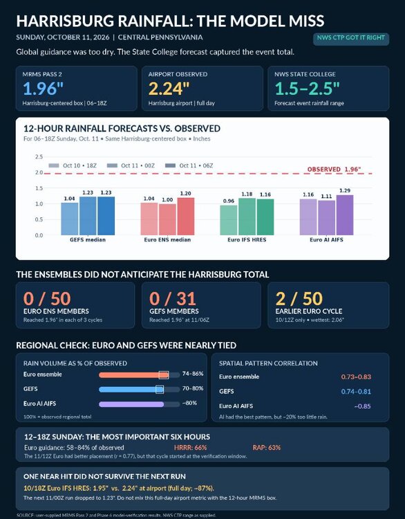
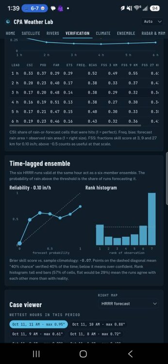
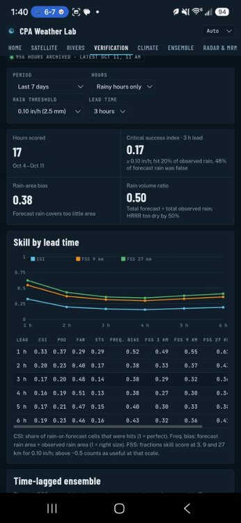
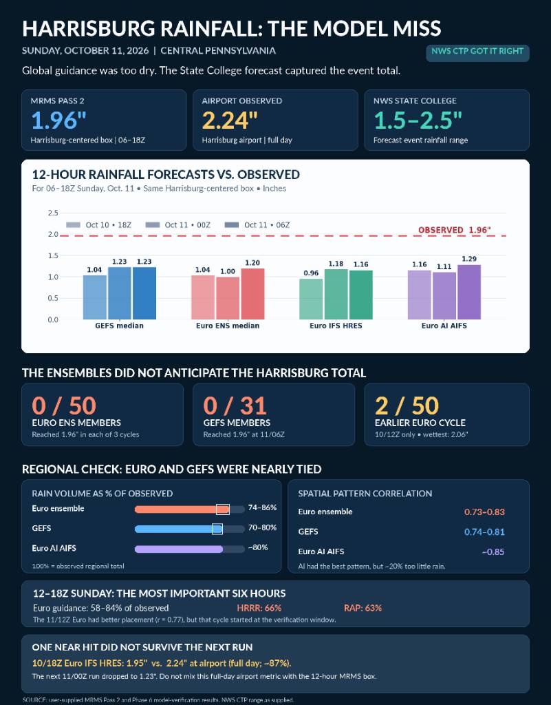
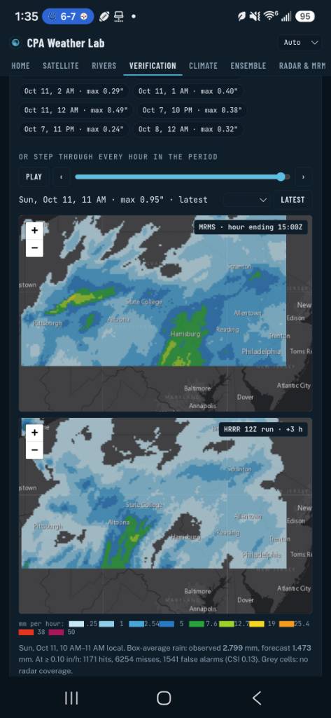
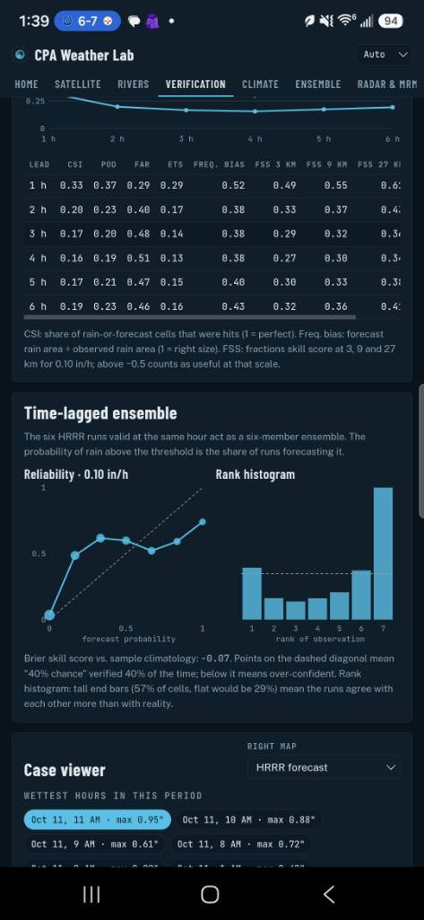
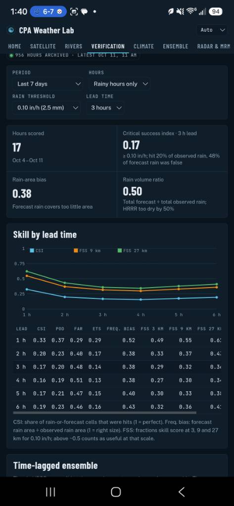
shall we discuss the total and complete collapse of every single model and ensemble model for this past system. The HRRR literally had a negative skill score at 3 hours that's how bad it was. and it wasn't just the American the euro is just as bad I don't know what that hints for this winter time but that was the most epic and total failure I have seen by models in a long long time Sent from my SM-S731U using Tapatalk
-
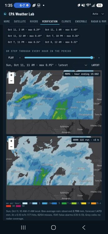
the hrrr is getting absolutely wrecked Sent from my SM-S731U using Tapatalk
-
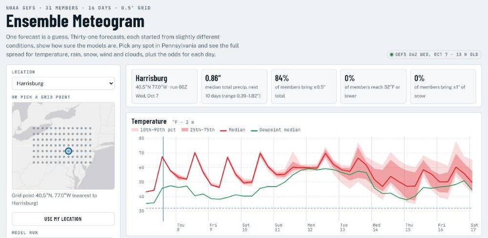
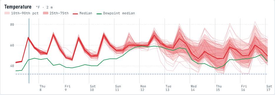
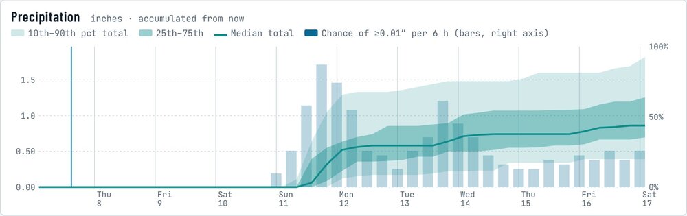
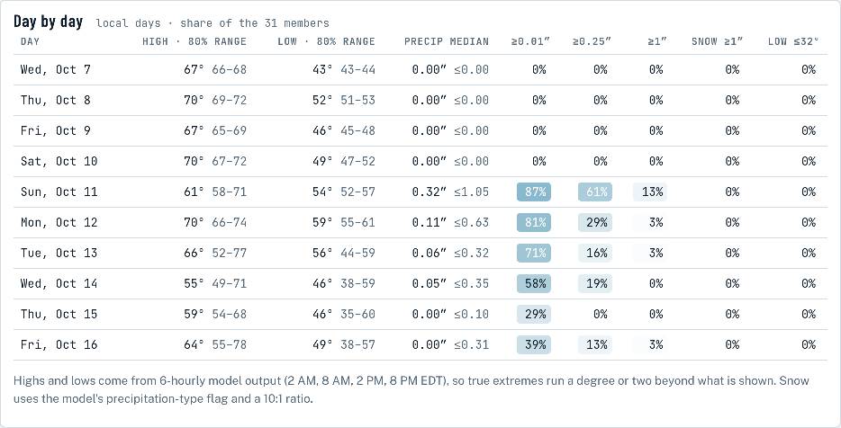
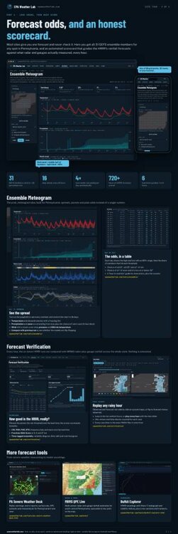
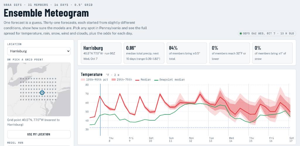
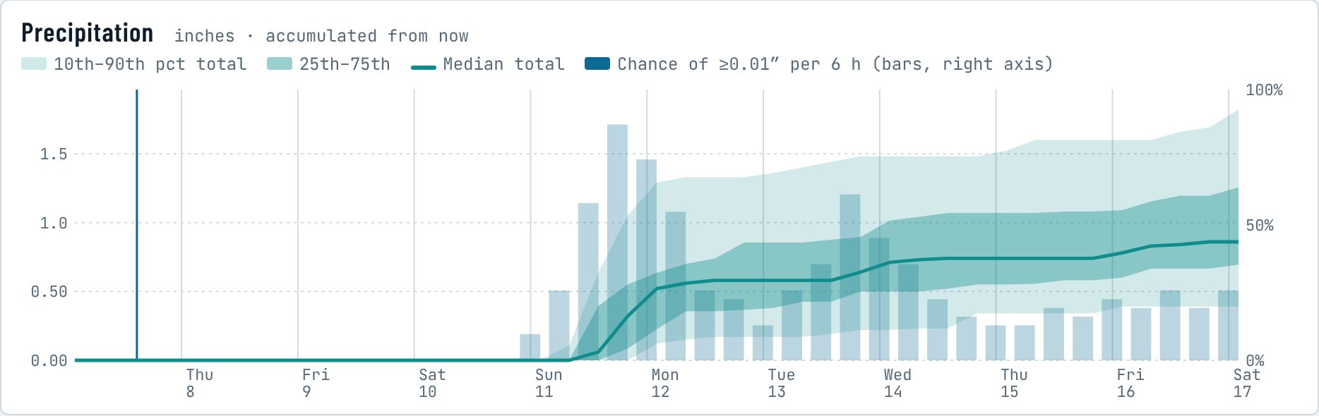
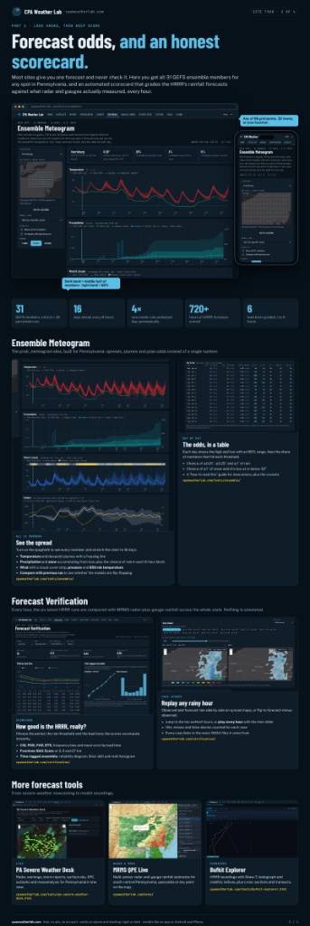
Tool Spotlight #1: The Ensemble Meteogram https://cpaweatherlab.com/tools/ensemble/ What it is. Most forecasts you see are a single answer: 68 and sunny, half an inch of rain. But that answer comes from one run of one model, and the atmosphere is chaotic enough that tiny errors in the starting conditions grow into big differences a few days out. NOAA handles this by running its Global Ensemble Forecast System (GEFS) 31 times, four times a day, each run starting from slightly different conditions. The Ensemble Meteogram takes all 31 of those forecasts for any spot in Pennsylvania and lays them side by side out to 16 days: temperature, rain, snow, wind, clouds and the overall pressure pattern, plus a day-by-day table of the odds. Instead of one guess, you see the whole range of what the models think could happen. How to use it. Pick a city from the Location menu, tap a dot on the little map, or hit "Use my location." The tiles across the top give you the headline numbers for that spot: the median rain total for the period, the chance of at least half an inch, the chance of a freeze and the chance of an inch of snow. Below that, each chart works the same way. The solid line is the median (the middle member), the darker band holds the middle half of the 31 members, and the lighter band holds 80 percent of them. Use the 7 / 10 / 16 day buttons to zoom in or out, and the Model Run menu if you want to look at an earlier run. The spread is the forecast. Check the "Show all 31 members" box and you'll see every individual forecast drawn as its own thin line. Look at this week for Harrisburg: through Saturday the lines are practically stacked on top of each other, which means the models agree and you can trust the numbers. Starting around Tuesday they fan out, with highs anywhere from the low 50s to the upper 70s on the same day. That isn't the tool being broken; that's the honest answer. When the lines fan out, any single-number forecast for that day is basically a coin flip. "Compare with previous run" helps here too: if the median keeps jumping from one run to the next, confidence should stay low even if the latest run looks tight. Rain odds you can actually read. The precipitation chart shows rain piling up over time, with blue bars for the chance of at least a hundredth of an inch in each 6-hour block. Right now it shows nothing through Saturday, then the bars jump on Sunday as the members agree rain is coming. The Day by Day table turns all of that into plain percentages, and they're simple member counts: Sunday's 87% chance of measurable rain means about 27 of the 31 members produce it, and the 61% for a quarter inch or more means about 19 of them do. Shaded cells make the wet days jump out, and the "80% range" next to each high and low tells you how wide the uncertainty is. Why it's worth your time, and a few caveats. Knowing the odds is more useful than a single number when you're planning anything outdoors, deciding whether to cover the garden, or watching for a storm a week out. It also teaches you to spot a shaky forecast before it busts. A few honest limits: each grid point is about 35 by 25 miles, so it won't capture your valley or ridge, and the NWS point forecast is still better for local detail. The GEFS also tends to be a bit overconfident, so real-world odds for extremes are a little wider than it shows. Highs and lows come from 6-hourly output and can miss the true extremes by a degree or two. Use it for timing and odds, and let it tell you how much to trust everything else you're reading. Give it a try and post what you find. Data: NOAA/NCEP GEFS v12, processed on the CPA Weather Lab server. Not an official forecast. Sent from my SM-S731U using Tapatalk
-
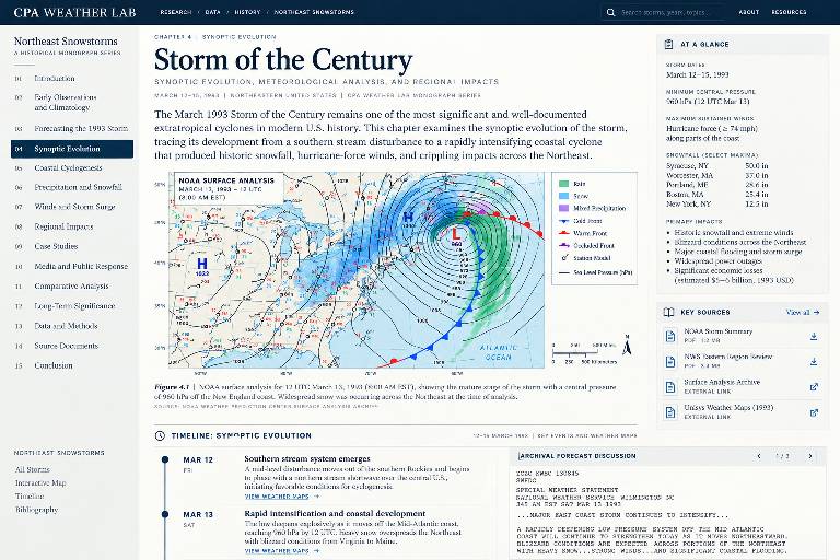
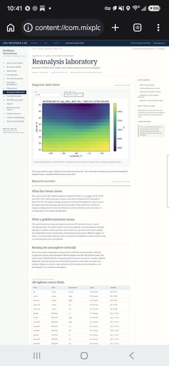
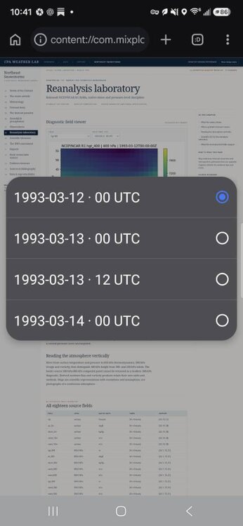
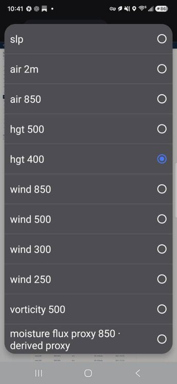
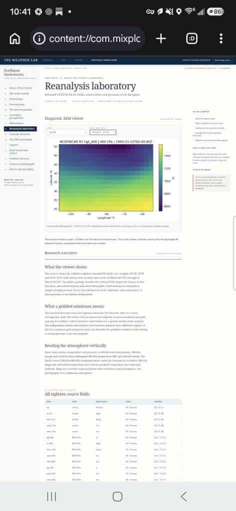
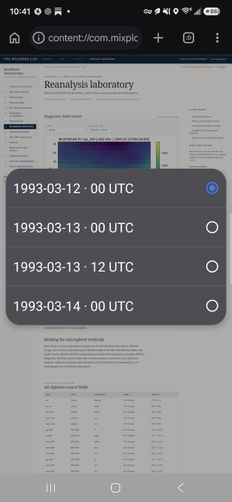
So I'm almost done with 1993 and about 30%-40% finished overall with my NORTHEAST SNOWSTORMS VOL I & II PROJECT There are whispers volume 3 might be out this winter. When finished every snowstorm highlighted in Vol I & II book will have its on Special Portal. I pull in the narrative and analysis from Paul Kocin, Louis Uccellini, various other Scientist who have analyzed each of the storms I provide interactive reanalysis viewer, and laboratory. I try to hone in especially on what feature or part was meterologly interesting as well as local in depth narrative if at all possible, from those inside and around the storm. Mix in GIS NESIS sciring and snowfall maps, detailed co-op, cochras, spotter reports. If recent am trying to do a full 3D imaging and analysis of CCB band and hopefully a proper montage of its highlights. Hopefully by the end you'll be able to close your eyes and taste the storm. Sent from my SM-S731U using Tapatalk
-
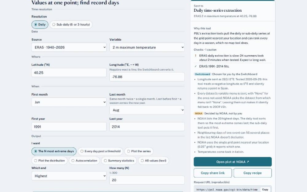
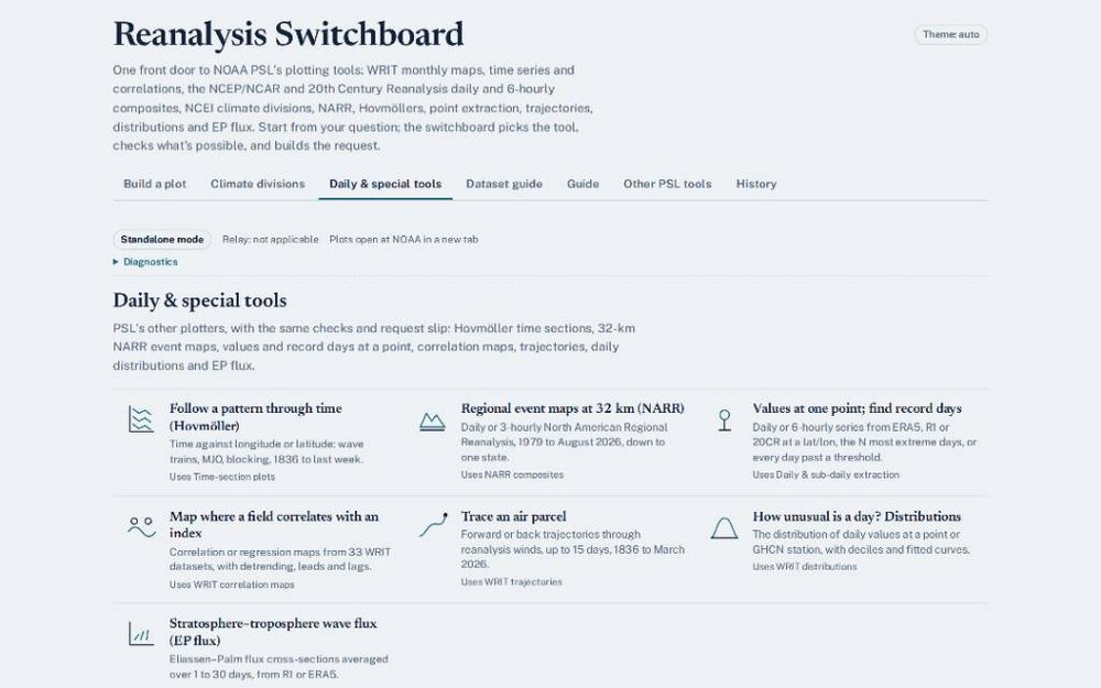
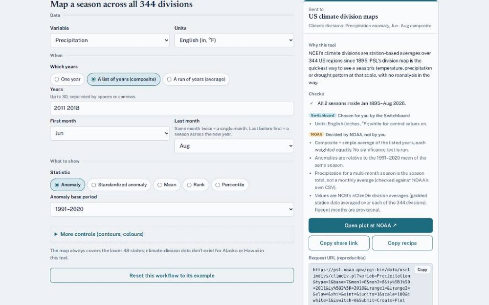
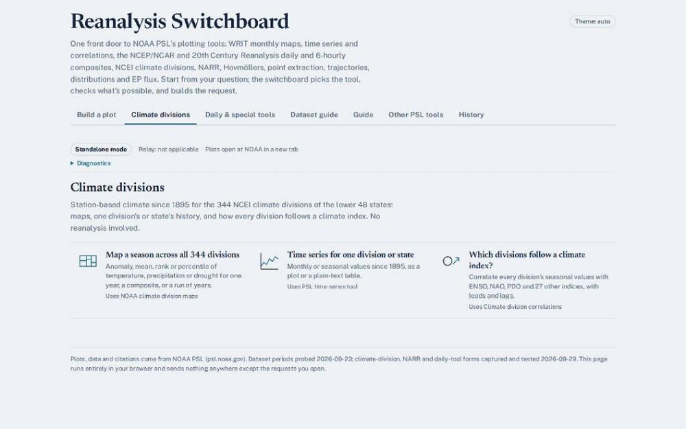
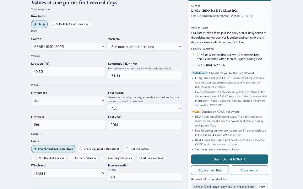
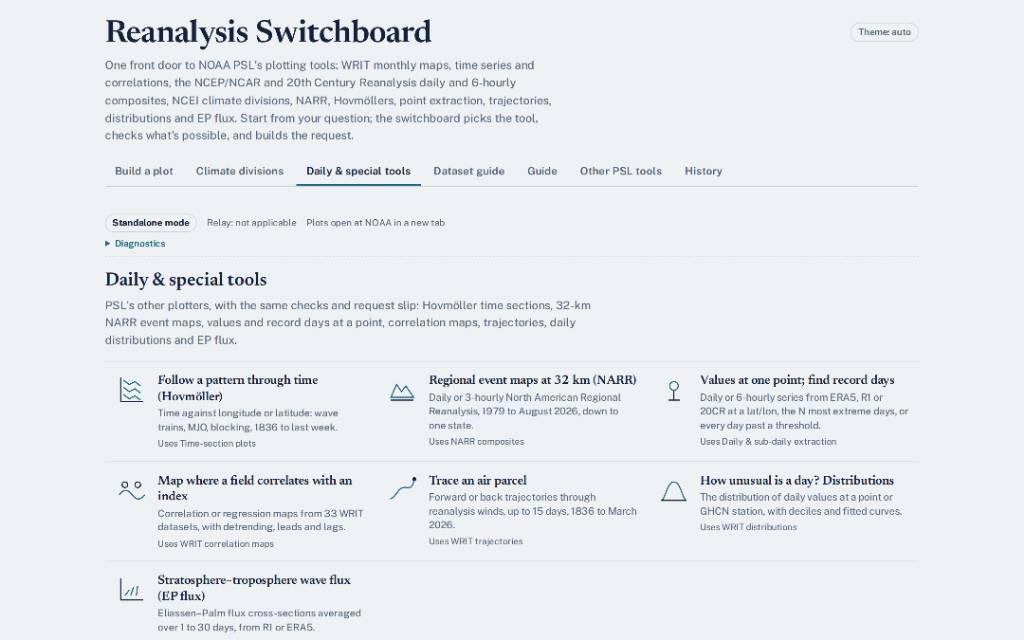
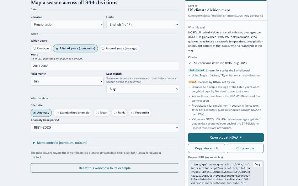
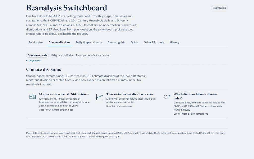
http://CPAWEATHERLAB.COM/SWITCHBOARD.COM UPDATED UPDATED UPDATED **Climate divisions tab** This tab uses NCEI climate-division data: averages built from station observations for 344 regions of the lower 48, from 1895 to August 2026. No reanalysis is involved. - **Map a season across all 344 divisions.** Maps temperature, max/min temperature, precipitation, degree days or any Palmer index. You can map one month or season for one year, a list of up to 30 years averaged together, or a run of years. Show it as an anomaly, standardized anomaly, mean, rank or percentile, against a base period you choose. For precipitation and degree days, a season's value is the total, not the monthly average. For a season that crosses the new year, you enter the year of its last month; the page converts it to NOAA's first-month labelling for you. - **Time series for one division or state.** Gives one division's or one state's history from 1895, as monthly values or one value per year for a season. You get a plot or a plain-text table you can save. Anomalies are switched off for single divisions because NOAA's are wrong there; they work for state averages. - **Which divisions follow a climate index?** Maps how closely every division's seasonal values track one of 30 indices, such as ENSO, NAO, PNA, PDO, AMO or a plain trend. The index can lead or lag by up to 12 months or seasons. The slip tells you roughly how large a correlation has to be to stand out from zero with your number of years. **Daily & special tools tab** - **Follow a pattern through time (Hovmöller).** Plots time against longitude or latitude, averaged across a band you choose. It shows wave trains, blocking and the MJO moving. Data runs from 20CRv3 in 1836 through R1 to NCEP's operational analysis, which is current to within a few days. - **Regional event maps at 32 km (NARR).** Makes daily or 3-hourly maps from the North American Regional Reanalysis, 1979 to August 2026. You can frame the map on one state, like Pennsylvania, or a custom box. This is PSL's best source for recent events now that R1 has ended. The page asks for a 0.3° plot so the 32-km detail isn't smoothed away. - **Values at one point; find record days.** Pulls daily or 6-hourly values from ERA5, R1 or 20CR at a latitude and longitude, or from a daily climate index. It can plot the series or its distribution, or list the N most extreme days in a season (up to 300), or every day past a threshold. The page catches NOAA's bug where a western longitude silently becomes a point in Spain. - **Map where a field correlates with an index.** Makes a correlation or regression map of a seasonal field against an index, using any of 33 WRIT datasets. You can detrend both series and have the index lead or lag. It shows where a climate mode's influence reaches. - **Trace an air parcel.** Runs forward or back trajectories up to 15 days through reanalysis winds at one pressure level. You can add a box of neighbouring starting points to see how much the path depends on where it starts. Use it to see where a moisture plume or air mass came from. - **How unusual is a day? Distributions.** Gathers every day of a season at one point (from R1, 20CR V2c or PRISM precipitation) or at one GHCN station, and shows the distribution with its deciles and a fitted curve. It can also give the probability of a value you enter. - **Stratosphere–troposphere wave flux (EP flux).** Draws Eliassen–Palm flux arrows, with divergence or the implied acceleration, from R1 or ERA5, averaged over 1 to 30 days. It's the standard picture of waves driving the stratosphere, useful around sudden warmings. Sent from my SM-S731U using Tapatalk
-
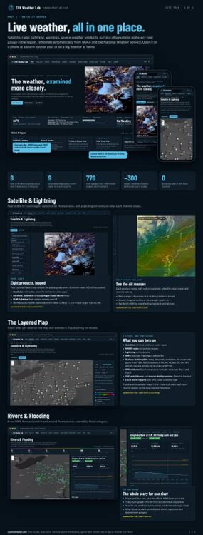
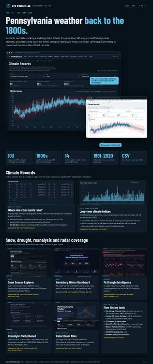
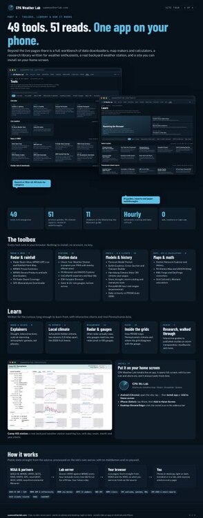
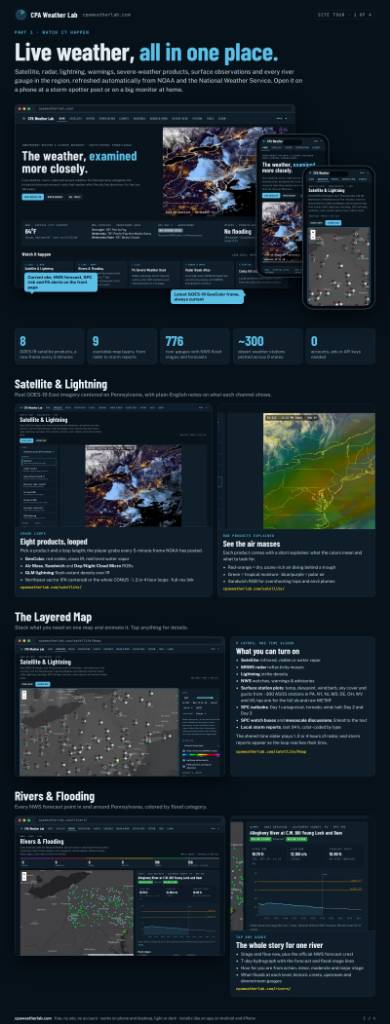
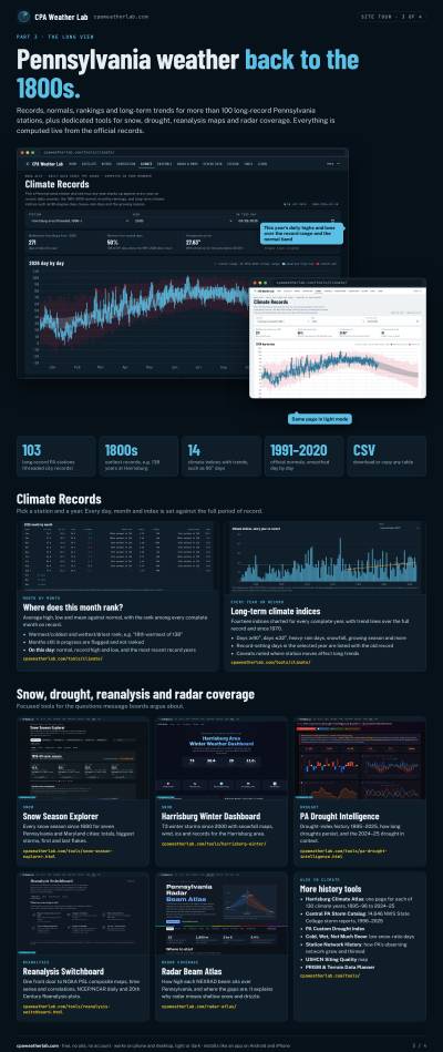
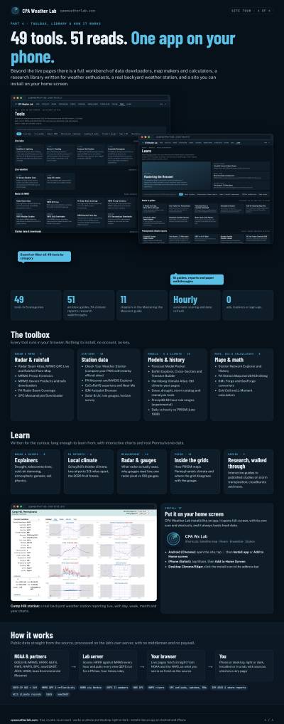
CPA Weather Lab https://cpaweatherlab.com TAKE A TOUR!!!! https://claude.ai/artifact/3hPJ2tTBfYqULiavQzXZ7U#cf7995a2-237f Most people check the weather, see “60% chance of rain,” and continue living productive lives. I apparently took that as a personal challenge and built an entire weather laboratory to determine exactly where the other 40% went. CPA Weather Lab has live radar, satellite, river gauges, severe weather, surface observations, ensembles, climate records, storm archives, and enough historical data to turn a perfectly healthy interest in weather into something your family quietly refers to as “the website.” The forecast section is particularly useful if you enjoy watching certainty die in real time. Thirty-one GEFS ensemble members begin with roughly the same atmosphere and gradually wander off in different directions like relatives trying to agree on where to eat. You can watch the spread grow, compare consecutive model runs, examine precipitation and snow probabilities, yell at models that have personally offended you, and cackle at yesterday's model run once observational data arrives and exposes its lies. This is meteorology, where screaming “THAT IS NOT WHERE THE LOW IS GOING” at a computer screen remains technically unpaid peer review. And because merely yelling at numerical weather prediction models seemed far too emotionally healthy, there is forecast verification. The HRRR makes a prediction, MRMS observes what actually happened, and CPA Weather Lab keeps the receipts. Hits, misses, false alarms, bias, CSI, probability reliability, lead-time degradation. The model can confidently paint two inches of rain across half of Pennsylvania, reality can put it somewhere else entirely, and the next day we can gather around the statistics and quietly cackle over the evidence like deeply maladjusted meteorological raccoon goblins. Today's beautiful model solution is tomorrow's row in a verification table. Then there is the historical side, because sometimes today's weather is disappointing and you need to investigate whether people in 1914 were also disappointed. Harrisburg records stretch back into the 1800s, alongside snowfall histories, drought analysis, storm catalogs, climate rankings, station records, radar tools, and enough obscure meteorological rabbit holes to make “I'll just check one thing” a statement with absolutely no credibility. Nothing restores perspective quite like spending an evening researching a 117-year-old precipitation event because something about Tuesday's rainfall seemed suspicious. At some point I realized I had essentially become a weather raccoon: awake at unreasonable hours, digging through NOAA's enormous data dumpster with both paws, dragging home anything shiny labeled radar, reanalysis, snowfall, or precipitation, and then becoming strangely territorial when somebody suggests I probably don't need another dataset. The difference is that a normal raccoon eventually gets tired and leaves the trash can. I built search tools for mine. There are tools for examining radar coverage because apparently knowing that it is snowing is insufficient when you can instead calculate how many thousands of feet above your head the lowest radar beam is passing. There are river gauges because rain eventually becomes somebody else's problem downstream. There are weather-station tools because spending hundreds of dollars measuring rainfall naturally leads to wondering whether the rain gauge is lying to you. And there are climate tools for those special evenings when you would rather rank 130 winters than interact with another human being. CPA Weather Lab is also a web app, so if merely visiting this thing occasionally isn't enough commitment, you can install it directly from your browser on your phone, tablet, or computer and give it its own icon like a normal app. On Android you can install it through Chrome, on iPhone through Safari's Add to Home Screen, and desktop browsers such as Chrome and Edge can install it too. Then it opens full-screen, because apparently what your phone was missing was immediate access to river hydrographs, ensemble spaghetti, radar beam heights, and more than a century of evidence that Pennsylvania weather has been doing this nonsense far longer than any of us have been alive. This whole thing exists because weather refuses to behave like the tidy numbers in a forecast table. Models disagree. Gauges disagree. Radar misses things. Snowfall measurements become arguments. Rivers ignore county boundaries. Ensembles abruptly discover seventeen different futures. A model that looked brilliant at 00Z can become an object of ridicule by breakfast. And somewhere in central Pennsylvania, I will be staring at the screen yelling at it, then returning twelve hours later to cackle when the observations confirm that, yes, the lying bastard really did move the storm 150 miles. Instead of accepting any of this like a well-adjusted person, I kept adding datasets. So CPA Weather Lab is basically what happens when “I wonder what the weather is doing” goes untreated for long enough and the local weather raccoon gains server access. Now you can install the condition on your phone. https://cpaweatherlab.com Sent from my SM-S731U using Tapatalk
-
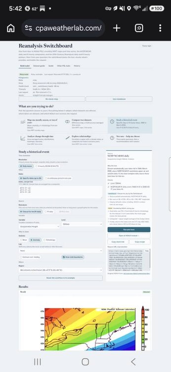
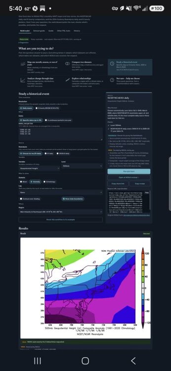
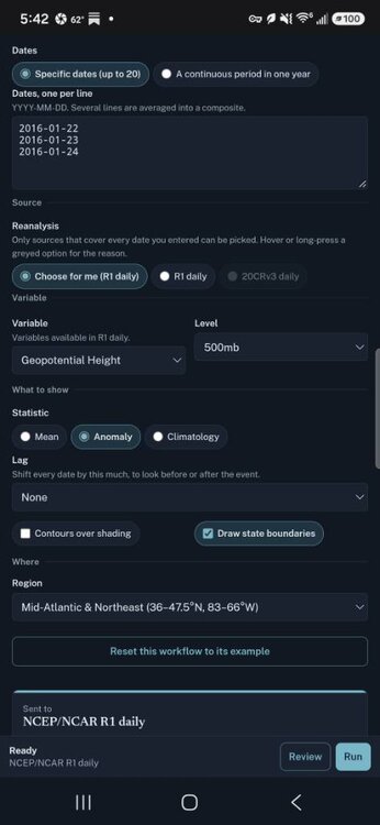
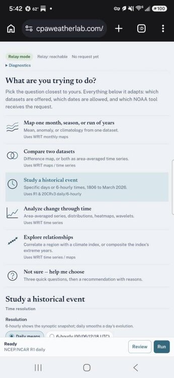
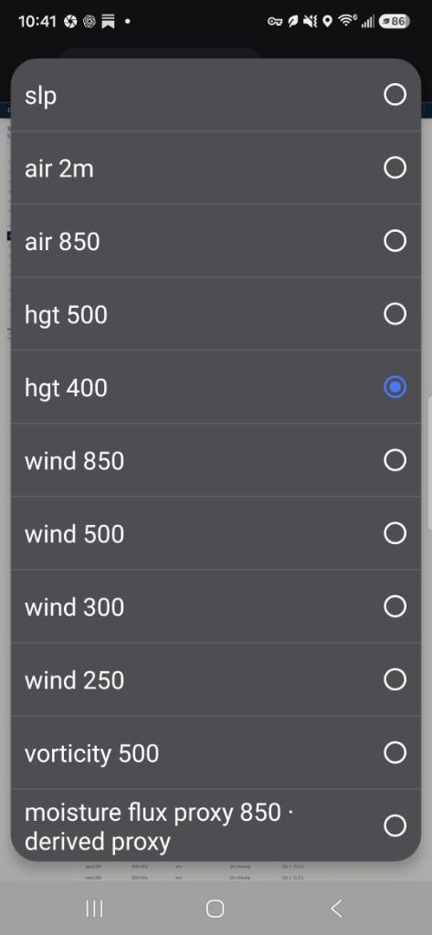
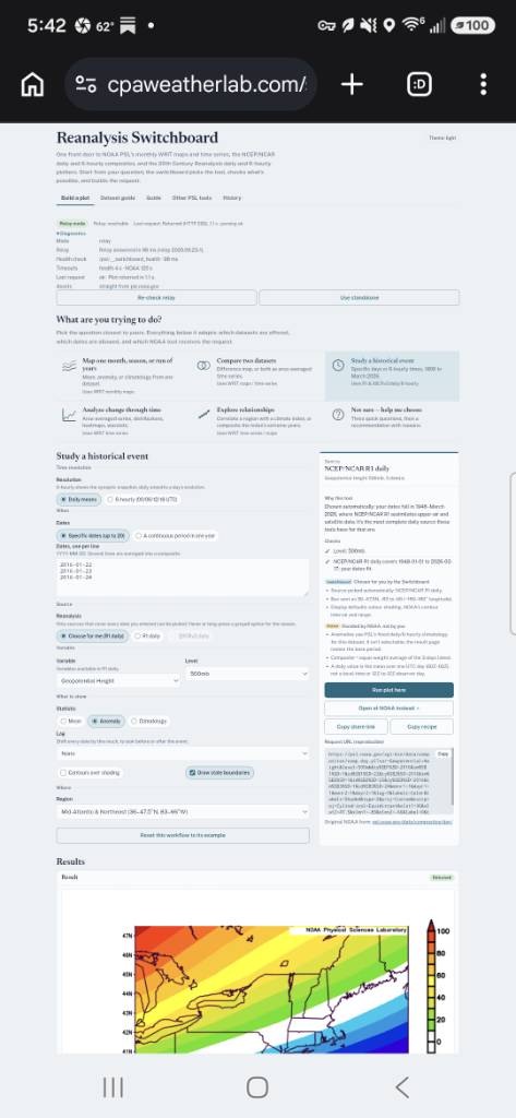
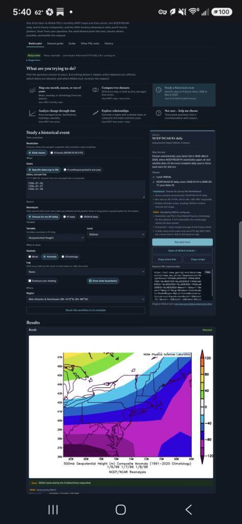
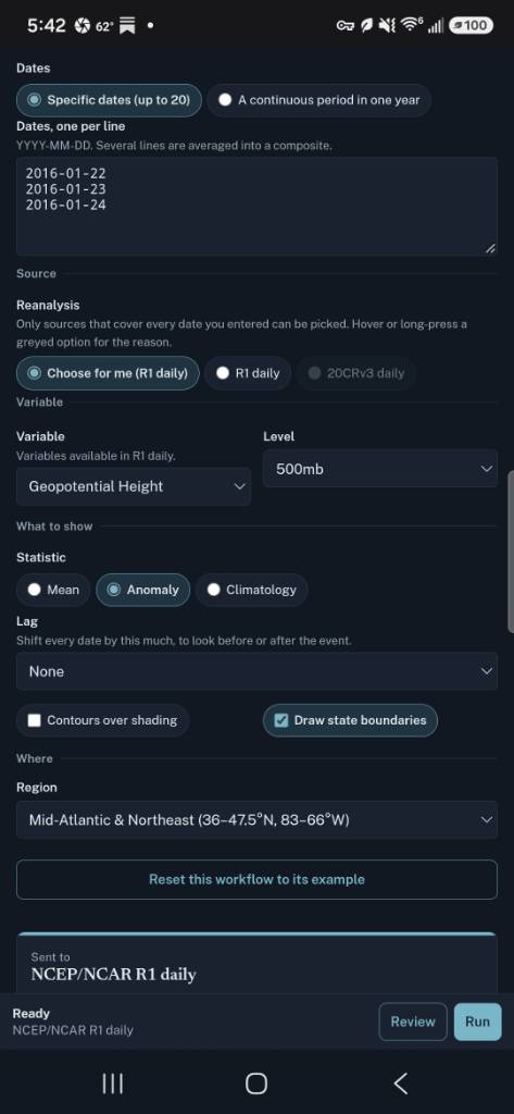
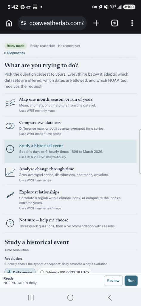
Tis the season where this will come in handy. A gift to the board, with plenty more to follow. Reanalysis Switchboard I put together the Reanalysis Switchboard as a friendlier front door to NOAA Physical Sciences Laboratory’s historical weather and climate tools. NOAA has an enormous amount of reanalysis data and some genuinely powerful plotting tools, but there has always been a slight assumption that the person using them already has a PhD in atmospheric science, knows what every dataset acronym means, and remembers which web form was designed sometime around the Clinton administration. I wanted something where a weather enthusiast could start with the actual question instead. The Switchboard lets you map a month or season, compare two datasets, examine individual historical storms at daily or 6-hourly resolution, analyze changes through time, make distributions and month-by-year heatmaps, run wavelet and autocorrelation analyses, and explore relationships with climate indices such as the NAO, PNA, ENSO, PDO and others. Instead of making you figure out which NOAA tool to use, the Switchboard asks what you are trying to do, determines which NOAA plotting system can handle it, checks whether the dates and variables are actually available, explains important limitations, and builds the request for you. The plots and underlying data still come from NOAA PSL. The Switchboard is basically the traffic controller. I also added a simple Dataset Guide because the alphabet soup gets ridiculous very quickly. It gives basic information about ERA5, JRA-3Q, JRA-55, MERRA-2, NCEP/NCAR R1, 20th Century Reanalysis V3, CORe and the other datasets, including their approximate spatial resolution, period of record, time resolution available through the site, what each dataset actually is, and why you might choose one over another. One example is comparing two famous East Coast snowstorms. I used the Switchboard to compare the Blizzard of 1996 (January 6–8, 1996) with the January 2016 blizzard (January 22–24, 2016). Both storms were analyzed using the same NCEP/NCAR Reanalysis 1 dataset, the same Mid-Atlantic/Northeast geographic area, the same three-day averaging method and the same anomaly climatology. That makes it possible to directly compare things such as the 500-mb upper-air pattern and precipitable water between the two storms without first downloading a reanalysis archive and writing a bunch of code. That is really the point of the project: give people access to some very powerful historical-weather tools without requiring them to earn another degree just to figure out which button NOAA wanted them to press. Reanalysis Switchboard: https://cpaweatherlab.com/switchboard/ Sent from my SM-S731U using Tapatalk
-
Central PA Summer 2026 Discussion/Obs Thread
Jns2183 replied to Voyager's topic in Upstate New York/Pennsylvania
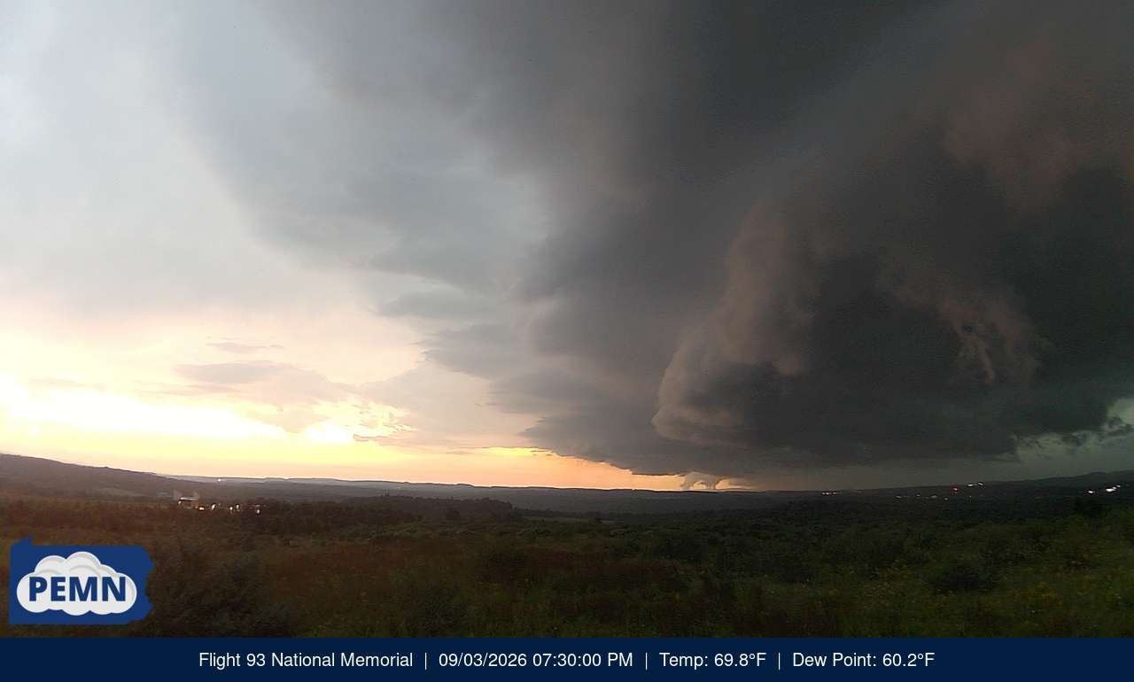
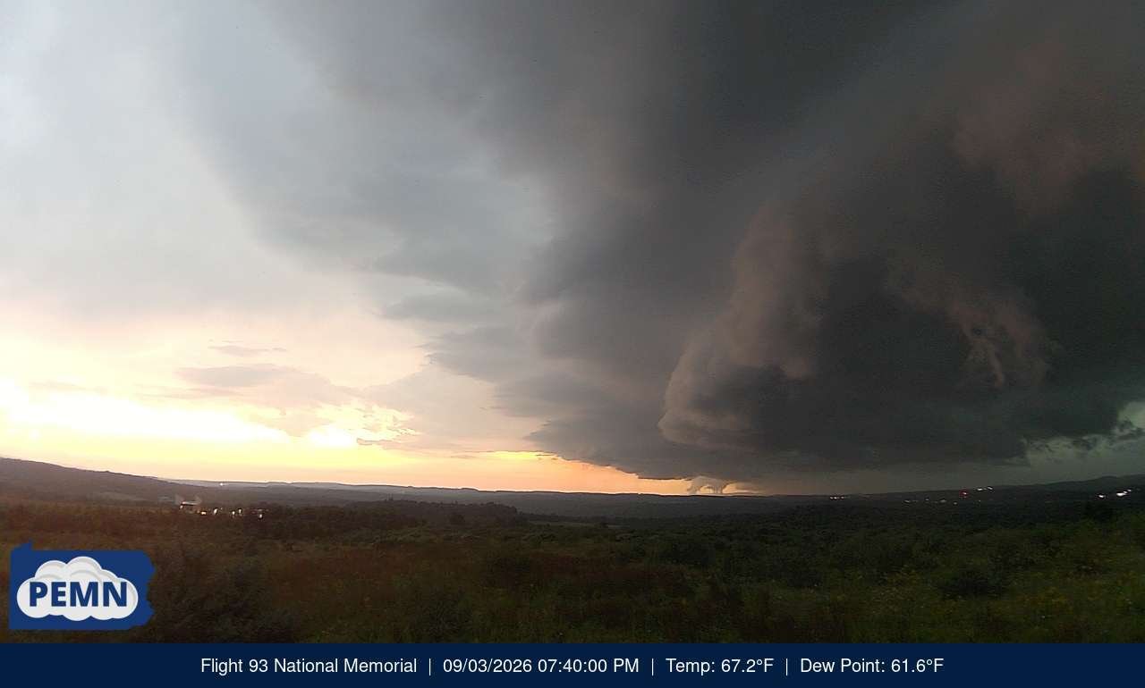
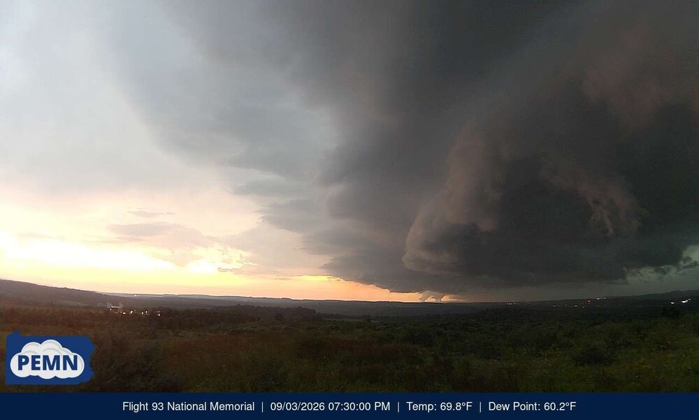
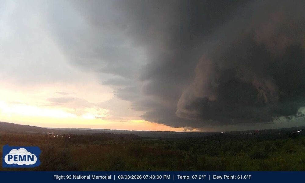
from the flight 93 memorial PEMN weather station cameras appointed right after that tornado warned storm that is coming towards. first picture is 7:10 717-20 thirds 7:30 this last one 7:40 station itself has one minute resolution so if you want to enjoy watching the live webcam I'll see one minute resolution weather station data have at it https://climate.met.psu.edu/data/pemn/?site=SMRS02&numObs=1440 Sent from my SM-S731U using Tapatalk.thumb.jpg.4d606dd9631d85f1fa6db5056aa35ff6.jpg)
-
Central PA Summer 2026 Discussion/Obs Thread
Jns2183 replied to Voyager's topic in Upstate New York/Pennsylvania
best ring of fire action I've seen in years and it's quite delayed from normal Sent from my SM-S731U using Tapatalk
.jpg.eef30e5085f124b3162760b9ef3c230a.jpg)




.jpg.112d72f291640cfc9dec499b566e51f4.jpg)