chubbs
-
Posts
4,166 -
Joined
-
Last visited
About chubbs

-
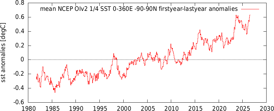
That's the $64 question for this year. Will we see the same type of "gobsmaking" global warming we saw in 2023 or will this year behave more like a typical strong/super el nino. So far I'd put this year in the typical camp, with global air temperatures lagging the rise in ENSO and global SST. One aspect that has held back global temperatures in the past 2 months has been very cold temperatures in Antarctica associated with a strong AAO+ regime. In 2023 AAO was strongly positive in January (see AAO table below), reversing by March, and staying negative through September. So the AAO boosted global temperatures in the first half of 2023 but are holding them back this year. One of the many factors that contributes to a different outcome in 2026 vs 2023. If the AAO reverses in August there will be an added boost in global temperatures on top of ENSO. We will see. 2023 2.304 0.554 -0.258 -0.921 1.452 -0.438 -0.818 -0.038 -1.050 0.535 0.097 1.510 2024 0.922 1.043 -0.058 1.005 -0.073 0.210 -0.597 -2.150 0.098 -0.567 1.020 -0.826 2025 -0.080 -0.271 0.733 1.138 0.509 0.209 0.753 0.357 -0.709 -1.236 -1.324 -1.136 2026 0.848 0.489 0.492 -0.125 0.544 2.506
-
Chester County PA - Analytical Battle of Actual vs. Altered Climate Data
chubbs replied to ChescoWx's topic in Climate Change
OK lets see what the raw data says. After all bias adjustments are based solely on raw data. If the the steel mill impacted the Coatesville station it would be reflected in the raw data and in the NCEI bias adjustment. Below is a plot of Coatesville 1SW minus West Chester and the Coatesville bias adjustment (right axis). A station change at either Coatesville or West Chester causes a sudden change in relative temperature of Coatesville and West Chester. While a growing steel mill or an urban heat island in one of the towns would cause a gradual change in the difference between the two stations. There are many large sharp changes in Coatesville's temperature relative to West Chester. These are all station changes. There is no indication of a gradual long-term trend so a large change in the steel mill impact can be ruled out. Station changes are the primary cause of Coatesville's (and West Chester's) cooling. The Coatesville bias adjustment (right axis) tracks the raw temperature data at Coatesville and West Chester closely, capturing the each wide swing due to station changes. The only exception to the close tracking is when West Chester had station changes: 1915, the 1920s, the 1960s and with the West Chester move in 1970. Both stations start out at about the same temperature in the 1890s. Between 1894 and the 1960s, most of the chart movement is due to Coatesville station changes as West Chester experienced relatively minor station changes. After 1920 Coatesville cools relative to West Chester. The change is anything but gradual with several large swings due to station changes. From the late 1940s to the late 1950s Coatesville is 2F cooler than West Chester. The rural Doe Run Road site is the coolest Coatesville station location. Coatesville warms by roughly 0.5F around 1960. After 1960 the main station changes are at West Chester, ending in the 1970 move which cools West Chester to down Coatesville's level. Note that station changes can be warming or cooling, but on balance both stations cooled significantly over the period due to station changes. This exercise is another feather in NCEI's cap. The Coatesville and West Chester raw data shows that bias adjustments are needed and accurate in Chester County. No surprise if you have been reading the thread.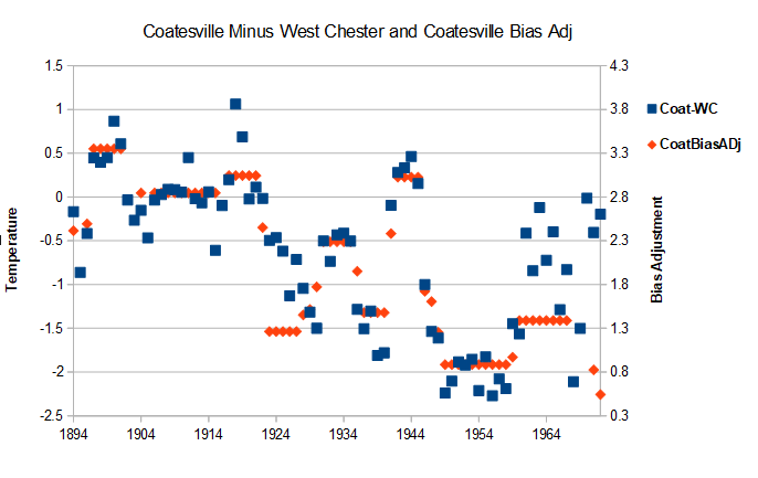
-
Chester County PA - Analytical Battle of Actual vs. Altered Climate Data
chubbs replied to ChescoWx's topic in Climate Change
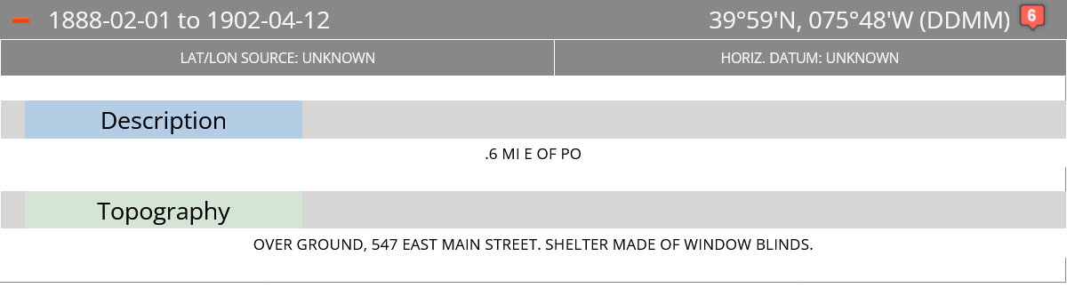
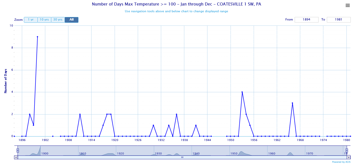
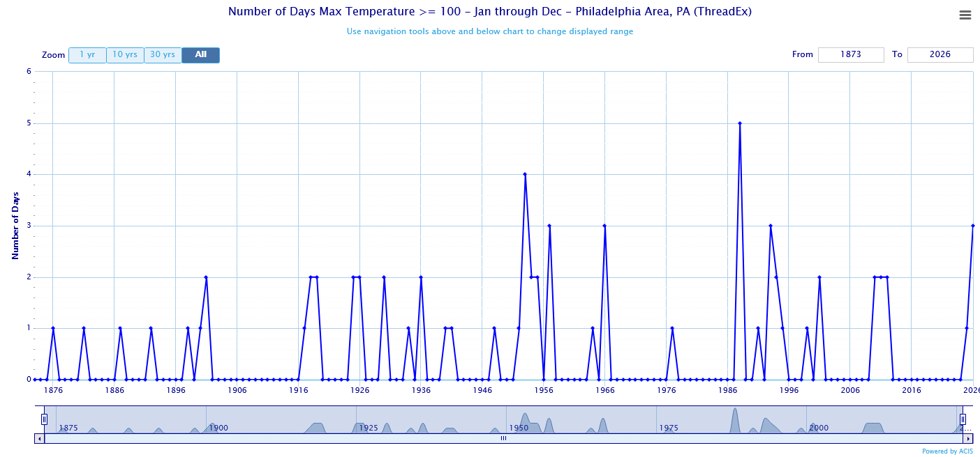
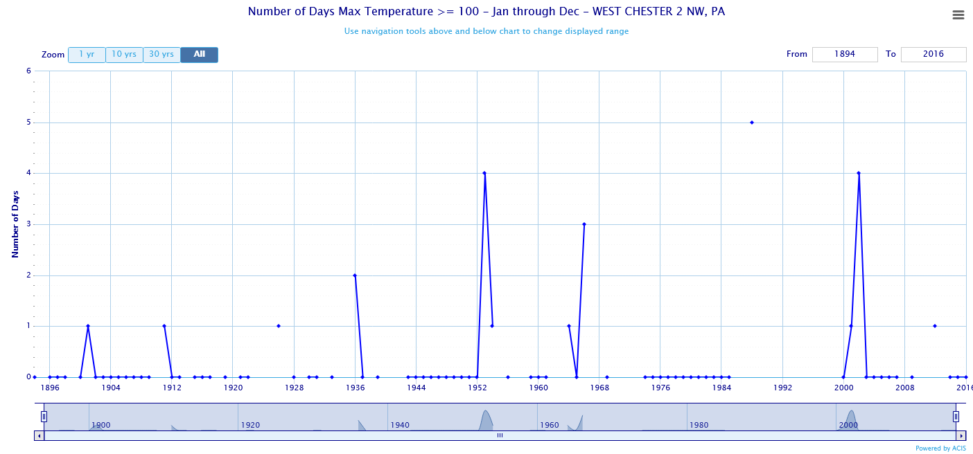
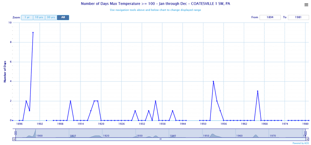
You left in all the other station changes. Your current station population is much cooler, more rural, and higher elevation compared to the older COOPs. All the COOPs were in towns before the Coatesville post-war move. The more I look at the Chesco COOP data the more problems I find. Per NCDC the Coatesville 1SW shelter was made of window blinds before 1902. The "window blinds" apparently produced a big spike in 100F days in 1900, which wasn't observed in West Chester or Philadelphia. After the "window blind" spike, the Coatesville 1SW data is similar to Philadelphia and West Chester with no indication of the pronounced downtrend you are showing. Once again the local raw data doesn't agree with the climate trend you are reporting.
-
Chester County PA - Analytical Battle of Actual vs. Altered Climate Data
chubbs replied to ChescoWx's topic in Climate Change
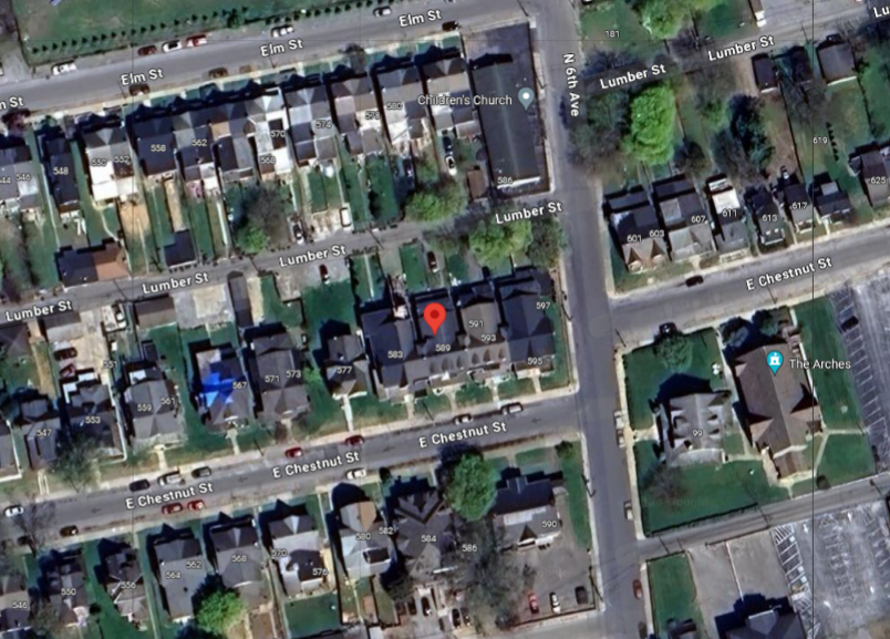
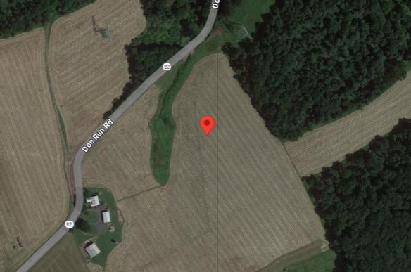
Yes TOB is not an issue at Coatesville. The big issue is station moves and other changes. The NCDC chart below shows all the locations of the Coatesville COOP station. The station numbers increase as you go back in time: Site 1 is the newest and site 6 is the original site. The most consequential move was the last one from site 2 in the City of Coatesville to to a rural site on Doe Run Road. The pictures illustrate the change. As documented in the Chester County thread roughly 2F spurious cooling with this move. photos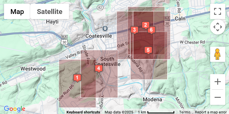


-
July to-date satellite OiSST has reached the peak anomaly from the 2023-24 nino.
-
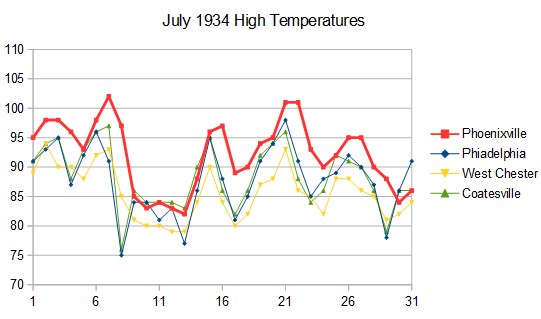
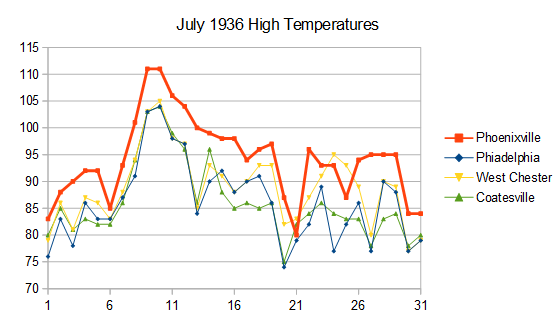
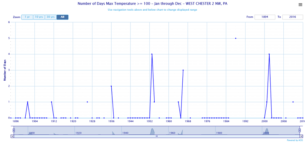
We have a good example in Chester County PA. Here are high temperatures for July 1934 and 1936 for 4 local stations. Phoenixville ran much warmer than the other stations probably due to poor shelter placement. Phoenixville also carried over hot temperatures to the next day when the other stations cooled. This shows that the Phoenixville max/min thermometer was flipped near the time of peak temperature while the other stations were not. Phoenixville completely dominates the # of 95 and 100F days in Chester County in the 1930-40s, but the data is spurious. This is why I don't trust plots of historic max temperatures in the US, unless the data has been scrutinized for bad data. Only takes one or two bad apple stations to create a spurious result.
-
Chester County PA - Analytical Battle of Actual vs. Altered Climate Data
chubbs replied to ChescoWx's topic in Climate Change
Nope no dust bowl in Chester County, just Phoenixville with a bad shelter location. Philadelphia and West Chester don't agree at all with your plot. Not surprising since once again you are confounding station changes and weather. East Nantmeal and West Grove are a little different than the City of Coatesville or West Chester don't you think?
-
Chester County PA - Analytical Battle of Actual vs. Altered Climate Data
chubbs replied to ChescoWx's topic in Climate Change
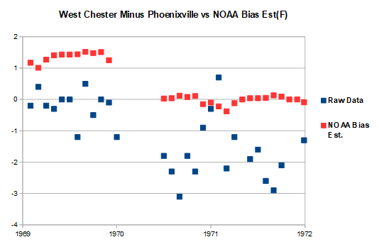
Clear that you do not understand the science behind bias adjustments. Bias adjustments are not made in an ad hoc manner or to raise or lower the temperature of a station. Bias adjustments are only made to correct station changes. If the station observation time doesn't change, then no adjustment is needed. Adjustments are based solely on raw data. A station has to change with time in a manner that is different from all other stations that experience the same weather. The goal is to include weather and exclude station changes when calculating long-term climate trends. The only way to evaluate bias adjustments is to inspect raw station data at the time of the station change. Here's an example using the West Chester 1970 move. The old West Chester COOP shut down in December of 1969 and re-opened in May of 1970 at a new location. Subtracting Coatesville from West Chester isolates the relative temperature changes at the two stations at the time of the move. The raw data shows that the new West Chester site cooled by significantly relative to Coatesville after the move. That's all the proof needed to identify a major station change at either Coatesville or West Chester. We know from raw data from Phoenixville that West Chester is the guilty party. The Chesco raw data clearly shows that West Chester cooled significantly after its 1970 move. The NOAA bias adjustment is in complete agreement with the raw data from Coatesville and West Chester. That shouldn't be surprising. NCEI is using all the raw data that experiences the same weather as West Chester, hundreds of stations potentially. I've looked at multiple large station changes at the Chesco COOPs and NCEI nails every one. Note that NCEI is asking a similar question as your AI analysis. Does West Chester respond to local May 1970 weather in the same as the other regional stations? However the NCEI procedure is much more targeted than AI, is using more data, and it is using the right conceptual model. The temperatures at West Chester do not vary independently of the temperatures at Coatesville or other stations. This gives the NCEI analysis much more power. It can correctly flag the West Chester move as a major station change. While your AI analysis can not. The raw data is the final arbiter and in this case NCEI is clearly superior to AI.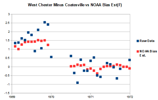
-
Chester County PA - Analytical Battle of Actual vs. Altered Climate Data
chubbs replied to ChescoWx's topic in Climate Change
Repeating what I said above garbage in, garbage out. Your analysis and AI's conclusion is faulty. You aren't telling AI that the Chesco COOPs are included in the SE PA climate division. You can't conclude that Chester County is the same as the non-Chesco stations if you include Chester County with the other stations. Second the regression slopes depend on the end-date. You need to include enough years before and after the moves for the station moves to be fully reflected in the regression. For the period 1941-1975 I get a much bigger difference in slopes -.69 for Chesco and only -.32 for the Division. Excluding Chester County from the Division would lower the Division slope further. Finally AI already has a Pvalue of 0.057, i.e, there is a 94% chance that Chesco is different using your faulty comparisons. Correct the errors and the P value will shrink considerably. My biggest complaint though is that your statistical model is inadequate. Temperature observations are highly correlated across a region because all stations experience the same weather. The Chesco and SEPA stations should be very close. Instead the chart clearly shows that Chesco COOPS cool significantly vs the SEPA Climate Div. The different temperature response by the Chesco Coops is closely associated with the timing of station moves. End of story.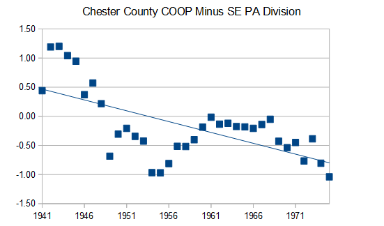
-
Chester County PA - Analytical Battle of Actual vs. Altered Climate Data
chubbs replied to ChescoWx's topic in Climate Change
Nope. The Chesco COOPs cool significantly relative to the SE PA Division data from the PA climatologist. Regression isn't a good tool because the station changes are sudden not gradual and you picked an interval that started after the initial Coatesville move and ended before the West Chester move took full effect. If you widen the interval to 1941-1975, the difference in slope is large. Per table below, comparing the five years before the first move and the five years after the last move, the Chesco COOPs cool by 1.7F relative to the SE Pa Division. Note that the Pa SE Division includes the Chesco Coops so the two items compared are not independent. For that reason it is not surprising that the delta for the SE PA is slighly smaller than ABE. Funny seeing your persistent effort to dismiss what the the raw data from Chester County clearly shows. The 3 stations each cooled significantly after the 1945-1970 moves: first Coatesville cooled relative to Phoenixville and West Chester; then Phoenixville cooled relative to Coatesville and West Chester; and finally West Chester cools relative to Coatesville and Phoenixville. Clear as day in the raw COOP data.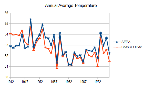
-
2026-2027 Super El Nino
chubbs replied to Stormchaserchuck1's topic in Weather Forecasting and Discussion
Plenty of ocean heat to be re-distributed, as ocean heat content increased at a rapid pace in the first quarter. The ocean as a whole is warming much faster now vs 97/98.
-
Chester County PA - Analytical Battle of Actual vs. Altered Climate Data
chubbs replied to ChescoWx's topic in Climate Change
Your AI isn't very well informed about the changes with time at the Chester County COOP stations. That's on you. Garbage in, Garbage out. The raw data clearly shows that Coatesville, Phoenixville, and West Chester cooled by roughly 2F after station moves in the 1946-70 period.. As discussed above, The roughly 2F cooling at the 3 Chesco COOPs matches the 2F cooling relative to ABE. The station move cooling isn't a small change. Very easy to see in the raw data.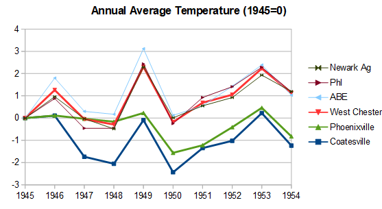
-
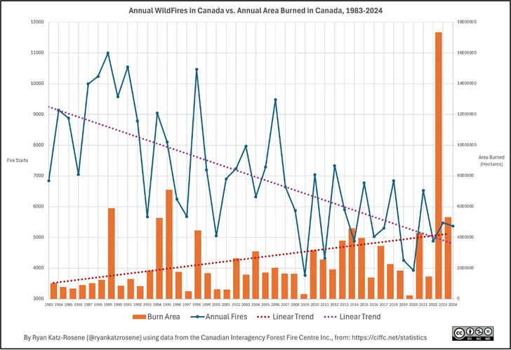
Good 2-part blog from last year on Canadian wildfire history outlining the role of forest management and climate. Canadian forest fires are less numerous than in the past; but, larger and burning a wider area. The cause of fires has transitioned from mostly man-made in the past to mostly ignited by lightning today. https://thetradeoff.substack.com/p/north-americas-forests-used-to-burn https://thetradeoff.substack.com/p/part-2-many-of-north-americas-forests
-
Chester County PA - Analytical Battle of Actual vs. Altered Climate Data
chubbs replied to ChescoWx's topic in Climate Change
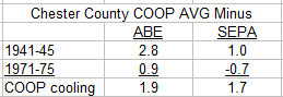
Why is NCEI cooler than the Allentown COOP? Because the Allentown COOP is in downtown Allentown and runs warmer than the Allentown Airport. NCEI has Chester County exactly where it should be: warmer than the Allentown Airport and cooler than downtown Allentown. Per the Table below, NCEI does a much better job of tracking the Allentown Airport (ABE) than the Chesco COOP average. Two five-year periods are chosen: 1941-45 before the first big Chesco station move in 1946 (Coatesville) and 1971-75 just after the last move in 1970 (West Chester). NCEI is 0.4-0.5F warmer than ABE, before and after the station moves. While the COOP average cools by 2F relative to ABE. The 2F cooling matches the roughly 2F cooling at the individual Chesco stations and is completely spurious. Once again the raw data shows that, by removing station moves, NCEI is far superior to the COOP average. As I said above the pre-1945 Chesco COOPs are very warm. It isn't only the City of Coatesville either. Phoenixville ran very hot on sunny days and West Chester was in a built-up town location. All 3 stations cooled significantly after post-1945 station moves.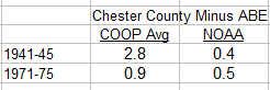
-
Chester County PA - Analytical Battle of Actual vs. Altered Climate Data
chubbs replied to ChescoWx's topic in Climate Change
You aren't looking at the chart I posted. Per your table the Chesco COOPs and the Philadelphia Airport both averaged 54.1 between 1942-44. After 1945 the large cooling moves started in the Chesco COOPs. By the early 1970s the COOPs were almost as cool as ABE. Clearly shown in the chart I posted above. If you don't correct for station moves, the raw COOP data is unusable for climate purposes in this post-war period. Not sure why this is so hard for you to accept. The Coatesville stations below, 1930-1945 and 1949+ are very different. One is much cooler than the other and the local raw data shows it. You can't treat these two sites as the same station, an adjustment is needed. That's why NCEI gets the right answer for Chesco and you don't.