

CustomWX
-
Posts
25 -
Joined
-
Last visited
Content Type
Profiles
Blogs
Forums
American Weather
Media Demo
Store
Gallery
Posts posted by CustomWX
-
-
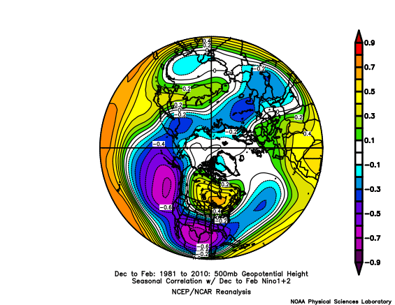
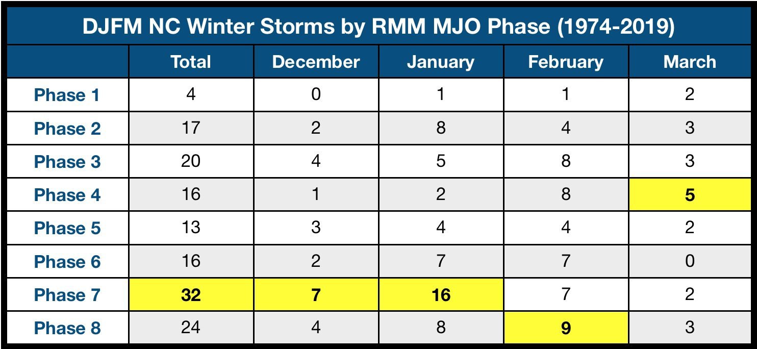
I figured you all would like to see a more clear-cut difference between the more east and west based El Nino events. Below is a statistical correlation graphic that determines relationships between two variables. In this case, geopotential height and ENSO regions (1+2, 3, 3.4, 4). The red indicates there is a direct relationship between ENSO (as El Nino strengthens, so does geopotential height). The purple/blue is an inverse relationship (as El Nino strengthens, geopotential height falls).
There is a clear west trend in the heights as the ENSO regions move west. The highest heights to go from the Hudson Bay to the Pacific Northwest, the 50/50 low is strengthened closer to the coast as El Nino is centered further west.
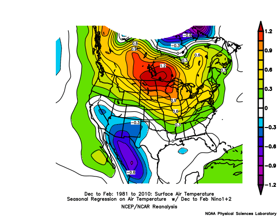
Same trend with surface temperatures. Note that I changed it to regression here, which is a linear fit.
I just think its interesting to actually see why "modoki" El Ninos are more favorable. Link to the site: https://psl.noaa.gov/data/correlation/
-
 8
8
-
-
2 minutes ago, eyewall said:
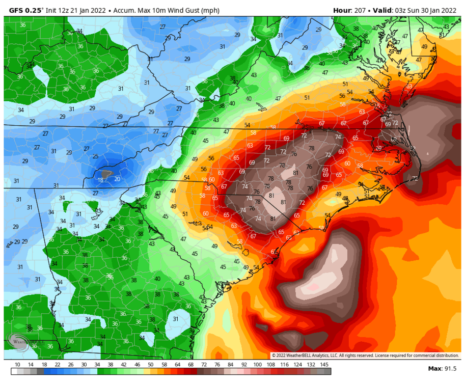
967 LOL:

Hurricane Force Wind Gusts. Would be the new storm of the century haha.
-
1
-
 2
2
-
-
6 minutes ago, Brick Tamland said:
Usually the Kuchera is lower than the regular run. Must be some awesomw rates. Glad to see the GFS actually go bigger after the last ICON run went north.
Surface temperatures are in the mid-20's. Definitely not a storm that we would need to deal with a lack of cold air if the more southerly tracks verify.
-
1
-
-
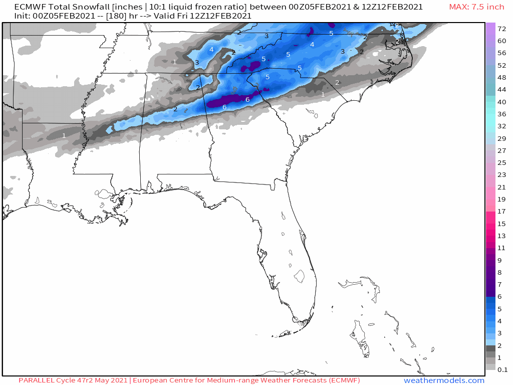
28 minutes ago, griteater said:
Well that's more like it...can you tell us the timing of the heavy snow? As in Friday or is it later?
Here's a gif showing the timeline:

-
 1
1
-
-
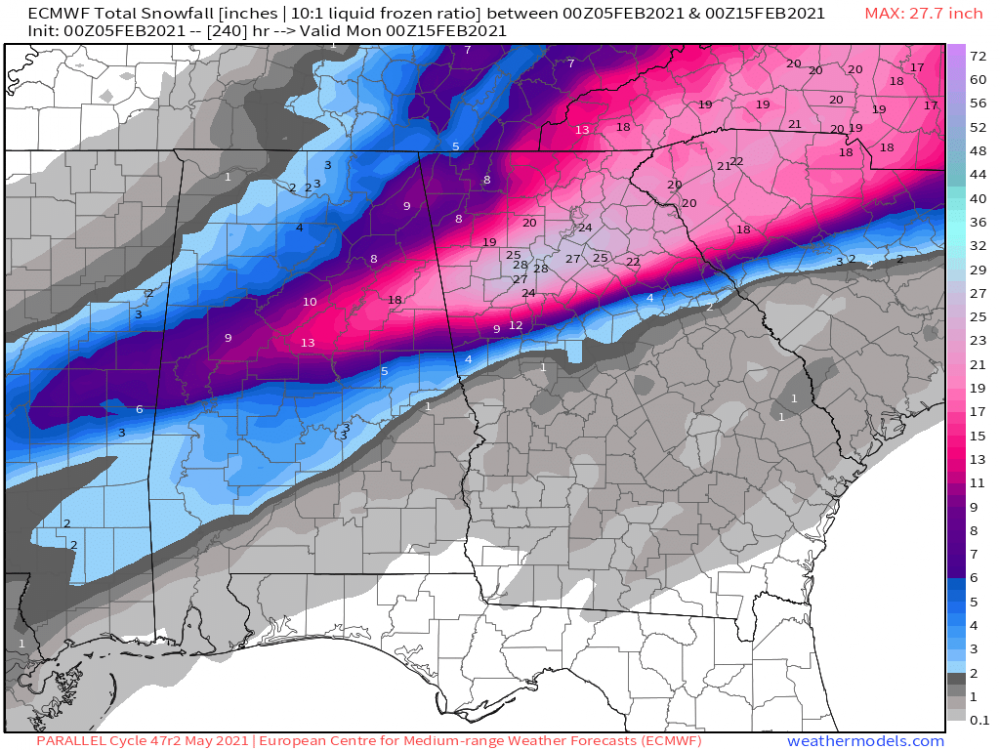
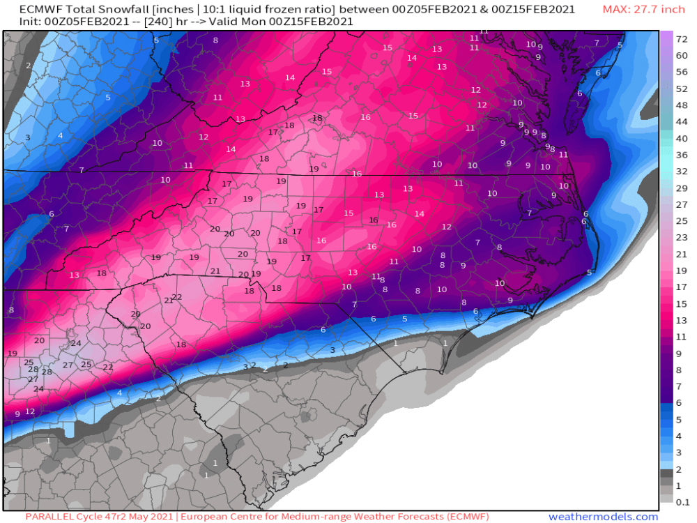
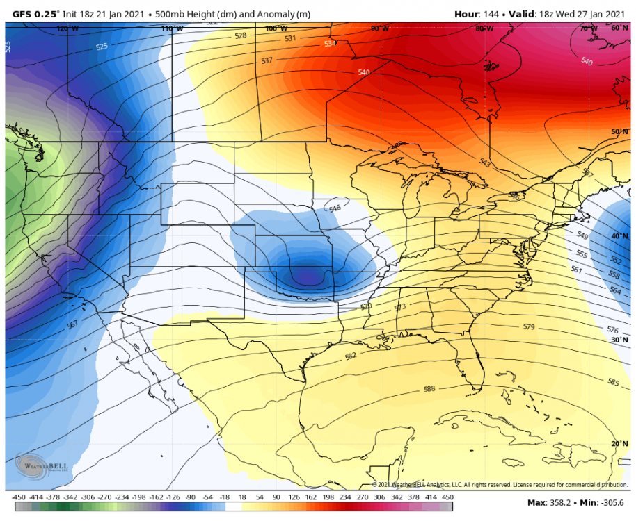
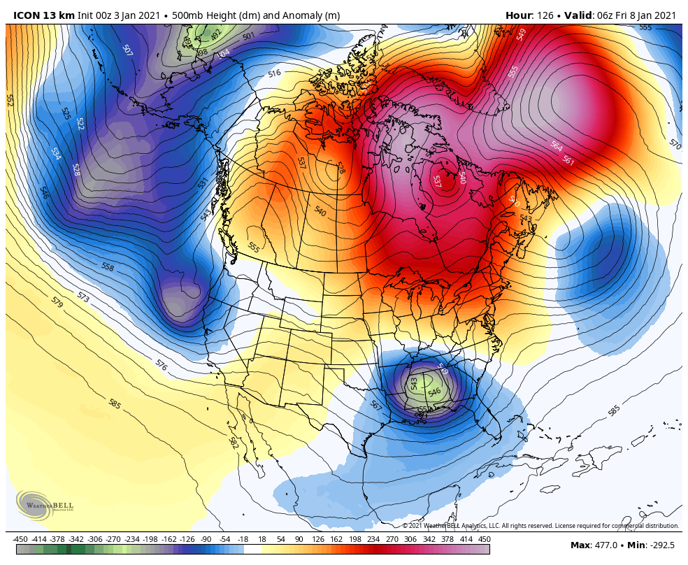
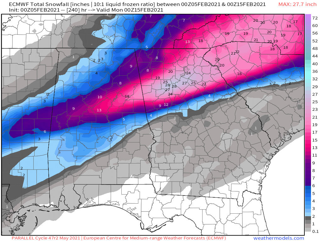
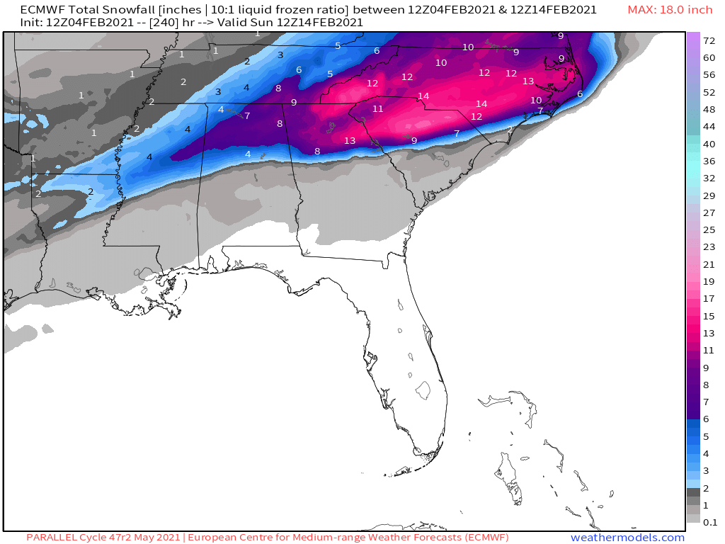
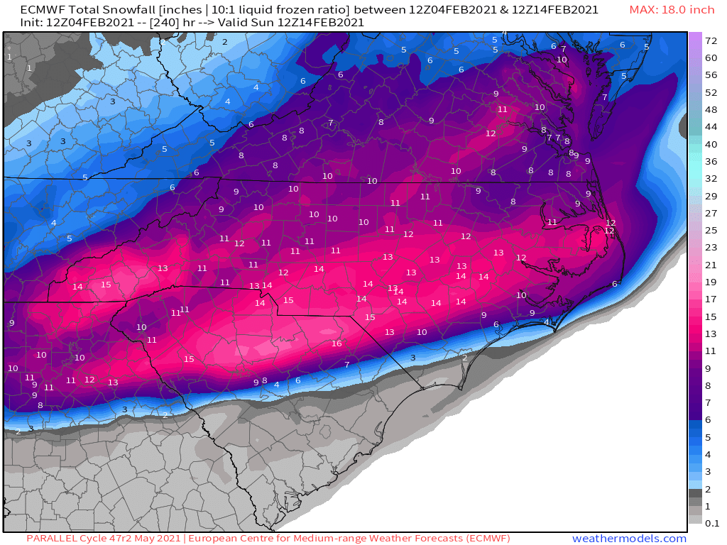
FWIW, the Euro Parallel continues with its bullish runs.
-
2
-
2
-
 2
2
-
-
9 minutes ago, griteater said:
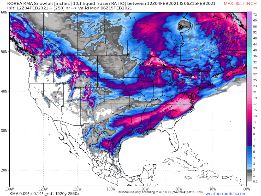
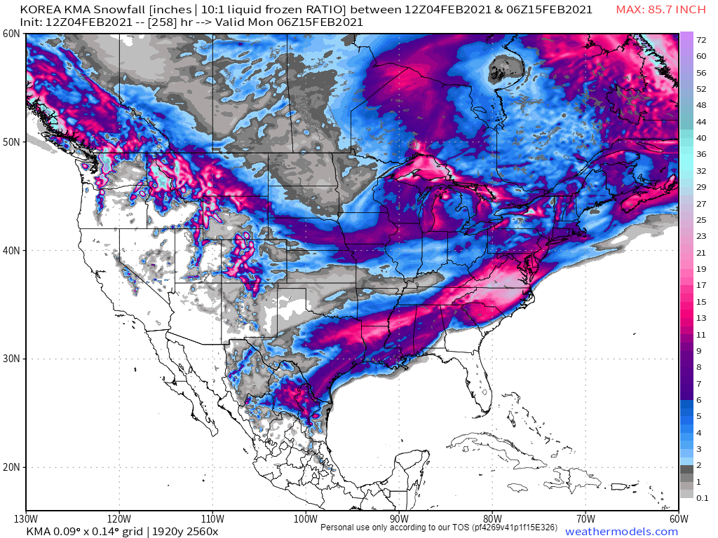
Y'all have been looking at the wrong models. Today's JMA is lit
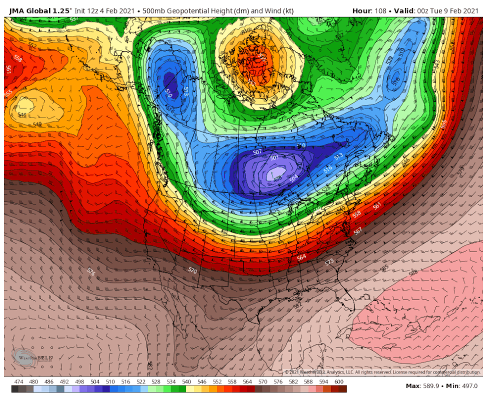
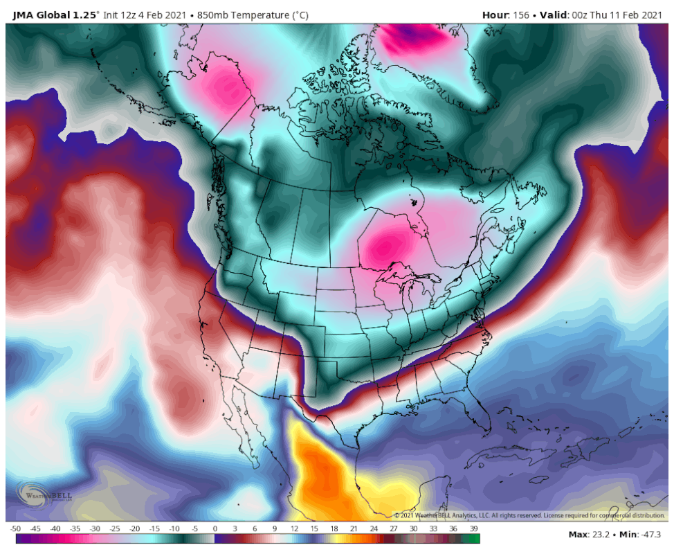
Nah, The KMA model is where it's at!
-
1
-
3
-
1
-
-
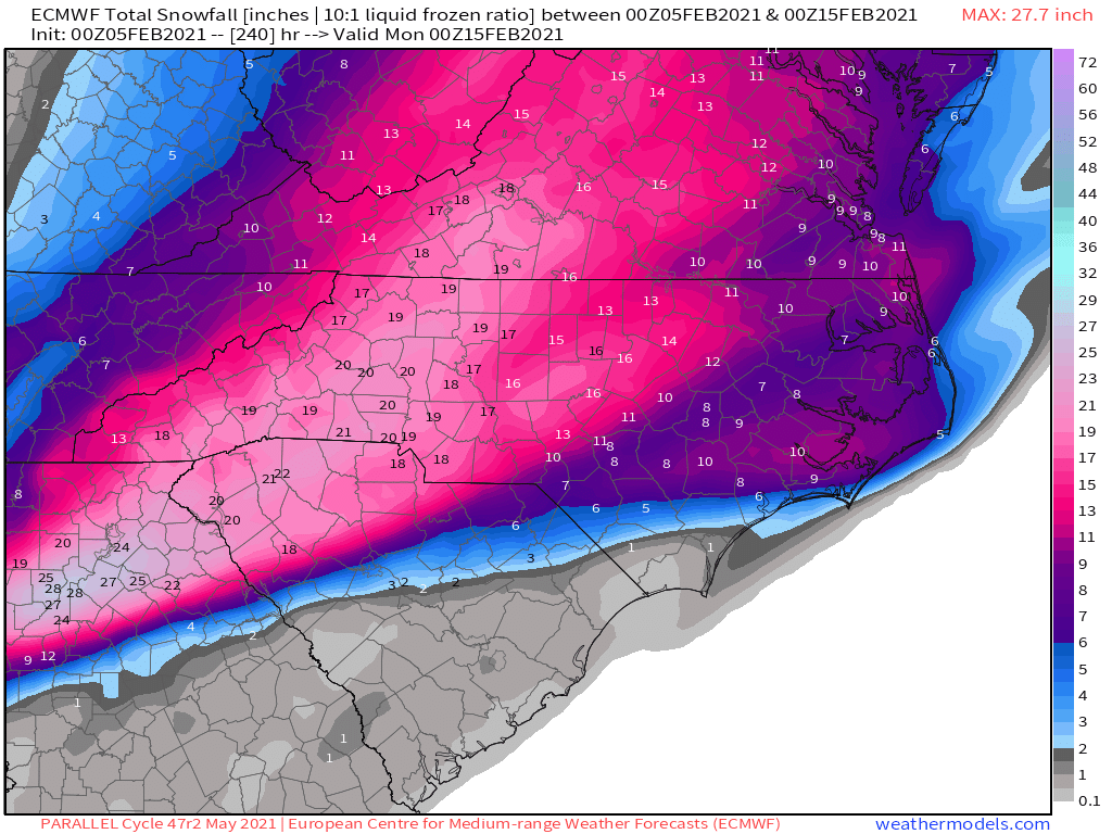
The 12z Euro Parallel looks awesome!


-
3
-
-
8 minutes ago, BornAgain13 said:
18z EPS with a nice CAD look for the system next week with plenty of moisture in coming...

Sent from my SM-N981U using Tapatalk
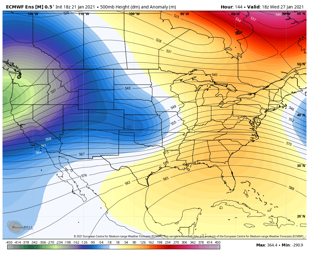
I'm not liking the 18z EPS. That piece of the TPV might end up screwing us over.

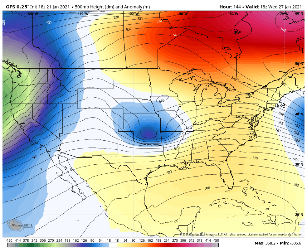
GFS
-
This is legitimately kind of funny.
-
1
-
-
10 hours ago, NC_hailstorm said:
Have been noticing the Euro forecast is ever so slightly trying to pull this MJO into phase 1 over the last 5 or so days.Even better look if that happened so things still on schedule.
Carry on.
Accord to Eric Webb’s MJO research, we do not want to MJO to go to phase one. It’s our least snowiest phase!
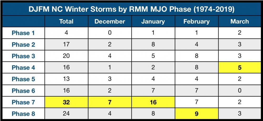
-
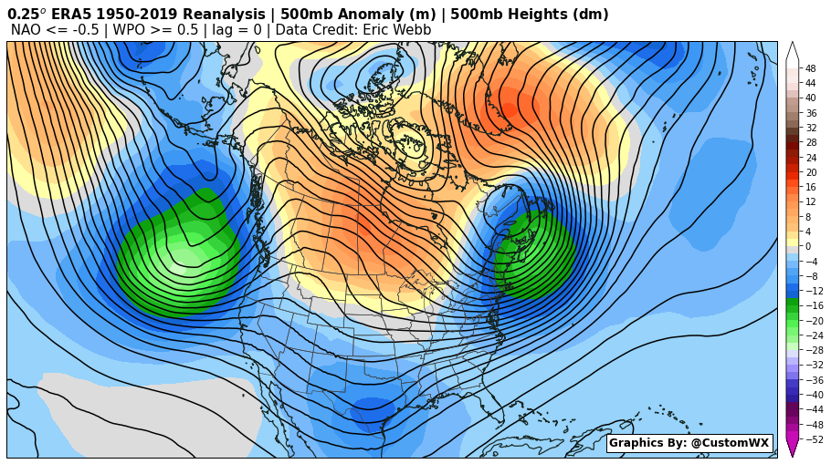
I know that Webber has been preaching this for a while, but I’m really not upset with the Pacific. Heck, I’m fine if we keep it as it is the entire year! I took a look back at some of our classic CAD/Miller B storms, and put them into a composite. Those years were Dec 208, Feb 2004, Jan 2002, Jan 1988, Dec 1971, Feb 1969, many of which produced a foot in Charlotte. Definitely some minor adjustments I would like to see, like more of a 50/50 low, but still, relatively close to the current look!
-
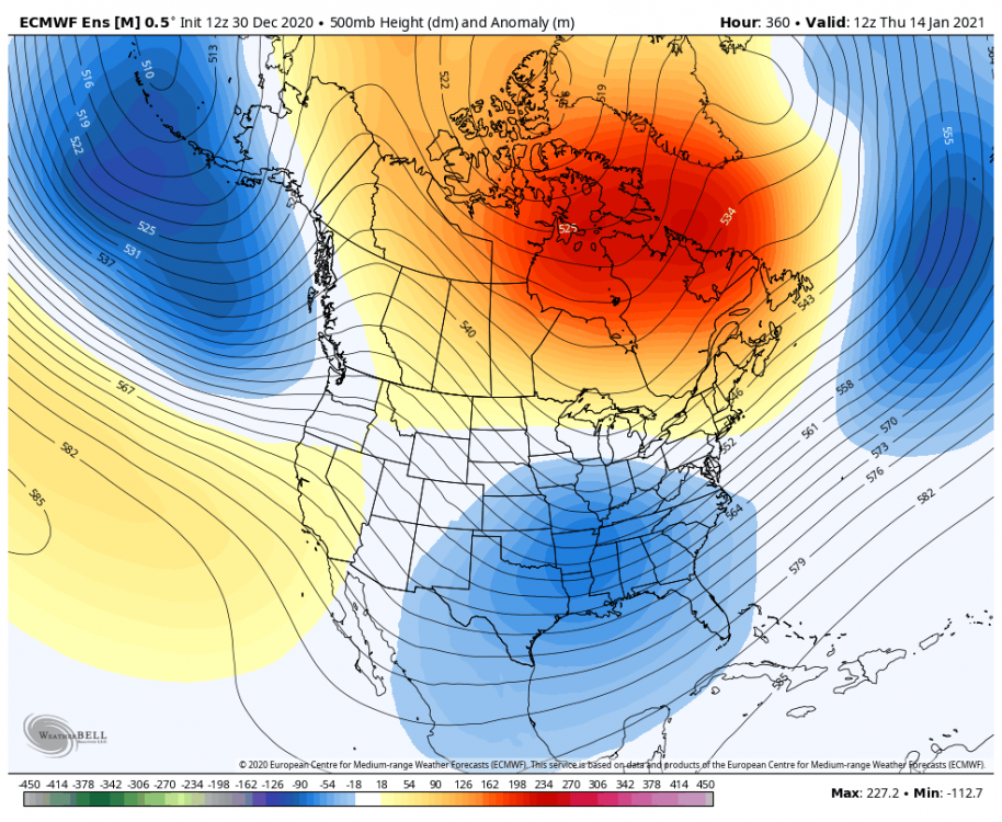
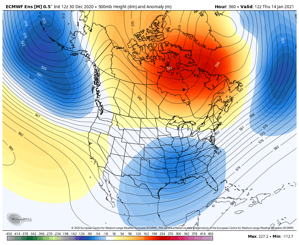
4 hours ago, CaryWx said:

Nearly bullseyed here. She was a beaut Clark.

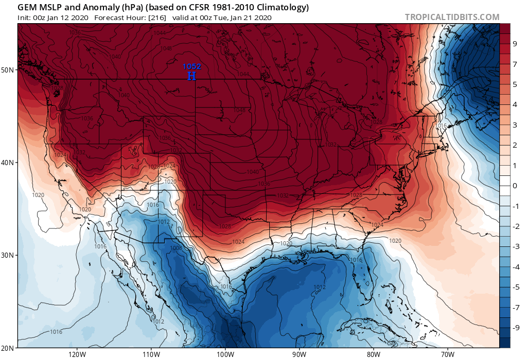
Here’s the H5 look!
-
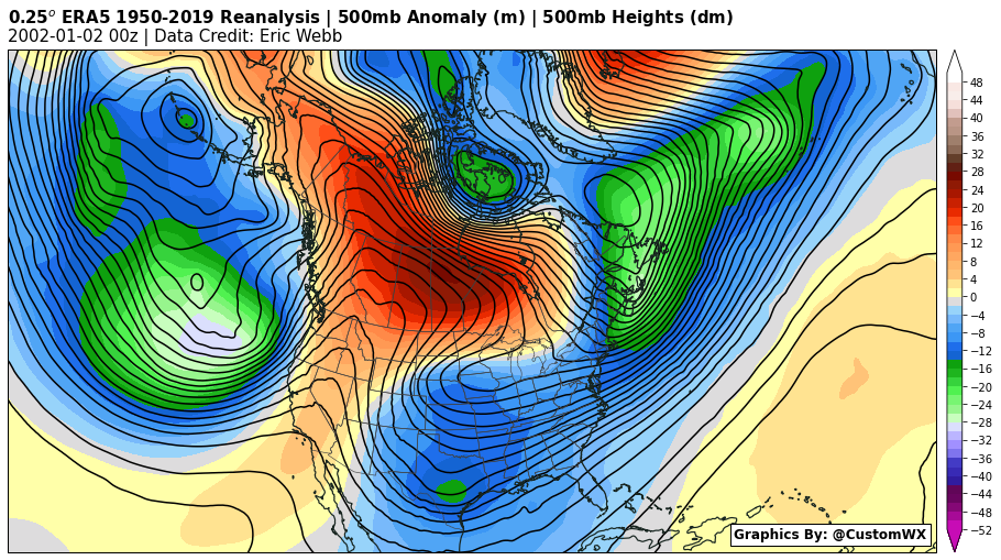
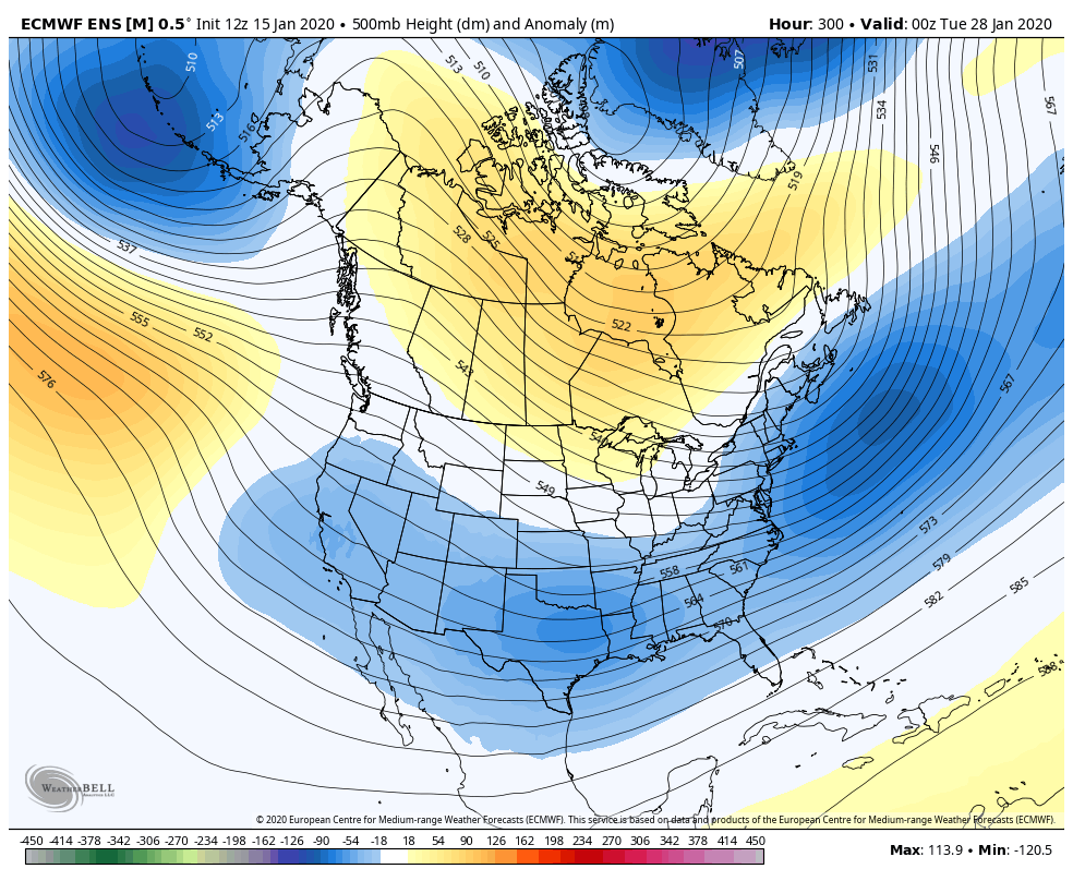
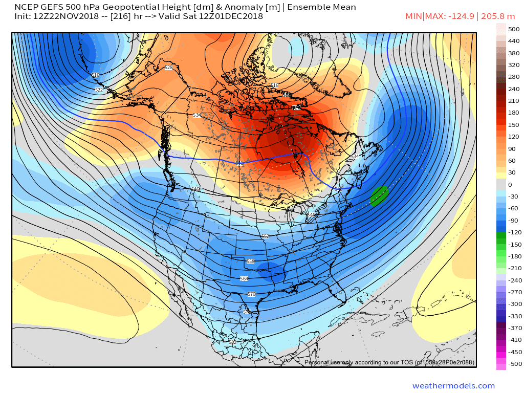
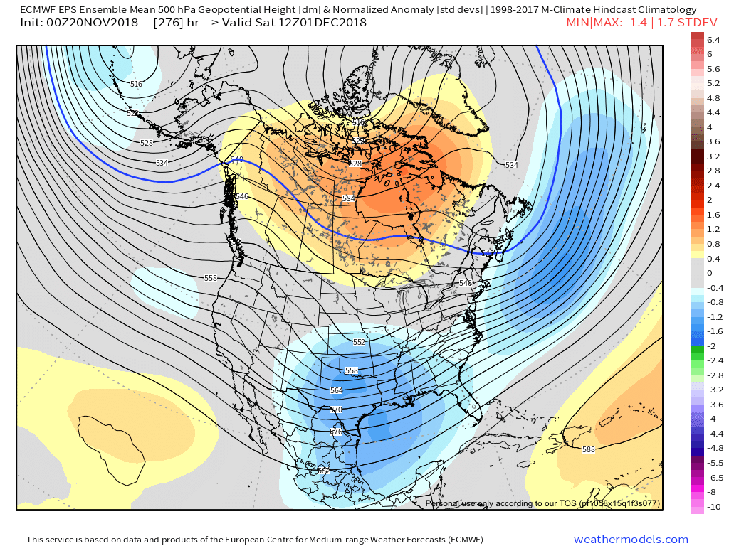
Interestingly enough, the EPS run looks extremely similar to late November, Early December 2018 (Timeframe where we got our December storm). Sure I'm cherry-picking a couple of maps, but almost identical look if we were to raise the height over Canada. To be clear the 2 maps from 2018 are not the same forecast period from two different models.
-
3
-
-
EPS isn't necessarily bad, it's just worse than 00z. At this point changes at H5 are well within the realm of possibility.

-
EPS is onboard. Lots of big dogs!


-
1
-
2
-
-
CMC onboard!


-
Most beautiful ensemble run since December 2018. Nearly half of the members are big dogs


-
4
-
-
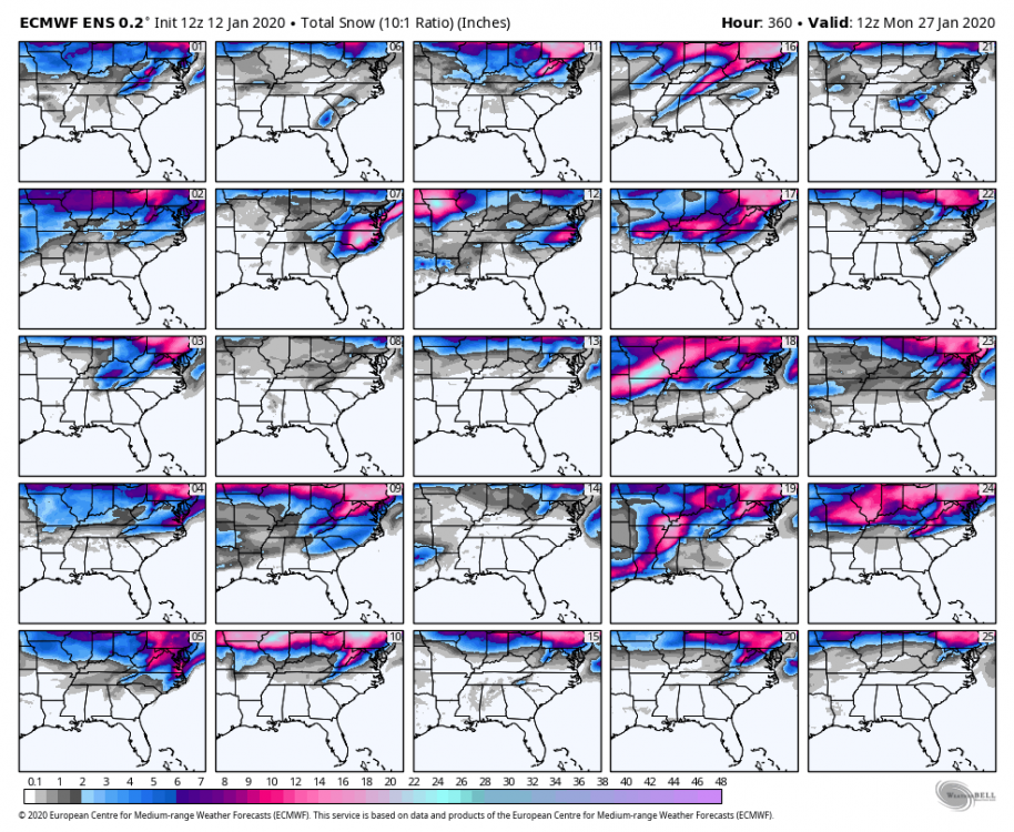
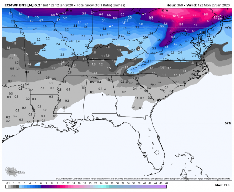
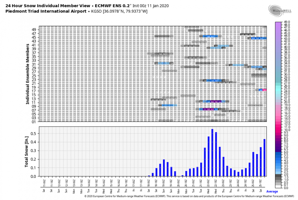
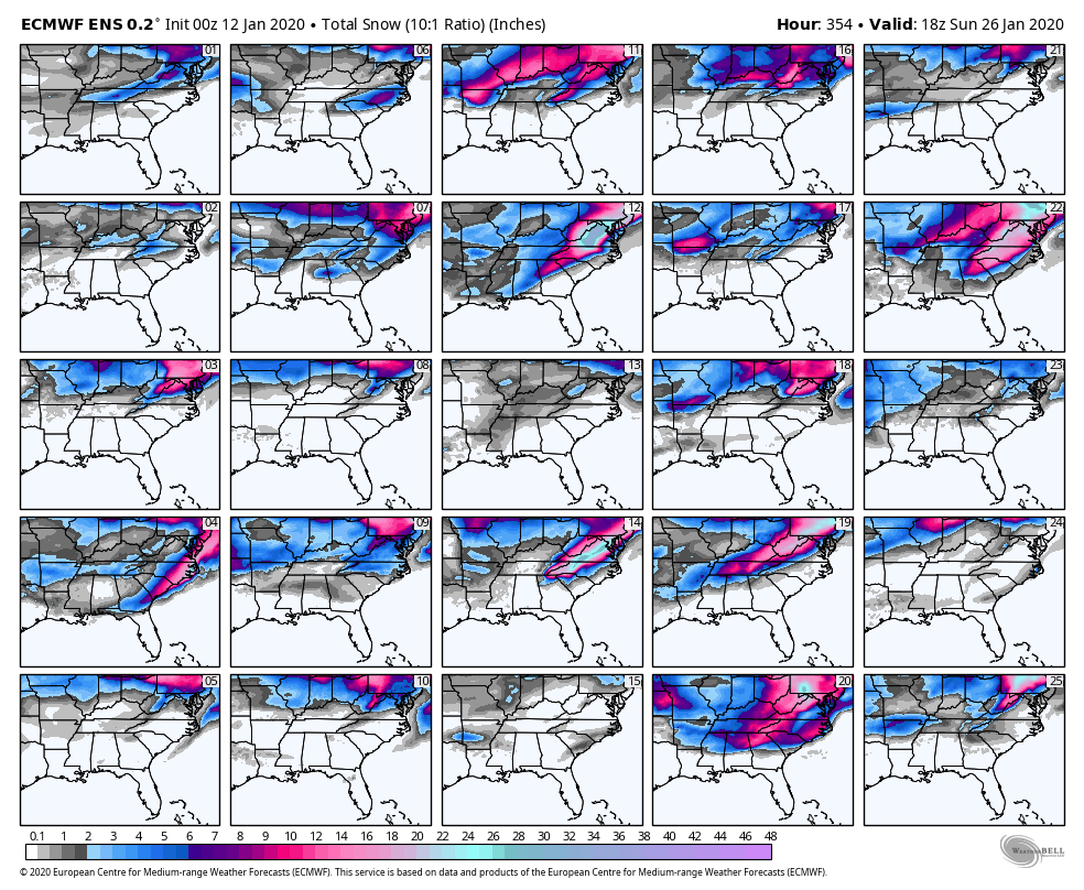
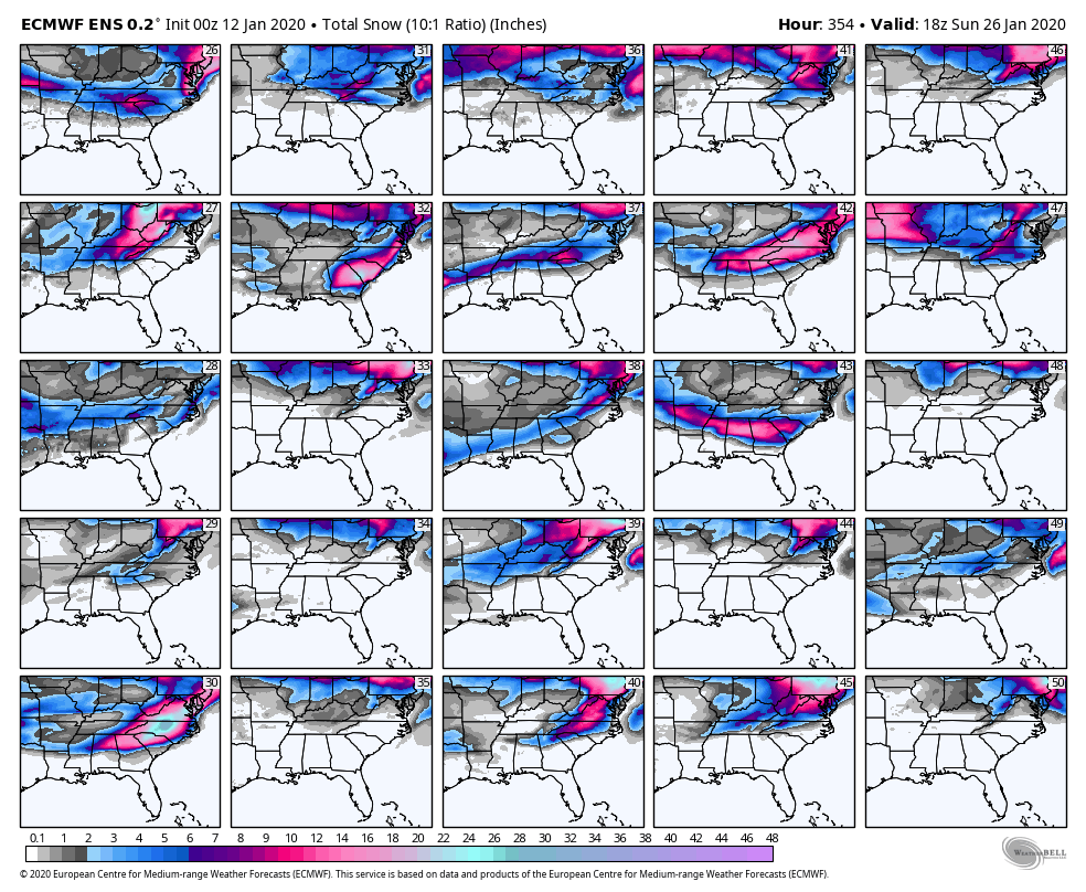
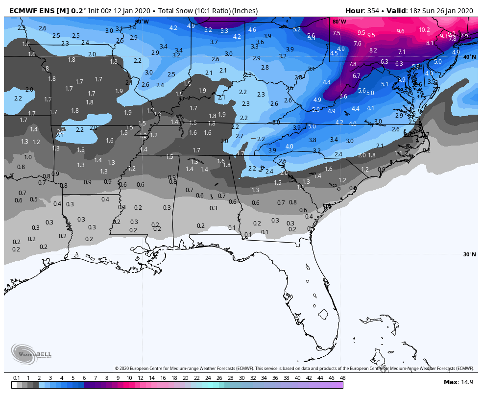
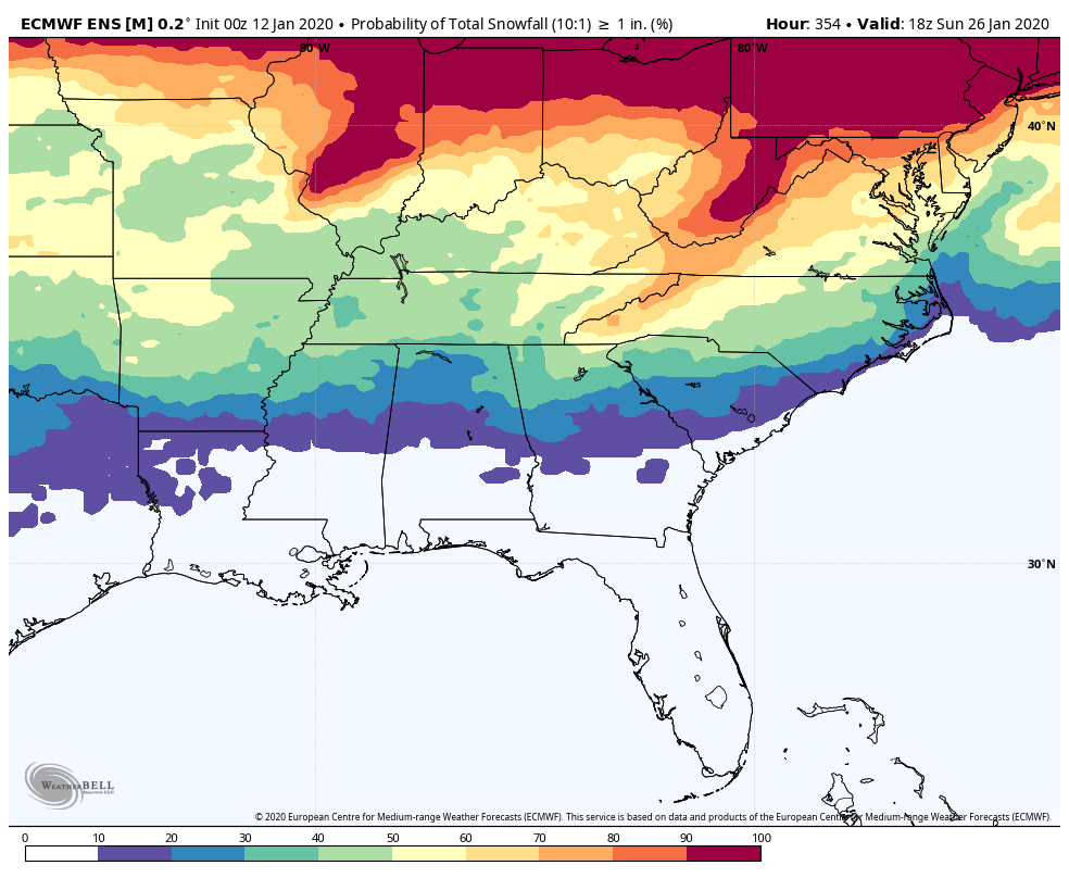
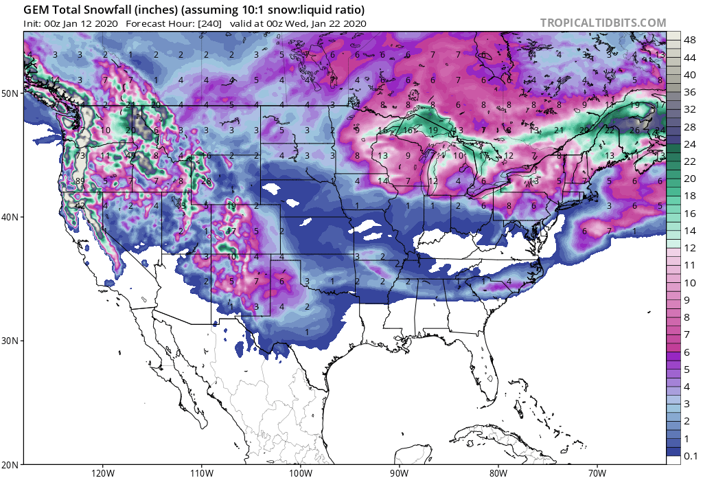
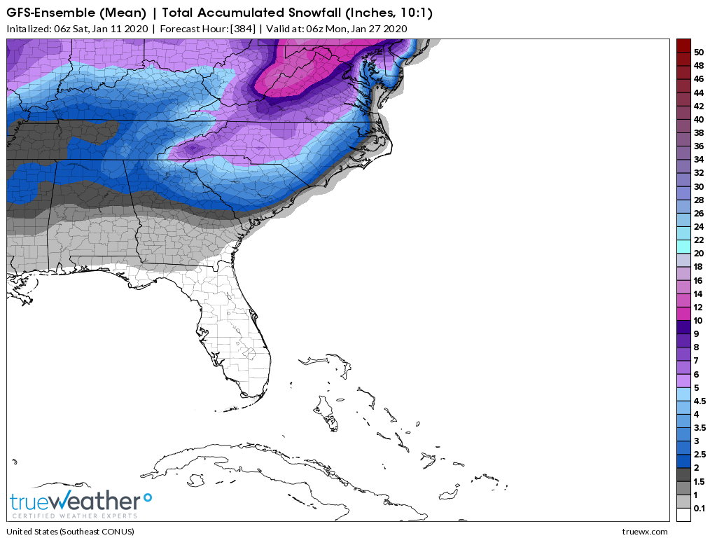
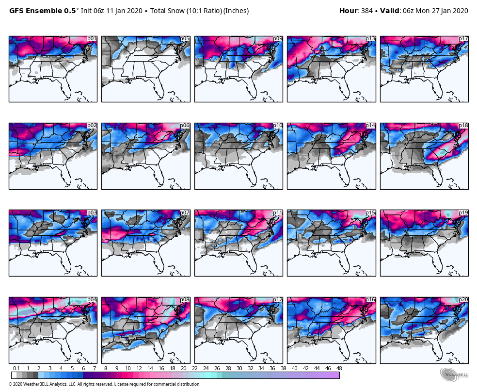
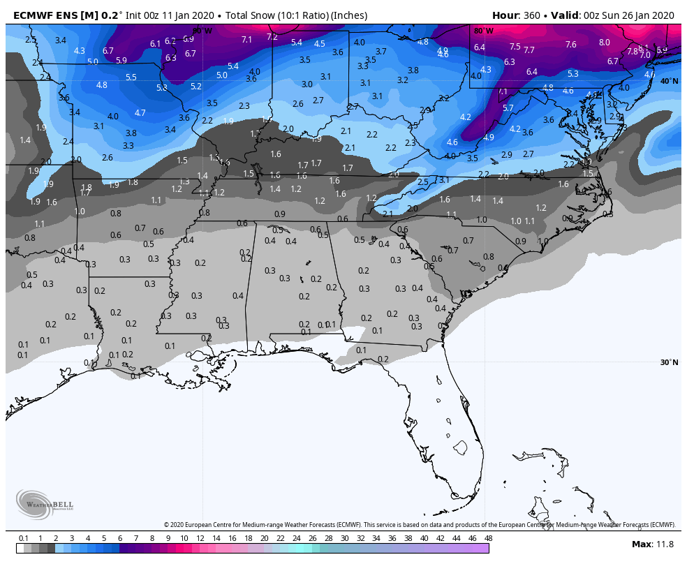
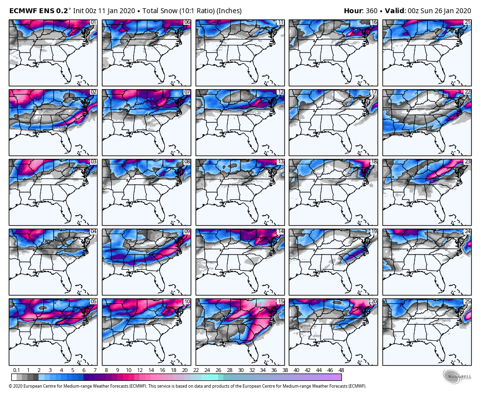
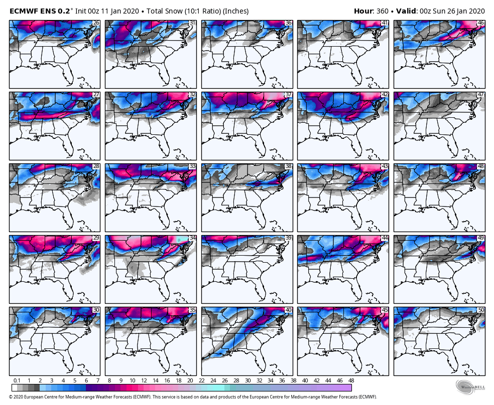
Maps:
1. GEFS mean w/ sleet (Largest since 06z yesterday)
2. GEFS members w/ sleet
3. GEFS Mean without sleet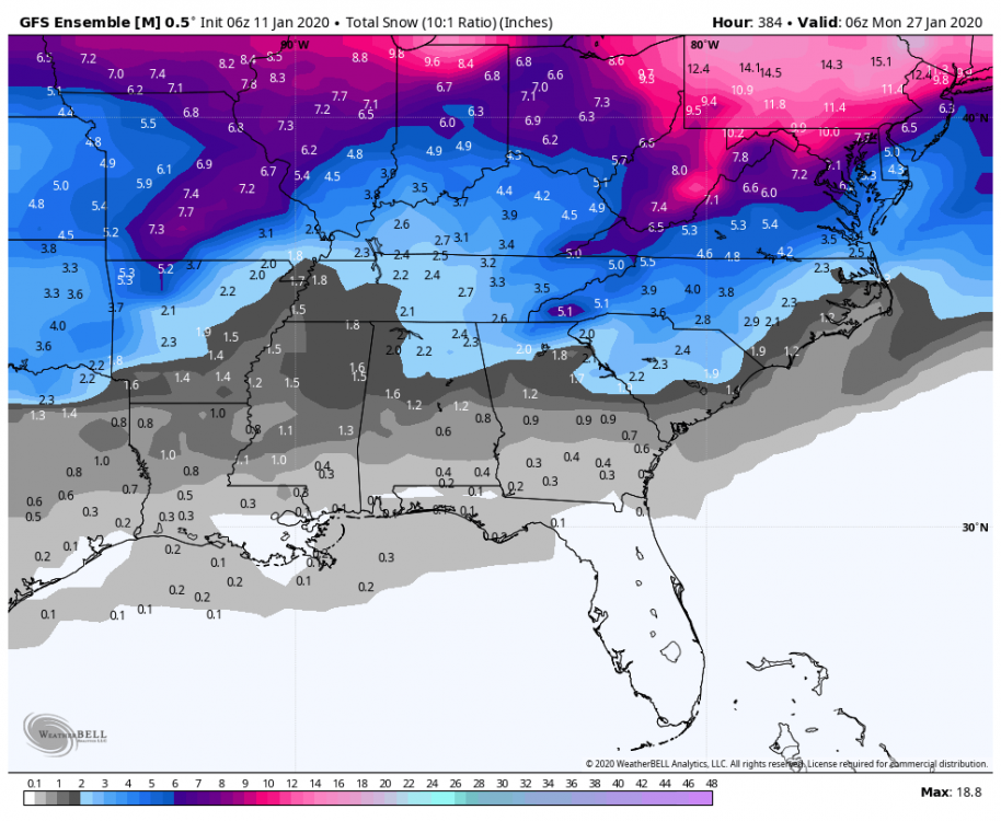
4. GEFS members without sleet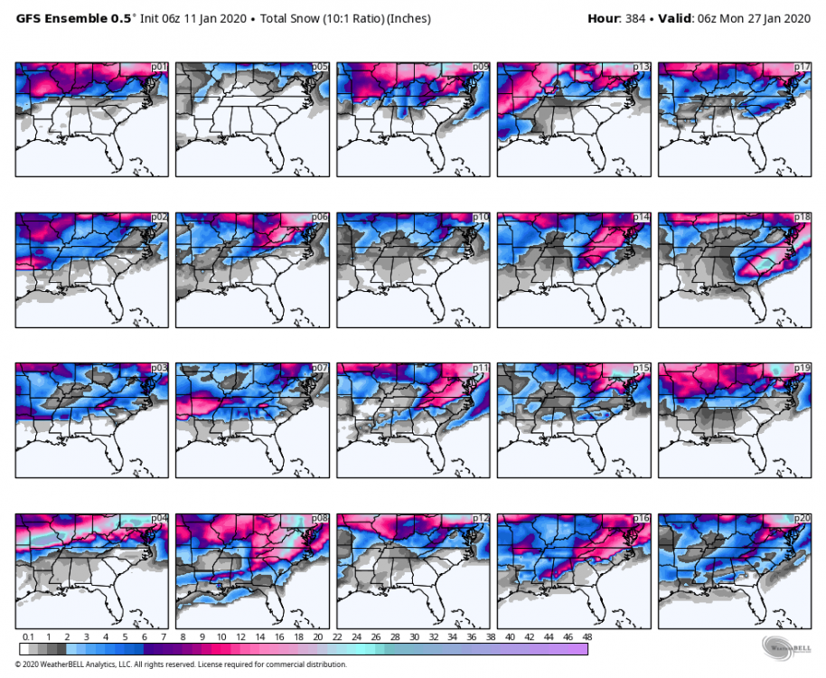
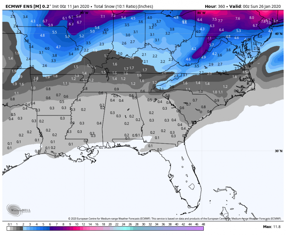
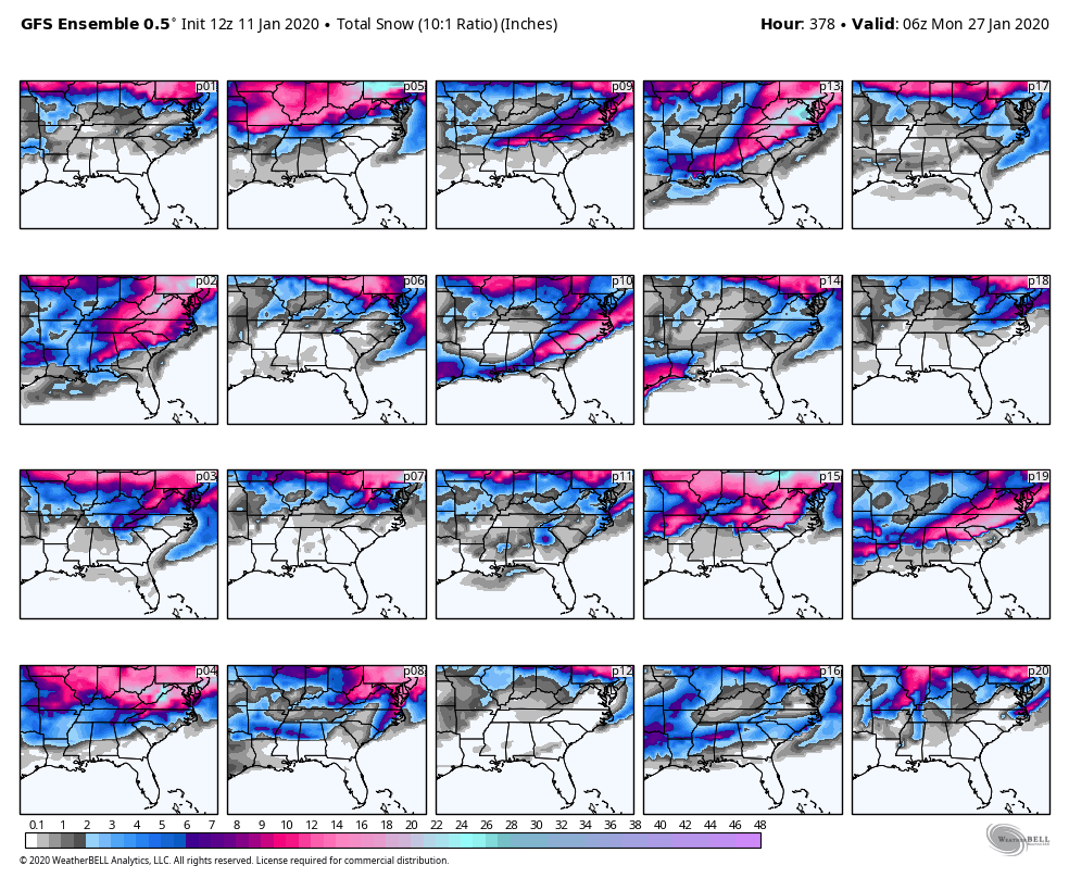
5. EPS Mean (Highest run I’ve seen the entire year)
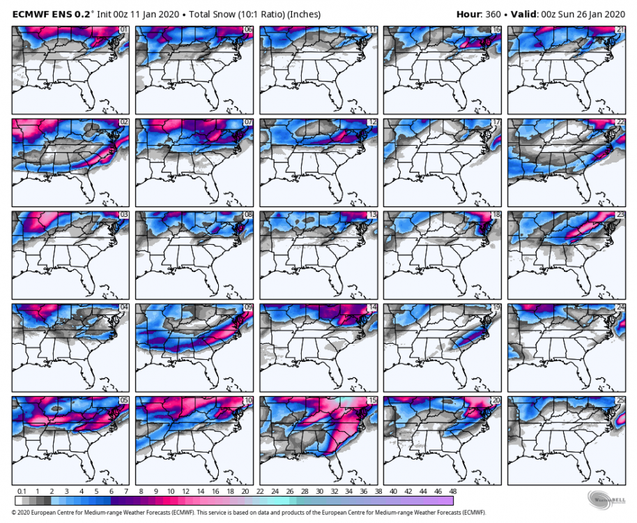
6. EPS Members 1-25
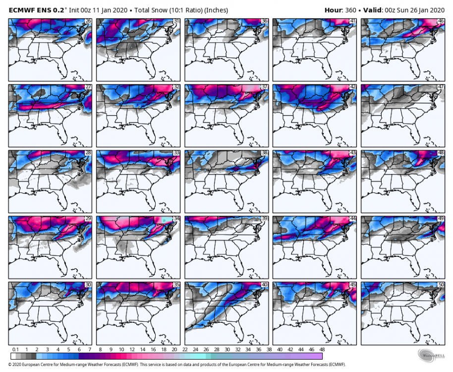
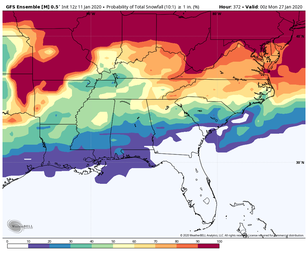
7. EPS Members 26-50
8. EPS percentages for over an inch
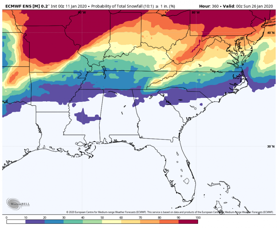
9. 24hrs snow Meteogram For GSO
-
1
-
3
-
-
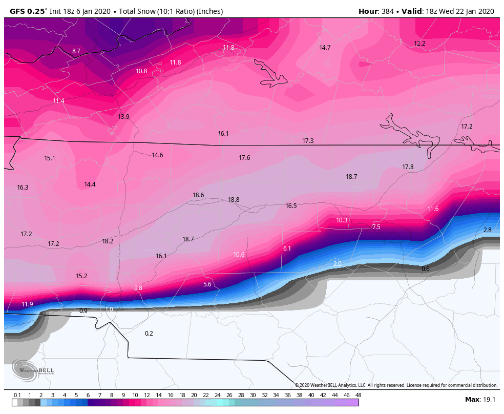
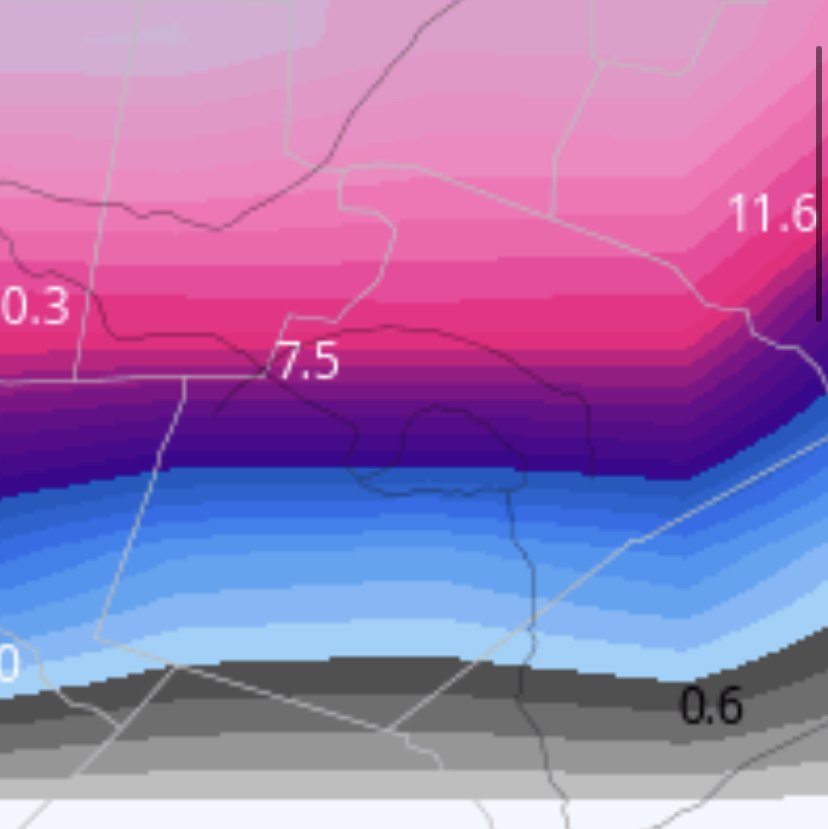
The 18z GFS based on the Weatherbell maps, is the most classic case of the Wake county gradient.


-
2
-
-
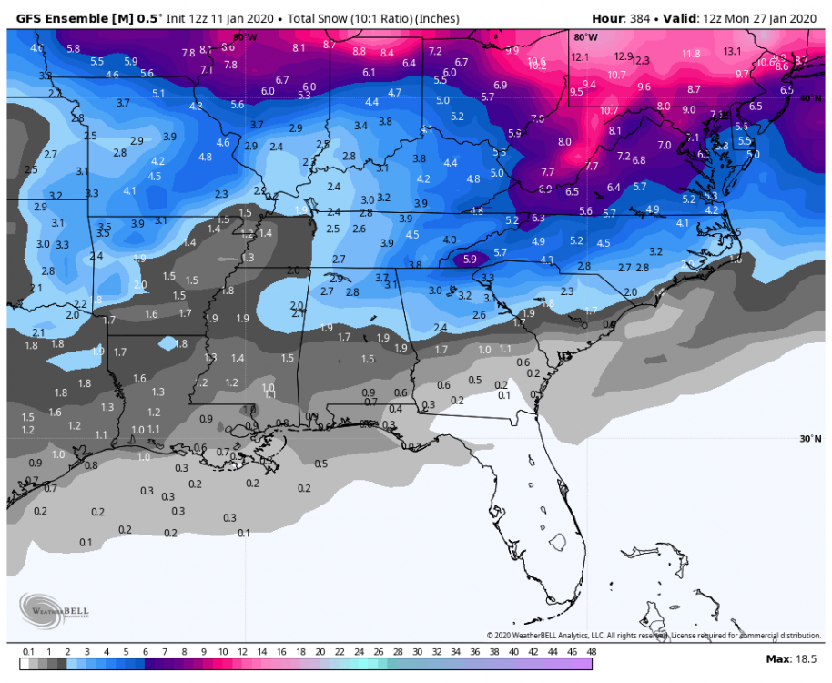
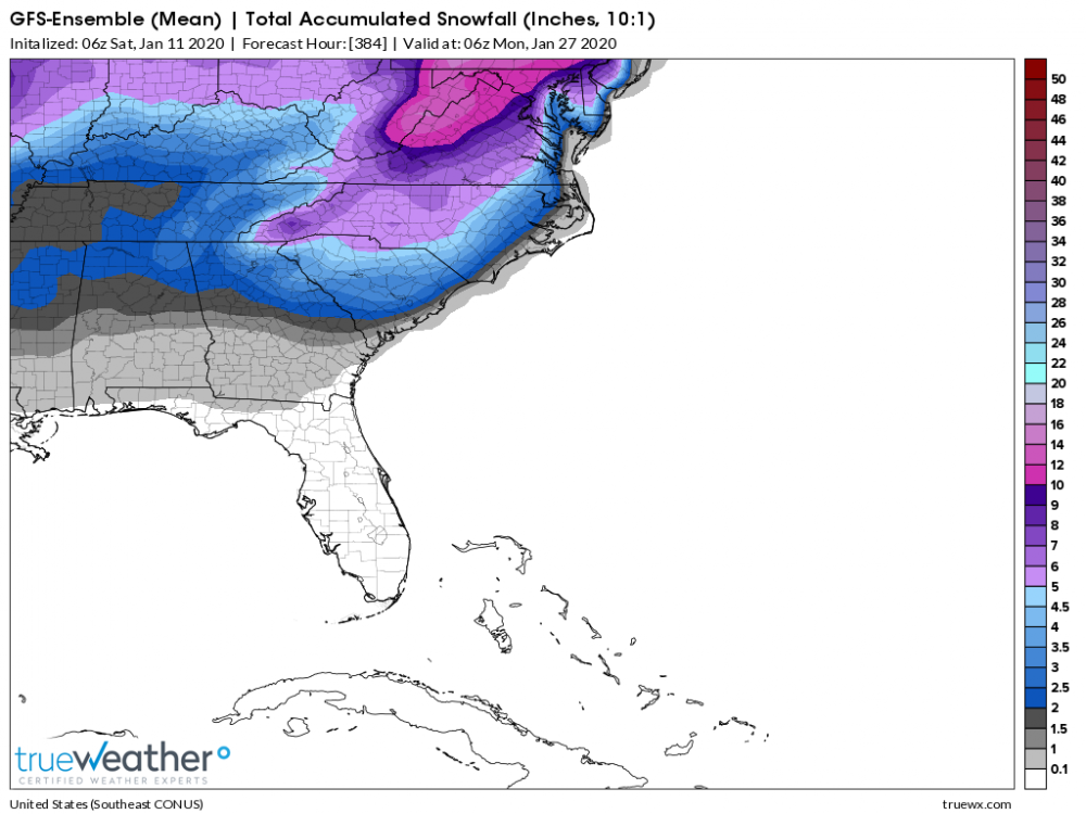
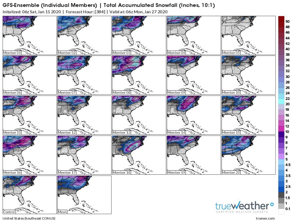
FWIW huge increase on the GEFS


-
2
-


Link to Plot Relative AAM Charts
in Weather Forecasting and Discussion
Posted
If I recall it’s not available to the public and only folks like HM have a legacy account. However, Victor Gensini has similar maps on his page. https://atlas.niu.edu/gwo/