

TerryM
-
Posts
3,307 -
Joined
-
Last visited
Content Type
Profiles
Blogs
Forums
American Weather
Media Demo
Store
Gallery
Posts posted by TerryM
-
-
CSt68
This particular thread is dealing with methane emissions that may or may not be increasing with or without man's assistance.
You are correct re. diesel autos, but wish you would move your argument to a more appropriate thread. Perhaps the one regarding natural vs man made warming.
Thanks
-
Phillip
The Barrow flasks have indeed been suspect since the discrepancy was first noted by Mathesda. AIR seems to be showing large emissions from iced over areas of the Arctic with much smaller seeps from ice free zones. I wonder if the bugs that eat methane also require oxygen to do their thing, and that the fairly anaerobic conditions under the ice shut them down. If so loosing the ice cover could retard atmospheric CH4 while at the same time allowing greater amounts to be released at the sea floor due to wave action and heating of the water column.
In this case a small atmospheric CO2 rise might be noted as well as increased oceanic acidification - not a great result, but easier to deal with than catastrophic warming.
I'm awaiting the April release of S&S's report, and hoping.
-
I posted this link back on page 5, but perhaps it's relevant at this stage of the discussion.
http://www.polarresearch.net/index.php/polar/article/view/6425/html_150
Talks about the lower regions of the Lapev Sea being heated 3C by a combination of albedo, and storm conditions due to lessened ice cover. When coupled with S&S's findings that permafrost becomes permeable at temperatures much lower than previously believed, it seems to provide a rational for the observations, and a warning of things to come if the ice continues to abate.
The spike upward in early 2008 shown on Friv's anomaly charts corresponds to the time that Semiletov began noting signs of dangerous emissions in the ESAS.
BTW Verg - Thanks for doing something with the AIR graphics, I think they will help guide the discussion.
-
Don't see the drop looking at a composite.

-
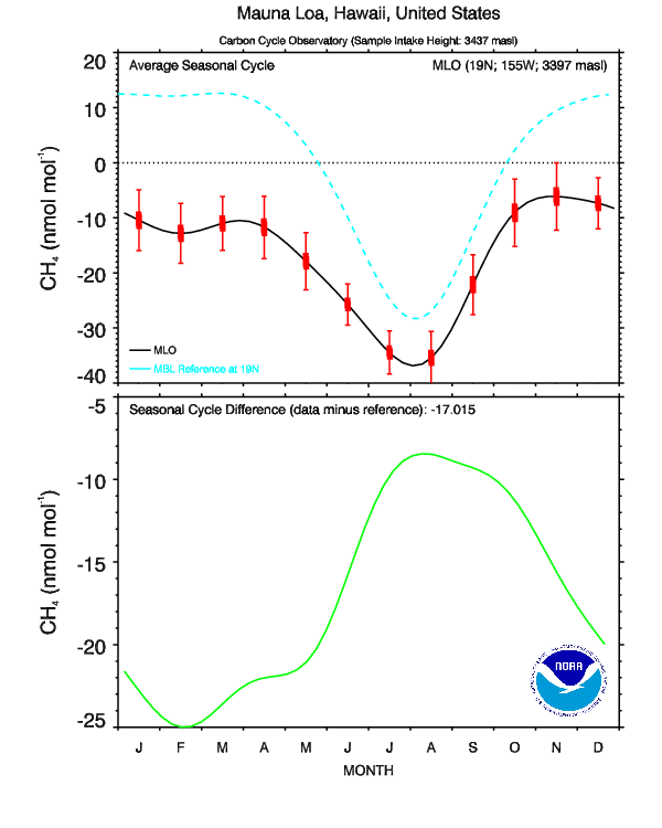
The progression through the months is also interesting, and not what I would have expected, Far more emissions during colder months. Could solar influences on methane chomping algae be having an influence?
-
ftp://asl.umbc.edu/pub/yurganov/methane/MAPS/NH/ARCTpolar2006.11._AIRS_CH4_400.jpg
ftp://asl.umbc.edu/pub/yurganov/methane/MAPS/NH/ARCTpolar2008.11._AIRS_CH4_400.jpg
ftp://asl.umbc.edu/pub/yurganov/methane/MAPS/NH/ARCTpolar2011.11._AIRS_CH4_400.jpg
Perhaps someone more familiar than I at shrinking images can post these.
They show Northern Hemisphere CH4 for November in 2006, 2008 and 2011
-
Summer decreases through insolation & plant growth certainly makes sense.
I know this is old news - but I for one was not aware that methane venting from shallow Antarctic Seas was being investigated.
http://www.nature.com/news/2010/100903/full/news.2010.442.html
I haven't been able to locate any newer info on the venture, but possibly someone fluent in Spanish will have better luck.
The postulation about seal mortality being tied to methane releases could tie into recent Arctic die offs.
-
Sorry - pasted wrong graph

-
Yes, looks like more spikes in the warmer months when the soil is thawing and vegetation is active.
I'm not sure. This seasonal chart seems to be showing both CO2 & CH4 peaking during freeze -up.
Does not include the spikes of course.
Wonder if it could have anything to do with local residential heating during winter months?
-
Verg
Good point re longer data sets - Could the collapse of the USSR play a role in the readings?
-
Here's an interesting comparison up till the beginning of 2011 showing both flask and in-situ measurements. We see spikes in the past, and these spikes are better sampled by the more frequent in-situ measurements (if we can plot all the points).
http://www.esrl.noaa...am=ccgg&type=fi
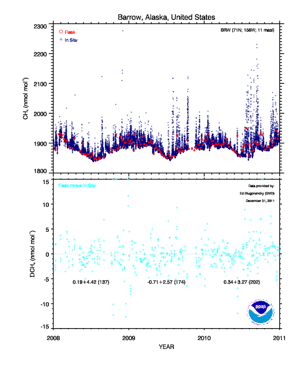
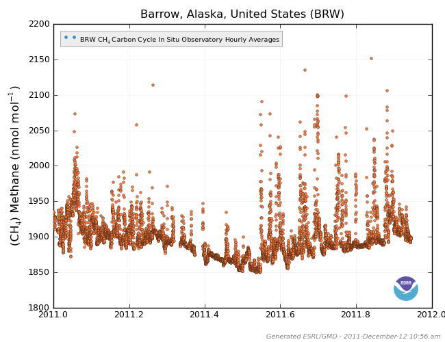
And thus below is 2011 hourly in-situ averages of Methane at Barrow so we can get a good view of the spike events over the year (up until Dec 12).
ESRL/GMD is also working on a "Methane Tracker" that will strive to model the sources and sinks of methane over time based on the observations.
Thanks for the link - I'd not noticed that page.
The methane spikes shown seem to increase over time with a large seasonal signal more or less in sync with CO2.
Any idea when the "Methane Tracker" will be available?
-
And yet peer reviewed papers posted in this thread don't support that position at all. The source(the authors) of the article that prompted this thread reject that position also. There is no history beyond several years to even speculate on methane release. (Not even a hockey stick with cherry picked tree data as proxy to temperature. Tree data that is replaced with real data the last 50 years because real data does not match the proxy.)
There are many things we do not know about climate change. Somehow massive releases of methane have not doomed the planet in the history of the planet. Even when dinosaurs roamed the poles.
Read up on the Permian Extinction.
-
Would this not dilute the methane? This is a 10,000 mile trip.
NOAA ESRL uses a 3-column quality control flag where each column
is defined as follows:
column 1 REJECTION flag. An alphanumeric other
than a period (.) in the FIRST column indicates
a sample with obvious problems during collection
or analysis. This measurement should not be interpreted.
column 2 SELECTION flag. An alphanumeric other than a
period (.) in the SECOND column indicates a sample
that is likely valid but does not meet selection
criteria determined by the goals of a particular
investigation.
column 3 COMMENT flag. An alphanumeric other than a period (.)
in the THIRD column provides additional information
about the collection or analysis of the sample.
ftp://ftp.cmdl.noaa...._flask_ch4.html
Judging from the data set
ftp://ftp.cmdl.noaa...._ccgg_event.txt
a single or a double high reading is flagged in column 1; bad data
A string of four or more high readings is usually flagged in column 2; valid but does not meet the selection criteria.
This data set they are trying to show the atmospheric baseline, short-term elevated values are tossed out of the graph, not the data set. I can guarantee that they are there, and they are probably flagged in the second column. This years data will be added to this data soon I hope.
But to call it bad data without knowing how the displayed data is selected is self imposed ignorance. So all the high readings we are seeing will probably be flagged, and furthermore there are probably many valid high readings that never get displayed at all.
Good news indeed - I confess I had feared a Monnet event, where a researcher faced huge pressure to change his findings.
-
okay,
"Siberian Seas Seethe Swamp Smell", it is
Superb!
-
I suppose so.
By the way, does "vast area of ocean boiling with methane" sound like an appropriate caption for that picture?
Siberian Seas Seethe
(Alliteration Always Advances An Agenda)
-
Both articles quoted
Tim Minshall saying that "T
he last time, when methane was raised in huge quantities on the surface planet Earth is just coming out of the last ice age about 15,000 years ago."
Would he be referring to the end of the Younger Dryas, when IIRC Greenland experienced a 10C raise in a 10 year period?
-
All the images I posted were using surface flasks. This does not make any sense unless the reading was an error. One chart is newer than the other, perhaps the readings were bad and the reason it is variable depending on the start date is that one image is newer than the other. All the images showing no spike are newer than the one that showed the spike. I think the spike was an error, this post is basically proof.
Good eye!!
Something is indeed amiss
The new data using 2010/2011 actually shows the average CH4 dropping over the course of the year - something belied by all other monitoring stations.
-
My position is I have doubts about the data, it may be accurate it may not be. Until there are other locations showing something I remain skeptical. I never once said the plumes don't exist, I said I have my doubts about Barrow's data and rightfully so. I'm done for the day I need to get to work I've wasted enough time with this for now.
What data are you skeptical about?
You agree that the plumes are real.
Do you doubt the validity of the Barrow testing procedures?
How else would you explain the high readings?
-
A link to show high temperature clathrate response.
http://findarticles.com/p/articles/mi_m1200/is_n16_v150/ai_18795944/
-
How 'bout this one - from a time a little closer to the relevant period?

The point is that all Arctic stations could not be expected to experience the anomalous readings - and the fact that one did is enough to verify the observations. I'd assume that the observations of the plumes plus the observations of ocean acidification off Barrow plus the observed arctic 'hot spots' with temperatures >10C above normal would be enough to convince any fair minded person that we have a problem. The fact that the Kara Sea is not frozen over when we are passed the solstice may also add some weight to the argument.
I watched the very late thaw of Foxe Basin this last season with interest, this is another shallow area that may be out gassing, possibly at a high enough rate to slow ice melt by freshening and cooling the waters due to clathrate breakdown. The waters there are known to be brown in color, although currents are not particularly strong. Doubt if Harper's government will do anything to investigate, but if someone does I'd be interested in the results.
-
Very good - see the maps are relevant!
Now go back to a date more in keeping with time being discussed and see if your theory still holds. - but wait till you're off work - boss could get nasty.
-
I don't see how the map posted has anything to do with why the supposed massive amounts of plumes of methane are only showing up on Barrow's data. So I'm not attacking the map but I am attacking the reason why it was brought up in response to my question about why is Barrow the only station picking up on the methane when there are 1000's of plumes.The map posted literally shows us nothing of significance in relation to this thread. The map is not even an exact depiction of how the air traveled across the arctic it's an estimate based on large scale circulations not the exact path.
The map means nothing to the discussion.
Except to answer your questions.
You seem to be implying that the methane plume - which has been observed -Does not exist because only one of the three Arctic stations (the other two being up wind of the event) did not record it.
Have I stated your position correctly?
-
I'm not asking again, if you choose to ignore them that's your prerogative. They are asked about three times in the last six posts.
Thank you
Trying to understand some new data before attacking it is a sign of progress.
Now on with the conversation.
Do you find S&S's research to be alarming?
-
I read the thread and it still does not mean anything in relation to the discussion at hand. Like I said before there are legitimate questions as to why this is significant to the discussion and you and TerryM keep ignoring it.
What questions? If you don't understand what the map represents how can you pose legitimate questions?
This is not good.
in Climate Change
Posted
Over the last 25 yrs atmospheric methane appears to have increased at a rate of about 6 ppb/yr. and the 400Mb charts we have seem to show more and more of this increase is emanating from Arctic regions.
Whether this is due to present Arctic warming or is a function of a heat pulse dating back to the inundation of the area 8k BP may not yet be settled, but the people actually in the field are warning that the lid could blow at any time.
I think that HIPPO and the 400Mb charts are indicating that CH4 is not mixing as rapidly in the atmosphere as had been predicted and I assume that part of the recent extreme Arctic temperatures is due to CH4 "plumes". As long as these are confined to the most northern regions they have to add to further loss of ice coverage, the heating of the ocean and further methane releases. If the Arctic vortex should weaken and these "plumes" escape further south there are areas that would be devastated by temperatures 15-20C above normal.
Fortunately at present the winter months seem by far the most severely effected.