bdgwx
-
Posts
1,350 -
Joined
-
Last visited
About bdgwx

- Birthday 10/19/1977
Recent Profile Visitors
5,179 profile views


-
"Experts" did not predict the Arctic would be "ice-free" (< 1e6 km2) by the summer of 2013. The most aggressive prediction I've seen using a broad based consilience of evidence approach so far is from the IPCC AR6 report in which they say "The Arctic is likely to be practically sea ice-free in September at least once before 2050." This is a significant downward revision from their 2070 target in the early 2000's and 2100 target in the 1990's. It is important to point out that the IPCC has a poor track record of Arctic sea ice declines. For example, in 2001 they said annual mean Arctic sea ice extent would not drop below 10.5e6 km2 until 2040. It first happened in 2007 followed by 2011, 2012, 2016, 2017, 2018, 2019, 2020, and 2023. And this is systematic of scientific community in general. Scientists have woefully underestimated Arctic sea ice decline. BTW...the only "expert" I know of that gave an early prediction was Peter Wadhams in a The Guardian article from 2013. His prediction was immediately criticized by the scientific community as not being supported by the evidence. It's also strange that Wadhams' own research at the time only stated within the next 30 years [Wadhams 2012] so it's not clear to me how this discrepancy gets resolved. Did he actually say what The Guardian said he said? If he did then why did he give a prediction to The Guardian that contradicts his prediction given in his own peer reviewed publications?
-
It's a pretty big deal if true. Hansen name dropped Mann as an example of a scientists who are dismissive of this hypothesis in his latest monthly email. So there is some friendly debate in the climate science community right now. I think Schmidt said we'll know within a year if we've been underestimating the warming all along.
-
Yeah. If you look at enthalpy metrics like equivalent potential temperature (theta-e) you'll see that heat (including latent) actually increased in the corn belt.
-
@Chicago Storm Yep. If I had to make a decision right now. It would be the IN/IL border near Vincennes. For me it is the best balance of low driving time and low odds of thicker cirrostratus.
-
It's just one model, but the 12Z HRRR is iffy everywhere except Maine. Based on the Incoming Direct Radiation cirrus are going to be thick enough to block some of the Sun through most of the path. Notice the reduction in direct insolation through southern MO and IL. Outside Maine it looks like Bloomington, IN and Cleveland, OH are the most favored areas, but it is a thread the needle situation. For reference Bloomington and Cleveland should be receiving about 800 W/m2 and 850 W/m2 respectively under clear skies at 18Z. See my post above with the Incoming Solar Radiation at 18Z for the baseline radiation. And note that Direct = Solar - Diffuse. Diffuse is the amount scattered by the atmosphere and clouds. Direct is the amount that makes it through unscattered.
-
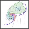
The penumbra begins sweeping over the CONUS with umbra off the Mexican coast at 18Z. The umbra is over the central CONUS (near Cape Girardeau MO) at 19Z. The penumbra is exiting the CONUS at 20Z.
-
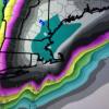
0Z HRRR is forecasting the largest weather effects to be in Arkansas, Missouri, and Illinois. The temperature drop in this region is 7 F and wind speeds get cut almost in half with directions changing from SSE to more S. It's short lived though. By 20Z everything reverts back to the state it was in at 18Z. 19Z is the eclipse peak.
-
The 2nd order polynomial regression on the UAH data shows an acceleration of the warming trend of +0.05 C.decade-2.
-
That video is grossly incorrect. No need for me to rehash the problems since @donsutherland1 already did. I do want to provide some commentary on the UHI though since it is one of the most grossly misrepresented concepts in the contrarian blogosphere. UHI Effect - This is the real phenomenon where urban areas are systematically warmer than rural areas. This is due to both land use changes that decrease albedo and to a lesser extent waste heat. The effect is always positive. Because it is real it should be included in global average temperature datasets. It often isn't included because removing it is an easy way to mitigate the UHI Bias (different concept described below) and because its not that significant anyway so its removal does not substantially bias the global average temperature trend. The effect was recently quantified by Dr. Spencer (a climate change "skeptic") as adding only about 0.03 C to the global average temperature. UHI Bias - This is a non-real phenomenon where urban/rural stations are used as proxies for the rural/urban areas. This is due to the methodological choices made in regards to gridding, infilling, and spatially averaging the data. For example, if you have a grid cell that is 50/50 urban/rural, but your station mix is 90/10 urban/rural then you are biasing that grid cell. What contrarians get totally wrong is that they assume the bias is always positive like the effect. This isn't true at all though. Consider that same 50/50 urban/rural grid cell where the station mix starts out 90/10 urban/rural but then overtime the station mix goes to 50/50. If that transition from 90/10 to 50/50 occurs after urbanization has peaked (like is often the case post WWII) then you actually bias that grid cell low. Berkeley Earth concluded that the net effect of the UHI Bias is statistically equivalent to zero, but if anything it is actually negative after 1950. [Wickham et al. 2013] That's worth repeating...the UHI Bias (not the UHI Effect) is more likely to be negative and bias their dataset too low than it is to be positive and bias their dataset too high.
-
Oh yeah duh. How'd I miss that. That's a better way to do it. I've been using that technique too with the NBM. If you go here you'll get the text output from the NBM which includes both the SKY and SOL parameters. For the NBE product SOL is the mean solar irradiance over a 12 hour period. For example, KCGI (Cape Girardeau, MO) has 39% coverage with 460 W/m2 while KIND (Indianapolis, IN) has 38% coverage with only 260 W/m2. Since both are roughly at the same latitude (close enough) that means that even though have nearly identical cloud coverage the optical depths are higher at KIND. At this latitude we expect about an average of about 600 W/m2 in completely clear skies from 12Z to 0Z on April 8th. BTW...I believe this technique works on April 8th because the global models are not simulating the eclipse. The actual solar irradiance on April 8th will be much lower even under clear skies (obviously). The only model I'm aware of that simulates eclipses is the HRRR (and I presume its successor RRFS). The only place I know of to get modeled solar irradiance data is the ESRL site. Unfortunately its FV3 equivalent has not been pulling the "downward shortwave flux" product for the GFS in awhile.
-
I was not able to find the downward solar radiation plot. Can you post a link or an brief description of how to get it?
-
Someone can correct me if I'm wrong, but it is my understanding that the global models like GFS and ECMWF do not simulate eclipses so they will have a tendency to overestimate shortwave driven clouds. However, the HRRR has been programmed from its inception to simulate eclipses so we should be able to get a feel for the cloud thinning effect starting on April 6th. Clouds are one of the least skillful forecast parameters already and we've seen problems with HRRR's PBL physics in the past so its wise to keep a discerning mindset regardless. Speaking of the cloud thinning effect...here is a very recent study both from an observational and modeling perspective regarding the topic. [Trees et al. 2024] Here is the HRRR simulation from the 2017 eclipse. Notice the shortwave driven clouds build just before onset of the eclipse and then wane rapidly as totality approaches. Then after totality passes shortwave driven clouds explode aggressively as the surface warming is reinstated. The bootheel of Missouri is an example of this. I was down there in 2017 and can corroborate the fact that there was a significant reduction in clouds in the 30 minutes leading up to totality.
-
NOAAGlobalTemp has been updated to version 6.0. This version uses artificial intelligence to improve the temperature reconstruction. https://www.ncei.noaa.gov/products/land-based-station/noaa-global-temp
-
From the latest CERES data we can see that Earth's albedo has dropped from 0.293 in 2003 to 0.288 in 2023. That is a radiative feedback of 340 W/m2 * (0.293-0.288) = +1.7 W/m2. For the lurkers...notice that I called it a radiative feedback and not a radiative force. The reason is because this a feedback response to global warming. See [Donohoe et al. 2014] for a more intuitive explanation of what is happening.
-
My hometown St. Louis obliterated the previous record by 7F yesterday. Sent from my Pixel 5a using Tapatalk